How to Build Your Personal Colour Palette (That You'll Actually Use)
A personal color palette is not a mood board. It is a small, structured set of shades that share your undertone, your depth, and your clarity, which means everything in it flatters you and everything in it goes together. Call it a personal colour palette or a personal color palette; the method below is the same.
If you have ever typed "color palette for my skin tone" into a search bar at 11pm while holding a sweater you were not sure about, this guide is for you. Below is the full process for how to build a personal color palette: what actually belongs in it, how to pull each layer from your color season, and how to use it in fitting rooms, at the salon, and in front of your own closet.
What's in this guide
- What a personal color palette really is
- How to know if a color actually fits you
- The four layers of a palette that works
- Building each layer from your color season
- Auditing your closet against the palette
- Shopping with your palette
- Extending it to makeup, hair, and metals
- Keeping the palette alive
- How Tone & Fit builds yours from a selfie
- Palette vs. color analysis: the difference
- FAQ
What a personal color palette really is
Start with what it is not. It is not a collection of colors you happen to like, and it is not a generic chart screenshotted from Pinterest. A personal color palette is a set of shades that match your natural coloring on three measurable qualities:
- Undertone: whether your skin leans warm (golden, peachy, olive) or cool (pink, rosy, blue-based). Warm skin harmonizes with warm colors; cool skin harmonizes with cool ones.
- Depth (value): how light or dark your overall coloring reads when you take hair, eyes, and skin together. Light coloring suits light colors; deep coloring can carry real darkness.
- Clarity (chroma): whether your features are clear and high-contrast or soft and blended. Clear coloring handles saturated color; soft coloring looks best in slightly muted shades.
When a shade matches you on all three, your skin looks even, your eyes look brighter, and people compliment you rather than the outfit. When it misses on even one, you look tired in the exact same face. That is the whole game, and it is why "just wear colors you love" keeps failing. Take red:
Blue-red, tomato, brick, raspberry, soft coral. Same word on the label, five different undertones, depths, and clarities.
All five are "red." One flatters a cool, deep person; another only works on warm, muted coloring. A personal palette answers that question once, for every color family, so you never have to squint at a rack again.
How do you know if a color actually fits you?
A color fits you when it passes on your undertone, your depth, and your clarity at the same time, not just one of the three, which is why a quick "does this look nice" glance in a store mirror is so unreliable. Test any color you are unsure about against all three before it earns a place in your palette.
| Check | How to run it | Pass | Fail |
|---|---|---|---|
| Undertone | Hold the fabric at your jaw in daylight, no makeup | Skin looks clearer, more even | Skin looks sallow, grey, or flushed |
| Depth | Compare the fabric to your own value in a grayscale photo | Sits close to your own light or deep level | Washes you out or overpowers your features |
| Clarity | Compare the fabric's intensity to your own contrast | Matches how soft or vivid your coloring is | Looks louder or duller than your face can support |
Score it honestly: three passes means the color belongs in your main or signature layer. Two passes means it is wearable, usually further from your face, in shoes or a bag rather than a blouse. Zero or one pass means the color is fighting you no matter how much you like it on the hanger, the same lesson the red comparison above makes with fabric instead of words. If you are unsure whether you are reading your own undertone correctly in the first place, warm vs cool skin undertone and how to find your contrast level walk through both checks in more depth.
The four layers of a palette that works
A usable palette is not a flat list of forty swatches. It has structure, and the structure mirrors how a wardrobe actually gets worn.
1. Base neutrals: about 60 percent
Your versions of black, white, gray, and beige. These carry the coats, trousers, knitwear, boots, and bags, the frame around nearly every outfit. Warm seasons build this layer from browns, olives, and ivories; cool seasons build it from true grays, navies, and soft whites. Get your six or so neutrals right and most of your closet starts coordinating itself. The coat is the neutral that matters most, because it sits beside your face all winter; best coat colors for your skin tone charts the right one for every season.
2. Main colors: about 30 percent
Four to six wearable colors for sweaters, dresses, and shirts, the pieces people actually notice. Every main color should pair with every neutral without a second thought. This layer is also where your signature colors live: the two or three shades that earn compliments so reliably that friends start calling them "your color."
3. Accents: about 10 percent
Two to four punchier shades for scarves, lipstick, nails, and jewelry moments. Accents carry the personality and absorb the trends. Because they are small and cheap to swap, this is the layer where you can flirt with fashion without rebuilding anything.
4. Metals
The forgotten layer. Jewelry, watch cases, belt buckles, zips, and glasses frames all read as color next to your skin. Warm undertones glow beside yellow gold, copper, and brass; cool undertones sharpen beside silver, platinum, and white gold. Choose a primary metal and your accessories stop arguing with each other. If you are not sure which way you lean, the gold or silver jewelry test settles it in daylight and lists the best metal for each of the 12 seasons.
The 60/30/10 split is a guide, not a law. But if your closet is currently 60 percent accents and 10 percent neutrals, that is precisely why you own a hundred things and wear nine of them.
Building each layer from your color season
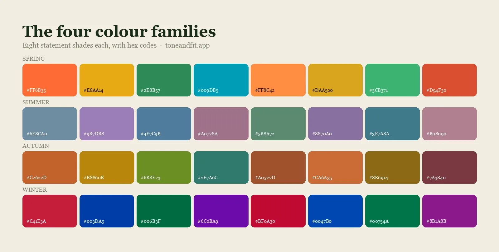
Your color season is shorthand for the three qualities above. Modern analysis uses a 12-season system: the four families (Spring, Summer, Autumn, Winter) each split by whether warmth, depth, lightness, softness, or brightness dominates. Once you know your season, filling in the layers becomes almost mechanical. Here are two worked examples from opposite corners of the map.
A warm, deep example: Deep Autumn
- Base neutrals: espresso, dark chocolate, camel, warm ivory, olive, deep navy. Espresso replaces black; ivory replaces stark white.
- Main colors: rust, burgundy, forest green, mustard. Rich, earthy, October colors.
- Accents: warm teal, plum, tomato red.
- Metals: yellow gold, copper, brass. Silver reads cold against golden skin.
A Deep Autumn palette in 60/30/10 proportion: six neutrals, three main colors, one accent.
Notice there is no pure black and no pure white anywhere. Deep Autumn darkness comes from espresso and forest; its light comes from ivory and camel. The full family breakdown lives in our autumn color palette guide, and the subtype version is spelled out shade by shade in the Deep Autumn color palette post.
A cool, light example: Light Summer
- Base neutrals: soft white, dove gray, cool greige, rose-beige, taupe, soft navy. Soft navy replaces black; soft white replaces bright white.
- Main colors: powder blue, dusty rose, lavender, seafoam. Light, cool, gently muted.
- Accents: raspberry, periwinkle, soft aqua.
- Metals: silver, white gold, platinum, ideally in brushed finishes rather than high shine.
A Light Summer palette in the same proportions: cool, light, and softly blended.
Same structure, completely different fill. That is the point: the four layers are universal, the colors are personal. If you do not know your season yet, start with find my color season or the complete personal color analysis guide, then come back and fill in your layers.
Skip the guesswork. Get your palette from a selfie.
Tone & Fit's AI reads your undertone, depth, and clarity from one photo and builds your named palette in about 30 seconds. Free to scan, no account, no quiz.
Try the App ↗Auditing your closet against the palette
Now the confronting part. Pull your clothes out near the biggest window you have, in daylight, and sort every piece into three piles:
- In palette: matches your undertone and depth. Keepers, and very likely your most-worn pieces already.
- Close: right color family, slightly wrong version. A tomato red top when your best red is brick, or a warm beige when yours should be cool greige.
- Off: wrong temperature or wrong depth entirely.
Two patterns show up in almost every audit. First, the clothes you never wear despite loving them on the hanger cluster in the "off" pile; you were not being lazy, they were fighting your face. Second, the gaps are nearly always in neutrals: most of us buy fun colors and skimp on the 60 percent layer that holds outfits together, which is why "nothing goes with this" happens so often.
Do not purge everything off-palette. Trousers, skirts, and shoes in the wrong colors are usually fine, since they sit far from your face. A slightly-off sweater can survive under an in-palette scarf or over an in-palette collar. The working rule: the closer to your jaw, the stricter the palette. If you want to take the audit one step further into a full wardrobe plan, the capsule wardrobe by color season guide picks up exactly here.
Shopping with your palette
A palette you cannot see at the moment of decision is a palette you do not have. Five habits make it stick:
- Keep it on your phone. Screenshot it, pin it, favorite it. Tone & Fit stores your palette in the app, so it is already in your pocket in the fitting room.
- Check fabric in daylight. Store lighting is engineered to flatter; warm bulbs make nearly everything look golden. Carry the garment toward a window or the doorway and hold it against your palette before you decide.
- Shop by shade name. Searching "soft sage knit" or "burnished copper dress" filters a retailer far better than "green" or "brown." This is why named shades beat anonymous swatches.
- Apply the three-outfit rule. Only buy a piece if it pairs with at least three things you already own. Inside a real palette, almost everything passes; outside it, almost nothing does.
- Trust the avoid list on sale racks. A discount is the price doing the persuading. If the color is on your avoid list at full price, it is still on your avoid list at 70 percent off.
For the fitting-room version of all five, including the under-the-chin daylight test and a rule for how many off-palette pieces to allow yourself, read how to shop your color palette.
Extending it to makeup, hair, and metals
The palette does not stop at the neckline. The same three qualities decide what sits well on your face and around it.
Makeup: foundation should match your undertone, not just your surface depth; a base one shade too pink is the most common reason "warm" makeup looks wrong. Lipstick comes from your red family: brick and terracotta for a Deep Autumn, raspberry and rose for a Light Summer. Blush and eyeshadow behave like accents and neutrals respectively, so echo your palette's warmth or coolness there too.
Hair: stay inside your temperature, and move depth one step at a time. A Deep Autumn shines in chocolate, chestnut, and auburn with copper glints, and dulls in ash tones. A Light Summer suits ash blonde, cool beige blonde, and light cool brown, and fights anything brassy or golden. When your hair drifts outside your season, half your palette quietly stops working.
Metals: pick one primary metal for the pieces that live near your face, earrings, necklaces, glasses. Mixing metals is fine lower down, on belts and bags, as long as the primary wins up top.
Keeping the palette alive
A palette is a system, not a one-time printout. Three habits keep it useful for years:
Refresh the accent layer seasonally. Your neutrals and mains barely change, which is what makes them worth investing in. Each fashion season, translate the trend color into your version of it: if butter yellow is everywhere and you are cool-toned, your translation might be soft lemon chiffon; if you are warm and deep, it is mustard. You stay current without buying colors that fight you.
Use capsule logic for every purchase. Each new item should multiply outfits, not add a single one. Because everything in the palette shares your undertone and depth, a single new main color typically creates six or more combinations with what you already own.
Re-check after big changes. Undertone is stable for life, but depth and clarity soften as hair grays or lightens. A Deep Autumn can drift toward Soft Autumn over a decade. If your old favorites start looking heavy on you, re-run your analysis rather than forcing the old chart.
How Tone & Fit builds your palette from one selfie
Everything above can be done by hand with drapes, mirrors, and patience. Tone & Fit compresses it into about 30 seconds. The app's AI reads your undertone, value, and chroma from a single selfie, places you in one of the 12 seasons, and then does the layer-building for you. Your photo is analyzed and then discarded; there is no account, no quiz, and no subscription.
The result is a palette of up to 20 curated colors, expanded into 40+ named shades and grouped the same way this guide is: Signature (your compliment magnets), Everyday (your mains), Accent, and Neutrals. The names are real, searchable ones like "Burnished Copper" and "Soft Sage," so the shopping trick from earlier works out of the box. You also get your power shades and an avoid list, hair color and makeup recommendations, your jewelry metal, outfit formulas built from your own palette, a draping preview so you can see shades against yourself before committing, and an AI Style Assistant for the "can I wear this to a wedding" questions.
The scan itself is free, with no account and no quiz. Unlocking the full palette and its recommendations is a one-time purchase rather than a subscription, priced on the App Store listing. It runs on iPhone with iOS 15.1 or later.
How is a personal color palette different from personal color analysis?
Personal color analysis is the diagnostic step, the process that measures your undertone, depth, and clarity and places you in a season. A personal color palette is the output of that process: the actual list of neutrals, main colors, accents, and metals you get to use once the diagnosis is done. You only need to run the analysis once; the palette is what you return to for years.
This is also why the two terms show up in different kinds of searches. Someone asking about "analysis" usually wants to know their season or how the method works. Someone asking about a "palette" already has a season and wants the practical shopping list that follows from it, which is the entire subject of this guide. If you have not been analyzed yet, seasonal color analysis explained covers the process end to end before you come back here to build the palette itself.
Your palette is one selfie away.
Free scan, no account, no quiz. Get your 40+ named shades, grouped into Signature, Everyday, Accent, and Neutrals, and keep them in your pocket for the fitting room.
Download Tone & Fit ↗If you are comparing options, see the color analysis apps we tested before you install anything.
Personal colour palette: a note for UK readers
If you searched for a personal colour palette rather than a color palette, nothing here changes except the spelling. The four layers, the closet audit and the shopping rules apply the same way, and the colour analysis app guide for UK and Australian readers covers the one thing that does differ: how softer northern daylight affects a selfie result. Build your personal colour palette from a photo taken by a window in the middle of the day and the seasons line up.
Frequently Asked Questions
How many colors should a personal palette have?
Enough to dress from, few enough to remember. Seasonal charts often show 30 to 65 colors, but a working personal palette is usually 15 to 25: around six base neutrals, four to six main colors, two to four accents, plus your metals. Tone & Fit curates up to 20 colors for your season and expands them into 40+ named shades so you can be precise when you shop.
What if my favorite color is not in my palette?
Keep it, just move it. Wear it below the waist, in shoes, or as a bag, where it cannot reflect onto your face. Or find its closest relative inside your palette: if you love hot pink but your coloring is warm and deep, tomato red scratches the same itch. A palette is a set of best choices, not a list of banned colors.
Does Tone & Fit name the exact shades?
Yes. Your result includes 40+ named shades grouped into Signature, Everyday, Accent, and Neutrals, with real names like Burnished Copper and Soft Sage instead of anonymous swatches. Names matter when you shop: you can search a retailer for a soft sage knit and actually find the right color.
How do I use my palette when shopping?
Keep it on your phone and compare before you buy. In stores, carry the garment toward a window and hold it against your palette in daylight, since store lighting flatters almost everything. Online, match the product photo to your named shades and double-check the color in customer photos. Tone & Fit keeps your full palette in your pocket, with power shades and an avoid list, so the decision takes seconds.
Do neutrals count as part of my palette?
They are the most important part. Neutrals cover roughly 60 percent of what you wear, so getting them right does more for your look than any accent. Every season has its own best neutrals: a Deep Autumn swaps black for espresso and pure white for warm ivory, while a Light Summer reaches for soft white, dove gray, and cool greige.
What is the fastest way to check if a color fits me?
Hold the item at your jaw in daylight without makeup and watch your skin, not the fabric. If your skin looks clearer and more even, the color fits. If it looks sallow, grey, or tired, it does not, no matter how much you like the color on its own.
Do the colors that fit me change over time?
Your undertone stays fixed for life, so the core colors that fit you rarely change. What can shift is depth and clarity as hair lightens, greys, or you spend time in the sun, which is why the palette gets rechecked occasionally rather than rebuilt from scratch.
Is a personal color palette the same for everyone in a season?
The four layers and general direction are the same, but the exact named shades vary, because two people in the same season can still differ in exactly how warm, how deep, or how clear they read. A photo-based read accounts for that individual variation rather than handing everyone in a season an identical chart.