What Colors Look Good on Me? The Real Answer
The colors that look good on you are the ones that share your skin's undertone (warm or cool), your depth (light or deep), and your contrast (crisp or soft). Warm skin glows in camel, rust and olive; cool skin in navy, emerald and berry; and the exact list narrows further once you know your season.
You already own the proof: one shirt earns compliments every single time, and another makes people ask if you slept. This guide explains the difference, gives you a quick lookup table and a ten-minute self-check, then helps you find your whole list. Start with your season if you want the shortcut: the free color analysis tool estimates it from one photo, then points you to the palette.
What's in this guide
- Why some colors make you glow and others make you look tired
- What colors should I wear? Quick answer by undertone and depth
- How to tell what colors look good on you: the 3-step self-check
- How to know your self-assessment is right
- Your best colors by undertone
- Which one looks better on me? The two-photo test
- Almost-universal colors, and the universal myth
- What to wear by occasion
- Why generic advice fails, and how 12 seasons fix it
- Your exact palette from one selfie
- FAQ
Why some colors make you glow and others make you look tired
Type what colors look good on me into a search bar and you get quizzes, celebrity slideshows, and shade lists that contradict each other by the third result. The real answer is simpler and far more personal: the colors that flatter your skin tone are the ones whose physical properties match the properties of your own natural coloring. That is the entire science. Everything else is detail.
Every color you could wear has three measurable properties:
- Hue temperature: whether the color is built on a warm base of yellow and gold or a cool base of blue. Camel is warm; navy is cool.
- Value: how light or dark it is. Blush is light; burgundy is deep.
- Chroma: how pure or muted the pigment is. Emerald is clear and saturated; sage is soft and grayed.
Your natural coloring carries the same three properties. Your skin has an undertone that leans warm, cool, or somewhere in between. Your hair, eyes, and skin together sit somewhere on the light-to-deep scale. And your features are either crisp and contrasting or soft and blended.
When a color's temperature, value, and chroma line up with yours, the light it reflects onto your face is harmonious: skin looks more even, under-eye shadows recede, eyes and teeth read brighter. When they clash, that reflected light exaggerates exactly what you would rather soften: sallowness, redness, blotchiness, dullness.
Nobody says "her sweater's hue temperature contradicts her undertone." They say "you look tired." Same event, different vocabulary.
That reflection effect is why you can look radiant in rust and drained in baby pink while your friend gets the exact opposite result from the same two sweaters. Neither color is objectively better. They are answering different faces.
What colors should I wear? Quick answer by undertone and depth
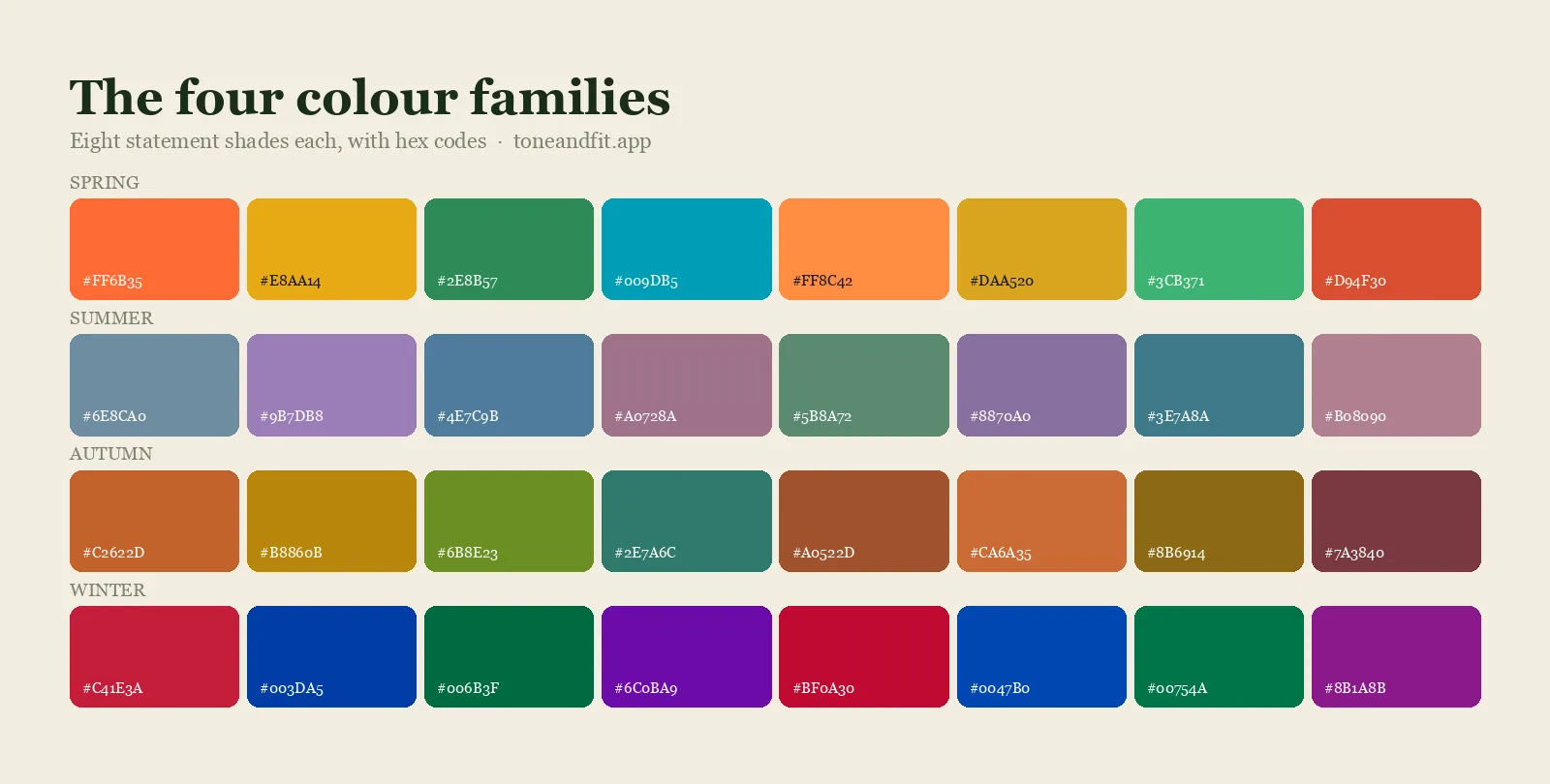
If you already know roughly whether your skin runs warm or cool and whether your coloring is light or deep, this table answers "what color suits me" in one row. It is a starting list drawn from the undertone sections further down, not your full palette; the season link in the last column gives you the complete one.
| You are | Wear these first | Skip these | Full palette |
|---|---|---|---|
| Warm and light | Peach, camel, warm cream, light olive, marigold, warm taupe | Jet black, concrete gray, and anything so dark it wears you | Spring palettes |
| Warm and deep | Rust, terracotta, chocolate, espresso, dark olive, gold, mustard | Jet black, concrete gray, and pale shades you fade into | Autumn palettes |
| Cool and light | Soft berry, dusty blue, cool pink, icy pink, silver, soft white | Camel, orange, mustard, and anything so dark it wears you | Summer palettes |
| Cool and deep | Navy, cobalt, emerald, plum, fuchsia, charcoal, pure white | Camel, orange, mustard, and pale shades you fade into | Winter palettes |
| Neutral or olive | Teal, jade, dusty rose, mauve, soft white; for olive skin, deep teal, forest, aubergine, burgundy | Neon brights, stark black-on-white, strongly yellow shades, chalky pastels | Run the free scan: neutral coloring is the hardest to place by eye |
Not sure which row you are? That is what the next three steps settle. Contrast, the third coordinate, decides how bold your pairings can be within any row.
How to tell what colors look good on you: the 3-step self-check
You know which colors look best on you once you have three data points about yourself, your undertone, your depth, and your contrast, and you can approximate all three at home in about ten minutes. Work in daylight, near a window, with a clean face and a plain mirror.
Step 1: Find your undertone
Undertone is the temperature underneath your skin's surface, and it stays constant whether you are tanned in August or pale in January. Run three quick checks. Look at the veins on your inner wrist: green suggests warm, blue or purple suggests cool, a mix suggests neutral. Hold gold and silver jewelry against your bare arm and judge which makes the surrounding skin look healthier, not which you happen to like. Finally, hold a sheet of white paper beside your face: skin that casts yellow-gold against it is warm; skin that casts pink or blue is cool. Two out of three agreeing is a verdict. Our guide to warm vs cool undertones walks through the tricky edge cases.
Step 2: Judge your depth
Depth, called value in color theory, is how light or dark your coloring reads from across a room. Look at your hair and eyes together. Pale blonde hair with light blue eyes is light coloring; blue-black hair with espresso eyes is deep; most of the world sits in the middle. Depth sets a ceiling on how dark your clothes can go before the outfit wears you, and a floor on how pale they can go before you fade into them. Eye color feeds into that reading too, and if yours are brown, the shades that make them read brightest are broken out in our guide to dressing around brown eyes.
Step 3: Read your contrast
Contrast is the size of the gap between your skin, hair, and eye values. Dark hair over fair skin is high contrast; golden blonde hair over golden skin is low. High-contrast coloring carries bold pairings like navy with crisp white effortlessly. Low-contrast coloring looks most expensive in tonal outfits where neighboring shades blend into each other. If you have ever felt swallowed by an outfit that looked sharp on the mannequin, a contrast mismatch is usually why. Our walkthrough on measuring your contrast level runs the grayscale test in full.
Temperature, depth, contrast: those are your coordinates. Every recommendation below is just a lookup against them.
How do you know your color self-assessment is actually right?
You know a self-assessment is right when at least two of your three checks, undertone, depth, and contrast, agree with each other, and when the colors it points to match the pieces in your closet that already earn the most compliments. Years of accidentally wearing the right and wrong colors is a dataset you can check any new answer against for free.
Two signs your result is probably correct: your named best colors keep showing up in the compliment-earning pieces you already own, and swapping to a color from the opposite end of the spectrum, warm to cool or light to deep, feels obviously wrong rather than just different. Two signs it is probably off: you keep needing to talk yourself into a color the guide says should work, or your checks disagreed with each other and you picked whichever answer you liked better. That second failure mode is common and worth naming honestly: wanting to be a certain season is not evidence that you are one.
If the self-test keeps leaving you guessing at the rack, the self-assessment has reached its ceiling, and that is the gap a measured method closes, a professional drape or a photo-based scan, both reading your face directly instead of asking you to judge yourself again. See app vs in-person consultant for how those measured options compare, and if a color keeps making you look tired despite testing fine, the specific colors that wash people out covers failure patterns common enough to name directly.
Your best colors by undertone
Undertone is the highest-leverage variable, so start there. These directions are broader than a full personal color palette, but they will beat guessing immediately.
Warm undertones: earth and spice
If your checks pointed warm, your skin is built on gold, and golden-based colors amplify it: camel, rust, terracotta, olive, moss, mustard, marigold, tomato red, warm cream, chocolate. Notice the theme: autumn leaves, spices, baked earth. Your serious colors have warm versions too; espresso and dark olive will always look richer on you than jet black, and warm taupe beats concrete gray.
Warm-undertone directions: camel, rust, olive, gold, cream, chocolate.
Cool undertones: jewels and frost
If your checks pointed cool, your skin is built on blue and rose, and blue-based colors return the favor: navy, cobalt, emerald, berry, raspberry, plum, blue-red, icy pink, charcoal, pure white, and silver. Warm staples are the usual suspects when an outfit feels inexplicably off; camel, orange, and mustard tend to pull cool skin sallow, while a berry or an emerald in the same cut suddenly looks intentional.
Cool-undertone directions: navy, cobalt, emerald, berry, plum, silver.
Neutral and olive undertones: the in-betweens
Neutral undertones show mixed signals on every test and can borrow from both lists, with one catch: extremes flop. Mid-temperature, gently muted colors like teal, jade, dusty rose, mauve, and soft white harmonize, while neon brights and stark black-on-white pairings read harsh. Olive skin earns its own note, because its green cast often behaves neutral-to-cool even when the surface looks golden: muted jewel tones such as deep teal, forest, aubergine, and burgundy usually flatter it, strongly yellow shades can push it sallow, and chalky pastels tend to fall flat against it. If your three tests keep disagreeing, you are probably in this group, and measurement will serve you better than more guessing.
Stop guessing. Get measured.
Tone & Fit reads your undertone, depth, and chroma from one selfie in about 30 seconds. Free scan, no account, no quiz, and your photo is never stored.
Get Your Colors Free ↗Which one looks better on me? The two-photo test
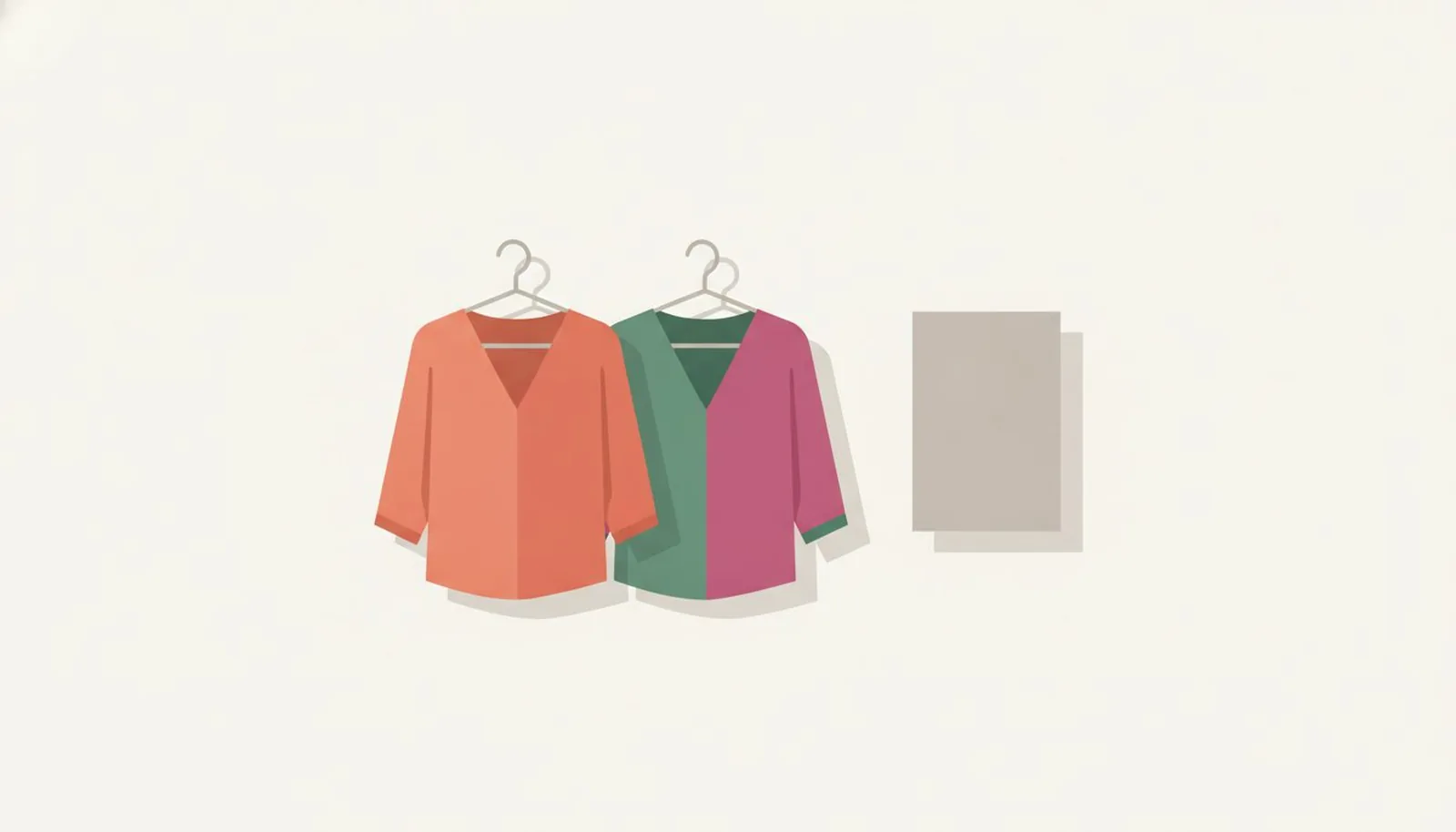
When you are choosing between two colours, stop looking at the clothes and look at your face. Hold each colour under your chin in the same daylight, same spot, same expression, and take one photo of each. Then compare only the face: skin evenness, the shadows under the eyes and around the mouth, and whether your eyes look brighter or duller. The colour that leaves your skin smoother and your eyes clearer is the one that looks better on you, even if you prefer the other colour on the hanger.
Two rules keep the test honest. Change one thing at a time, so compare a warm red against a cool red rather than a red against a blue. And judge in daylight near a window, never under warm indoor bulbs, which flatter warm colours and penalise cool ones. If neither photo wins, the difference is too small to matter and you can buy on fit and price.
Almost-universal colors, and the universal myth
When people get impatient with nuance, they ask what colors suit me a different way: fine, what looks good on everyone? The honest answer is that no color flatters everyone equally, but three come unusually close, because each sits near the middle of all three dimensions:
- Medium teal: balanced between blue and green, mid value, moderate chroma. It lends warmth to golden skin and coolness to rosy skin, and it survives both office lighting and photos.
- Soft white: the off-white lane between yellowed ivory and blue optic white. It frames every skin depth more gently than pure white does.
- Mid-tone blush: a rose that is neither pastel nor neon. It is deep enough not to vanish on dark skin and muted enough not to overwhelm fair skin.
Now the myths. "Everyone looks good in black" is the biggest: black is a cool, deep, high-contrast extreme, and it visibly tires anyone whose coloring is warm, light, or soft, which is most people (more in the FAQ below). "There's a red for everyone" is the rare claim that holds, but only because red spans from warm tomato to cool blue-red; grab the wrong end of that spectrum and it lands worse than no red at all. Universal shades are the beige of color advice: safe everywhere, spectacular nowhere. Use them for gifts and uniforms, not as your signature.
What to wear by occasion
At work: authority from your own palette
Authority colors are real, but they only project confidence when they agree with your face. Instead of defaulting to black or a random navy, wear your palette's version of serious: deep navy, charcoal, or burgundy for cool undertones; espresso, dark olive, or camel-and-cream layers for warm ones. Keep chroma moderate, since a searing bright reads louder than most rooms want. We break down interview dressing shade by shade in what colors to wear to a job interview.
On dates: color near the face
Date dressing rewards approachability, and approachability is mostly warmth and color near your face rather than a wall of black. Your best red or blush is the classic move: tomato red, coral, and peach for warm undertones; raspberry, burgundy, and cool rose for cool ones. If a full red outfit feels loud, one piece close to the face, a knit, a scarf, a lip color, does most of the work at a fraction of the commitment.
In photos: solid, mid-value, slightly muted
Cameras exaggerate everything color does to skin. Pure white blows out highlights, neon bounces tint onto your jaw, and busy prints eat faces at thumbnail size. For photos that flatter, wear a solid, mid-value shade from your own list and keep chroma one notch below your ceiling. If you have ever barely recognized your own skin in professional photos, the color of your top was probably the villain, not the photographer.
Why generic advice fails, and how 12 seasons fix it
Most color advice fails for one structural reason: it answers a three-variable question with a one-variable rule. "Warm undertones should wear earth tones" is true-ish, but a fair, low-contrast warm person and a deep, high-contrast warm person need entirely different earth tones. Hand them the same mustard sweater and one glows while the other disappears behind it.
Seasonal color analysis fixes this by scoring all three variables together. The modern system sorts human coloring into 12 seasons, three variants each of Spring, Summer, Autumn, and Winter, and each season encodes one specific combination of temperature, value, and chroma. A Light Spring and a Deep Autumn are both warm, yet their palettes barely overlap. That precision is the difference between "wear jewel tones" and a shoppable list of exact shades.
If you want the theory end to end, start with our complete guide to personal color analysis, then skim the 12 color seasons to see where you likely land, or follow the step-by-step find my color season guide to self-type. Once your season is settled, a capsule wardrobe built on your palette nearly assembles itself, because every piece already coordinates with every other piece.
The fastest answer: your exact palette from one selfie
Self-assessment gets you to the right neighborhood. If you want the exact address, this is what we built Tone & Fit to do, and it is the straight answer to the search what colors look good on me app.
You take one selfie. The AI measures the same three variables this entire guide runs on, undertone, value, and chroma, and matches you to one of the 12 seasons in about 30 seconds. The scan is free, with no account to create, no forty-question quiz, and no subscription. Your photo is analyzed on the spot and discarded; it is never stored.
The result goes far beyond a season name:
- A palette of 40+ named shades, grouped into Signature, Everyday, Accent, and Neutrals, so you know what to build outfits on and what to sprinkle.
- Power shades and an avoid list, which turn the two minutes before a big meeting into enough time to choose right.
- Hair, makeup, and jewelry recommendations tuned to your season, plus outfit formulas that combine your shades for you.
- An AI Style Assistant for the "does this camel coat actually work on me" questions that surface mid-shopping.
The feature that ends arguments is Preview Colors On You: it drapes your own photo across all 12 seasonal palettes so you can watch your face light up in one and flatten in the next. Reading that rust flatters you is one thing; seeing it on your actual face is what finally clears the wrong colors out of your cart. The full toolkit is a one-time purchase rather than a subscription, priced on the App Store listing, and it runs on iOS 15.1 or later.
See your colors on your own face.
One selfie: your season, 40+ named shades, and a draping preview across all 12 palettes. Free to scan, no account needed.
Download Tone & Fit ↗Frequently Asked Questions
How do I know if a color suits me?
Hold the color near your face in daylight, without makeup, and watch your skin instead of the fabric. A color that suits you makes skin look even, eyes look brighter, and under-eye shadows look softer. A color that fights you makes skin look sallow, gray, or blotchy and pulls attention to shadows and redness. Comparing two colors side by side is far more reliable than judging one alone, and an AI analysis like Tone & Fit removes the guesswork entirely by measuring your undertone, value, and chroma from a selfie.
What colors look good on everyone?
No color flatters everyone equally, but a few come close because they sit in the middle of every dimension: medium teal, soft white, and mid-tone blush pink. They balance warm and cool, they are neither very light nor very dark, and their chroma is moderate. Treat them as safe defaults for gifts and uniforms, not as your best colors. A shade matched to your own undertone, depth, and contrast will always outperform a universal one.
Can Tone & Fit show me colors on my own photo?
Yes. The Preview Colors On You feature drapes your selfie in palettes from all 12 seasons, so you can see the glow-up or the wash-out on your own face instead of imagining it. The scan is free, there is no account or quiz, and your photo is processed on the spot and discarded, never stored.
Why do I look bad in black?
Black is cool, extremely dark, and high in contrast, so it only harmonizes with coloring that shares those traits, typically deep, cool Winter types. If your coloring is warm, light, or soft, black overpowers it and casts shadows upward onto your face, which reads as tiredness. Swap in espresso, deep navy, charcoal, or dark olive, whichever matches your undertone, and keep black below the waist where it cannot reflect onto your skin.
What colors should I wear if I'm pale / have dark skin?
Depth alone does not decide your colors; undertone and contrast matter at every skin depth. Pale skin with cool undertones shines in soft berry, dusty blue, and cool pink, while pale warm skin glows in peach, camel, and light olive. Deep skin with warm undertones carries rust, gold, and emerald beautifully, while deep cool skin owns fuchsia, cobalt, and icy brights that would overwhelm lighter coloring. Every depth has a full palette; the win is matching temperature and clarity, not lightening or darkening yourself.
What color looks best on me?
The color that looks best on you is whichever one matches your undertone, depth, and contrast at the same time, not just one of the three. A single "best color" claim without knowing those three traits is a guess. Matching all three is the actual answer, and it is different for almost everyone.
How do you know which colors look best on you?
You know by testing your undertone, depth, and contrast against real fabric or a real photo rather than asking someone else's opinion. Hold a color at your jaw in daylight and watch your own skin: if it looks clearer and more even, that color is a match. Repeat with enough colors and a pattern in what flatters you emerges fast.
Is there a quiz for what colors look good on me?
Yes. Our seasonal color analysis quiz estimates your season from six questions if you would rather answer questions than run the mirror test above, though it works from your own self-reported answers rather than a measurement, so treat it as a starting hypothesis the same way this guide treats the self-assessment.
How can I find out what colors look best on me without guessing?
The only way to stop guessing is to measure your undertone, depth, and chroma instead of estimating them, either with a trained colorist's drape test or a photo-based AI scan that reads the same three traits directly from your face. Both replace opinion with a repeatable read. A quiz or a friend's guess does not.