Bright Spring Color Palette: Every Shade With Hex Codes
Bright Spring, also called Clear Spring, is the most vivid season in the warm half of the system: clear, high-contrast colouring with a warm cast that comes alive in hot pink-red, vivid teal and clean yellow and looks tired in anything dusty. This is the complete Bright Spring palette from the Tone & Fit app, 38 shades with hex codes, plus the five to buy first, the colours to avoid, and the metals that suit it.
On this page
Not sure Bright Spring is your season?
One selfie tells you which of the twelve seasons you are. Free, no sign-up. You can also try the browser tool without installing anything.
Find your season free ↗What defines Bright Spring
Bright Spring is defined by chroma. Saturation comes before warmth, and the palette is built from colours at full strength with nothing softened or greyed about them. The undertone is warm but only mildly, which places Bright Spring on the border with True Winter, its cool and equally vivid sister; the two share a love of clear brights and differ mainly in whether the brights lean gold or blue. Contrast is medium to high, often with bright eyes that stand out sharply against skin and hair.
The palette is a tropical garden: vivid pink-red, orange, teal, violet, coral-red, green and yellow at the front, a second band of bright midtones behind them, and crisp, light neutrals from bright white to greige. Compared with Warm Spring it is clearer and slightly cooler; compared with Light Spring it is far more saturated. If a colour has to be bright before it looks right on you, and a muted version of the same colour makes you look ill, this is your season.
Still deciding? The Bright Spring identification guide lists the seven signs to check, and the spring colour palette shows how the three Springs compare. Also called Clear Spring.
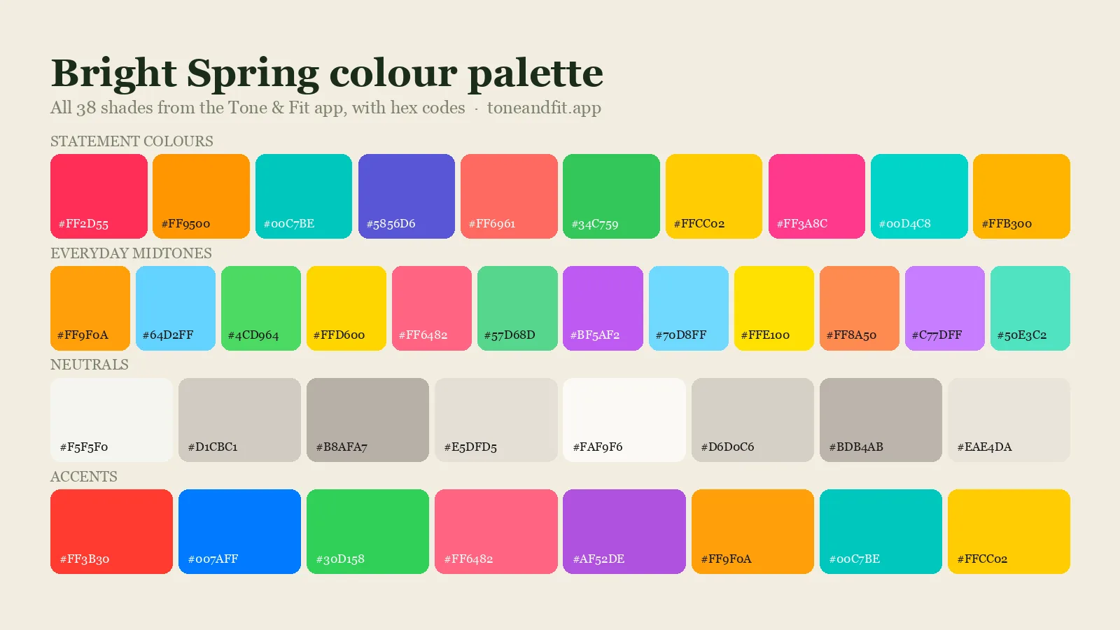
All 38 Bright Spring colours with hex codes
This is the Bright Spring palette exactly as the Tone & Fit app stores it: 10 statement colours, 12 everyday midtones, 8 neutrals and 8 accents. Every swatch carries its hex code, so you can paste it into a shopping filter, a paint app or a moodboard. The app shows a filtered selection of these on your result screen so that no single hue family crowds out the rest.
Statement colours (10)
The ten shades that carry the season. Wear them as the main colour of an outfit.
- Vivid Warm Pink Red#FF2D55
- Vivid Orange#FF9500
- Vivid Warm Teal#00C7BE
- Vivid Warm Violet#5856D6
- Vivid Coral Red#FF6961
- Vivid Warm Green#34C759
- Vivid Yellow#FFCC02
- Vivid Hot Pink#FF3A8C
- Vivid Cyan Teal#00D4C8
- Vivid Golden Orange#FFB300
Everyday midtones (12)
Twelve softer versions for shirts, knits and layering. These are the workhorses.
- Warm Orange Mid#FF9F0A
- Bright Sky Blue#64D2FF
- Mid Green#4CD964
- Bright Yellow#FFD600
- Bright Pink#FF6482
- Mid Mint#57D68D
- Bright Violet#BF5AF2
- Bright Aqua#70D8FF
- Light Yellow#FFE100
- Warm Coral Mid#FF8A50
- Soft Violet#C77DFF
- Bright Teal#50E3C2
Neutrals (8)
Eight anchors for trousers, coats and bags. They replace the black and white that are not in this palette.
- Bright White#F5F5F0
- Warm Grey#D1CBC1
- Stone#B8AFA7
- Pale Sand#E5DFD5
- Soft White#FAF9F6
- Pebble#D6D0C6
- Greige#BDB4AB
- Shell#EAE4DA
Accents (8)
Eight deeper or brighter shades for shoes, scarves, lipstick and small doses of drama.
- Vivid Red#FF3B30
- Vivid Blue#007AFF
- Vivid Green#30D158
- Vivid Pink#FF6482
- Vivid Purple#AF52DE
- Vivid Orange#FF9F0A
- Vivid Teal#00C7BE
- Vivid Yellow#FFCC02
Bright Spring power shades: the five to buy first
Start with these five. They are the highest-chroma warm colours in the palette and the ones the app surfaces first for Bright Spring, because they meet your contrast rather than washing out against it.
- Vivid Warm Pink-Red#FF2D55
- Vivid Warm Teal#00C7BE
- Vivid Orange#FF9500
- Vivid Warm Violet#5856D6
- Vivid Yellow#FFCC02
- Vivid Warm Pink-Red #FF2D55: The colour that defines the season: hot, clear and warm-leaning.
- Vivid Warm Teal #00C7BE: A saturated teal that looks electric on you and garish on softer colouring.
- Vivid Orange #FF9500: Your orange at full volume; you are one of two seasons that can wear it near the face.
- Vivid Warm Violet #5856D6: The purple with enough clarity to hold its own against your contrast.
- Vivid Yellow #FFCC02: A clean, sunny yellow that reads as cheerful rather than sallow on Bright Spring skin.
Bright Spring colours to avoid
Muted is the word to avoid. Dusty rose, sage, mauve, muddy brown, camel and every greyed or earthy shade flattens your natural clarity and makes you look washed out or tired. Soft pastels are usually too weak; if you want a light colour, choose a clear, bright tint rather than a powdery one. Very dark, cool colours such as black can work as a base, but keep a vivid colour near the face so the look stays lively.
- Dusty Rose#BC8F8F
- Sage#9CAF88
- Muddy Brown#8B7355
- Dusty Mauve#B0A8B9
- Camel#C8AD7F
Five shades that work against Bright Spring colouring
- Dusty Rose: Muted and greyed, it makes bright colouring look tired.
- Sage: Soft and dusty, the exact opposite of your clarity.
- Muddy Brown: Muted, earthy and low-contrast; it swallows your features.
- Dusty Mauve: Too soft and too cool; it vanishes on you.
- Camel: Warm but dull; bright white or warm grey keeps the contrast you need.
Metals and jewellery for Bright Spring
Bright, polished metals. Yellow gold and polished brass suit the warm cast of the palette, and Bright Spring is one of the few seasons that can mix gold and silver in the same outfit, because the contrast itself is flattering. Antiqued or brushed finishes are less successful; they read as muted. Bright stones such as turquoise, citrine and clear crystal all work.
Best metals: Bright yellow gold, polished brass, mixed metals.
Sister seasons and neighbours
Bright Spring borders True Winter and Warm Spring. If you sit between two of them, wear the colours the palettes share and skip the extremes of each. The full spring palette puts all three Spring sub-seasons side by side, and the 12 colour seasons guide explains how the whole system fits together.
Frequently asked questions
Is Bright Spring the same as Clear Spring?
Yes. Bright Spring and Clear Spring are two names for the same season, the high-chroma Spring that borders Winter. The palette above is the same under either name.
What is the difference between Bright Spring and True Winter?
Both are vivid and high-contrast. Bright Spring leans warm and looks best in coral-red, orange and warm teal; True Winter leans cool and looks best in true red, royal blue and magenta. If gold jewellery beats silver near your face, you are Bright Spring.
Can a Bright Spring wear black?
As a base, yes, better than the other Springs. Black on its own can still look heavy; pair it with one vivid colour from the palette above near the face and it works.
How many colours are in the Bright Spring palette?
The Tone & Fit palette has 38 Bright Spring colours: ten statement shades, twelve everyday midtones, eight neutrals and eight accents, all listed above with hex codes.
How do I confirm I am a Bright Spring?
Try a vivid warm pink-red against your face, then a dusty rose. If the vivid one looks natural and the dusty one makes you look tired, you are a bright season; if gold then beats silver, you are Bright Spring. Our free colour analysis tool estimates your season from one selfie.