Bright Winter vs Deep Winter: The Difference
Bright Winter and Deep Winter share the same cool, never-golden undertone and the same love of saturated jewel tones. The one axis they split on is depth, whether the darkness in your coloring comes from a sharp jump between features or from everything running dark together.
What's in this guide
Both are unmistakably cool. If you have already confirmed that with our guide to warm versus cool skin undertone and you are choosing between these two specific Winters, you are looking at two seasons that agree on undertone and largely agree on chroma, both wear clear, saturated color well. What separates them is value, and it shows up less in skin tone than in how the whole face is built.
Bright Winter vs Deep Winter Side by Side
Here is every dimension compared at once. Undertone barely moves between the two columns. Value and the shape of the contrast move the most.
| Bright Winter | Deep Winter | |
|---|---|---|
| Undertone | Cool to cool-neutral, the clearest of the three Winters | Cool, with extra depth borrowed from Autumn |
| Value (depth) | Medium | Deep, the darkest Winter |
| Chroma | Bright, clear and saturated | Rich and saturated, holds up at near-black strength |
| Contrast | High, features jump sharply against each other | Can read lower overall, since skin, hair and eyes all run deep together |
| Best colors | True red, royal blue, emerald, fuchsia, lemon ice | Black cherry, midnight navy, deep pine, deep plum, aubergine |
| Colors to avoid | Warm, muted, dusty tones | Pale pastels, dusty muted tones |
| Best metals | Bright silver, platinum | Gunmetal, pewter, dark silver |
| Often-cited celebrities | Megan Fox is a name often typed as Bright Winter | Lupita Nyong'o is a name often cited as a Deep Winter example |
The Tell
Depth is the tell, but it shows up as a shape rather than a shade. Bright Winter's power usually comes from a sharp jump between features, fair or medium skin next to dark hair, with eyes that read bright and clear rather than hazy. Deep Winter's power comes from the opposite arrangement: skin, hair and eyes that all sit deep together, so there is less of a jump to notice even though the overall coloring is darker. Two people can both look "dramatic," and still belong to different seasons, because one is built on contrast between features and the other is built on depth across all of them.
The two palettes even share a color name that proves the point. Both call one of their reds a true red: Bright Winter's version, at #C8102E, sits bright and clear, while Deep Winter's version, at #B01128, sits a shade darker and quieter. Side by side they read as close cousins. Held against two different faces, one will look electric and the other will look like it is trying too hard, and that reaction is the entire test in miniature.
Where the Palettes Agree, and Where They Split
They agree on clarity and split on darkness. Both wardrobes reject anything warm, dusty, or muted, and both build around colors clean enough to read from across a room. Below is the real Bright Winter palette, pulled from the full Winter palette guide, and it is also the answer to where Bright Winter pulls ahead: the brightest, clearest end of the cool spectrum, including icy pastels that Deep Winter can only wear sparingly.
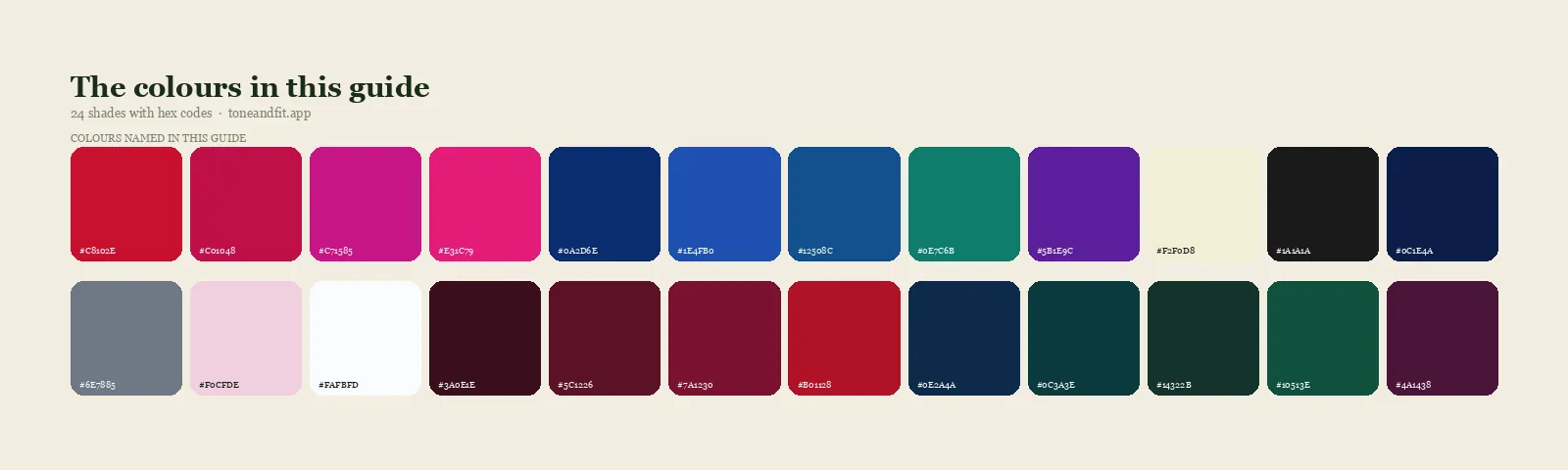
- True Red#C8102E
- Cool Cherry#C01048
- Fuchsia#C71585
- Hot Pink#E31C79
- Royal Blue#0A2D6E
- Cobalt#1E4FB0
- Sapphire#12508C
- Emerald#0E7C6B
- Pure Violet#5B1E9C
- Lemon Ice#F2F0D8
- True Black#1A1A1A
- True Navy#0C1E4A
- Cool Slate Grey#6E7885
- Icy Pink#F0CFDE
- Optic White#FAFBFD
Bright Winter neutrals. See every shade in the Bright Winter color palette guide.
Deep Winter keeps the same cool clarity but takes it dark. Black cherry, midnight navy, deep pine, deep plum and aubergine belong to Deep Winter's side, and on a medium-value Bright Winter they can look heavy rather than rich. The Deep Winter color palette guide breaks the full set down shade by shade, and our Deep Winter vs Deep Autumn comparison is useful if warmth, not just depth, is still an open question for you.
- Black Cherry#3A0E1E
- Cool Burgundy#5C1226
- Garnet#7A1230
- True Red#B01128
- Midnight Navy#0E2A4A
- Deep Teal#0C3A3E
- Deep Pine#14322B
- Emerald#10513E
- Deep Plum#4A1438
- Aubergine#35182F
- True Black#111214
- Dark Charcoal#2A2D33
- Deep Cool Grey#4C525A
- Icy Blue Accent#B7D3E6
- Icy Pink Accent#EBC9D9
Deep Winter neutrals & accents. Note the icy tones are listed as accents here, not core colors, the reverse of Bright Winter's palette above.
4 Tests to Settle It
Run all four of these in daylight near a window, no makeup, hair pulled back, then count which season wins more rounds.
1. The two-reds test
Hold Bright Winter's true red next to your face, then Deep Winter's true red. The two hexes sit close on paper, bright cherry against a quieter brick-red, but most faces show a clear preference. Whichever one looks electric rather than muddy, or calm rather than flat, is doing the telling.
2. The black-cherry-vs-true-red test
Compare a near-black burgundy like black cherry to a bright, clear true red. Deep Winter tends to look sharper and calmer next to the black cherry, since the color matches its own internal depth. Bright Winter tends to light up next to the bright red and can look a little flattened by the near-black wine tone, which reads heavier than the season needs.
3. The grayscale contrast test
Take a photo of your face in neutral daylight and convert it to black and white. Look for a sharp jump between your lightest and darkest areas rather than for a single feature. A clear jump between fair or medium skin and dark hair or eyes points to Bright Winter. A grayscale that reads uniformly dark across skin, hair and eyes with no sharp jump points to Deep Winter.
4. The icy-pastel test
Hold an icy pastel like lemon ice or icy blue next to your face. On a Bright Winter, an icy pastel can look like a natural part of the wardrobe, clean and bright rather than washed out. On a Deep Winter, the same pastel tends to look thin, more like a small accent than a color that could anchor an outfit, because the season's real strength lives in its darks rather than its lights.
If You Sit Between Them
Since Bright Winter and Deep Winter already share undertone and most of their chroma, sitting between them usually means your contrast is built a little differently than either textbook description, some jump between features and some overall depth at once. When the four tests split evenly, weigh the grayscale test and the icy-pastel test most heavily, since they test the shape of your contrast directly rather than reacting to a single swatch. A common mistake worth ruling out first: assuming dark hair by itself settles it. Dark hair is necessary for Deep Winter but not sufficient, since a Bright Winter can also have quite dark hair, so the whole face, skin included, is what decides it, not one feature.
If either season is starting to feel like a stretch once you look closely, it may be worth confirming undertone and family before going further. Our guides to Am I a Bright Winter and Am I a Deep Winter both cover the fuller set of signals, including hair and eye evidence, this comparison assumes you have already checked.
Stop guessing which Winter you are.
The free web tool names your season from one selfie, with no sign-up. The app's scan is free too and shows your undertone, best metals and starter colors; your season and full palette in the app are an optional upgrade.
Find my season free → Get the app ↗FAQ
What is the difference between Bright Winter and Deep Winter?
Depth. Bright Winter sits at a medium value and gets its power from a sharp jump between light skin and dark hair or eyes. Deep Winter takes the same cool undertone and runs it dark all the way through, skin, hair and eyes together, so the intensity comes from overall darkness rather than a jump.
Is Bright Winter the same as Deep Winter?
No, though they sit next to each other and share the most important trait: a cool, never-golden undertone. Chroma stays fairly close too, since both wear saturated jewel tones well. The real split is value: Bright Winter reads medium overall, Deep Winter reads deep overall, and that changes which end of the palette does the flattering.
Which season is darker, Bright Winter or Deep Winter?
Deep Winter is darker. It is the deepest of the three Winter sub-seasons and can wear black cherry, midnight navy, and true black at full strength without being overwhelmed. Bright Winter sits at a medium overall value, even though it can still wear black well through contrast rather than depth.
Can a Bright Winter wear pastels?
Yes, more easily than a Deep Winter. Icy pastels like lemon ice and icy pink sit inside Bright Winter's core palette because the season's whole identity is built on clarity, not just darkness. Deep Winter can wear a small amount of icy blue or icy pink as an accent, but leans far more on its darks.
What colors flatter Deep Winter but not Bright Winter?
Black cherry, midnight navy, deep pine, deep plum, and aubergine. These need real depth behind them to look rich instead of heavy, and a medium-value Bright Winter can look a little swallowed by them. Bright Winter gets more mileage from true red, royal blue, and emerald instead.
What is the fastest way to tell Bright Winter and Deep Winter apart?
Hold a true, blue-based red next to your face, then a near-black burgundy like black cherry. If the black cherry makes your features look sharper and calmer, you lean Deep Winter. If the bright red makes you glow and the black cherry looks heavy, you lean Bright Winter. An AI color analysis app or a professional drape can confirm it by measuring value directly.
Can I check my color season from a photo?
Yes. The free Tone & Fit web tool reads your color season from one selfie in about 30 seconds, with no sign-up and no photo stored by us. It also tells you whether you land in Deep Winter or a neighbouring season. The Tone & Fit app for iPhone and Android then builds your full palette of 38 named shades.