Deep Autumn vs Deep Winter: How to Tell Which Dark Season You Are

These two seasons agree on almost everything. Dark hair, dark eyes, rich saturated colors, no patience for pastels. They disagree on one thing only, and that one thing decides your entire palette.
What's in this guide
Why these two get confused
Almost every mix-up in seasonal color analysis happens between neighbours that share a dominant trait. Deep Autumn and Deep Winter share depth, and depth is the loudest trait in the system. It is the one you notice from across a room, so it is the one people diagnose themselves by, and it is the one that tells you nothing about which of these two you are.
Both seasons have deep colouring. Both look overwhelmed by pale washed-out shades. Both suit rich, weighty, saturated color. Put a Deep Autumn and a Deep Winter next to each other and describe them in three words each, and you will probably write the same three words twice.
The trap is that the shared trait is also the most visible one. Dark hair reads as Winter to most people, because Winter has been the default label for dark colouring since the four-season system was popularised in the 1980s. That shorthand sends a large number of warm deep people into a cool palette and leaves them there for years, wearing black and charcoal and quietly wondering why they photograph as tired.
Depth tells you which half of the twelve seasons you belong to. Undertone tells you which season. People diagnose on the first and skip the second.
The one measurement that separates them
The twelve-season system describes every season with three measurements: undertone, value, and chroma. Our primer on seasonal color analysis works through all three in order. For this particular pair, two of the three are effectively tied.
- Value is deep for both. This is the trait they share, and it is why they look alike.
- Chroma is moderate to high for both. Deep Winter runs a little clearer, Deep Autumn a little richer, but the gap is small enough that it makes a poor diagnostic.
- Undertone is opposite. Deep Autumn is warm. Deep Winter is cool. There is no overlap here at all.
So the entire decision reduces to undertone, which is unfortunate, because undertone is the hardest of the three to judge on your own face. Value you can photograph. Chroma you can compare. Undertone requires you to see a shift of a few degrees in the colour of your own skin while your visual system actively works to cancel that shift out. If you have not read up on it yet, our guide to warm vs cool skin undertone covers the mechanism, and how to find your skin undertone at home gives you the practical procedures.
Here is the useful reframe. Both of these seasons build their darkness out of something. Deep Autumn builds it out of brown. Its darkest colours are chocolate, coffee, deep rust, dark olive, bronze, and forest green with yellow in it. Deep Winter builds its darkness out of black. Its darkest colours are true black, navy, aubergine, pine, and deep berry. Same depth, different raw material.
Side by side
| Trait | Deep Autumn | Deep Winter |
|---|---|---|
| Undertone | Warm, golden or olive base | Cool, blue or pink base |
| Dominant trait | Depth, with warmth secondary | Depth, with coolness secondary |
| Darkness built from | Brown, rust, olive, bronze | Black, navy, aubergine, berry |
| Best neutral | Dark chocolate brown | True black |
| Best white | Cream, oyster, warm ivory | Optical white, icy white |
| Best red | Brick, tomato, garnet | True red, blood red, wine |
| Best green | Dark olive, moss, warm forest | Pine, emerald, deep teal |
| Best pink | Salmon, terracotta pink, coral | Magenta, fuchsia, cool berry |
| Metals | Yellow gold, bronze, brass | Silver, white gold, platinum |
| Worst offender | Icy pastels and fuchsia | Mustard and camel |
| Adjacent season | Warm Autumn | True Winter and Cool Winter |
Read down the two columns and the pattern is consistent. Every entry in the Deep Autumn column has gold somewhere inside it. Every entry in the Deep Winter column has blue somewhere inside it. Same depth throughout, opposite temperature throughout.
Five tells that actually discriminate
These are the tests that separate the two seasons rather than confirming what they share. Deliberately excluded: hair darkness, eye darkness, and whether you look good in bold colour. All three are true of both and will only make you more confident in whichever answer you already preferred.
1. Chocolate brown against charcoal grey
This is the single best test for this pair, because it holds depth constant and varies only temperature. Find a dark chocolate brown top and a dark charcoal grey top of similar darkness. Hold each under your chin in daylight. One of them makes your face look clearer and more defined. The other makes it look slightly flat. Chocolate winning means Deep Autumn. Charcoal winning means Deep Winter.
2. Cream against optical white
Warm ivory next to pure bright white. Deep Autumn looks well in cream and slightly startled in optical white, which can carve a hard line at the jaw. Deep Winter is the reverse: optical white sharpens the face, and cream drops a faint yellow cast over the skin. This is a reliable test because both whites are light, so depth cannot interfere with the result.
3. What your skin does in the sun
Deep Autumn skin typically tans to a golden or bronze brown and rarely burns badly. Deep Winter skin tends to either burn first and then tan, or tan to a cooler ashier brown. This is imperfect and depends heavily on your ethnic background, so treat it as one input rather than a verdict, but it is genuinely informative for a lot of people.
4. Olive green
Olive is the great divider. It is a warm, yellow-based, slightly muted green, and it is a hero colour for Deep Autumn while being close to unwearable for Deep Winter. If people have complimented you in olive or army green, that is a substantial data point toward Autumn. If olive makes you look faintly unwell, you are on the cool side of the line.
5. Fuchsia
The mirror image of the olive test. Fuchsia and cool magenta are blue-based, high-chroma, and deep enough that they do not overwhelm either season on value. Deep Winter can carry them easily. On a Deep Autumn they read as loud and slightly artificial, and the skin looks reddish next to them. If a colour that bright feels wrong on you but a deep rust does not, temperature is what you are reacting to, not brightness.
Or settle it in 60 seconds
Judging your own undertone is the hardest part of this, because your brain corrects for colour before you can measure it. Tone & Fit's AI measures undertone, value, and chroma from one selfie and returns your season with a full palette.
Try the App ↗Three at-home tests
Set up matters more than the tests themselves. Do all three in indirect daylight, near a window, never under warm indoor bulbs. Remove makeup. Wear a neutral grey or white top, or drape a white towel over your shoulders so your current outfit is not colouring the result. And watch the skin beneath your eyes and along your jaw, not the fabric.
The vein test, with a caveat
Look at the veins on your inner wrist in daylight. Green-leaning veins suggest a warm undertone, blue or purple-leaning suggest cool. The caveat is real: this test performs poorly on deeper skin tones and on anyone whose veins are not clearly visible, and it should never be the only test you run. It is useful as a tiebreaker when two other tests already agree.
The metals test
Yellow gold against silver, both held near your face, alternating. This is the strongest single test for a warm-versus-cool question, and since that is the only question separating these two seasons, it does a lot of work here. We wrote up the full procedure and the common mistakes in the gold or silver jewelry test guide. In short, the metal that makes your skin look more even and your eyes clearer is your temperature.
The two-photo test
Take two selfies in the same spot, same light, seconds apart. One in your best warm dark colour, one in your best cool dark colour. Do not judge them on your phone as you shoot, because you will be looking at the clothes. Look at them side by side an hour later, and compare only the skin. One photo will show more even skin and less shadow under the eyes. That is your side. If they look identical, you may be closer to a neutral position than either pure season, which is worth investigating in our overview of the 12 color seasons.
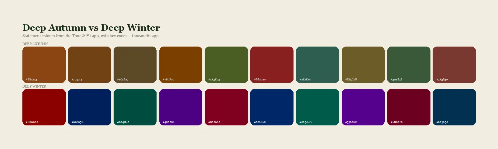
The two palettes compared
Seeing the palettes next to each other makes the temperature difference obvious in a way that reading about it does not.
Deep Autumn: chocolate, rust, dark olive, bronze, brick, warm forest, antique gold.
Deep Winter: true black, navy, aubergine, deep teal, blood red, cool berry, icy white.
Note where they nearly touch. Deep teal appears in both, and so does a very dark green, and both palettes contain a deep red. Those shared shades are the reason a wrong diagnosis can survive for years, because a wardrobe built mostly out of the overlap will never look obviously bad. It just never looks as good as it could. For the complete versions, see the Deep Autumn color palette and the broader Winter color palette, which covers what all three Winter seasons share.
Hair, makeup, and metals
Clothing mistakes are recoverable in an afternoon. Hair colour mistakes take months, so this is where getting the season right pays for itself.
Hair. Deep Autumn holds warm dark colour: espresso with a red or gold cast, deep auburn, chestnut, dark chocolate. Ash tones tend to look flat and grey against warm skin. Deep Winter holds cool dark colour: blue-black, true black, cool espresso, dark ash brown. Warm honey highlights on a Deep Winter usually read as brassy within weeks. Our Deep Autumn hair color guide covers the warm side in detail, and the best hair color for your skin tone covers the general logic across all twelve seasons.
Makeup. The lip is where the difference shows most. Deep Autumn wants brick, terracotta, warm burgundy, and brownish nudes. Deep Winter wants true red, wine, plum, and cool berry. Swap them and the result is the classic mismatch where the lipstick looks like it is sitting on top of the face rather than belonging to it. The Deep Autumn makeup guide has the full breakdown for warm deep colouring.
Metals. Jewellery sits closer to your face than almost anything else you wear, so the effect is amplified. Yellow gold and bronze for Deep Autumn, silver and white gold and platinum for Deep Winter. If you love the metal that is not yours, wear it below the collarbone where it is no longer competing with your skin.
If you have been wearing the wrong one
The most common version of this error, by a wide margin, is a Deep Autumn who has been dressing as a Winter. Dark hair gets read as Winter, black gets adopted as a default, and warm colours get quietly filtered out of the wardrobe over years. If that description lands, three things usually happen when you switch.
- Chocolate brown replaces black as your dark neutral, and you notice your face looks less severe in photographs almost immediately.
- Cream replaces white, which sounds minor and is not. White shirts near the face are one of the biggest offenders in a mismatched wardrobe.
- Gold jewellery, which you may have written off entirely, becomes usable again.
The reverse error, a Deep Winter dressing as an Autumn, is less common but produces a distinctive symptom: everything looks slightly muddy, as though your photos need more contrast. Correcting it means reintroducing clarity, not more depth. You already have depth.
Before you rebuild anything, rule out the neighbours. If warm feels right but the depth feels heavy on you, check Deep Autumn versus Warm Autumn, which is the more common Autumn-side confusion. If cool feels right but true black feels slightly hard, check Cool Winter versus True Winter. And if you are still unsure whether the problem is temperature or something else entirely, our piece on colors that wash you out explains what each kind of mismatch actually looks like on a face.
It is also worth being honest about the difficulty. Self-diagnosis on this specific pair is genuinely hard, harder than most pairs in the system, because the shared trait is the visible one and the deciding trait is the invisible one. Our comparison of a color analysis app versus a consultant weighs both routes if you want an outside read, seeing the season on real faces helps, which is what our Deep Autumn celebrities roundup is for, and the complete personal color analysis guide ties the whole framework together if you want to work it out from first principles.
Ready to find your season?
One selfie, your 12-season result, and the palette that goes with it. Free, no sign-up.
Find your season free ↗For the underlying reading, our skin tone analyzer explains what undertone, depth and contrast actually are.
FAQ
What is the difference between Deep Autumn and Deep Winter?
Both seasons are dark and both wear rich saturated colors well, so depth is not the deciding factor. The difference is undertone. Deep Autumn is warm with depth following, so its darkness is built from brown, rust, olive, and bronze. Deep Winter is cool with depth following, so its darkness is built from black, navy, aubergine, and berry. If a dark warm brown looks better on you than a dark cool charcoal, you are Deep Autumn.
Am I Deep Autumn or Deep Winter if I look good in black?
Black is a weak test because depth alone lets both seasons carry it. Deep Winter wears black as a true best color with nothing needed to soften it. Deep Autumn can wear black but usually looks better in a very dark chocolate or deep forest, and needs a warm second color near the face when wearing black. If black looks fine but never striking on you, you are more likely Deep Autumn.
Can Deep Autumn wear jewel tones?
Yes, but the warm-leaning half of them. Deep teal, forest emerald, garnet, and amber all sit inside a Deep Autumn palette. What does not work is the icy, blue-based end of the jewel range, such as sapphire, fuchsia, and true ruby. Those belong to Deep Winter. Jewel tone is a brightness description rather than a temperature one, which is exactly why it causes so much confusion between these two seasons.
Which is more common, Deep Autumn or Deep Winter?
Deep Winter appears more often in the general population because cool undertones with dark hair and eyes are widespread across many ethnic backgrounds. Deep Autumn is less common but heavily under-diagnosed, since warm deep colouring is frequently mistaken for Winter on the strength of dark hair alone. Hair depth does not establish temperature.
Does the gold or silver jewelry test work for these two seasons?
It is one of the most reliable tests for this specific pair, because the two seasons sit on opposite sides of the undertone line. Deep Autumn looks better in yellow gold, bronze, and antiqued brass. Deep Winter looks better in silver, white gold, and platinum. Test in daylight with your face bare and watch the skin under your jaw rather than the metal.
What happens if I dress in the wrong one of these two seasons?
The failure is subtle rather than dramatic, which is why it goes unnoticed for years. A Deep Autumn in Deep Winter colors looks slightly harsh, with shadows sharpening under the eyes and any redness in the skin getting emphasised. A Deep Winter in Deep Autumn colors looks slightly dulled and sallow, as though the photo needs more contrast. Neither looks disastrous, and both look noticeably worse than the correct palette side by side.