Bright Winter Color Palette: Every Shade With Hex Codes
Bright Winter, also called Clear Winter, is the most vivid of the three Winters: cool undertone, high contrast and colours at full saturation with nothing dusty or softened about them. This is the complete Bright Winter palette from the Tone & Fit app, 38 shades with hex codes, plus the five to start with, the colours that flatten you, and the metals that finish the look.
On this page
Not sure Bright Winter is your season?
The free web tool names your season from one selfie, with no sign-up. The app's scan is free too and shows your undertone, best metals and starter colours; your season and full palette in the app are an optional upgrade.
Find my season free → Get the app ↗What defines Bright Winter
Bright Winter is defined by clarity. Every colour in the palette is vivid and clean, and the season's own colouring matches it: clear skin, bright eyes and a strong contrast between hair and skin. The undertone is cool but not as blue-heavy as Cool Winter, which is why Bright Winter sits on the border with Bright Spring and can wear a clear warm-leaning pink-red that a Cool Winter cannot. Depth is medium to dark.
That produces a palette of pure primaries and jewel tones: true red, royal blue, emerald, magenta, hot pink and violet, backed by the crispest neutrals in the seasonal system, optic white to ink. What separates it from Deep Winter is brightness rather than darkness; what separates it from Cool Winter (the season many sites call True Winter) is chroma rather than temperature. If the brightest, clearest version of a colour consistently looks best on you, you are here.
Still deciding? The seasonal colour analysis quiz narrows it down in a few questions, and the winter colour palette shows how the three Winters compare. Also called Clear Winter.
All 38 Bright Winter colours with hex codes
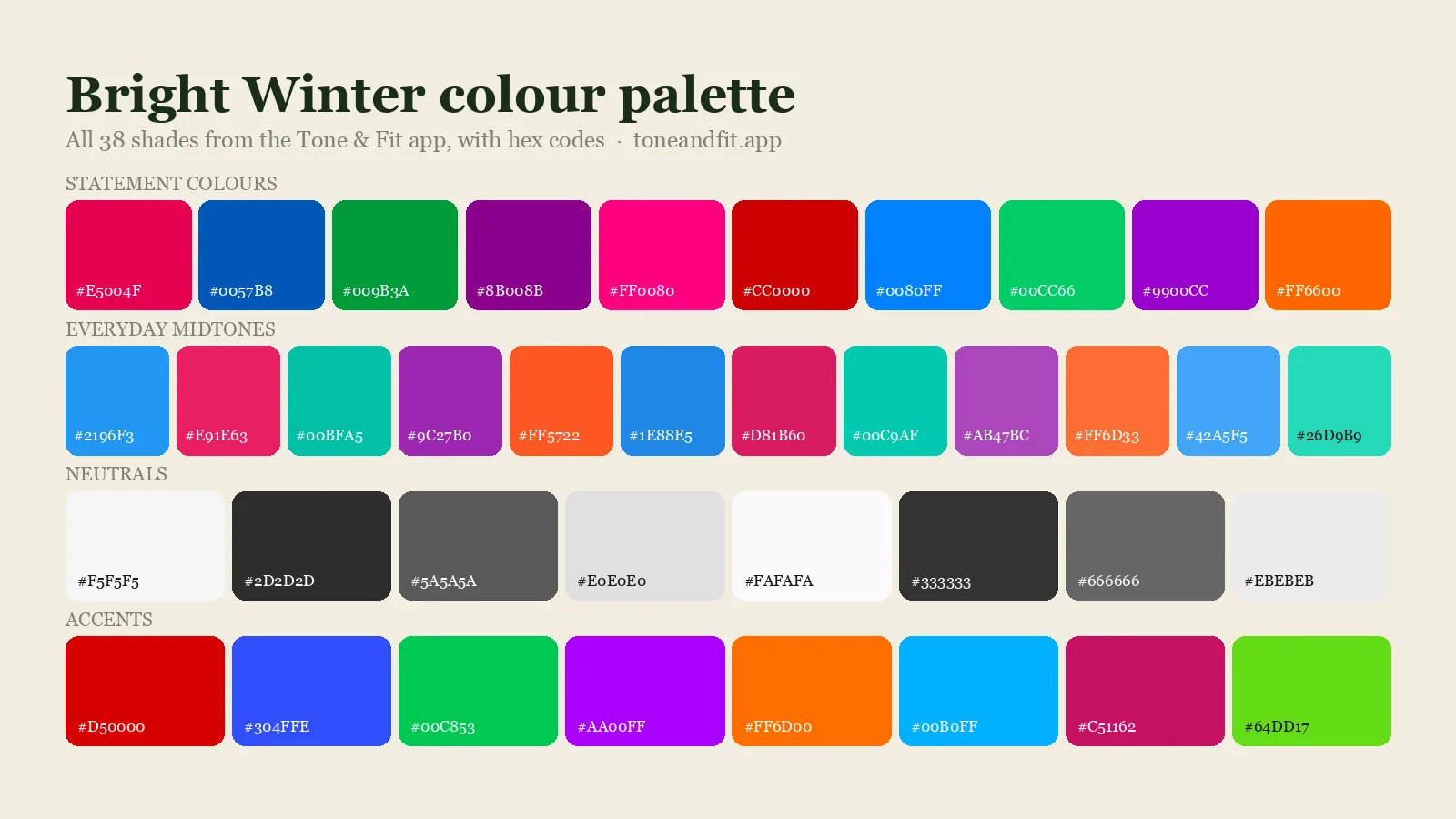
This is the Bright Winter palette exactly as the Tone & Fit app stores it: 10 statement colours, 12 everyday midtones, 8 neutrals and 8 accents. Every swatch carries its hex code, so you can paste it into a shopping filter, a paint app or a moodboard. The app shows a filtered selection of these on your result screen so that no single hue family crowds out the rest.
Statement colours (10)
The ten shades that carry the season. Wear them as the main colour of an outfit.
- Vivid Warm Pink Red#E5004F
- Vivid Royal Blue#0057B8
- Vivid Cool Green#009B3A
- Vivid Magenta Purple#8B008B
- Vivid Hot Pink#FF0080
- Vivid True Red#CC0000
- Vivid Bright Blue#0080FF
- Vivid Emerald#00CC66
- Vivid Violet#9900CC
- Vivid Orange Red#FF6600
Everyday midtones (12)
Twelve softer versions for shirts, knits and layering. These are the workhorses.
- Bright Blue Mid#2196F3
- Bright Pink Mid#E91E63
- Bright Teal Mid#00BFA5
- Bright Purple Mid#9C27B0
- Bright Orange Red Mid#FF5722
- Vivid Blue Mid#1E88E5
- Vivid Cerise Mid#D81B60
- Vivid Cyan Mid#00C9AF
- Vivid Violet Mid#AB47BC
- Vivid Coral Mid#FF6D33
- Light Vivid Blue#42A5F5
- Vivid Mint#26D9B9
Neutrals (8)
Eight anchors for trousers, coats and bags. They replace the black and white that are not in this palette.
- Optic White#F5F5F5
- Charcoal#2D2D2D
- Slate Grey#5A5A5A
- Light Grey#E0E0E0
- Pure White#FAFAFA
- Ink#333333
- Mid Grey#666666
- Frost Grey#EBEBEB
Accents (8)
Eight deeper or brighter shades for shoes, scarves, lipstick and small doses of drama.
- Vivid Red#D50000
- Vivid Indigo Blue#304FFE
- Vivid Green#00C853
- Vivid Purple#AA00FF
- Vivid Orange#FF6D00
- Vivid Sky Blue#00B0FF
- Vivid Pink#C51162
- Vivid Lime#64DD17
Bright Winter power shades: the five to buy first
Start with these five. They are the highest-chroma colours in the palette and the ones the app surfaces first for Bright Winter because they meet your natural contrast rather than fighting it.
- Vivid True Red#CC0000
- Vivid Royal Blue#0057B8
- Vivid Cool Green#009B3A
- Vivid Magenta-Purple#8B008B
- Vivid Hot Pink#FF0080
- Vivid True Red #CC0000: The colour the whole season is built around: pure, clear and neither orange nor blue.
- Vivid Royal Blue #0057B8: Your blue at full strength. Anything softer looks faded next to your contrast.
- Vivid Cool Green #009B3A: An emerald-leaning green that most people cannot wear and you can.
- Vivid Magenta-Purple #8B008B: The cool purple that makes Bright Winter eyes and hair look sharper.
- Vivid Hot Pink #FF0080: Loud on paper, effortless on you; high chroma is your comfort zone.
Four Bright Winter outfit formulas
Bright Winter is the brightest Winter in the Tone & Fit app: cool with very high clarity and the highest contrast in the system. It is the one season that can wear a fully saturated colour next to pure white and look better for it.
Read each one as base, main colour, accent. Brightness is the point; muting anything here loses the season.
-
The signature Optic White + Vivid Royal Blue + Vivid Warm Pink Red #F5F5F5 #0057B8 #E5004F
Optic white base, vivid royal blue at the face, warm pink-red accent. Maximum clarity, which is what this colouring was built to carry.
-
Black and bright Charcoal + Vivid Emerald + Pure White #2D2D2D #00CC66 #FAFAFA
Charcoal trousers, vivid emerald knit, pure white accessories. Charcoal reads softer than black without losing the contrast.
-
Smart and vivid Slate Grey + Vivid Indigo Blue + Vivid Pink #5A5A5A #304FFE #C51162
Slate grey suit, vivid indigo-blue shirt, vivid pink detail. Grey is a real neutral here, not a compromise.
-
Evening Ink + Vivid Magenta Purple + Frost Grey #333333 #8B008B #EBEBEB
Ink base, vivid magenta-purple at the face, frost grey accent. The purple is the colour that separates Bright Winter from every other season.
A six-piece Bright Winter capsule
Six garments, one colour each. The brightest Winter needs its neutrals to be genuinely neutral, so charcoal and slate do the structural work and the colour arrives at full strength.
Buy the charcoal coat and the optic white shirt first. Everything vivid in the palette above is designed to go against them.
| Garment | Colour | Why this one |
|---|---|---|
| Coat | Charcoal #2D2D2D | Charcoal, which keeps the contrast high while reading slightly softer than pure black. |
| Jeans or trousers | Slate Grey #5A5A5A | Slate grey trousers, or a bright clean indigo denim. |
| White shirt | Optic White #F5F5F5 | Optic white. On this colouring it is the correct answer, not the harsh one. |
| Knitwear | Vivid Royal Blue #0057B8 | Vivid royal blue near the face, at full strength. |
| Occasion piece | Vivid Warm Pink Red #E5004F | A warm pink-red that is still cool-based, and the most photographed colour in this palette. |
| Shoes and bag | Vivid Pink #C51162 | Vivid pink as the accent, or black leather with silver hardware. |
Bright Winter colours to avoid
Muted and warm are the two things Bright Winter cannot carry. Tan, warm beige, olive khaki and camel all bring a golden, softened quality that makes clear cool skin look sallow and tired. Dusty pastels and greyed shades such as dusty mauve, sage and mushroom simply vanish on you, taking the face with them. Warm, earthy darks like chocolate and rust are also out. If a colour looks as though it has been mixed with grey or with amber, it is not yours.
- Tan#D2B48C
- Dusty Salmon#E9967A
- Olive Khaki#BDB76B
- Warm Beige#C0A080
- Dusty Mauve#B0A8B9
Five shades that work against Bright Winter colouring
- Tan: Warm and muted, it makes clear, cool colouring look dull.
- Dusty Salmon: Warm and softened, two strikes against a bright cool season.
- Olive Khaki: The Autumn neutral that turns Bright Winter skin sallow.
- Warm Beige: Muddy and low-contrast against your clarity.
- Dusty Mauve: Too muted; it disappears on you and drags the face down with it.
The four near misses
For Bright Winter the near misses are rarely about hue. They are colours that have had their brightness taken away.
-
Rust #B7410E
Warm and deep, and completely out of range. It is the single fastest way to make bright cool colouring look dull. Wear Vivid Orange Red #FF6600 instead.
-
Sage Grey #B2BEB5
Muted greens read as tasteful and expensive. Against this colouring they read as nothing at all; the face has more clarity than the clothes. Wear Vivid Green #00C853 instead.
-
Wheat #F5DEB3
A warm light neutral, which is the opposite of what this palette needs on both counts. Wear Light Grey #E0E0E0 instead.
-
Dusty Wine #722F37
Close to the palette's pinks, but greyed. The greying is exactly what removes it: Bright Winter colours have no dust in them. Wear Vivid Pink #C51162 instead.
Metals and jewellery for Bright Winter
Bright, cool, polished metals. Silver, platinum and white gold match the crispness of the palette; a high-polish finish suits you better than a brushed one because it keeps the contrast sharp. Yellow gold reads warm and can look brassy, though a very cool, pale white gold is fine. Clear stones, crystal and black enamel all work well against Bright Winter colouring.
Best metals: Bright silver, platinum, white gold.
Every Bright Winter guide
The palette above is the reference. These guides put it to work, one question at a time: what to avoid, makeup, hair, outfits and the people who share your colouring.
- Is this your season? Am I a Bright Winter? 7 Signs to Check
- Celebrities Bright Winter Celebrities: 12 Examples
- Side by side Cool Winter vs True Winter: Same Season?
- Side by side Bright Spring vs Bright Winter: The Difference
- Side by side Bright Winter vs Deep Winter: The Difference
Sister seasons and neighbours
| Bright Winter | Bright Spring | Cool Winter | |
|---|---|---|---|
| Undertone | Cool | Warm | Cool, strongly blue-based |
| Depth | Medium to deep | Light to medium | Medium to deep |
| Chroma | Very high, fully clear | High, fully clear | High, fully clear |
| Contrast | Very high | High | High |
| Best neutral | Optic White #F5F5F5 | Bright White #F5F5F0 | Pure White #FAFAFA |
| Signature colour | Vivid Royal Blue #0057B8 | Vivid Teal #00C7BE | Royal Blue #003DA5 |
Bright Winter borders Bright Spring and Cool Winter. If you sit between two of them, wear the colours the palettes share and skip the extremes of each. The full winter palette puts all three Winter sub-seasons side by side, and the 12 colour seasons guide explains how the whole system fits together. Side-by-side comparisons: Bright Spring vs Bright Winter.
Frequently asked questions
Is Bright Winter the same as Clear Winter?
Yes. Bright Winter and Clear Winter are two names for the same season: the high-contrast, high-chroma Winter that borders Bright Spring. It is not True Winter. In the 12-season system True Winter is another name for Cool Winter, the pure-cool Winter, which has its own palette.
What is the difference between Bright Winter and Cool Winter?
Both are cool. Bright Winter is defined by brightness and can wear a slightly warm-leaning clear pink-red; Cool Winter (True Winter) is defined by temperature and looks best in pure blue-based colours. If clarity matters more than coolness on you, you are Bright Winter.
Can a Bright Winter wear black and white?
Yes. Optic white and ink are both in the palette and the combination is one of the best on the season. Pair them with one vivid colour for the classic Bright Winter look.
How many colours are in the Bright Winter palette?
The Tone & Fit palette has 38 Bright Winter colours: ten statement shades, twelve everyday midtones, eight neutrals and eight accents, all listed above with hex codes.
How do I confirm I am a Bright Winter?
Try a vivid true red against your face and then a dusty rose. If the red looks natural and the rose looks tired, you are a bright season; if silver also beats gold, you are Bright Winter rather than Bright Spring. Our free colour analysis tool gives you a season estimate from a single selfie.
Can I check my colour season from a photo?
Yes. The free Tone & Fit web tool reads your colour season from one selfie in about 30 seconds, with no sign-up and no photo stored by us. It also tells you whether you land in Bright Winter or a neighbouring season. The Tone & Fit app for iPhone and Android then builds your full palette of 38 named shades.