Deep Winter Colors to Avoid and Wear Instead
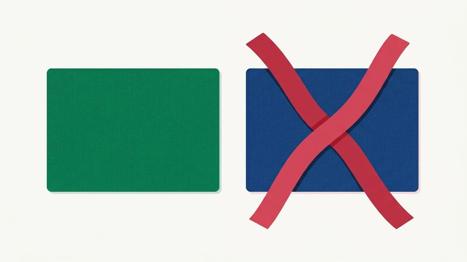
Deep Winter runs into trouble with four kinds of color: warm earth tones, dusty muted shades, pale warm pastels, and warm neutrals like cream and camel. None of them are ugly colors. They are simply built for a different season, and against coloring this cool, deep, and clear they read as sallow, flat, or tired.
What's in this guide
A quick recap on Deep Winter
Deep Winter sits at the coolest, deepest, and clearest corner of the color wheel, and every color on this list breaks one of those three qualities. Depth and clarity lead the way here, with a cool undertone running underneath both, and that combination is exactly what predicts which shades work against you rather than for you.
The direction below is what every swap in this guide points toward. Anything that pulls toward warmth, toward haze, or toward paleness is working against your coloring rather than with it.
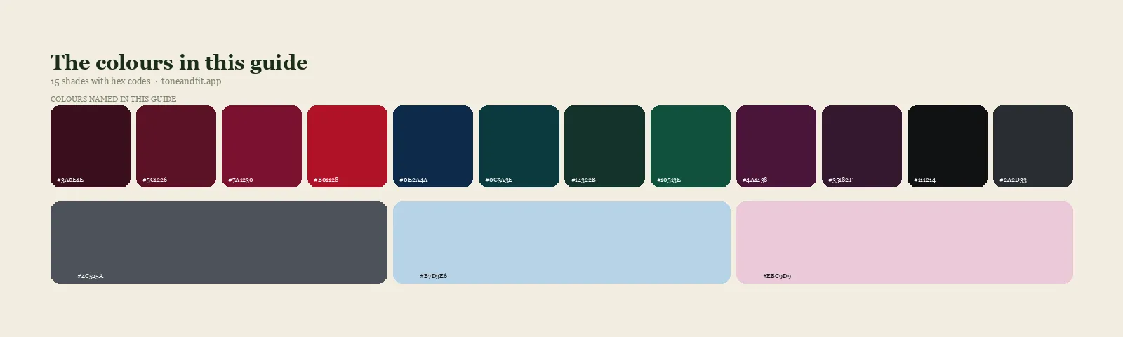
- Black Cherry#3A0E1E
- Cool Burgundy#5C1226
- Garnet#7A1230
- True Red#B01128
- Midnight Navy#0E2A4A
- Deep Teal#0C3A3E
- Deep Pine#14322B
- Emerald#10513E
- Deep Plum#4A1438
- Aubergine#35182F
- True Black#111214
- Dark Charcoal#2A2D33
- Deep Cool Grey#4C525A
- Icy Blue Accent#B7D3E6
- Icy Pink Accent#EBC9D9
Neutrals & accents
If you have not confirmed the season itself yet, our guide to whether you are a Deep Winter walks through the tells, and the full Deep Winter color palette lays out how to build a wardrobe around it.
Warm earth tones: the first colors to avoid
Mustard, rust, terracotta, and olive are the first colors to avoid, because each one carries a golden or brick based warmth that argues with a face built on cool undertone. These shades were made for a season that runs warm underneath its color, and Deep Winter runs cool underneath its color, so the argument shows up as a sallow, slightly muddy cast rather than the rich glow these same colors give a Warm Autumn or a Warm Spring.
The fix is not to give up on depth or richness, both of which genuinely suit you. It is to keep the same weight and swap the temperature: reach for true red or garnet instead of rust, deep teal or emerald instead of olive, and cool burgundy instead of terracotta.
Dusty, muted shades: the second colors to avoid
Dusty rose, mauve, and sage green are the second group to avoid, because Deep Winter's whole identity depends on clarity, and a muted, greyed shade erases exactly that. These colors are not wrong because they are unattractive. They are wrong because they belong to a softer, hazier season, and next to your natural contrast they read as flat or slightly muddy instead of gentle.
Chase the same color family at full saturation instead. True red stands in for dusty rose, deep plum stands in for mauve, and deep pine stands in for sage, all without losing the mood you were after.
Pale warm pastels: the third colors to avoid
Peach, buttery yellow, and warm baby pink are the third group, because a pastel asks for lightness and Deep Winter's coloring sits at the deep end of the value scale. Warmth and paleness rarely cause trouble on their own, but stacked together they miss your season twice at once, which is why these particular pastels look more washed out on you than they do on almost anyone else.
If you want a lighter shade in the mix, choose one of your own icy pastels instead: a pale cool blue or a cool pink with a hint of grey in it. They deliver the same lightness without the warmth working against you.
Warm neutrals: the fourth colors to avoid
Cream, ivory, warm beige, and camel are the fourth group, and they cause the most damage precisely because a neutral feels safe. Nobody interrogates a camel coat the way they interrogate a mustard dress, so the coat stays in the closet for years, quietly dulling every outfit built around it. Warm neutrals are not a small mistake here. They are one of the most common ones.
True black, dark charcoal, deep cool grey, and crisp white carry the same everyday usefulness in a temperature your skin actually agrees with. If you already own the warm versions, they are not wasted, just better suited to a bag or a shoe than to anything near your collar.
Not certain you are a Deep Winter?
An avoid list only helps if the season underneath it is right. Tone & Fit reads your undertone, value, and chroma from one selfie and returns your season with a full palette in about 60 seconds.
Get your season ↗The worst offenders, ranked, with swaps
Here are the individual shades that cause the most trouble in practice, each paired with the closest match from your own palette. Nothing on the right side of this table asks you to change your taste, only its temperature or its clarity.
| Avoid | Why it fails | Wear instead |
|---|---|---|
| Mustard | Golden warmth fights a cool base and reads sallow | True red or garnet |
| Terracotta | Brick colored warmth flattens deep cool skin | Deep teal or emerald |
| Rust | Same warm clash, slightly heavier | Cool burgundy or deep plum |
| Camel | A warm neutral that quietly drains cool depth for years | Dark charcoal or true black |
| Olive | Muted and warm at once, a double miss | Deep pine or emerald |
| Dusty rose | Greyed pink erases the clarity that defines you | True red or cool burgundy |
| Mauve | Soft and warm leaning, disappears against real contrast | Deep plum or aubergine |
| Peach | Pale and warm, misses value and undertone together | Icy pink accent or garnet |
| Cream and ivory | Warm undertone dulls next to deep cool skin | Crisp white or true black |
| Gold jewelry | A warm metal glowing against skin built for cool light | Silver, pewter, or gunmetal |
The exceptions: wearing a bad color away from your face
Every color on this list is still wearable as long as it stays away from your face, because undertone conflict is a proximity effect rather than a rule about the color itself. Light bounces off fabric and onto your skin, so the closer a wrong color sits to your jaw, the more it argues with you, and the further away it sits, the less it matters.
Camel trousers, an olive bag, or mustard colored shoes read as neutral background details rather than as a verdict on your face. A cream coat still works if you keep it open over a true black or garnet top, since the color touching your neckline is doing the real work. Scarves are the cheapest version of this trick: a deep, cool scarf between a warm coat and your skin fixes the whole problem in one move.
Hair, makeup, and metals
The same four families do more damage above the neckline than anywhere else, because nothing sits closer to your skin than what is on it. Gold jewelry is the clearest example: it reflects warm light straight back onto a cool face, the same conflict a mustard sweater creates at a fraction of the distance. Silver, pewter, and gunmetal are your metals, and the gold or silver jewelry test is one of the fastest ways to sanity check your undertone if you are still unsure.
In hair, warm honey balayage and golden highlights fight you the same way camel does. Off black, cool dark brown, and a true blue black work with your natural depth instead of against it. In makeup, peachy blush and warm bronzer are the most common misfires. A cool berry or true red lip and a cool taupe or plum eyeshadow read far better against skin this deep and this clear.
Are you sure you are a Deep Winter?
If more than a couple of items from this list quietly look fine on you, it is worth double checking the season before you change anything in your closet. Deep Winter borders Deep Autumn, and the two are the pair most often confused, so if warm neutrals feel more right than wrong, our Deep Winter versus Deep Autumn comparison is the next stop.
Seeing the season on real faces helps too, which is what our roundup of Deep Winter public figures is for, and the Deep Winter section of the Winter palette guide lays out the full set of core and accent colors side by side.
Ready to find your season?
One selfie, your 12 season result, and the palette that goes with it. Free, no sign up.
Find your season free ↗For the underlying reading, our skin tone analyzer explains what undertone, depth and contrast actually are.
FAQ
What colors should a Deep Winter avoid?
Four families cause the most trouble: warm earth tones such as mustard, rust, and terracotta, dusty muted shades such as dusty rose and sage, pale warm pastels such as peach and buttery yellow, and warm neutrals such as cream, ivory, and camel. The pattern underneath all four is the same: anything warm, hazy, or pale contradicts coloring that is cool, clear, and deep.
Can a Deep Winter wear camel or cream?
Away from your face, yes, on a bag, a pair of trousers, or a shoe. Near your face, camel and cream are two of the most common wardrobe mistakes for this season, because a warm neutral feels safe and stays in rotation for years while quietly dulling everything around it. Dark charcoal, true black, and crisp white do the same job in a color your skin actually agrees with.
Can a Deep Winter wear pastels?
Only the cool ones. Warm pastels such as peach and pale butter yellow miss on both value and undertone at once, which is the worst possible combination for this season. The icy pastels in your own palette, a pale cool blue or a cool pink, keep the lightness without the warmth, and they read as an accent rather than a whole outfit.
What neutrals suit a Deep Winter?
True black, dark charcoal, deep cool grey, and crisp white are the core neutrals. They carry the depth and clarity this season needs without introducing any warmth. Cream, ivory, and warm beige are the neutrals to drop first, since they are warm at exactly the moment your coloring calls for cool.
Is olive off limits for a Deep Winter?
Close to it. Olive is muted and warm at the same time, which means it misses your season on two measurements rather than one. Deep pine, emerald, or a true forest green give you a similar earthy, grounded feeling while staying cool and clear enough to actually flatter you.
What if I love a color that's on the avoid list?
Move it away from your face rather than out of your closet. Bottoms, shoes, and bags sit far enough from your skin that undertone conflict stops mattering, and a correct colored top or scarf worn underneath a problem coat does the same job. You can also look for the cooler, deeper cousin of the shade you love, since most avoid list colors have one inside the Deep Winter palette.
Can I check my color season from a photo?
Yes. The free Tone & Fit web tool reads your color season from one selfie in about 30 seconds, with no sign-up and no photo stored by us. It also tells you whether you land in Deep Winter or a neighbouring season. The Tone & Fit app for iPhone and Android then builds your full palette of 38 named shades.