Light Summer Colors to Avoid and Wear Instead
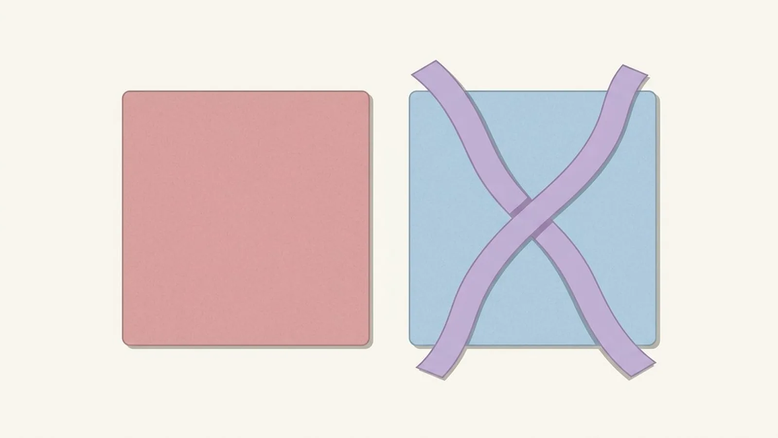
Light Summer's hardest colors are black, pure white, and anything warm or earthy like orange, tomato red, or mustard, since each one fights a palette built on pale, cool, low contrast color. The fix for almost every one of them is not to give up the mood you wanted, just to borrow the softer, cooler version of it that already lives in your own palette.
What's in this guide
- A quick recalibration on Light Summer
- The four families that fight you
- The worst offenders, ranked, with swaps
- Can a Light Summer wear black at all?
- The exceptions: wearing a wrong color away from your face
- Hair, makeup, and metals
- How to rescue a color you love
- How do you know you're really a Light Summer?
- FAQ
A Quick Recalibration on Light Summer
Light Summer sits at the palest, gentlest corner of the whole system: a cool undertone, a light overall value, and a soft, muted chroma, which is the technical way of saying that nothing about this coloring is supposed to shout. If you have not confirmed the season itself yet, the Light Summer tells walks through the seven markers, and the full Light Summer color palette covers everything that flatters you, in depth, as the positive counterpart to this list.
Every entry on the avoid list below fails one of those three traits, and usually two at once. Here is the palette it is failing against, copied directly from the season's own reference so you have the real colors in front of you before we get to what to skip.
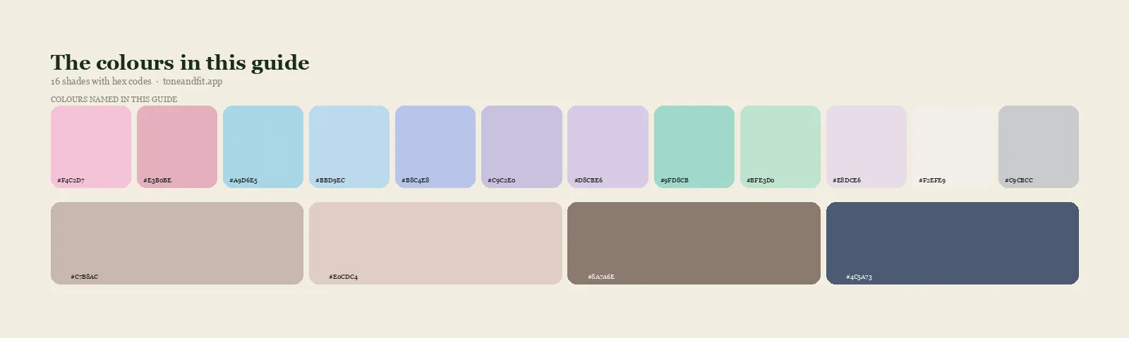
- Ballet Pink#F4C2D7
- Dusty Rose#E3B0BE
- Powder Blue#A9D6E5
- Soft Sky#BBD9EC
- Periwinkle#B8C4E8
- Soft Lavender#C9C2E0
- Pale Lilac#D8CBE6
- Seafoam#9FD8CB
- Cool Mint#BFE3D0
- Misty Mauve#E8DCE6
- Soft White#F2EFE9
- Dove Grey#C9CBCC
- Light Taupe#C7B8AC
- Rose Beige#E0CDC4
- Cocoa#8A7A6E
- Soft Navy#4C5A73
The Light Summer core palette and neutrals. Nearly every swap below is pulled from one of these sixteen colors.
The Four Families That Fight a Light Summer
Every problem color for a Light Summer belongs to one of four groups. Learn the groups and you stop needing to memorize individual shades.
1. Heavy darks
Black, near black, dark chocolate brown, and charcoal-black. These are simply too dark for a season built on light value, and they create a contrast jump against pale, soft skin that the face was never built to carry. The effect is not dramatic in a flattering way. It reads as tired, or several years older than a softer neutral would.
2. Stark, optical whites
Pure white, bright white, and any white with a visible blue brightener. Light Summer already reads light and soft, so a glaring white does not add freshness, it competes with a face that has nothing to compete with it. The result is a color that overwhelms rather than lifts.
3. Warm, earthy tones
Orange, tomato red, mustard, camel, and warm brown. These fail on undertone rather than value: a cool, light face next to a warm, dense color reads sallow or slightly grey, the classic sign that a color and a complexion are working against each other instead of together.
4. Oversaturated cool brights
Electric blue, shocking pink, true fuchsia, and neon anything. These pass the temperature test, they are genuinely cool, and still fail, because they are far more saturated than the season's soft chroma can support. Loud and cool is still loud, and loud is the one thing this palette is not built for.
The Worst Offenders, Ranked, With Swaps
These are the specific shades that cause the most trouble in practice, each paired with the closest working substitute from the palette above. The colors and hex codes here come directly from the Light Summer section of the Summer palette hub, so you can match them exactly rather than guessing at a paint chip.
| Avoid | Why it fails | Wear instead |
|---|---|---|
| Black | Too dark and too high contrast for light, soft coloring | Soft Navy #4C5A73 |
| Pure or optical white | Stark and glaring against pale, delicate skin | Soft White #F2EFE9 |
| Tomato red | Warm and saturated, the opposite of your cool base | Dusty Rose #E3B0BE |
| Orange | Warm and vivid, fights the cool undertone directly | Ballet Pink #F4C2D7 |
| Mustard | Warm, dense, and earthy, everything this palette is not | Cocoa #8A7A6E |
| Camel or warm tan | Warm and heavy for a season built on lightness | Rose Beige #E0CDC4 |
| Electric blue | Cool, but far too saturated for soft chroma | Powder Blue #A9D6E5 |
| Shocking pink or true fuchsia | Cool, but the same saturation problem as electric blue | Misty Mauve #E8DCE6 |
| Neon or highlighter shades | Maximum saturation, minimum relation to a soft palette | Cool Mint #BFE3D0 |
| Gold jewelry | A warm metal sitting directly against cool skin | Silver or white gold |
Can a Light Summer Wear Black at All?
Barely, and mostly away from your face: black is the hardest color on this entire list because it fights Light Summer on two fronts at once, value and contrast, rather than just one. Where a color like tomato red only clashes on undertone, black is simply too dark for a season defined by lightness, and the jump from pale skin to zero-reflectance black creates a contrast level this face was never built to carry. The common result is a look that reads flat, tired, or noticeably older than the same face in a lighter neutral.
That does not mean black is banned outright. Trousers, shoes, and a bag sit far enough from your skin that the contrast problem stops applying, and a black coat worn open over a soft white or ballet pink top puts the correct color where it actually matters, at your collar and face. For anything you plan to wear close to your neckline, though, treat soft navy as your black. It gives you the same grounding, anchoring effect with none of the harsh jump.
The Exceptions: Wearing a Wrong Color Away From Your Face
Every color on the avoid list becomes negotiable the further it moves from your face, because the clash is a proximity effect: it happens when light bounces off fabric and reflects onto your skin. Shoes, bags, trousers, and belts are far enough away that this reflection stops reaching you, which is why a pair of mustard flats or a tomato red bag can sit comfortably in a Light Summer's closet even though the same color as a sweater would not.
A second workaround is distance through layering rather than distance through the garment list. A camel coat worn open over a soft lavender scarf puts the correct color at your collarbone, which is the only place that actually matters for the effect. Small, isolated pops, an orange enamel pin, a single mustard button, work for the same reason: there simply is not enough surface area for the wrong color to dominate the read.
Hair, Makeup, and Metals
The same avoid list applies above the neckline, and the effect is stronger there because nothing sits closer to your skin than what is on it directly.
Metals. Gold and rose gold sit against cool skin the same way orange does against a shirt: warm metal, cool undertone, visible clash. Silver, white gold, and platinum are the metals built for this coloring, and the quickest way to confirm that on yourself is the gold or silver jewelry test, which takes about thirty seconds in front of a mirror.
Hair. Warm golden blonde, brassy tones, and flat jet black all fight this coloring for the same two reasons covered above, undertone and contrast. Ash blonde, light ash brown, and soft cool balayage keep the same lightness without introducing either problem.
Makeup. Orange-toned bronzer and a full warm red lip are the two most common misfires. Cool petal pink or soft rose on the cheeks, a sheer berry or cool pink on the lips, and taupe or dusty lilac on the eyes all stay inside the same soft, cool family as the wardrobe above. A foundation with a rosy or neutral base avoids the sallow cast a golden-based formula can create on cool, light skin.
How to Rescue a Color You Love
An avoid list is not a disposal list. Three moves let you keep most of what you already own.
Move it below the waist. Trousers, skirts, shoes, and bags are far enough from your face that undertone and contrast conflicts mostly stop mattering. A wrong color there is almost always a non issue.
Put a correct color between it and your face. A black blazer worn open over a soft white or dusty rose top does the work, because the layer touching your collarbone is what your skin actually reacts to. This makes a lightweight scarf one of the single most efficient fixes you can own.
Find the paler, cooler cousin. If you love orange, ballet pink gives you the same warmth and cheer in your own temperature. If you love mustard, cocoa gives you the same grounded depth without the clash. If you love black, soft navy gives you the same anchoring effect without the harsh contrast. You are not giving up the mood, only shifting its temperature and weight a few degrees toward yourself.
How Do You Know You're Really a Light Summer?
You know you are really a Light Summer when your undertone reads cool, your overall coloring reads light rather than deep, and the contrast between your skin, hair, and eyes stays gentle rather than sharp. The most common mix-up is with Soft Summer, since both share the same cool base. The difference is which trait leads: Light Summer is about lightness first, Soft Summer is about mutedness first, and getting that one distinction right changes several entries on this very list.
Once the season is confirmed, the fastest way to put it to work is a Light Summer capsule wardrobe, since it turns this whole avoid list into a shopping filter instead of a set of rules you have to remember every time you shop.
Not certain you are a Light Summer?
An avoid list only helps if the season underneath it is right. Tone & Fit reads your undertone, value, and chroma from one selfie and returns your season with a full palette in about 60 seconds.
Get your season ↗FAQ
What colors should a Light Summer avoid?
Two rules cover almost everything. Nothing warm: orange, tomato red, mustard, camel, and warm brown all fight the cool undertone. Nothing heavy or oversaturated: black, pure white, electric blue, and shocking pink all overwhelm a palette built on pale, soft, low contrast color. If a shade would look at home in a deep winter wardrobe, it is almost certainly wrong here.
Can a Light Summer wear black?
Barely, and mostly away from the face. Black is too dark and too high contrast for coloring built on lightness and softness, and it tends to overwhelm rather than anchor a Light Summer look. Soft navy, dove grey, or light taupe do the same grounding job without the harshness, and black is fine as shoes, trousers, or a bag.
Why does orange look wrong on a Light Summer?
Orange is warm and fully saturated, the opposite of a cool, soft, light palette on both counts at once. Against Light Summer's pale, cool skin, orange does not read as cheerful, it reads as a color that arrived from somebody else's wardrobe. Ballet pink or dusty rose deliver the same warmth and energy in a temperature that actually matches you.
What is the best white for a Light Summer?
Soft white, not pure or optical white. Stark white is blue brightened and high contrast, which overwhelms Light Summer's delicate coloring the same way black does. A soft, slightly warm off white keeps the same clean effect without the glare, and it is one of the season's core neutrals rather than an occasional substitute.
Can a Light Summer wear bright colors at all?
Cool brights in moderation, not the fully saturated versions. Powder blue, soft lavender, and cool mint give you brightness and interest while staying inside the season's soft chroma. Electric blue, shocking pink, and neon shades are cool enough on undertone but too loud on saturation, which is a different failure than warmth and just as noticeable.
What if a color I love is on the avoid list?
Move it away from your face rather than out of your closet. Bottoms, shoes, and bags sit far enough from your skin that the clash mostly stops mattering. You can also look for the paler or cooler cousin of the shade, since nearly every avoid list color has a relative inside the Light Summer palette that keeps the mood and drops the problem.
Can I check my color season from a photo?
Yes. The free Tone & Fit web tool reads your color season from one selfie in about 30 seconds, with no sign-up and no photo stored by us. It also tells you whether you land in Light Summer or a neighbouring season. The Tone & Fit app for iPhone and Android then builds your full palette of 38 named shades.