Bright Spring vs Bright Winter: The Difference

Both are the two brightest, most saturated seasons in the entire twelve-season system, built to wear a genuinely electric color at full strength without it wearing them. The one axis that splits them is temperature: Bright Spring's brightness runs warm underneath, Bright Winter's runs cool, and almost every other difference on this page follows from that single fact.
What's in this guide
Bright Spring vs Bright Winter: side by side
Bright Spring and Bright Winter are the highest-chroma season in their respective families, which is exactly why they get mistaken for each other so often. Both reject anything dusty, muted, or soft. Both belong to people who look better in a saturated jewel tone than in a gentle pastel. On this site, Bright Winter is the same season covered in depth under the name True Winter, since that is the more common label for it in the modern 12-season system. Whichever name you use, here is how the two compare across the traits that actually matter.
| Bright Spring | Bright Winter | |
|---|---|---|
| Undertone | Warm: golden, peachy, or warm-neutral | Cool: blue or pink based |
| Depth (value) | Light to medium | Medium |
| Chroma | Highest of the three Springs | Highest of the three Winters |
| Contrast | Medium to high | High, often the most extreme in its family |
| Best colors | Coral red, electric teal, vivid yellow, emerald, warm fuchsia | True red, royal blue, magenta, emerald, royal purple |
| Worst colors | Olive, mustard, beige, dusty rose, cool icy pastels | Camel, mustard, rust, olive, coral, dusty pastels |
| Best metal | Bright, polished gold; can mix in a little silver | Silver, white gold, platinum |
| Often discussed | Shakira, Camila Cabello | Anne Hathaway, Megan Fox |
Names in the last row reflect common online discussion, not a confirmed typing. Hair color, studio lighting, and makeup all shift how a single photograph reads, which is exactly why this guide leans on your own tests rather than someone else's red carpet look.
The tell that actually separates them
The tell is temperature, not intensity. Both seasons want the same electric level of saturation, so reaching for "more vivid" or "more muted" will not sort them. The question that actually sorts them is whether that saturation looks better pushed toward orange or pushed toward blue.
Bright Spring is warm-bright. Its hair runs golden brown, deep golden blonde, warm auburn, or dark chestnut with a visible warm glint in direct sun, and its eyes tend to be vivid green, warm hazel shot through with gold, or a clear light brown. The skin carries a golden, peachy, or warm-olive cast that tans or flushes warm rather than turning sallow. Layer saturated color on top of that warm base and it reads as sunlight: vivid, clean, and alive.
Bright Winter is cool-bright. Its hair runs black, blue-black, or a dark cool brunette with no warm shimmer at all, and its eyes tend to be icy blue, deep cool green, gray-blue, or a cool dark brown that still looks clear rather than muddy. The skin is usually pale and pink-toned, or a cool-neutral to cool-olive that holds sharp contrast against dark hair. Layer the same saturated color on that cool base and it reads as moonlight on snow: bright, clear, and a little sharper at the edges.
Everything else in this guide, the tests, the palettes, the border cases, is just a way of pinning down which of those two descriptions actually matches your face.
4 tests to settle it
Description only gets you so far. Run all four of these in daylight near a window, no makeup, hair pulled back, and count which season wins more rounds.
1. The metal test (the decider)
Hold a bright, polished gold chain flat against your jaw, then swap it for a silver or white-gold one. A Bright Spring's skin looks clean and lit under the gold and slightly flat under the silver. A Bright Winter's skin looks bright and fresh under the silver and faintly sallow or yellowed under the gold. This single test resolves the comparison for most people faster than any other, because metal responds directly to undertone and nothing else.
2. The vein test
Look at the inside of your wrist in daylight. Veins that read distinctly green point warm, toward Bright Spring. Veins that read distinctly blue or purple point cool, toward Bright Winter. If they look teal or you genuinely cannot tell, your undertone may be closer to neutral, which is covered in the border-case section below. Our guide to finding your skin undertone at home walks through this test along with several backups.
3. The red test
Hold a tomato-red or coral-leaning red to your face, then a blue-based cherry or true red. A Bright Spring usually looks most alive in the tomato-red, since the orange undertone in the color matches their own warmth. A Bright Winter usually looks most alive in the blue-based red, since it stays perfectly cool and never drifts toward orange. If one red looks vivid and the other looks slightly muddy or orange-tinged for no clear reason, that reaction is your undertone talking.
4. The black-and-white test
Pair a true, cool jet black with a pure, stark white. Then pair a warm, near-black espresso with a soft, warm off-white or cream. Bright Winter is built for the first pairing and can wear unbroken black-and-white without any warm relief and still look sharp rather than harsh. Bright Spring usually prefers the second pairing, since a true jet black on its own can look slightly heavy while espresso does the same grounding job without fighting the warmth.
If your undertone tests keep landing on cool but your best colors keep skewing warm, or the reverse, revisit the basics with our explainer on warm versus cool skin undertone before assuming you are a border case.
Stop guessing which bright season you are.
Tone & Fit's AI measures your undertone, value, and chroma from a selfie and tells you whether you're Bright Spring, Bright Winter, or something else, with your full palette in 60 seconds.
Try the App ↗Where the palettes overlap and split
The overlap is real and it is rare: most season pairs do not share a taste for full-strength saturation, but these two do. The split shows up the moment you check whether that saturated color leans orange-based or blue-based underneath.
Where they agree
Both seasons can carry a genuinely electric pink, a bold teal, and a rich emerald-adjacent green at full strength, which is a short list most other seasons cannot claim. Both also do better in a crisp, near-white than in a soft ivory, an unusual trait that sets them apart from almost every other warm or cool season. The difference inside that overlap is always the same one degree of temperature: Bright Spring's version of each color tilts a shade toward orange, Bright Winter's tilts a shade toward blue.
Where Bright Spring pulls ahead
Bright Spring owns the warm end of the vivid spectrum: coral red, bright orange, vivid and bright yellow, emerald green, electric teal, bright turquoise, clear blue, and warm fuchsia. Its neutrals are just as specific, true white, cream, camel, warm grey, warm navy, and a warm espresso standing in for black. For the full breakdown with outfit formulas, see the complete Bright Spring color palette guide, and compare it directly against its Spring sisters on the spring palette hub.
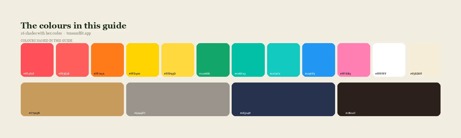
- Coral Red#FF4F58
- Hot Coral#FF5E5B
- Bright Orange#FF7A1A
- Vivid Yellow#FFD400
- Bright Yellow#FFD93D
- Emerald Green#12A66B
- Electric Teal#00BFA5
- Bright Turquoise#12C9C0
- Clear Blue#2196F3
- Warm Fuchsia#FF7EB3
- True White#FFFFFF
- Cream#F5EDD8
- Camel#C79A5B
- Warm Grey#9A948C
- Warm Navy#26324D
- Espresso#2B211C
Neutrals: the one Spring palette that wears a clean true white and a warm near-black espresso equally well.
Where Bright Winter pulls ahead
Bright Winter owns the cool end of the same vivid spectrum: true red, royal blue, magenta or fuchsia, emerald, royal purple, sapphire, and cobalt, all of it rendered with a blue base rather than an orange one. Its neutrals are true black, true white, true navy, and a cool slate grey, with icy pink standing in as a pale accent rather than a warm cream. For the deeper version of this season under its more common name, see the True Winter color palette guide and Am I a True Winter?.
The Bright Winter core: true red, royal blue, magenta, emerald, true black, pure white, royal purple.
Hold the two strips side by side and the split is visible rather than theoretical: Bright Spring's red has orange in it, Bright Winter's red does not; Bright Spring's blue sits closer to turquoise, Bright Winter's sits closer to royal. Same energy, opposite temperature.
If you sit between them
Sitting between Bright Spring and Bright Winter usually means a genuinely close-to-neutral undertone paired with high natural contrast and a strong, consistent pull toward saturated color, which is a real combination and not a sign you did the tests wrong. When that happens, comparing color categories, "red" versus "red", stops being useful, because both seasons already agree that red belongs in the wardrobe. Compare specific shades instead: a tomato-based red against a blue-based cherry red, a warm cobalt against a true royal blue, a warm fuchsia against a cool magenta. Whichever specific version looks cleaner and less like it is fighting your skin is the more reliable signal than any single test taken alone.
It also helps to run the metal test more than once, on more than one day, since indoor lighting can flatten the difference between gold and silver more than daylight does. If two or three of the four tests above point one direction and the rest are genuinely a coin flip, that is normal, not a failure, and it is exactly the case where a direct measurement is faster than more guessing.
Ready to find your season?
One selfie, your 12-season result, and the palette that goes with it. Free, no sign-up.
Find your season free ↗For the underlying reading, the skin tone analyzer explains what undertone, depth, and contrast actually mean, and our overview of the 12 color seasons maps out where both of these sit relative to every other season.
FAQ
What is the difference between Bright Spring and Bright Winter?
Undertone. Both are the highest chroma season in their family and both want fully saturated color, so the intensity is identical. Bright Spring's saturation runs warm, golden and peachy underneath, while Bright Winter's runs cool, blue and pink underneath. Nothing else in the comparison matters as much as that one split.
Is Bright Spring the same as Bright Winter?
No. They are neighboring seasons that share the same love of vivid, high-clarity color, which is why they get confused, but they sit on opposite sides of the undertone line. Bright Spring is warm, Bright Winter is cool. On this site Bright Winter is also called True Winter, the more common name for it in the modern 12 season system.
Which season is brighter, Bright Spring or Bright Winter?
Neither. Both sit at the top of the chroma scale for their family, Bright Spring is the most saturated of the three Springs and Bright Winter is the most saturated of the three Winters, so brightness is not the tiebreaker. Undertone is.
Can a Bright Spring wear Bright Winter colors?
Only after a small shift in temperature. A Bright Spring can usually wear the same level of saturation as a royal blue or a magenta, but needs the warm-leaning version of it, like a warm cobalt or a warm fuchsia, rather than the true blue-based shade a Bright Winter would reach for. Copy the intensity, not the exact hue.
What is the fastest way to tell Bright Spring and Bright Winter apart?
Hold a bright gold chain and a silver chain flat against your jaw in daylight. If the gold looks clean and lit, you lean Bright Spring. If the silver looks clean and the gold looks faintly sallow, you lean Bright Winter. It is the single fastest read because metal responds directly to undertone.
Is Bright Winter the same as True Winter?
Yes. True Winter and Bright Winter, along with Clear Winter, are different names some color systems use for the identical combination of cool undertone, medium value and the highest chroma in the Winter family. This guide uses Bright Winter to match the comparison, but our deeper coverage of the season lives under the True Winter name.