Color Combinations That Work, by Season
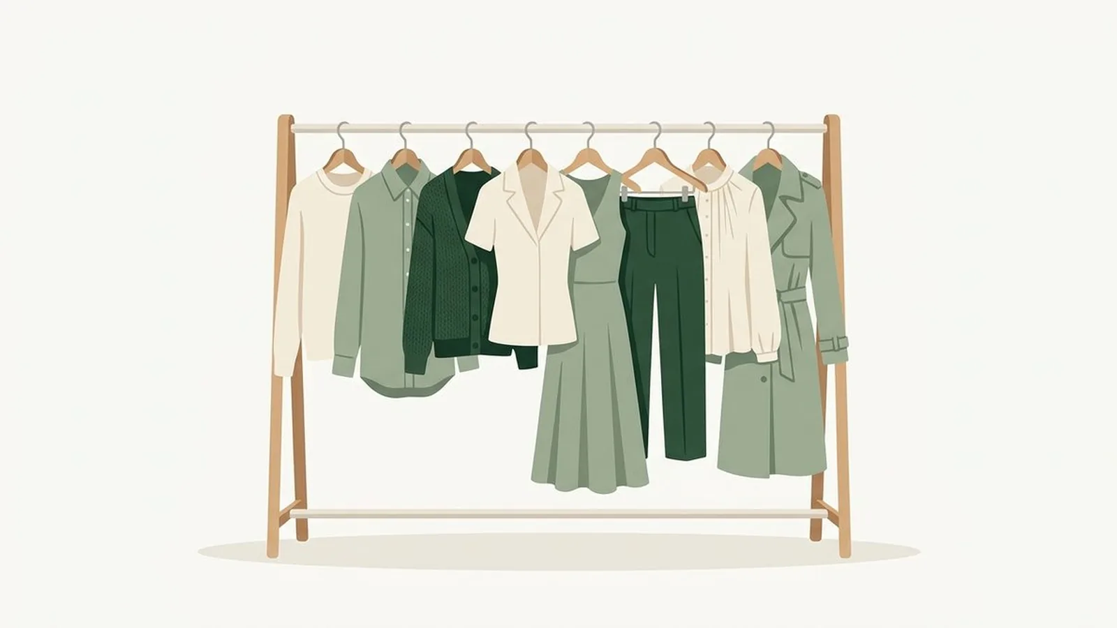
The color combinations that work in clothes come down to two decisions: matching temperature and controlling contrast. Pair shades that share your season's warm or cool undertone, anchor them with one true neutral, and almost any two colors from your own palette will look like they were bought as a set.
What's in this guide
What Actually Makes a Color Combination Work
A color combination works when every piece shares the same undertone and one true neutral in the outfit anchors the contrast, which is the real reason generic color-wheel advice fails so often. A color wheel only tells you which hues are opposite or adjacent. It says nothing about whether those hues lean warm or cool, and that single detail decides whether two "matching" colors sit together peacefully or fight at the seam.
Three checks separate a combination that works from one that only looks like it should. First, temperature: every color in the outfit needs to lean the same direction as your season, warm with warm or cool with cool, because a warm gold and a cool grey read as mismatched even though grey is supposedly a safe neutral. Second, contrast: the gap between your lightest and darkest piece should roughly match the natural contrast in your own face and hair, so a stark black-and-white pairing that looks sharp on a high-contrast Winter can look severe on a soft, low-contrast Summer or Autumn. Third, the anchor: at least one piece needs to come from your season's actual neutral list, not just any color that reads as neutral in isolation, because a cool taupe and a warm camel are both "neutrals" and only one of them belongs in your outfit.
Once you know your season, the fastest shortcut is pulling directly from an established list rather than guessing. Our capsule wardrobe by color season guide breaks every season into neutral, signature, and accent tiers, and every combination below is built from those same tiers so you can trust the names. If you know your 12-season subtype rather than just the 4-season family, lean toward the lighter or more saturated end of each combination accordingly, as covered in our 12 color seasons guide.
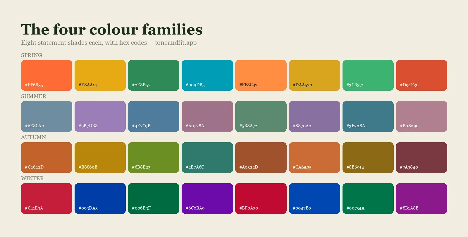
Spring Color Combinations That Work
Spring's best combinations pair a clear, warm neutral with one bright, clean signature color, because muted or cool shades flatten the natural brightness that makes Spring coloring work in the first place. Everything should look sunlit, not softened.
- Camel, tomato red, and warm ivory: the camel keeps the red from overwhelming, and the ivory (never a stark white) keeps the whole look warm from top to bottom. Reliable for daytime and easy to repeat with different pieces.
- Golden yellow and warm navy: a genuinely warm navy, the kind with a hint of teal in it, keeps this pairing from turning corporate-cool. High enough contrast to read as intentional, warm enough to stay in family.
- Warm turquoise and coral: both colors are clear and bright rather than muted, which is exactly why they work together instead of competing. This is the pairing that separates a confident Spring outfit from a washed-out one.
- Apple green, warm peach, and cream: a softer, more casual combination that still stays inside Spring's clarity. Good for a layered spring or summer outfit where you want three colors without any of them shouting.
Summer Color Combinations That Work
Summer's best combinations stay inside a narrow, cool, muted range, because a single bright or warm piece breaks the soft, watercolor quality that defines the season. Nothing here should compete for attention.
- Dusty rose, cool grey, and soft white: three quiet colors at similar depth, which is exactly the point. This combination photographs beautifully because nothing in it fights the others for contrast.
- Powder blue and lavender: two cool pastels close enough in value that they read as a deliberate, tonal choice rather than a mismatch. Add a cool grey bag or shoe and the outfit is finished.
- Sage green, taupe, and cool navy: the most "wearable to the office" Summer combination, since sage and taupe are both muted enough to feel professional while the navy adds just enough depth.
- Periwinkle and cool raspberry: the boldest pairing Summer can wear without breaking its own rules, because both colors are still cool and softened rather than clear and saturated.
Autumn Color Combinations That Work
Autumn's best combinations lean into depth and warmth together, because a pastel or icy piece anywhere in the outfit will look out of place next to Autumn's rich, earthy base colors. Everything here should feel like it was dyed with plants, not printed.
- Burnt orange, olive, and warm off-white: the single most reliable Autumn combination. Olive keeps the orange grounded instead of loud, and the warm off-white (never bright white) gives the eye somewhere to rest.
- Mustard and chocolate brown: a two-color combination that needs nothing else. The depth of the chocolate keeps mustard, which can look sharp on its own, feeling rich instead of acidic.
- Warm teal and rust red: Autumn's jewel-tone pairing. Both colors are deep and warm rather than clear, so despite being visually bold they stay inside the same family and never look like a costume.
- Warm cranberry, warm khaki, and bronze accessories: a combination built for outerwear season, where the khaki does the neutral work, the cranberry adds warmth near the face, and bronze jewelry ties the metals in.
Winter Color Combinations That Work
Winter's best combinations use maximum contrast on purpose, because Winter coloring is the one family that reads as flat rather than elegant in a low-contrast outfit. Clarity and sharpness are the goal, not softness.
- Emerald green, black, and pure white: the combination Winter was built for. The black and white supply the contrast, and emerald keeps it from feeling like a uniform.
- True red and true navy: both colors are cool-based and fully saturated, which is why this reads as sharp rather than patriotic-costume. A true, blue-based red is doing most of the work here, not a warm brick red.
- Royal blue and deep magenta: the boldest pairing on this list, and one only a genuinely cool, high-contrast face can carry without looking costumey. Balance it with a black or charcoal piece if it feels like too much.
- Icy pink and cool charcoal: proof that Winter can go soft without going warm. The icy, slightly blue-toned pink keeps this pairing in family even though it reads gentler than the others.
| Season | One reliable combination | Why it works |
|---|---|---|
| Spring | Camel + tomato red + warm ivory | Shares a warm undertone at three different depths, so nothing competes. |
| Summer | Dusty rose + cool grey + soft white | Stays inside one narrow, muted, cool range from top to bottom. |
| Autumn | Burnt orange + olive + warm off-white | Depth and warmth match across every piece, with olive grounding the orange. |
| Winter | Emerald green + black + pure white | Maximum contrast and full saturation, which is what Winter coloring wants. |
Combinations That Look Right on a Hanger but Fail on a Person
A combination fails on a real face for one of two reasons: the colors are both technically muted, or both technically bright, but from opposite temperature families, or the darkest piece in the outfit sits too close to the face for that person's natural contrast. Neither problem shows up when you are just looking at the fabric on a hanger, which is exactly why it catches people by surprise in the mirror.
Cool lavender and warm camel are a classic example. Both are soft, muted colors that seem like they should pair easily, but one is cool and one is warm, and worn together they create a faint, hard-to-name clash right where they meet. The same problem shows up when a naturally low-contrast Soft Autumn or Soft Summer face wears a stark black turtleneck: the color itself is not wrong for every context, but placed directly at the jaw it creates more contrast than that face carries anywhere else, and the effect reads as tired rather than sharp. An icy pink scarf on a deep, warm Autumn face is the same trap from the other direction, a color that looks pretty in a photograph but quietly drains warmth from skin that needs the opposite.
The fix is what we call the neckline rule: whichever color sits nearest your jaw needs to match your season exactly, because that is the color your skin has to answer to all day. Everything further from your face, a shoe, a bag, a hem, has more room to bend the rules. If you want the deeper mechanics behind why some colors drain a face while others light it up, our guide to shopping your color palette walks through the same test in a store, and the right coat color for your skin tone is worth getting right first since it frames your face more than almost anything else you wear.
Know your season before you buy the next piece.
The free web tool names your season from one selfie, with no sign-up. The app's scan is free too and shows your undertone, best metals and starter colors; your season and full palette in the app are an optional upgrade.
Find my season free → Get the app ↗How to Test a Combination on Yourself
The fastest way to test whether a combination works is to hold both pieces up under natural daylight near your jaw and watch what happens to your skin, not to the fabric. Stand by a window, pull your hair back, and drape one piece and then the other against your collarbone. If your skin looks even and clear with both colors in place, the combination works. If either piece makes your skin look grey, yellow, or tired, that piece is fighting your undertone regardless of how well it pairs with the other color on paper.
If you do not yet know your season, the fastest starting point is our seasonal color analysis quiz, which gives you a first read in a couple of minutes. To confirm it, use the free photo color analysis tool, which checks your undertone directly from a selfie rather than from self-reported answers. Once you know your season, the full list of named colors, neutrals, and metals for every family is on the palettes hub, and the combinations in this guide will keep working long after you have replaced every piece in your closet.
Ready to find your season?
The free web tool names your season from one selfie, with no sign-up. The app's scan is free too and shows your undertone, best metals and starter colors; your season and full palette in the app are an optional upgrade.
Find my season free → Get the app ↗FAQ
What is the easiest rule for combining colors in an outfit?
Match temperature first: keep every piece warm or every piece cool, then add one true neutral from your own season to anchor the look. Contrast is the second decision, not the first, and it only matters once the temperature is already settled.
Can I mix warm and cool colors in the same outfit?
You can, but it usually takes a genuinely neutral piece, a true grey rather than a warm taupe or a cool greige, to bridge the two temperatures. Most people get a cleaner result by staying inside one temperature family until they are confident reading combinations on sight.
Do black and white work as a combination for every season?
No. Black and white is a Winter combination because both colors sit at the extreme ends of value with nothing muting them. On a Spring or Autumn face it can look flat or draining, and the same crisp idea works better as camel and warm ivory for Spring or chocolate and warm off-white for Autumn.
What is the safest color combination to start with?
One neutral from your season plus one signature color, both pulled from the same seasonal list rather than guessed. It is close to impossible to get that pairing wrong, and it is the fastest way to build confidence before adding a third color or an accent.
Why do individual pieces I like not work together in one outfit?
Almost always a temperature mismatch: two colors that are each flattering on their own come from different undertone families, so the outfit reads as slightly off even though nothing is technically wrong with either piece. Checking both pieces against your season's palette before buying fixes this permanently.
Can I check my color season from a photo?
Yes. The free Tone & Fit web tool reads your color season from one selfie in about 30 seconds, with no sign-up and no photo stored by us. The Tone & Fit app for iPhone and Android then builds your full palette of 38 named shades.