Best Coat Colors for Your Skin Tone
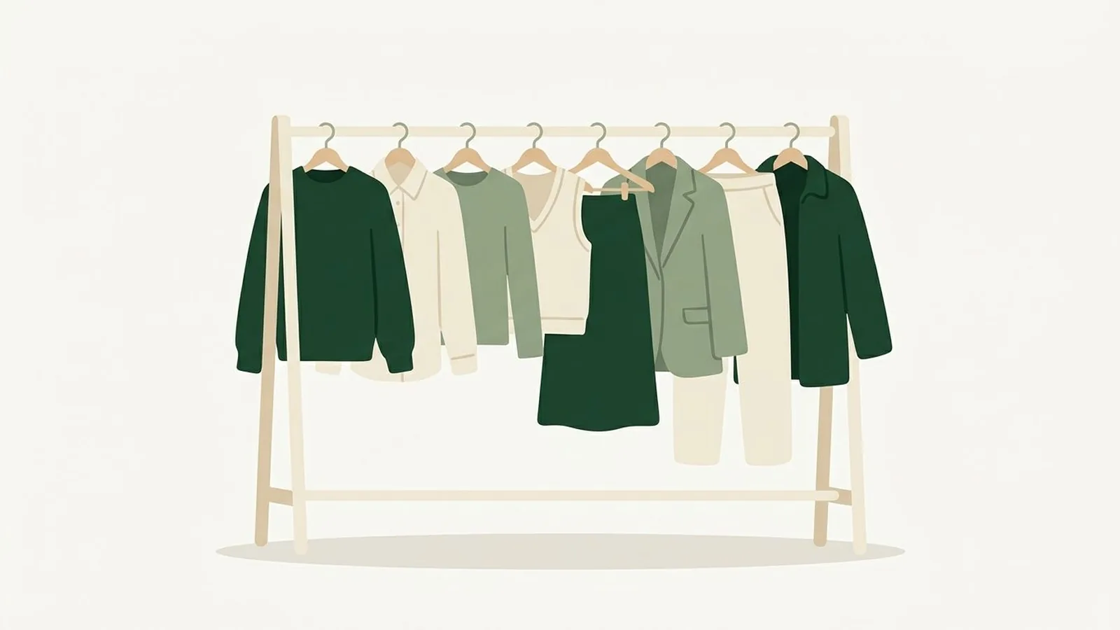
Short answer: the best coat colour is the darkest neutral inside your season, because a coat sits next to your face all winter. Cool, deep colouring wears black and true navy; warm colouring wears camel, chocolate and olive; light colouring needs a mid-depth neutral such as grey or taupe rather than black. The chart for all twelve seasons is below.
A coat is the piece of clothing that spends the most time next to your face and the least time being reconsidered. You buy one, you wear it every day for five months, and it is in every photograph anyone takes of you between October and March. It deserves more thought than the sweater underneath it.
In this guide
- Why coat color matters more than the rest of your wardrobe
- The three things that decide your best coat color
- Coat colors by undertone
- The coat chart: all 12 color seasons
- The camel coat problem
- Black or navy: settling the argument
- How to test a coat color in the store
- Buying a second coat without repeating the first
- FAQ
Why coat color matters more than the rest of your wardrobe
Most color mistakes are survivable. A shirt in the wrong shade of green gets worn twice, hides under a cardigan, and quietly leaves. A coat does not work that way. It sits at the top of the outfit, frames your face, and covers everything you chose underneath. For roughly half the year, the coat is the only garment most people see you in. The one garment that comes close is knitwear, which you keep on indoors all day, and picking a sweater colour for your skin tone has its own rules because texture changes the shade you end up wearing.
It is also the piece where the stakes are highest per purchase. Coats cost more than almost anything else in a wardrobe, they are bought infrequently, and returning one after a season of wear is not an option. So the ordinary advice to just try things and see what feels right is weaker here than usual. It helps to know, before you are standing in a shop in October with a card in your hand, which family of colors is going to work on you.
The good news is that outerwear is one of the simplest categories in color analysis. There are perhaps a dozen coat colors that actually exist in the market at any scale: black, navy, charcoal, grey, camel, tan, cream, olive, burgundy, forest, rust, and whatever accent color the season has decided on. You are not choosing from infinity. You are choosing from a short list, and your coloring rules out about half of it immediately.
The three things that decide your best coat color
The same three measurements that drive seasonal color analysis decide your coat, and they matter in a specific order.
1. Undertone, which sets the temperature
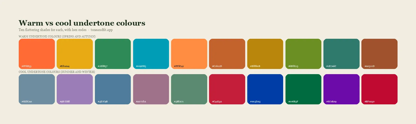
Undertone is whether your skin has a blue, pink, or rosy cast underneath, or a golden, peachy, yellow one. It is the single strongest factor in whether a coat makes your skin look clear or muddy, because the wool is reflecting light up into your jaw all day. If you have never pinned yours down, the fastest route is the at home undertone test, and the fuller explanation of what the two camps actually mean is in warm versus cool undertones.
In practice, undertone rules out entire coat colors. Cool skin next to a golden camel gets a yellow cast under the eyes. Warm skin next to a blue grey gets a flat, slightly grey look around the mouth. Neither is subtle once you have seen it.
2. Depth, which sets how dark the coat can go
Depth is how light or dark your overall coloring is, taking hair, skin, and eyes together rather than skin alone. Deep coloring supports a dark coat. Light coloring usually does not, which is why so many fair, light haired people own a black coat they never quite feel right in.
3. Contrast, which is the one everybody skips
Contrast is the gap between your lightest feature and your darkest. It is the measurement that decides whether black works on you, and it is independent of both undertone and depth. Dark hair against light skin is high contrast, and a very dark coat mirrors that. Light hair against light skin is low contrast, and a very dark coat overwhelms it. If you are not sure where you fall, the contrast level guide walks through it with a phone camera and a black and white filter.
The shortcut version
Undertone tells you which half of the color wheel your coat comes from. Depth tells you how dark it can be. Contrast tells you how far the coat can sit from your skin. Get those three right and the specific shade almost picks itself.
Coat colors by undertone
Before we go season by season, here is the coarse version, which is enough for most people standing in front of a rack.
Cool undertones
Charcoal, true navy, cool grey, black if your contrast supports it, burgundy, plum, forest with a blue cast, and cool cream or optic white for a lighter coat. Silver hardware sits better than gold on cool skin, which is worth checking on a coat with visible buckles or zips. If you want the reasoning behind that, it is the same logic as gold versus silver jewelry.
Cool undertones should be careful with camel, tan, warm beige, mustard, and rust. Those are not banned so much as badly placed at face level.
Warm undertones
Camel, tan, chocolate, olive, rust, moss, warm ivory, and a navy softened toward ink or teal rather than a hard blue. Brass and gold hardware. Warm undertones tend to struggle with black, cool grey, icy pastels, and stark white, which pull the gold out of the skin and leave it looking tired.
Neutral undertones
Neutral skin is the easiest case for outerwear, because the middle of the range is exactly where most coats live. Taupe, soft navy, mushroom grey, dusty teal, and muted burgundy all work. The thing to avoid is the extreme end of either temperature, so neither a bright orange rust nor an icy blue grey. More on what neutral actually means in neutral undertone skin.
Olive undertones
Olive skin has a green cast layered over a warm or neutral base, and it has its own rules. Olive, bronze, rust, cream, and warm navy tend to look excellent. Grey and cool pastels can flatten it. There is a fuller treatment in best colors for olive skin tone.
The coat chart: all 12 color seasons
If you already know your season, this is the section to bookmark. If you do not, the 12 color seasons guide is the fastest way to place yourself, and the complete color analysis guide is the reference version with the reasoning behind each grouping.
| Season | Best coat colors | Skip |
|---|---|---|
| True Winter | Black, true navy, charcoal, pure white, holly red | Camel, olive, rust |
| Cool Winter | Charcoal, cool navy, burgundy, icy grey, black | Camel, mustard, warm beige |
| Deep Winter | Black, espresso, deep pine, aubergine | Pastels, oatmeal |
| True Spring | Warm ivory, camel, coral red, bright navy | Black, cool grey |
| Warm Spring | Camel, warm cream, apricot, light olive | Black, charcoal, icy blue |
| Light Spring | Buttermilk, light camel, soft peach, denim blue | Black, deep burgundy |
| True Summer | Soft navy, dove grey, cool taupe, rose brown | Rust, mustard, black |
| Cool Summer | Slate blue, cool grey, plum, soft white | Camel, orange rust |
| Soft Summer | Mushroom grey, dusty teal, muted plum | Bright white, hard black |
| True Autumn | Chocolate, olive, rust, warm camel | Black, icy pastels |
| Warm Autumn | Camel, bronze, moss, terracotta | Cool grey, pure white |
| Deep Autumn | Espresso, forest, deep teal, oxblood | Pale beige, pastel anything |
If you are a Cool Winter
Cool Winter is one of the few seasons that genuinely earns a black coat, and one of the few that should not own a camel one. The undertone is cool and the contrast is high, so a charcoal or true navy coat against your face reads as sharp rather than heavy. Burgundy and deep plum are the underused options here and look far more considered than another black wool. The full range is in the Cool Winter color palette, and if you want to see it assembled into outfits, Cool Winter outfit ideas covers the layering. The list of shades to keep away from your collar is in Cool Winter colors to avoid.
If you are a Warm Spring
Warm Spring is the season camel was invented for. Warm undertone, medium to light depth, medium contrast, so a camel or warm cream coat sits perfectly against the skin without either overwhelming it or disappearing into it. The trap for Warm Springs is the default black coat, which drains the warmth out of the face and makes the whole outfit look heavier than the person wearing it. Light olive and apricot are the surprising wins. See the Warm Spring color palette for the exact shades and Warm Spring outfit ideas for how they combine.
If you are a Deep Autumn
Deep Autumn can go as dark as Winter can, but in the warm half of the wheel. Espresso brown, deep forest, oxblood, and dark teal all work where black tends to look slightly flat and lifeless. This is the season that should be buying a rich brown coat rather than a black one, and the difference in photographs is immediate. The Deep Autumn color palette has the full range, and Deep Autumn outfit ideas shows how the darks pair with the warmer mid tones underneath.
Not sure which season you are?
Point your camera at your face in daylight. Sixty seconds later you have your season, your palette, and the coat colors that go with it.
Analyze my photo free ↗The camel coat problem
Camel is the most photographed coat color of the last decade and one of the most conditional. It is warm, it is medium in depth, and it is low in saturation, which is a specific combination that suits a specific set of people extremely well and quietly undermines everyone else.
It works beautifully on Warm Spring, True Spring, Warm Autumn, Soft Autumn, and True Autumn. On those seasons the gold in the wool matches the gold in the skin and the whole face lifts.
It causes two different problems elsewhere. On a cool undertone, the yellow in camel pulls a sallow cast into the skin under the eyes and around the mouth. This is a temperature clash and it is the more visible of the two. On anyone whose skin sits at almost exactly camel's lightness, there is a separation problem instead: the coat and the face read as one continuous beige and the features lose definition. That second problem is not about temperature at all, and it is the same mechanism described in colors that wash you out.
If you already own a camel coat and you are on the wrong side of this, you do not have to sell it. Put a scarf in your palette between the wool and your jaw. The color touching your neck is doing most of the work, and a cool grey, plum, or soft white scarf changes what the camel does to your face without changing the coat.
Black or navy: settling the argument
This is the question people actually type into a search box, so here is the direct answer.
Black is the right choice when your own coloring already contains high contrast. Dark hair, dark eyes, clearly lighter skin. That describes most Winters and a good share of Deep Autumns. On those people a black coat looks intentional, because the face already contains a jump that dramatic and the coat simply repeats it.
Black is the wrong choice when your contrast is medium or low. Light or mid brown hair, softer eyes, skin that is not far from the hair in value. On that face a black coat introduces a hard line at the collar that nothing in your coloring answers, and the eye goes to the shadows under your jaw rather than to you. The effect is usually described as looking tired, and it is entirely a contrast problem.
Navy is the substitute in almost every one of those cases. It gives you the same anchoring, the same practicality, and the same ability to go from a commute to dinner, without the hard edge. Choose a navy with a blue or violet cast if you are cool, and one softened toward ink or teal if you are warm. The same reasoning applies to tailoring, which is covered in more depth in best suit colors for your season.
Charcoal is the third option and it is underrated. It reads as formal as black, it is far more forgiving on medium contrast faces, and it does not show every piece of lint the way black wool does. If the coat is going over tailoring most days, it helps to settle the pieces underneath first: the applied menswear playbook covers suits, shirts and knitwear in the same terms used here.
How to test a coat color in the store
Retail lighting is designed to sell coats, not to tell you the truth about them. It is warm, it is dim, and it flatters nearly everything. So the first move is to get the coat and yourself somewhere with daylight, which usually means walking to the shop window with it on.
- Put it on properly. Do not hold it up against yourself. The collar position matters, and a coat held at chest height tells you nothing about what happens at your jaw.
- Look at three places. The skin under your eyes, the area around your mouth, and the jawline. Those are where a wrong temperature shows first, as a grey or yellow cast.
- Check your lips. A coat in the wrong family pulls color out of them. If your mouth suddenly looks paler than it did a minute ago, that is the coat.
- Compare against a second coat. A single color in isolation is hard to judge. Try the same style in two colors back to back and the difference becomes obvious in about four seconds.
- Take a photo in daylight, no filter. Phone cameras are unforgiving in a useful way here.
The same daylight discipline applies to everything else you buy, and the longer version of the method is in how to shop your color palette.
Buying a second coat without repeating the first
Most people own two coats that do the same job. A dark wool for work and weather, and a second dark wool bought two years later because the first one was fine.
The more useful split is by function rather than by formality. One dark anchoring coat in your best neutral, whether that is charcoal, navy, espresso, or forest. One lighter or brighter coat in a color from the saturated end of your palette, which is what carries you through the grey months and shows up well in photographs. For a Cool Winter that second coat is burgundy or icy grey. For a Warm Spring it is warm cream or apricot. For a Deep Autumn it is oxblood or deep teal.
If you are building the rest of the wardrobe around those two, the structure is laid out in capsule wardrobe by color season, and the season by season swatches live on the palettes pages. Coats belong to the base-neutral layer, the roughly 60 percent of a wardrobe that frames everything else, and how to build your personal color palette covers how that layer fits with your main colors, accents and metals.
One last note on practicality. A coat gets worn in rain, on trains, and against every bag strap you own. Color analysis will tell you which family to buy from, but within that family, pick the shade you will actually keep wearing. A perfect icy grey that shows every mark is worse than a very good charcoal you reach for without thinking.
Get your palette before you buy the coat
Tone & Fit reads your undertone, depth, and contrast from one selfie and hands back the exact shades that work on you.
Analyze my photo free ↗FAQ
What is the most universally flattering coat color?
There is no single answer, but navy comes closest. A true navy sits in the middle of the temperature scale, is dark enough to anchor most faces without the hard edge of black, and reads as formal or casual depending on the cut. Cool seasons want a navy with a blue or slightly violet cast. Warm seasons want a navy softened toward teal or ink. If you want one coat and you do not know your season, navy is the lowest risk purchase you can make.
Who should not wear a camel coat?
Camel is a warm, medium, low saturation color, so it struggles in two situations. First, on cool undertones, where the gold in the wool pulls a sallow yellow cast into the skin. Cool Winter, True Winter, Cool Summer, and Soft Summer usually look better in taupe, oyster, or soft grey. Second, on anyone whose skin sits at almost exactly camel's lightness, because the coat and the face blur into one another with no separation. Warm Spring, Warm Autumn, Soft Autumn, and True Autumn are the seasons camel was made for.
Should I buy a black coat or a navy coat?
Buy black if your own coloring is high contrast, meaning dark hair and eyes against clearly lighter skin, which describes most Winters and some Deep Autumns. Black next to that face looks deliberate. Buy navy if your contrast is medium or low, or if your undertone is warm. Navy gives you the same visual anchoring and the same practicality, without the harsh line at the collar that makes a low contrast face look tired.
What color coat looks best with pale skin?
Depth is not the deciding factor, undertone and contrast are. Pale skin with dark hair can carry charcoal, black, and deep berry. Pale skin with light hair usually looks better in mid weight colors like soft teal, dove grey, cornflower, or dusty rose, because a very dark coat next to a very light face creates more contrast than the face itself contains. Avoid coats at exactly your own lightness in a low saturation shade, such as oatmeal or nude beige, since they leave nothing to separate you from the coat. There is more on this in best colors for pale skin.
Does the coat lining or scarf color matter?
Yes, and it is the cheapest fix in outerwear. The color that touches your jaw and neck is doing most of the work, so a scarf in your palette can rescue a coat that is slightly off. If you already own a camel coat and you are cool toned, a soft grey, plum, or cool cream scarf sits between the wool and your face and neutralizes the problem. The same trick works in reverse for a warm person in a black coat, using a rust, olive, or cream scarf.
How do I check a coat color in a store?
Take the coat to a window and put it on. Store lighting is usually warm and dim, which flatters almost everything and tells you nothing. Look at three places in daylight: the skin under your eyes, the area around your mouth, and your jawline. A coat in the wrong temperature adds grey or yellow under the eyes and pulls color out of your lips. A coat in the right one makes the skin look more even before you have adjusted anything else.