Tone-on-Tone Outfits, the Korean Way

A tone on tone outfit dresses you head to toe in a single hue family worn at different depths, light, medium, and dark versions of the same color, instead of mixing several unrelated hues. It is the core method Korean personal color consultants use to turn a season into an actual outfit, because holding the undertone constant is what keeps a monochrome look from reading as flat.
Scroll past a handful of well-dressed people in Seoul and a pattern shows up fast: an outfit built almost entirely from one color family, layered from pale to deep. It is not an accident and it is not a uniform. It is a technique, and it works whether you learned your season in a Gangnam studio or from a selfie.
In this article
What tone-on-tone actually means
Tone-on-tone means every visible piece of an outfit comes from one hue family at varying depths, rather than several different hues mixed together. A powder blue shirt, a mid-wash denim jacket, and a navy trouser are three different named colors, but they share the same hue and the same undertone, so together they read as one deliberate idea instead of three separate choices. The technique is sometimes written as tonal dressing in Western styling guides, but the underlying logic is identical: pick a lane, then vary how deep you go within it.
This is different from picking "a favorite color" and repeating it. The whole point is the range. A single shade of blue worn top to bottom is monochrome, flat, and a little stiff on camera. Three or four depths of blue, arranged so the eye travels from light to dark, has movement even though nothing about the outfit is loud. That movement is what a tone-on-tone outfit is actually selling.
Why Korean stylists build outfits this way
Korean stylists lean on tone-on-tone so heavily because Korean personal color practice sorts everyone by warm or cool undertone before anything else. Once a client's warm or cool lane is fixed, tone-on-tone is the fastest way to prove that sorting was correct, because an outfit that stays inside one undertone across several depths either photographs as clean and intentional or it does not. There is nowhere for a wrong undertone to hide the way there might be in an outfit built from five different hues.
It also solves a problem that shows up constantly in Korean street fashion coverage and airport style photography: outfits need to read instantly in a still photo, often taken quickly and from a distance. A tone-on-tone look is legible at a glance because the eye does not have to reconcile competing hues, it just tracks depth. That is one reason the technique became closely associated with idol stylists and fashion week street style long before it had an English name.
The method, step by step
Here is the version worth actually following, expanded past the basic checklist most guides repeat.
- Confirm your undertone and season before you pick a color. Tone-on-tone only works if every piece shares the same warm or cool lean, so start from a confirmed result rather than a guess. If you have not pinned this down yet, seasonal color analysis explained covers the three measurements that decide it.
- Choose one hue family that your season already owns. Do not choose a color you like in the abstract; choose one that is already sitting inside your palette, since that removes the undertone risk before you even start layering depths.
- Collect three or four depths of that hue, not three or four items of the same shade. You want a visible light-to-dark spread: powder blue through navy, or camel through chocolate, not three things that are all "medium blue."
- Anchor the outfit with a mid-depth piece. A mid-tone top, dress, or knit usually reads better as the base layer than the lightest or the darkest item you own, because it gives the eye room to travel in both directions.
- Place the darkest piece where it does structural work. A dark jacket, blazer, or bag reads as intentional weight rather than an accident when it shares the hue and undertone of everything else.
- Place the lightest piece where it draws the eye up. A pale scarf, shirt, or earring near the face keeps the lightest value close to where people actually look first.
- Check the undertone match in daylight before you commit. Two blues can carry opposite undertones even when they look similar under store lighting, so hold the actual pieces together near a window.
- Add exactly one neutral if the look needs a break. Cream, gray, black, or white, whichever pairs with your season, stops a monochrome outfit from reading as one solid block. Keep the neutral to a single item rather than splitting it across several pieces.
Tone-on-tone by season: which hue family to start with
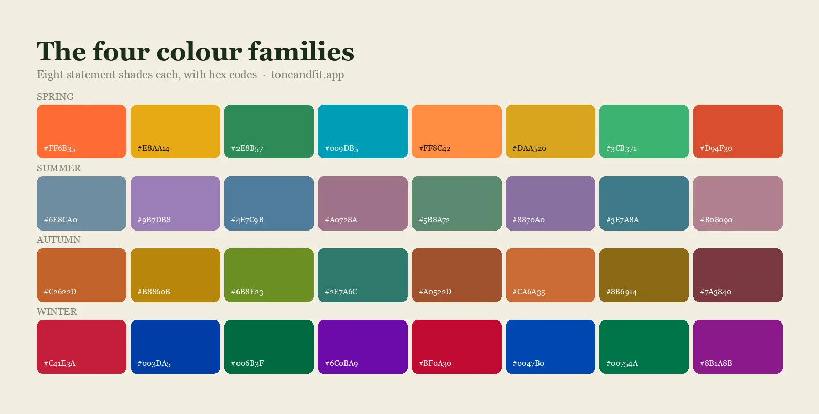
The fastest way to build a first tone-on-tone outfit is to pick a hue family your season already leans on, then simply gather it in more than one depth. This table is a starting point, not the only option, since every season's full palette has several usable hue families.
| Season family | Easy starting hue | Light to dark example | Neutral to add |
|---|---|---|---|
| Spring (warm, clear) | Warm blue or aqua | Sky blue through a warm mid-teal | Warm ivory or camel |
| Summer (cool, soft) | Blue or rose | Powder blue through soft navy | Soft white or cool taupe |
| Autumn (warm, muted) | Olive or rust | Warm sand through espresso | Warm cream or dark chocolate |
| Winter (cool, bright or deep) | A jewel tone, emerald or sapphire | Icy blue through deep navy or forest | Pure white or black |
If you already know your 12-season subtype, refine the depth range toward the lighter or deeper end accordingly. A Light Spring stays in the upper half of that blue range; a Deep Winter can push all the way to a near-black navy without leaving the family. The building blocks for a full seasonal wardrobe, not just one outfit, are laid out in capsule wardrobe by color season, which is worth reading alongside this if you are starting from scratch.
Tone-on-tone vs monochrome vs color blocking
Tone-on-tone gets confused with two neighboring techniques often enough that it is worth separating all three in one place.
| Technique | What varies | What stays fixed |
|---|---|---|
| Tone-on-tone | Depth, light to dark | Hue and undertone |
| Monochrome | Very little | Hue, undertone, and roughly one depth |
| Color blocking | Hue, sometimes undertone | Usually just saturation or clarity |
Monochrome is the tightest of the three: one color, one depth, occasionally different fabrics for texture. It photographs as sleek but can look severe if the wearer's contrast is low. Color blocking is the opposite instinct, deliberately pairing two or more distinct hues, which takes real confidence in exactly which combinations your season supports. Tone-on-tone sits in between: it has the visual movement color blocking offers without the risk of an undertone clash, which is exactly why it is the technique Korean stylists reach for first when introducing someone to their own palette.
Mistakes that break the look
Mixing warm and cool versions of the "same" color. A warm rust and a cool brick red both photograph as red, but pairing them side by side creates the exact clash tone-on-tone is supposed to prevent. Hold pieces together in daylight, not under a store's warm bulbs, before deciding they match.
Choosing depths that are too close together. Three items that are all technically "medium" have no visible movement and read as an accident rather than a plan. The light-to-dark spread needs to be obvious from across a room.
Skipping the neutral entirely. A full outfit in one hue family with no neutral break can look costume-like on some people, especially in high-saturation hues. One neutral shoe, bag, or belt is usually enough to fix it.
Forgetting texture. When every piece is close in color, fabric becomes the only remaining source of contrast. A flat cotton top under a flat cotton jacket in the same hue can look unfinished; swapping one piece for knit, denim, or a subtle sheen adds the visual interest color alone can no longer provide.
How to check this on yourself
The whole method depends on one fact you need before you start: your actual undertone and season, not a guess based on your favorite colors. If you have not confirmed it yet, the seasonal color analysis quiz is a fast starting point, and the free photo analysis tool reads your undertone, value, and chroma directly from a selfie rather than asking you to self-report traits you are too close to judge accurately.
Once you know your season, do a quick photo test before you buy anything new: lay your candidate pieces together in natural daylight and take one photo. Convert it to grayscale. If the pieces show a clear light-to-dark gradient with no jarring gaps, the outfit will read as tone-on-tone in person. If two pieces sit at nearly identical gray values, add a piece from further up or down your palette before you commit to the combination.
Find your season, then build the outfit around it
Tone & Fit reads your undertone, value, and chroma from one selfie and hands back your full palette, the raw material every tone-on-tone outfit starts from.
Try Tone & Fit Free ↗Frequently Asked Questions
What is a tone on tone outfit?
A tone on tone outfit is built from a single hue family worn at different depths, light, medium, and dark versions of the same color, rather than combining several unrelated hues. The undertone stays constant throughout the look, which is what keeps a monochrome outfit from reading as flat or accidental.
Is tone on tone the same as monochrome dressing?
They overlap but are not identical. Monochrome usually means one color in roughly one shade, like an all-navy suit. Tone on tone specifically varies the depth within one hue family, powder blue through navy, for example, so the look has visible light-to-dark movement instead of sitting at a single flat value.
Which hue family should I pick for my first tone on tone outfit?
Pick a hue that already sits inside your color season's palette, since that guarantees the undertone works before you even start layering depths. A Summer Cool type might start with blue or rose, an Autumn Warm type with olive or rust, and a Winter Cool type with a jewel tone like emerald or sapphire.
Do I need three or four pieces in the same exact color?
No. You need three or four depths of the same hue family, which is different. A powder blue shirt, a mid denim jacket, and a navy trouser are three different named colors that still read as one tone on tone outfit, because they share both the hue and the undertone.
Can a tone on tone outfit include a neutral?
Yes, and it usually should. Cream, gray, black, or white, whichever your season pairs with, gives the eye a place to rest and stops a monochrome outfit from reading as one solid block of color. Add the neutral as a single piece, like a bag or shoe, rather than splitting it across several items.
Why do Korean stylists favor tone on tone so heavily?
Because Korean personal color practice sorts everyone by warm or cool undertone first, tone on tone is the most direct way to prove that sorting worked. An outfit built from one undertone at several depths photographs cleanly and reads as intentional, which matters in a culture where personal color diagnosis is treated as basic style literacy.