Bright Winter Colors to Avoid and Wear Instead

Warm earthy tones, muted dusty pastels, and off white creams are the three groups most likely to dull a Bright Winter's natural clarity. None of them need to leave your closet for good, they just need to move away from your face or get swapped for a clearer, cooler cousin.
What's in this guide
What Bright Winter actually is
Bright Winter, also called Clear Winter, is the most saturated member of the Winter family, where clarity meets coolness at full strength. Contrast leads every decision here: your coloring carries a genuine, visible gap between your lightest feature and your darkest, and a color either matches that sharpness or it muddies it. Undertone runs a close second, cool and blue based rather than warm and golden.
Those two rules explain almost everything below. Every avoid list color here fails for one of two reasons: it is too warm for your cool undertone, or it is too soft and hazy for a season built on clarity rather than blend. If you have not confirmed you are a Bright Winter yet, our guide to the tells that point to Bright Winter walks through the checks, including how to separate it from a deeper or softer Winter neighbor.
Warm earthy tones
Warm earthy tones are the single worst family for a Bright Winter because they fight your undertone directly rather than merely underwhelming your contrast. Peach, coral, camel, gold, olive, and beige all carry a yellow or orange base, and set against cool, high clarity coloring they read muddy and flat rather than warm, almost like a filter left on by mistake. The tell shows up fast: hold one of these near your jaw in daylight and your skin will look dulled rather than glowing within seconds.
The fix is a direct swap on the color wheel rather than a change in mood. Peach becomes true red or hot pink, camel becomes true navy or true black, and olive becomes emerald or cobalt. Each pairing keeps roughly the same weight and presence while moving the temperature fully onto your side of the wheel.
Muted and dusty pastels
Muted and dusty pastels have the coolness your palette allows and still fail, because softness rather than temperature is the actual problem. Dusty rose, sage, taupe, and muted lavender are all correctly cool or close to neutral, yet their greyed, low chroma quality flattens the sharp contrast that makes Bright Winter coloring work in the first place. Against your dark hair and bright eyes, a muted pastel looks less like a soft complement and more like it belongs to a different, gentler face.
Icy pink, lemon ice, and a clear cool cherry give you the same lightness with the clarity restored. If a muted, hazy shade consistently looks better on you than a clear one does, that is worth paying attention to, since soft, blended color is what a Soft Summer wears best, not any Winter, and a soft-leaning Winter is more often a Cool Winter (True Winter).
Off white and cream neutrals
Off white and cream neutrals do quiet, constant damage precisely because neutrals feel safe. Cream, ivory, and oatmeal show up in ordinary wardrobes without a second thought, yet next to crisp, high contrast coloring they read dingy rather than soft, because they are warmed, muted versions of white rather than true ones. Beige does the same job in a slightly deeper register, warm and flat at the same time, which is two misses in a single neutral.
None of these need to disappear from your closet, they just are not the neutral doing the most for you. Optic white replaces cream and ivory outright, true navy or true black replace beige and camel, and a warm gold accessory can still work as a small accent if you are not ready to give it up, worn away from your collar rather than against it.
Not certain you are a Bright Winter?
The free web tool names your season from one selfie, with no sign-up. The app's scan is free too and shows your undertone, best metals and starter colors; your season and full palette in the app are an optional upgrade.
Find my season free → Get the app ↗Hair, makeup, and metals
The same three families apply above the neckline, where the effect is even stronger because nothing sits closer to your skin than what you put on it. Gold, rose gold, and copper jewelry warm a face that runs cool, which is the same conflict a camel coat causes at a fraction of the distance. Silver, white gold, and platinum are your metals, and they read cleaner and brighter on you than on almost anyone else.
Warm honey, golden blonde, and copper hair colors fight your cool base, while blue black, cool ash brown, and a true platinum work with it instead. In makeup, peachy or coral lipstick and warm bronzer are the most common misfires, a true red, fuchsia, or berry lip and a cool toned blush do the job far better, and a foundation that runs even slightly warm will undo everything layered on top of it.
Quick reference: avoid and wear instead
Here is the short version to keep on your phone while you shop, ordered roughly by how much visible damage each color does, with the closest working substitute next to it.
| Avoid | Why it fails | Wear instead |
|---|---|---|
| Peach | Warm and hazy against cool clarity | True red, hot pink |
| Coral | Warm and soft, muddies contrast | Cool cherry, fuchsia |
| Camel | Warm neutral, flattens cool skin | True navy, true black |
| Gold jewelry | Warm metal against cool skin | Silver, platinum |
| Olive | Warm and muted, dulls contrast | Emerald, cobalt |
| Dusty rose | Muted and hazy, hides your contrast | Fuchsia, icy pink |
| Sage | Muted and warm leaning | Emerald, sapphire |
| Cream | Reads dingy next to true white | Optic white |
| Beige | Warm and flat at once | Cool slate grey, true navy |
The exceptions: wearing a wrong color anyway
The fastest way to keep a color you love is to put distance between it and your face, since undertone and clarity conflicts are mostly reflection effects that fade with proximity. Camel trousers, beige boots, and a gold buckled bag all sit far enough from your skin that the clash stops registering, which is why this whole list works best as a face rule first and a wardrobe rule a distant second.
A scarf, collar, or open coat lapel in a correct cool color between the wrong shade and your neckline does the same job for outerwear. A beige coat worn open over a true red or icy pink layer reads completely differently than the same coat worn buttoned against bare skin, because the layer touching your collar is doing the actual work. And if you keep being drawn to one specific wrong shade, look for its cooler or clearer cousin inside your own palette instead of giving it up entirely: peach becomes true red, camel becomes true navy, and dusty rose becomes fuchsia. Each swap keeps the mood of the original while fixing the one thing that was actually working against you.
Your Bright Winter palette, for contrast
Seeing your actual palette next to an avoid list tends to make the pattern click: everything below is cool and clear, and nothing above was. This is the Bright Winter palette in full, catalogued in our Bright Winter color palette guide and in the Winter palette hub.
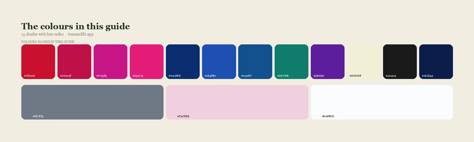
- True Red#C8102E
- Cool Cherry#C01048
- Fuchsia#C71585
- Hot Pink#E31C79
- Royal Blue#0A2D6E
- Cobalt#1E4FB0
- Sapphire#12508C
- Emerald#0E7C6B
- Pure Violet#5B1E9C
- Lemon Ice#F2F0D8
- True Black#1A1A1A
- True Navy#0C1E4A
- Cool Slate Grey#6E7885
- Icy Pink#F0CFDE
- Optic White#FAFBFD
Neutrals
Ready to find your season?
The free web tool names your season from one selfie, with no sign-up. The app's scan is free too and shows your undertone, best metals and starter colors; your season and full palette in the app are an optional upgrade.
Find my season free → Get the app ↗FAQ
What colors should a Bright Winter avoid?
Three groups cause the most trouble. Warm earthy tones such as peach, coral, and camel. Muted dusty pastels such as dusty rose, sage, and taupe. And off white or cream neutrals. Every one of them is either too warm or too soft for coloring that is cool, clear, and high contrast.
Can a Bright Winter wear brown?
Most browns read muddy against Bright Winter's cool clarity, because brown is a warm, low chroma color by nature. A near black espresso can pass as a dark neutral in small doses, but true black and true navy do the same job with far more of your natural sharpness intact.
Can a Bright Winter wear pastels?
Only clear, cool pastels such as icy pink and lemon ice, which keep enough clarity to match your contrast. Muted, dusty pastels like dusty rose and sage are the ones to avoid, since softness rather than temperature is what fails on you.
What neutrals suit a Bright Winter?
True black, true navy, optic white, and cool slate grey do everything camel, beige, and cream do in a warmer wardrobe, while matching your cool undertone and keeping your contrast sharp. Beige is the neutral to retire first, since it is warm and flat at once.
Is cream off limits for a Bright Winter?
Close to it. Cream and ivory are warmed, softened versions of white, and next to crisp cool coloring they read dingy rather than gentle. Optic white gives you the same clean base with the clarity your coloring actually needs.
What if a color I love is on the avoid list?
Move it away from your face. Bottoms, shoes, and bags sit far enough from your skin that the clash stops mattering, and a cool colored scarf or collar between a wrong toned coat and your neckline does the same job for outerwear.
Can I check my color season from a photo?
Yes. The free Tone & Fit web tool reads your color season from one selfie in about 30 seconds, with no sign-up and no photo stored by us. It also tells you whether you land in Bright Winter or a neighbouring season. The Tone & Fit app for iPhone and Android then builds your full palette of 38 named shades.