Colors Cool Winters Should Avoid (and What to Wear Instead)
Knowing your palette is only half of it. The faster win, the one you can see in the mirror this afternoon, is knowing which four color families quietly drain you and what to reach for instead.
What's in this guide
A quick recalibration on Cool Winter
Cool Winter is the cool-dominant member of the Winter family. Coolness leads, depth and clarity follow. That single fact explains almost every entry on the list below, so it is worth holding onto before we get to specifics.
In the twelve-season system, each season is described by three measurements: undertone, value, and chroma. Our primer on seasonal color analysis walks through all three. Cool Winter measures cool on undertone with no wiggle room, medium to deep on value, and moderately high on chroma. It sits on the bridge between Winter and Summer, which is why its palette allows some slightly softer blues and pinks that a True Winter would find too quiet. What it does not allow, at any point on that bridge, is warmth.
The practical consequence is that Cool Winter has one of the least forgiving undertone rules in the whole system. A Soft Autumn can cheat toward cool and get away with it because muting hides the mismatch. A Cool Winter cannot, because the palette's clarity puts every color under a spotlight. If you have not yet confirmed your season, our guide to whether you are a Cool Winter lists the seven tells, and the wider 12 color seasons overview maps where you sit relative to your neighbors.
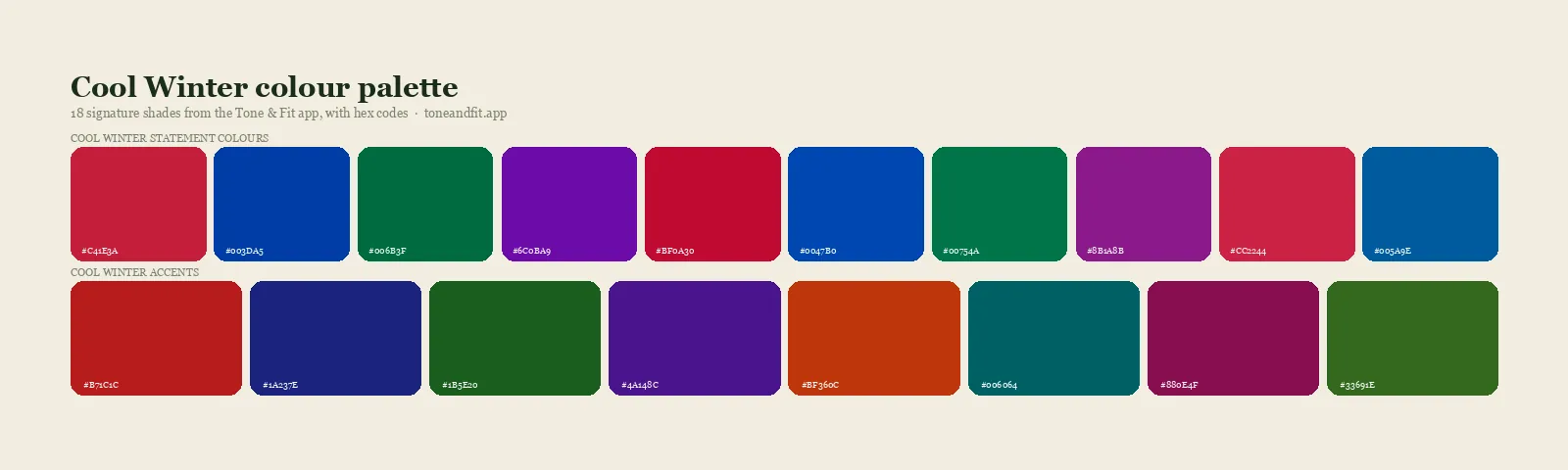
The Cool Winter direction: navy, cool berry, blue-red, icy lavender, deep teal, and true black.
The four families that fight you
Every problem shade for a Cool Winter falls into one of four groups. Learn the groups and you will not need to memorize individual colors.
1. Golden warm colors
Mustard, marigold, terracotta, rust, coral, peach, apricot, orange, and warm yellow-greens. These carry visible yellow, and yellow next to a blue-based skin tone creates the specific clash that reads as sallowness. This is the largest and most damaging family, and it is where most accidental purchases live. Our explainer on warm versus cool skin undertones covers the underlying mechanism if you want the theory.
2. Muted and dusty colors
Sage, dusty rose, mushroom, moss, greyed lavender, and most of what gets sold as a soft neutral palette. These are not warm, so they do not make you look sallow. They do something quieter and arguably worse: they flatten you. Cool Winter features are built for contrast, and a dusty color removes the contrast without replacing it with anything.
3. Warm neutrals
Camel, beige, oatmeal, tan, khaki, cream, ivory, and warm browns. Neutrals feel safe, which is exactly why this family does so much damage. Nobody scrutinizes a beige coat the way they scrutinize an orange dress, so the beige coat stays in rotation for years while quietly dulling every outfit it touches.
4. Mid-value, low-contrast combinations
This one is about pairing rather than any single color. Two medium tones of similar depth worn together, say a medium grey top with medium blue trousers, produce a flat block that a Cool Winter's natural contrast fights against. The individual colors may be perfectly correct and the outfit still falls short.
The worst offenders, ranked, with swaps
Here are the individual shades that cause the most trouble in practice, roughly in order of how much damage they do, each with the closest working substitute. Nothing on the right side of this table asks you to change your taste, only the temperature.
| Avoid | Why it fails | Wear instead |
|---|---|---|
| Olive green | Warm and muted at once, so it hits you twice | Pine green, emerald, deep teal |
| Orange-based red | Pulls yellow into the skin at close range | True red, blue-red, cool cherry |
| Camel and tan | Warm neutral that greys out cool skin | Grey taupe, charcoal, cool stone |
| Mustard | The most concentrated yellow in most closets | Icy lemon, or skip yellow near the face |
| Coral and peach | Warm pink that turns skin ruddy | Fuchsia, magenta, cool berry |
| Cream and ivory | Yellow-based white that dulls the face | Optical white, icy grey-white |
| Sage and dusty rose | Too muted to hold your contrast | Icy mint, icy pink, cool raspberry |
| Chestnut and caramel brown | Red and gold sitting inside the brown | Cool chocolate, espresso, near-black |
Notice the pattern in the right-hand column. The substitute is almost never a different color, it is the same color with the gold removed. That is the whole discipline of dressing a cool palette, and it is much less restrictive than the avoid list first suggests. The full set of workable shades lives in our Cool Winter color palette guide, and our Cool Winter outfit ideas show the swaps assembled into real looks.
Not certain you are a Cool Winter?
An avoid list is only useful if the season is right. Tone & Fit's AI measures your undertone, value, and chroma from one selfie and returns your season with a full palette in 60 seconds.
Try the App ↗Colors people wrongly avoid
Three shades get blamed for problems they did not cause. Before you donate anything, check that it is not one of these.
Black. Cool Winter wears black better than almost any other season, and the internet's blanket warnings about black are aimed at Springs and Autumns. If black feels harsh on you, the usual culprit is the second color in the outfit rather than the black itself. Black with camel is a problem. Black with optical white, true red, or icy blue is a signature.
Grey. Grey has a reputation for being draining, but cool grey in a deep or very light value is one of the most useful neutrals in your wardrobe. Only medium warm-leaning greys, the ones with a brown or greenish cast, cause trouble. Hold a grey garment next to a piece of white printer paper: if the grey looks slightly beige by comparison, it is the wrong grey.
Pink. Cool Winters are often told to avoid pink after one bad experience with a warm blush tone. The correct read is narrower. Peachy and salmon pinks are out. Fuchsia, magenta, raspberry, and icy pink are among your strongest colors, and they sit in the part of the palette that distinguishes you from your neighbors. If pink has never worked for you, our breakdown of colors that wash you out explains the four separate mechanisms behind that feeling, only one of which is undertone.
Hair, makeup, and metals
The avoid list matters most within about a foot of your face, which is why these three categories deserve their own pass. A single wrong choice here outweighs several wrong choices in a wardrobe.
Metals
Yellow gold is the clearest miss for a Cool Winter. It adds exactly the warmth your skin is not built to absorb, and unlike a sweater it sits directly against your neck and wrists. Silver, white gold, and platinum reflect cool light upward and sharpen your features instead. Rose gold is a maybe, workable in small amounts on some Cool Winters and unflattering on others, so test it individually rather than assuming. If you are not sure which way your skin swings, our gold or silver jewelry test is the fastest at-home read, and the step-by-step method in how to find your skin undertone at home gives you a second opinion.
Hair
Golden blonde, caramel, honey, copper, and warm chestnut are the shades most likely to undo a correct wardrobe, because hair frames the face continuously. Ash blonde, cool dark brown, espresso, blue-black, and soft black all support the palette. Highlights should be cool and relatively low in contrast against the base, since your face already supplies the contrast. Our Cool Winter hair color guide has specific shade names to bring to a colorist, and the best hair color for your skin tone covers the general principle across all seasons.
Makeup
Bronzer is the leading offender, followed by peach blush, orange-red lipstick, warm gold eyeshadow, and any foundation with a yellow or golden base. The cool substitutes are a cool-toned contour rather than a warm bronzer, a berry or cool pink blush, a blue-based red or plum lip, and silvery or charcoal shadow. Foundation deserves particular care because it covers the largest area: a base half a step too warm will fight every correct choice you make on top of it. Full detail sits in our Cool Winter makeup guide.
How to rescue a color you love
An avoid list is not a disposal list. Three techniques let you keep most of what you already own.
Move it below the waist. Undertone conflict is a proximity effect. It happens because light bounces off the fabric onto your skin. A camel trouser or a rust skirt is far enough from your face that the reflection never reaches you. Wrong colors are almost always fine as bottoms, shoes, and bags.
Put a correct color between it and your face. A warm coat worn open over a true red or optical white top is fine, because the layer touching your neckline is doing the work. The same logic makes scarves the single most efficient correction tool you can own.
Find the cool cousin. Nearly every avoid-list shade has a cooler relative that keeps the mood. If you love rust, deep burgundy gives you the same autumnal weight. If you love sage, deep pine or cool grey-green gives you the same calm. If you love cream, a cool ivory or icy grey-white gives you the same softness. You are not being asked to give up a look, only to shift its temperature by a few degrees.
The goal is not a closet with nothing wrong in it. It is a closet where everything within a foot of your face is right.
A 20 minute closet audit
Do this once and you will not need to think about it again for a season.
- Pull out only the items that touch your face: tops, knitwear, scarves, collared shirts, and jackets you wear zipped. Ignore everything else for now.
- Take the pile to indirect daylight near a window. Artificial light, particularly warm bulbs, will lie to you.
- Hold each item under your chin and watch the area beneath your eyes rather than the garment. Shadows deepening or skin turning slightly grey means the color is wrong, regardless of how good the item looks on the hanger.
- Sort into three piles: keep near the face, demote to bottoms and accessories, and let go.
- Note which shades keep landing in the demote pile. That pattern is your personal shopping filter, and it is usually two or three specific colors rather than an entire family.
If a large share of your pile lands in the demote pile, that is worth a second look at the diagnosis rather than a shopping spree. Cool Winter is commonly confused with two neighbors. Compare against Cool Winter versus True Winter if bright colors feel a little strong on you, and against Cool Winter versus Cool Summer if deep colors feel heavy. Seeing the season on real faces helps too, which is what our roundup of Cool Winter celebrities is for.
And if you would rather not adjudicate this yourself, that is a reasonable position. Judging undertone on your own face is genuinely difficult, since your brain corrects for color constancy faster than your eye can register the shift. Our comparison of a color analysis app versus a consultant weighs both routes, the Winter color palette guide covers what the whole family shares, and the complete personal color analysis guide ties the system together end to end.
Ready to find your season?
One selfie, your 12-season result, and the palette that goes with it. Free, no sign-up.
Find your season free ↗For the underlying reading, our skin tone analyzer explains what undertone, depth and contrast actually are.
FAQ
What colors should a Cool Winter avoid?
Four families cause the most trouble. Golden warm colors such as mustard, terracotta, coral, and orange. Muted dusty colors such as sage, dusty rose, and greyed pastels. Warm neutrals such as camel, beige, cream, and warm brown. And mid-value low-contrast combinations that flatten a face built for sharp contrast. Olive green and orange-based red are the two single worst offenders.
Can a Cool Winter wear beige?
Not the classic warm beige, camel, or oatmeal shades, which pull yellow against cool skin and leave the face looking sallow. The workable substitutes are taupe with a grey base, light charcoal, and cool stone grey. These give the same soft neutral role in an outfit without adding warmth near the face.
Can a Cool Winter wear brown?
Only cool, deep versions. Chocolate brown with a cool cast, espresso, and near-black brown work because they read as dark neutrals. Chestnut, tan, caramel, and any brown with visible red or gold in it will fight your undertone. If a brown looks warm and inviting on the hanger, it is usually the wrong brown for a Cool Winter.
Is black bad for a Cool Winter?
No. Black is one of the few colors Winters wear better than any other season, and Cool Winter is no exception. The mistake is not black itself but pairing it with a warm or dusty second color. Black plus optical white, black plus true red, or black plus icy blue all work. Black plus camel does not.
Why does gold jewelry look wrong on a Cool Winter?
Yellow gold adds warmth to a face whose skin has a blue or pink base, so it creates the same clash as a mustard sweater but sits even closer to your face. Silver, white gold, and platinum reflect cool light back and sharpen your features instead. If you love the look of gold, keep it below the collarbone where it is not competing with your skin.
What if a color I love is on the avoid list?
Move it away from your face rather than out of your closet. Trousers, skirts, shoes, and bags sit far enough from your skin that undertone conflict stops mattering. You can also look for a cooler version of the same color, since most avoid-list shades have a cool cousin that keeps the mood and drops the gold.