Soft Autumn Colors to Avoid and Wear Instead
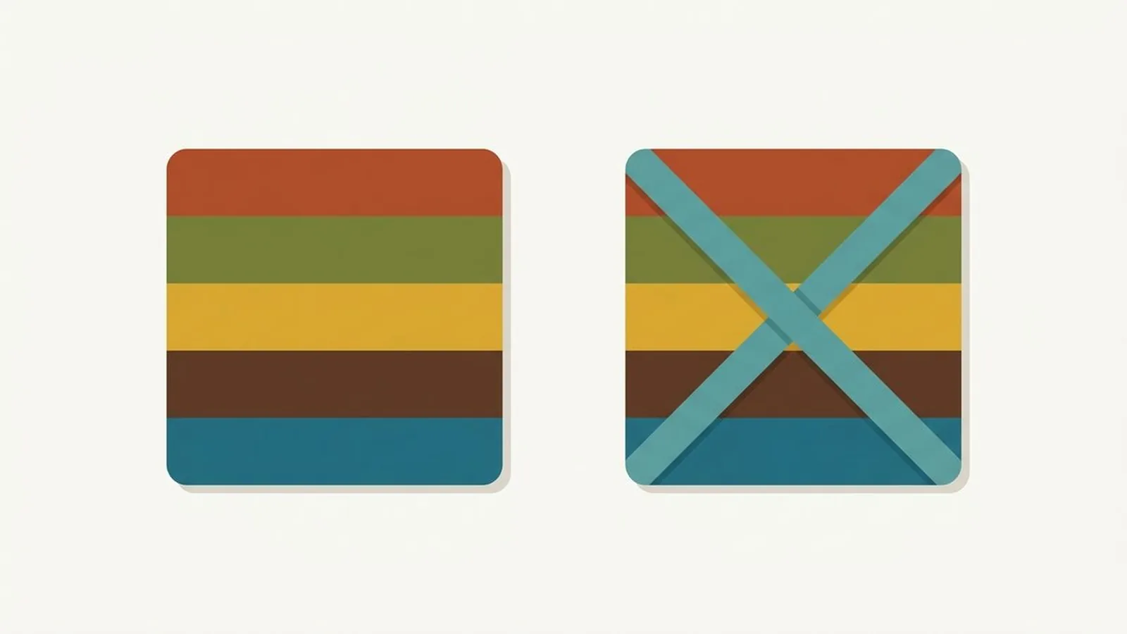
Fire engine red, hot fuchsia, true black, and stark white are the four colors that fight a Soft Autumn hardest, and every one of them fails for the same reason. Your coloring is warm, blended, and quietly muted, and each of those four colors is either too bright, too icy, or too extreme for a palette built on softness.
What's in this guide
A quick recalibration on Soft Autumn
Soft Autumn is the most muted season in the entire twelve season system, tied only with its cool counterpart Soft Summer. In the twelve season system, three variables describe every season: undertone, value, and chroma. Soft Autumn measures neutral warm on undertone, light to medium on value, and low, the most muted setting available, on chroma. If you have not confirmed the season yet, our guide to whether you are a Soft Autumn lists the tells, and our primer on seasonal color analysis explains what those three measurements mean in more depth.
That combination, gentle warmth plus the lowest chroma of any season, is what predicts nearly everything on the avoid list below. Soft Autumn borders Soft Summer, which is why the two are so often confused, and if cooler, greyer versions of these shades keep looking better on you than the warm ones ahead, our Soft Autumn versus Soft Summer comparison is worth reading before you commit either way. What Soft Autumn cannot borrow from any neighbor is intensity. Bright, saturated, or high contrast colors overwhelm this palette faster than they overwhelm any other season's.
Here is your actual direction, copied straight from the Soft Autumn palette, so you have something concrete to hold the avoid list against.

- Soft Gold#9C8A5E
- Sage#7E8B6A
- Toasted Coral#B07A66
- Salmon#C08C74
- Muted Teal#6F8378
- Soft Olive#7A7A55
- Dusty Peach#CBA183
- Warm Grey-Green#808873
- Soft Burgundy#7E4B4B
Every color on this list has been mixed with a little grey brown, and that is exactly what tames it enough to sit next to your face. See the full Soft Autumn color palette for outfit level detail, or the Soft Autumn section of the Autumn palette hub for how it compares with Warm Autumn and Deep Autumn.
The three groups that work against you
Every problem color for a Soft Autumn falls into one of three groups: too bright, too icy, or too extreme. Learn the groups and the individual shades stop mattering.
1. Bright, highly saturated colors
True red, hot fuchsia, cobalt blue, and any neon. Soft Autumn's chroma is the lowest of any season, so a fully saturated color does not read as bold on you, it reads as louder than your face, and the outfit ends up doing the talking instead of you. This is the single biggest failure mode for the season, more common than getting the undertone wrong.
2. Icy, cool pastels
Baby pink, powder blue, and icy lavender. These fail on two counts at once: they are cool against a warm undertone, and they are pale and clear against a season that wants everything softened and blended. Our explainer on warm versus cool skin undertones covers the undertone half of this problem in detail.
3. Stark, high contrast extremes
True black and bright, optical white. Both sit at opposite ends of the value scale, and both create sharp, defined contrast that fights a season built on gentle, blended transitions. Soft Autumn is a low contrast season by definition, and nothing raises contrast faster than pairing true black or true white with your skin.
The worst offenders, ranked, with swaps
Here are the individual shades that cause the most visible damage, roughly ordered by how much trouble they cause, each paired with the closest working substitute from your own palette. The goal is never to give up a color family, only to turn its intensity down until it matches you.
| Avoid | Why it fails | Wear instead |
|---|---|---|
| True red | Too clear and bright for the season's lowest chroma setting | Soft Burgundy, Toasted Coral |
| Hot fuchsia | Cool and blazing, the opposite of soft warmth | Dusty Peach, Salmon |
| Cobalt blue | Cool and vivid against a warm, muted undertone | Muted Teal |
| Icy lavender | Cool and pale, drains warm muted skin | Soft Burgundy |
| Baby pink | Too cool and too delicate for a warm, blended palette | Dusty Peach |
| True black | Stark contrast against a naturally low contrast look | Soft Olive, deep warm brown |
| Optical white | Too stark and too bright for gentle, blended coloring | Warm Grey-Green, soft ivory |
| Clear emerald green | Too cool and too clear next to warm, muted skin | Sage, Muted Teal |
| Silver jewelry | Cool metal against a warm undertone | Antique gold, warm brass |
| Neon anything | Chroma far beyond this season's lowest ceiling | Soft Gold, Salmon |
Not certain you are a Soft Autumn?
The free web tool names your season from one selfie, with no sign-up. The app's scan is free too and shows your undertone, best metals and starter colors; your season and full palette in the app are an optional upgrade.
Find my season free → Get the app ↗Black, white, and your real neutrals
Black and white are not equally bad for a Soft Autumn, but neither one is your neutral, and each fails in its own way.
Black's problem is contrast rather than warmth, since black itself has no undertone. Soft Autumn is one of the lowest contrast seasons in the whole system, meaning your hair, skin, and eyes naturally sit close together in depth, and true black creates a jump far bigger than anything your own face produces. The result is a face that looks washed out or harsh by comparison rather than framed. White's problem is starkness: optical white is treated with a blue brightener that reads as cool and glaring against warm, blended coloring, even though white itself is fairly light in value.
Your real neutrals sit in the middle of both scales. Warm taupe, soft camel, warm grey green, and a gentle warm ivory do everything black and white are supposed to do, and they do it while matching your undertone and your low chroma instead of overshooting it. Reach for these first when you want a base that lets the rest of your palette do the work.
Colors people wrongly avoid
A few shades get cut from Soft Autumn wardrobes for reasons that fall apart once you look at the actual palette. These are worth a second look.
Red. Many Soft Autumns hear "muted" and assume red is off the table entirely. It is clear, blue based red that fails, not red itself. A soft burgundy or a toasted brick red carries the same warmth and depth as a bold red, with the saturation dialed back to match your coloring, and it is one of the most flattering colors this season owns.
Green. Muted gets misheard as drab, so green sometimes gets dropped altogether. Sage and soft olive are quietly some of the best neutrals available to this season, precisely because they carry warmth and softness at once. The green to avoid is a clear, cool kelly green, not the family as a whole.
Pink. Cool baby pink is the version that fails, but a warm, dusty peach or a muted salmon pink is squarely inside your palette and gives you the same softness without the undertone conflict.
The exceptions: wearing a wrong color anyway
Yes, almost any color on this list still has a place in your closet, just not close to your face. Chroma and contrast conflicts are proximity effects, meaning they happen because light bounces off fabric and lands on your skin, so distance from your face matters more than the color itself.
Move it below the waist. A pair of true red trousers, a fuchsia bag, or black jeans sit far enough from your neckline that the reflected color never reaches your skin in a way that matters. Wrong colors are almost always fine as bottoms, shoes, and bags.
Put a correct color between it and your face. A black coat worn open over a soft gold or muted teal top is fine, because the fabric at your collarbone is doing the real work. A scarf is the single most efficient fix available to you.
Find the muted cousin. Nearly every avoid list color has a toned down relative inside your own palette. If you love the drama of true red, soft burgundy gives you the same warmth. If you love cobalt, muted teal gives you the same coolness with the saturation turned down. You are adjusting intensity, not giving up a mood.
Hair, makeup, and metals
The same bright versus muted, icy versus warm logic applies above the neckline, where the effect is stronger because nothing sits closer to your skin than what is on it.
Metals. Silver and white gold reflect cool light onto a face that runs warm, creating the same clash a cobalt scarf does, just closer to your skin. Antique gold, warm brass, and rose gold are your metals, and they look richer on you than they do on a cooler season. If you are still unsure of your undertone, our guide to finding your skin undertone at home covers the vein, jewelry, and daylight checks.
Hair. Flat, blue black and icy platinum both fight your coloring the same way a cobalt sweater does. Soft chestnut, warm caramel, and honey blonde work with your natural warmth and low contrast instead of against it, giving you dimension without a hard line between your hair and your skin.
Makeup. Blue based red lipstick and cool, ashy contour are the two most common misfires. Terracotta, warm rose, and a soft brick lip read far better, and a peachy blush does more for your face than a cool pink one ever will. Foundation matters just as much, since a base one shade too cool undoes everything layered on top of it.
Ready to find your season?
The free web tool names your season from one selfie, with no sign-up. The app's scan is free too and shows your undertone, best metals and starter colors; your season and full palette in the app are an optional upgrade.
Find my season free → Get the app ↗FAQ
What colors should a Soft Autumn avoid?
Three groups cause the most trouble: bright, highly saturated colors such as true red, fuchsia, and cobalt, icy cool pastels such as baby pink and powder blue, and the stark extremes of true black and optical white. Soft Autumn is the most muted season in the entire twelve season system, so anything vivid, icy, or high contrast overwhelms its naturally soft, blended coloring.
Can a Soft Autumn wear black?
Not comfortably at the face. Black creates far more contrast than a Soft Autumn's low contrast, blended coloring is built for, which makes features look harsh or washed out by comparison rather than defined. Soft olive, warm charcoal, or a deep muted brown give you the same grounding weight without the shock. Black still works as trousers, shoes, or a bag.
Can a Soft Autumn wear red?
Only in a muted, warm version. A clear, fire engine red carries more chroma than this season's palette can support, and it can read as costume like against soft, gentle coloring. A soft burgundy or a toasted brick red gives you the same warmth and depth with the intensity turned down to match you.
What neutrals suit a Soft Autumn?
Warm taupe, soft camel, warm grey green, and a gentle warm ivory do the work that black and stark white do for higher contrast seasons. They carry your season's warm undertone and muted chroma instead of fighting them, and they make the rest of your palette look richer by comparison rather than competing with it.
Is white off limits for a Soft Autumn?
Bright, optical white is the version to avoid, since its blue brightener adds a coolness and a starkness this warm, muted palette was not built for. A soft warm ivory or an oatmeal white gives you the same clean base without the shock, and it blends with the rest of your coloring instead of interrupting it.
What if a color I love is on the avoid list?
Move it away from your face rather than out of your closet. Trousers, shoes, and bags sit far enough from your skin that chroma and contrast conflicts stop mattering. You can also look for the muted, warm cousin of the shade inside your own palette, which usually keeps the color's mood while dialing back the intensity that was causing the problem.
Can I check my color season from a photo?
Yes. The free Tone & Fit web tool reads your color season from one selfie in about 30 seconds, with no sign-up and no photo stored by us. It also tells you whether you land in Soft Autumn or a neighbouring season. The Tone & Fit app for iPhone and Android then builds your full palette of 38 named shades.