Best Neutrals for Every Color Season
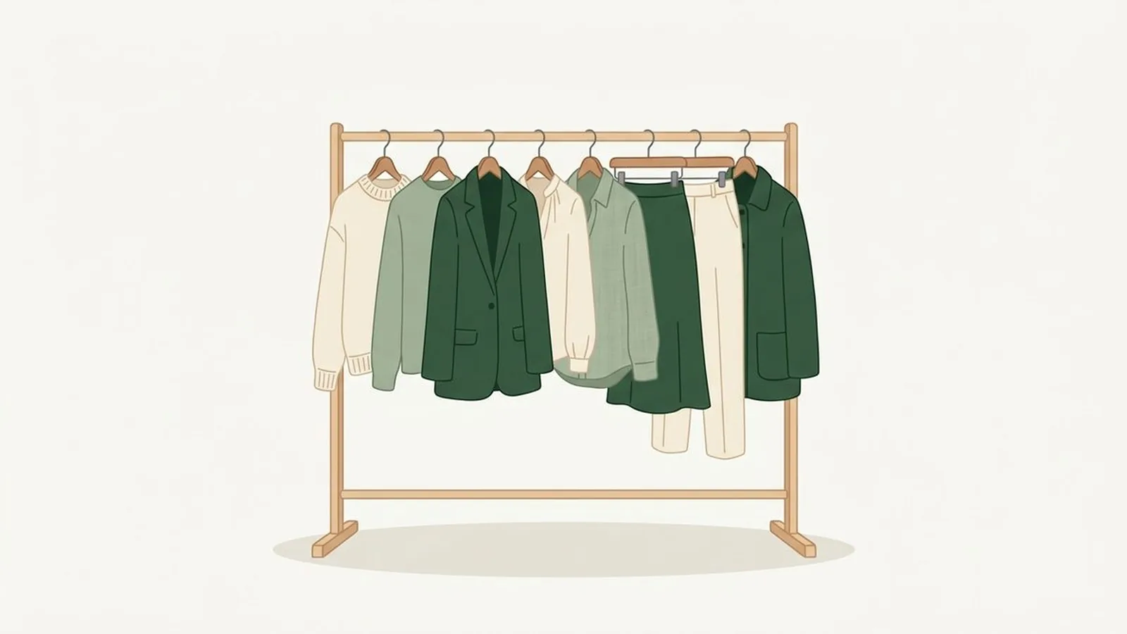
The best neutrals for your color season are whichever whites, greys, navys, and darks match your undertone's temperature, not simply whatever is lightest, darkest, or most "classic." A warm season's best neutrals are warm ivory, camel, and espresso instead of black; a cool season's best neutrals are crisp white, true black, and charcoal instead of camel or cream.
What's in this guide
What makes a neutral "right" for your season
A neutral is "right" when its undertone matches your own, not when it is simply beige, grey, black, or white. Every neutral color, even something as plain as a grey trouser or a white shirt, carries a temperature: warm neutrals lean golden or peachy underneath, cool neutrals lean blue or ash underneath. Wear the wrong temperature and even a "safe" neutral can make skin look tired, exactly the way the wrong bright color would.
This is easiest to see side by side. Bright Spring's neutral set is built entirely around warmth, right down to the near-black it uses instead of true black. True Winter's neutral set is built entirely around coolness, right down to the white it uses instead of cream.

- True White#FFFFFF
- Cream#F5EDD8
- Camel#C79A5B
- Warm Grey#9A948C
- Warm Navy#26324D
- Espresso#2B211C
Bright Spring's neutrals: warm end to end, including the near-black espresso it uses instead of true black.
- True Black#1A1A1A
- True Navy#0C1E4A
- Cool Slate Grey#6E7885
- Icy Pink#F0CFDE
- Optic White#FAFBFD
True Winter's neutrals: cool end to end, including the icy pink it uses as a light accent instead of cream.
Every other seasonal capsule sits somewhere between these two extremes, and the exact position is what the rest of this guide maps out. If you have not built the full wardrobe around your season yet, our guide to the capsule wardrobe by color season covers the neutral, signature, and accent layers together.
Best neutrals by season: the quick-reference table
Here is the fastest way to find your own row. "Power neutral" means the darkest, most grounding shade your season wears well, the one you reach for instead of a plain black blazer or trouser.
| Subtype | Lightest neutral | Power neutral | Best metal |
|---|---|---|---|
| Light Spring | Warm ivory | Light camel | Light, polished gold |
| True Spring | Cream | Dark chocolate brown | Warm, honey-toned gold |
| Bright Spring | True white | Warm espresso | Bright polished gold |
| Light Summer | Soft white | Soft navy | Light polished silver |
| True Summer | Cool taupe | Soft charcoal or navy | Bright cool silver |
| Soft Summer | Greige | Soft charcoal | Brushed silver, pewter |
| Warm Autumn | Warm ivory | Espresso | Rich yellow gold |
| Soft Autumn | Soft cream | Warm taupe | Soft brushed gold |
| Deep Autumn | Soft cream | Espresso, dark chocolate | Antique gold, copper |
| Cool Winter | Crisp white | Charcoal, blue-black | Bright silver |
| Deep Winter | Icy blue accent | True black | Silver, gunmetal |
| True Winter | Optic white | Pure black | Brightest polished silver |
Two patterns are worth noticing before you jump to your own row. First, every "power neutral" in the warm half of the table (Spring and Autumn) is a brown of some depth, never a true black. Second, the darkest, starkest neutrals in the whole system belong to the Winters, and even among the three Winters, only Deep Winter and True Winter treat pure black as a best-case shade; Cool Winter leans toward charcoal or blue-black instead.
Neutrals for each season, in detail
The table above is the shortcut. Here is the reasoning behind each row, family by family.
Spring neutrals: warm, and never darker than they need to be
All three Springs share a warm, golden undertone, so every Spring neutral leans toward ivory, camel, and gold rather than white, grey, and silver. Light Spring stays palest: warm ivory, champagne, light camel, and shell pink, with nothing darker than a medium camel in outerwear. True Spring sits in the middle with camel, warm beige, golden brown, and warm khaki, and reaches for dark chocolate brown, not black, when it wants a strong dark neutral; that subtype does not yet have its own guide on this site, but the Spring palette hub covers it in full. Bright Spring is the outlier: it is the one Spring that can also wear a clean true white, and the one Spring with a near-black option at all, a warm espresso rather than a cold jet black.
Summer neutrals: cool, and softened rather than stark
All three Summers share a cool, blue-based undertone, but unlike the Winters, none of them want their neutrals at full stark contrast. Light Summer stays softest: soft white, dove grey, light taupe, and soft navy, avoiding true black or a stark optic white near the face entirely. True Summer can go a shade stronger, with soft navy, blue-grey, cool taupe, and charcoal, and treats soft charcoal or navy as its answer to a power neutral. Soft Summer leans on brown-adjacent neutrals more than the other two, greige, mushroom, and muted navy, as long as every one of them stays cool and greyed rather than warm.
Autumn neutrals: warm, and comfortable going dark
All three Autumns share a warm undertone with the Springs, but they carry it at a deeper, earthier value, so their neutrals run darker across the board. Warm Autumn's set, camel, chocolate brown, warm ivory, and olive, is covered on the Autumn palette hub rather than its own guide for now. Soft Autumn leans on blended, muted neutrals: mushroom, warm taupe, soft cream, and muted khaki. Deep Autumn is the Autumn built for real depth, espresso, dark chocolate, deep olive, and aubergine, and it is the one Autumn that can wear a near-black neutral, as long as that black stays warm rather than turning cold and jet.
Winter neutrals: cool, and the only family built for true black
All three Winters share the coolest undertone of any family, and Winter is the only family where true black and crisp white both function as genuine best-case neutrals rather than substitutes. Cool Winter favors charcoal, cool navy, crisp white, and blue-black over a flat jet black. Deep Winter is, by this site's own reckoning, the season that wears jet black better than any other, alongside dark charcoal and midnight navy. True Winter wants its neutrals at their starkest and cleanest of all: pure black, optic white, and true navy, since anything softened or greyed down loses the clarity that defines the season.
Skip the guessing and get your exact neutrals.
Tone & Fit's AI reads your undertone, value, and chroma from a selfie and hands you your full palette, neutrals included, in 60 seconds.
Try the App ↗Why black is not a universal neutral
Black is not a universal neutral because it is a cool, extremely dark color, and only the three Winter seasons combine both a cool undertone and enough natural depth to match it without a fight. On a warm or lighter face, pure black can sit like a hole cut out of the outfit: the eye lands on the contrast between the fabric and the skin rather than on the person wearing it. That is not a styling opinion, it is the same undertone mismatch that would happen if you put a warm face in an icy blue instead of a golden yellow, just applied to a neutral instead of a bright color.
This is exactly why the table above gives almost every non-Winter season its own "power neutral" rather than defaulting to black. A Spring or Autumn substitutes a warm dark brown, dark chocolate, espresso, or aubergine, because brown carries the same warmth as the rest of that season's palette even at a near-black depth. A Summer substitutes a softened dark, soft charcoal or a muted navy, because it keeps the coolness without black's harsh, high-contrast edge. Only Deep Winter and True Winter get to skip the substitution entirely, and even Cool Winter, a fellow Winter, tends to prefer charcoal or blue-black over a flat jet black.
The metals that match your neutrals
Metal is the accessory version of a neutral, and it follows the same warm-or-cool rule as your clothing. Spring and Autumn, the two warm families, are built for gold. Summer and Winter, the two cool families, are built for silver. Within each family, the finish tracks depth and intensity the same way the fabric neutrals do:
- Light Spring: light, polished gold or rose gold, kept delicate.
- True Spring: richer, honey-toned gold, slightly antiqued.
- Bright Spring: bright, polished gold, the one Spring that can mix in a little silver.
- Light Summer: light, polished silver or white gold.
- True Summer: brighter cool silver or platinum.
- Soft Summer: brushed or matte silver and pewter, echoing its muted palette.
- Warm Autumn: rich yellow gold and gleaming copper.
- Soft Autumn: softer, brushed gold and matte bronze.
- Deep Autumn: antique gold, dark bronze, and burnished copper.
- Cool Winter: bright silver and white gold.
- Deep Winter: silver, gunmetal, and pewter for presence.
- True Winter: the brightest, most polished silver and platinum.
The one metal move that fights almost every season is crossing families: a warm season in flat, bright silver, or a cool season in heavy yellow gold, tends to read the same way a wrong-temperature neutral does, slightly off in a way that is hard to name until you see the correct metal next to it.
How to check this on yourself
The fastest way to check any of this on yourself is to hold two versions of the same neutral, one warm and one cool, flat against your jaw in daylight and watch which one your skin does not fight. Try a warm ivory against a stark optic white, or a soft camel against a cool taupe. The version that makes your skin look even and rested is your family; the one that looks slightly grey, sallow, or flat is not.
If you want a faster, more precise answer than eyeballing fabric in a mirror, our color analysis quiz narrows down your season in about two minutes with no photo required, and the free photo analysis tool reads your undertone, value, and chroma directly from a selfie and returns your full palette, neutrals included. Either one turns this guide's table into a single row that is actually yours.
Ready to find your season?
One selfie, your 12-season result, and the palette that goes with it. Free, no sign-up.
Find your season free ↗Once your neutrals are settled, the rest of the wardrobe follows the same logic. Our guide to shopping your color palette without losing your mind covers how to judge a color under store lighting, and the full palette hub has every season's complete color set in one place.
FAQ
What are the best neutrals for a warm color season?
Warm seasons do best in neutrals with a golden or peachy base: warm ivory or cream instead of stark white, camel or warm beige instead of grey, and chocolate brown or espresso instead of black. Which exact shade depends on your subtype: Light Spring stays soft and pale, True Spring and Warm Autumn sit in the middle, and Bright Spring or Deep Autumn can go as dark as a warm near-black.
What are the best neutrals for a cool color season?
Cool seasons do best in neutrals with a blue or grey base: crisp or optic white instead of cream, cool grey or charcoal instead of camel, and true navy or true black instead of chocolate brown. Light Summer keeps these soft and muted, True Winter and Deep Winter take them to their starkest, and Cool Winter and Soft Summer sit in between.
Is black a neutral for every color season?
No. Pure black is a true neutral mainly for the three Winters, especially Deep Winter, which wears jet black better than any other season. Every warm season and most Summers look better in a substitute: dark chocolate or espresso for Spring and Autumn, and soft charcoal or navy for Summer, all of which do the same grounding job without draining the face.
What neutral should replace black if I'm not a Winter?
Match your family. Springs and Autumns replace black with a warm dark neutral: dark chocolate brown, espresso, or aubergine, all of which read as rich rather than heavy near a warm face. Summers replace it with a softened dark neutral: soft charcoal or a muted navy, which keeps the coolness without the harsh, high-contrast edge of true black.
Do neutrals matter more than signature colors?
For everyday cost-per-wear, yes. Neutrals make up roughly 60 percent of a working wardrobe, pants, blazers, coats, and basic tops, so a mismatched neutral undermines every outfit built on top of it. Signature colors get the compliments, but the right neutrals are what make an entire closet mix and match in the first place.
What metal goes with my neutrals?
Warm seasons, Spring and Autumn, pair their neutrals with gold: light and rosy for Light Spring, rich and honeyed for True Spring and Warm Autumn, antiqued or bright for the deeper subtypes. Cool seasons, Summer and Winter, pair theirs with silver: soft and brushed for the muted subtypes, bright polished silver or platinum for True Winter and True Summer.
Can I check my color season from a photo?
Yes. The free Tone & Fit web tool reads your color season from one selfie in about 30 seconds, with no sign-up and no photo stored by us. The Tone & Fit app for iPhone and Android then builds your full palette of 38 named shades.