Soft Summer Colors to Avoid and Wear Instead
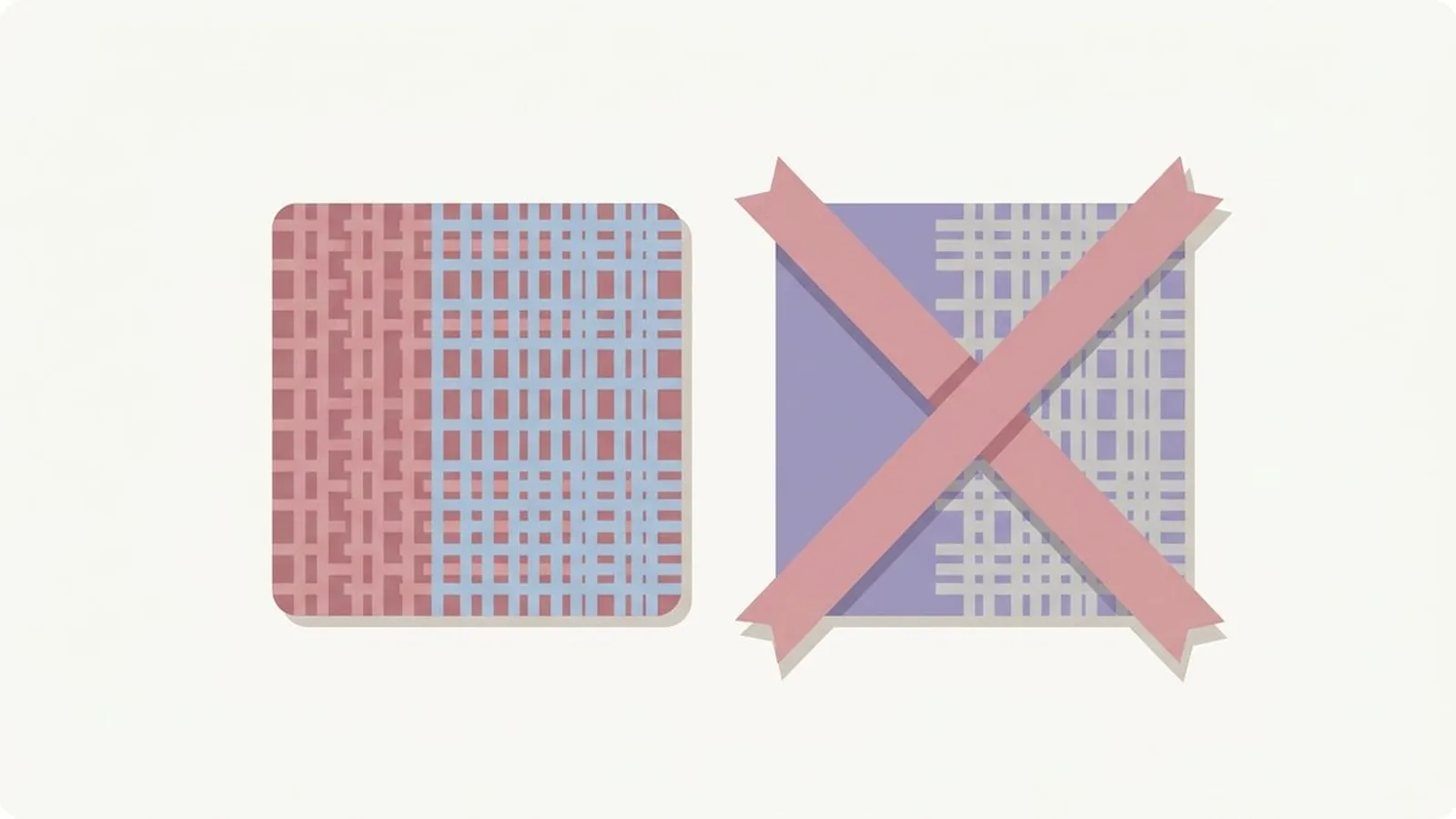
Soft Summer's worst offenders are tomato red, mustard yellow, neon pink, and true black or white, and every one of them fights against the same three things your coloring actually has. Softness, a cool undertone, and naturally low to medium contrast are what make you a Soft Summer, and each of those colors attacks at least one of them directly.
What's in this guide
A quick recap on Soft Summer
Soft Summer is the most muted member of the Summer family, and mutedness is the trait that decides almost everything on the avoid list below. In the twelve-season system, every season is described by three measurements: undertone, value, and chroma, which our primer on seasonal color analysis covers in full. Soft Summer measures cool on undertone, light to medium on value, and soft on chroma, meaning greyed and gentle rather than clear or saturated. If you have not confirmed the season for yourself yet, our Soft Summer signs guide lists the tells to check.
That soft chroma is the part people underestimate. Most seasonal advice focuses on warm versus cool, so a Soft Summer assumes any cool color is safe. It is not. A clear, saturated cool color can be just as wrong as a warm one, because the real requirement is softness on top of coolness. For contrast, here is the direction the palette actually points, all copied straight from our full Soft Summer color palette guide.
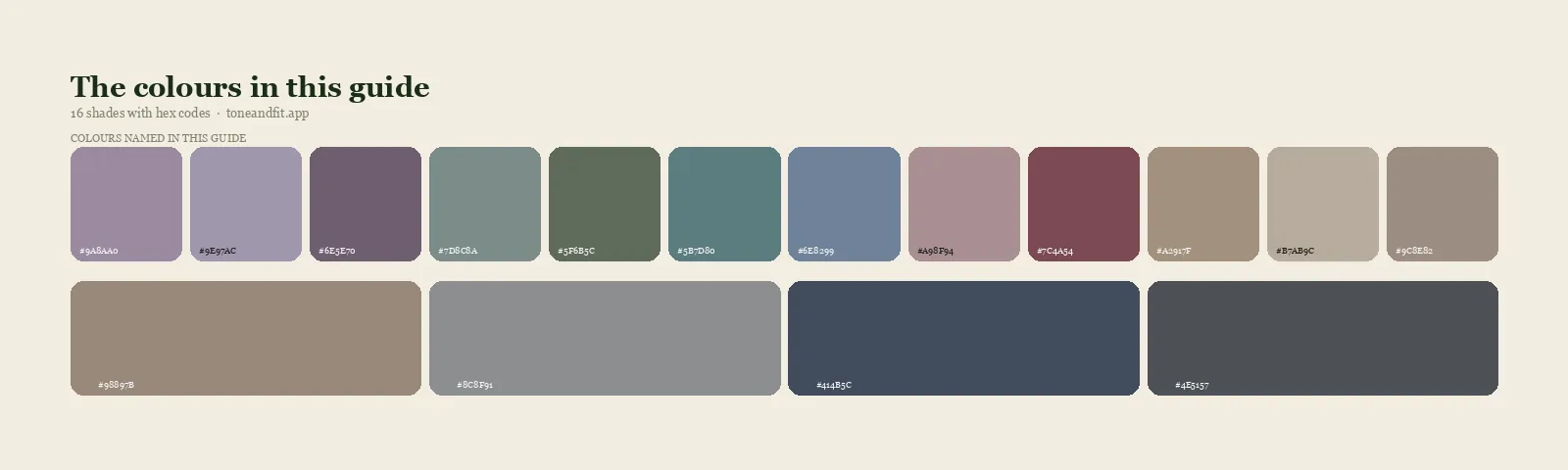
- Dusty Mauve#9A8AA0
- Greyed Lavender#9E97AC
- Soft Plum#6E5E70
- Sage Grey#7D8C8A
- Muted Spruce#5F6B5C
- Smoky Teal#5B7D80
- Denim Blue#6E8299
- Rosewood#A98F94
- Soft Burgundy#7C4A54
- Cool Taupe#A2917F
- Greige#B7AB9C
- Mushroom#9C8E82
- Warm-Grey Taupe#98897B
- Pewter#8C8F91
- Muted Navy#414B5C
- Soft Charcoal#4E5157
Neutrals & anchors
The four families that fight you
Every problem shade for a Soft Summer falls into one of four groups. Learn the groups and you stop needing to memorize individual colors.
1. Warm, saturated brights
Tomato red, bright orange, golden yellow, and hot coral. These fail on two fronts at once: they are warm against your cool undertone, and they are saturated against your soft chroma. Against gentle, muted coloring, a warm bright does not look energetic. It looks like it belongs to someone else's face, and it drags attention to the garment instead of the person wearing it.
2. Icy, clear cool brights
True fuchsia, electric blue, cobalt, and neon pink. These are the sneaky ones, because the temperature is correct. They are cool, so a Soft Summer assumes they are safe. They fail on chroma instead: a clear, high-voltage cool color is just as loud against soft coloring as a warm one, only in a different direction. Our explainer on warm versus cool skin undertone covers temperature on its own, but temperature is only half the equation here.
3. Warm, earthy, rustic tones
Rust, terracotta, mustard, and olive. These belong to the Autumn family, not yours, and they fail Soft Summer on undertone before chroma even enters the conversation. They can look rich on a warm season and simply muddy on a cool, soft one, dulling the skin rather than warming it.
4. Stark neutrals
Optical white and jet black. Soft Summer coloring usually sits at light to medium value with low to medium contrast, so both extremes read as harsher than your face can match. Black in particular gets treated as a safe default by nearly everyone, which is exactly why it does slow damage here: nobody questions a black sweater the way they question a neon one.
The worst offenders, ranked, with swaps
Here are the individual shades that cause the most trouble in practice, paired with the closest working substitute from the palette above. Nothing on the right asks you to abandon a color family, only to shift its saturation or temperature toward yours.
| Avoid | Why it fails | Wear instead |
|---|---|---|
| Tomato or fire engine red | Warm and clear, the opposite of cool and dusty | Soft Burgundy |
| Bright orange | Too warm and too saturated at once | Rosewood |
| Golden or mustard yellow | Warm and rich where you need cool and soft | Cool Taupe |
| Hot coral or bright pink | A saturated warm pink fights a soft cool face | Dusty Mauve |
| True fuchsia or magenta | Cool, but far too clear and electric | Soft Plum |
| Electric or cobalt blue | Right temperature, wrong intensity | Denim Blue |
| Neon anything | No season this soft can carry true neon | Smoky Teal |
| Rust or terracotta | Warm, earthy, and too saturated | Soft Burgundy |
| Optical white | Blue-brightened glare against soft cool skin | Greige |
| Jet or pure black | Too stark for naturally low to medium contrast | Soft Charcoal |
Not certain you are a Soft Summer?
The free web tool names your season from one selfie, with no sign-up. The app's scan is free too and shows your undertone, best metals and starter colors; your season and full palette in the app are an optional upgrade.
Find my season free → Get the app ↗The exceptions: wearing a wrong color anyway
An avoid list is not a ban, and three techniques let you keep almost anything you already own.
Move it away from your face. Undertone and saturation conflicts are a proximity effect: light bounces off fabric and onto your skin, so the closer a color sits to your face, the more it matters. Bright trousers, a rust-colored bag, or black boots sit far enough from your skin that the reflection barely reaches you. Almost any "wrong" color is fine as a bottom, a shoe, or a bag.
Put a correct color between it and your face. A tomato red coat worn open over a soft plum or dove grey top still lets the fabric touching your neckline do the flattering work. This makes a scarf or a collared layer the single most efficient fix you can own, since it sits exactly where the conflict would otherwise happen.
Reach for the muted cousin. Nearly every avoid-list color has a softer, cooler relative already living in your palette. If you love hot pink, dusty mauve gives you the same warmth of feeling without the saturation. If you love cobalt, denim blue gives you the same cool confidence at a quieter volume. You are not giving up a color, only turning its dial down until it matches you.
Colors people wrongly avoid
Some shades get cut from Soft Summer wardrobes for reasons that fall apart once you look closely. These three are worth reclaiming.
Dusty rose and mauve pink. After hearing that bright pink is off limits, many Soft Summers avoid pink altogether. The muted, greyed pinks in this palette, like dusty mauve and rosewood, are actually signature colors for the season, not a compromise. The pink to skip is the clear, saturated one, not the soft one.
Navy. Navy has a reputation for being the safe, slightly boring choice, which leads some Soft Summers to reach past it for something louder. A properly muted navy is doing real work here: it is dark enough to anchor an outfit and cool enough to match your undertone without any of the harshness of black.
Grey. Grey gets dismissed as lifeless, but a cool, soft grey is one of the more flattering neutrals this season owns, precisely because it never fights your gentle contrast the way black or white can. Pewter and sage grey both read as sophisticated rather than dull once they are next to the right skin.
Ready to find your season?
The free web tool names your season from one selfie, with no sign-up. The app's scan is free too and shows your undertone, best metals and starter colors; your season and full palette in the app are an optional upgrade.
Find my season free → Get the app ↗Not sure the diagnosis is right in the first place? Compare against Soft Summer versus Light Summer or Soft Summer versus Soft Autumn, the two seasons most often confused with this one, or jump straight to the full Summer palette hub to see all three Summer sub-seasons side by side.
FAQ
What colors should a Soft Summer avoid?
Four families cause the most trouble. Warm saturated brights such as tomato red, bright orange, and hot coral. Icy clear cool brights such as true fuchsia, electric blue, and neon pink. Warm earthy tones such as rust, mustard, and olive. And stark neutrals such as optical white and jet black. The pattern underneath all four is the same: anything warm, overly saturated, or high contrast contradicts coloring that is cool, soft, and gentle.
Can a Soft Summer wear black?
In small doses, but it is not a natural neutral for this season. Black is dark and stark, while Soft Summer coloring is usually light to medium in value with low to medium contrast, so head-to-toe black can look like a harsh frame around a gentle face. Soft charcoal or muted navy do the same job with far less contrast shock. If you love black, wear it below the waist or with a soft color at your neckline.
Can a Soft Summer wear white?
Optical, blue-white white is one of the harder neutrals for this season, since its brightness and cool clarity fight the softness in your coloring. A greige or soft dove white gives you the same clean neutral without the glare. Save true white for pieces that sit away from your face, like trousers or shoes.
What neutrals suit a Soft Summer?
Greige, mushroom, pewter, muted navy, and soft charcoal are the core neutrals. They carry the same cool, muted quality as the rest of your palette, so they blend with your signature colors instead of competing with them. Cool taupe and warm-grey taupe both work as a softer, warmer-leaning option when you want a neutral with a touch more warmth.
Can a Soft Summer wear bright colors at all?
Rarely at full strength. The issue is usually not the hue itself but how saturated it is. A true, clear fuchsia is off limits, but a soft plum or dusty mauve in the same color family reads as elegant rather than harsh. If you love a bright color, look for its muted, greyed-down cousin rather than giving up the color family entirely.
What if a color I love is on the avoid list?
Move it away from your face rather than out of your closet. Bottoms, bags, and shoes sit far enough from your skin that the undertone and saturation conflict stops mattering as much. You can also look for a muted or cooled-down version of the same shade, since nearly every avoid-list color has a softer cousin inside the Soft Summer palette.
Can I check my color season from a photo?
Yes. The free Tone & Fit web tool reads your color season from one selfie in about 30 seconds, with no sign-up and no photo stored by us. It also tells you whether you land in Soft Summer or a neighbouring season. The Tone & Fit app for iPhone and Android then builds your full palette of 38 named shades.