Colors Deep Autumns Should Avoid (and What to Wear Instead)

Deep Autumn is the season most often told it can wear anything dark. That is almost true, and the almost is where wardrobes go wrong. Your real enemies are not the dark colors at all. They are the pale ones, the icy ones, and one cool neutral hiding in plain sight.
What's in this guide
A quick recalibration on Deep Autumn
Deep Autumn is the darkest member of the Autumn family. Depth leads, warmth follows close behind, and richness rounds out the three. Hold onto that ordering, because it predicts nearly every entry on the avoid list below.
In the twelve-season system, every season is described by three measurements: undertone, value, and chroma. Our primer on seasonal color analysis walks through all three in detail. Deep Autumn measures warm on undertone, dark on value, and rich on chroma, meaning saturated rather than dusty. It sits on the bridge between Autumn and Winter, which is why its palette tolerates a few darker, more saturated shades that a Warm Autumn would find heavy. What it does not tolerate, anywhere on that bridge, is paleness or ice.
That gives Deep Autumn an unusual problem, and it is the opposite of the one most seasons face. Light seasons get burned by darkness and learn their rule quickly. Deep Autumns rarely get burned by darkness at all, so they assume they are hard to dress wrong, and then a pastel shirt or a grey marl jumper quietly takes ten percent off their face for years. If you have not confirmed your season yet, our guide to whether you are a Deep Autumn lists the tells, and the wider 12 color seasons overview maps where you sit relative to your neighbors.
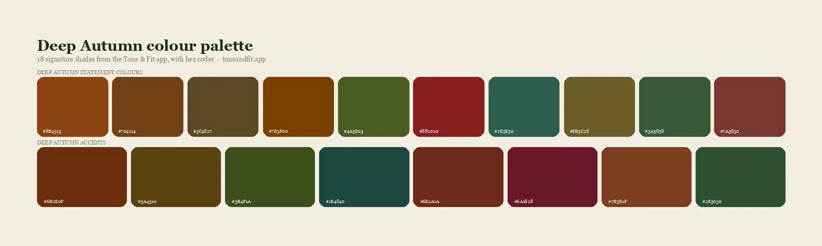
The Deep Autumn direction: espresso, burnt orange, mustard gold, olive, forest green, and deep teal.
The four families that fight you
Every problem shade for a Deep Autumn falls into one of four groups. Learn the groups and you will never need to memorize individual colors again.
1. Icy pastels and powder shades
Baby pink, powder blue, mint, icy lavender, and pale lemon. This is the worst family for your season because it misses twice at once: too light for your value and too cool for your undertone. Against deep warm coloring, a pastel does not look fresh. It looks like it belongs to someone else, and it makes you look heavier and more tired by comparison. No other season wears pastels worse than a Deep Autumn.
2. Blue-based brights
Fuchsia, magenta, cobalt, electric purple, and blue-red. These have the saturation you need but carry visible blue, and blue against skin with a golden base produces the clash that reads as sallow or slightly grey. Brightness alone was never the requirement. Saturation plus warmth is. Our explainer on warm versus cool skin undertones covers the mechanism underneath it.
3. Dusty greyed shades
Dusty rose, mauve, grey sage, greyed lavender, and the softer half of most neutral capsules. These are the sneaky ones, because they are often warm enough. They fail on chroma instead. Your coloring is rich, and a greyed shade drains that richness until you match the fabric, subdued. This family belongs to your softer cousin, and if these shades secretly feel better on you than your own, that is a clue worth chasing in our Soft Autumn guide.
4. Cold neutrals
Cool grey, optical white, cool taupe, and silver-toned metallics. Neutrals feel safe, which is exactly why this family does so much slow damage. Nobody interrogates a grey jumper the way they interrogate a magenta dress, so the grey jumper stays in rotation for years, quietly dulling every outfit it appears in. Cool mid-grey is arguably your single worst neutral, since it misses on all three measurements at once.
The worst offenders, ranked, with swaps
Here are the individual shades that cause the most trouble in practice, roughly ordered by how much damage they do, each paired with the closest working substitute. Nothing on the right side of this table asks you to change your taste, only the temperature, the depth, or the clarity.
| Avoid | Why it fails | Wear instead |
|---|---|---|
| Baby pink | Pale and blue-based, the exact opposite of you | Terracotta rose, warm brick, deep salmon |
| Powder blue | Icy and weightless next to rich warm depth | Petrol blue, deep teal, dark turquoise |
| Cool grey | Cool, muted, and mid-value, three misses at once | Dark chocolate, warm taupe, espresso |
| Optical white | Blue-brightened, harsh against golden depth | Cream, oyster, warm ivory |
| Fuchsia and magenta | Saturated but blue-based, the classic false friend | Tomato red, chili, burnt coral |
| Icy lavender | Cool and pale, it hollows out your face | Aubergine, warm plum, raisin |
| Dusty rose | Greyed softness that mutes your richness | Terracotta, paprika, russet |
| Lemon yellow | Cool sharp yellow that turns golden skin sallow | Mustard, saffron, amber gold |
| Silver jewelry | Cool metal sitting right against warm skin | Antique gold, bronze, copper |
| Black, worn at the face | Right depth, wrong temperature, slightly flattening | Espresso, black-brown, bitter chocolate |
Not certain you are a Deep Autumn?
An avoid list is only useful if the season underneath it is right. Tone & Fit reads your undertone, value, and chroma from one selfie and returns your season with a full palette in about 60 seconds.
Get your season ↗The black question, your closest call
Black deserves its own section for Deep Autumn, because no other season has a closer call with it, and most advice gets it wrong in one direction or the other.
Here is the honest version. Deep Autumn borders Deep Winter, the season that owns black outright. You share Winter's depth, so black passes the value test easily. It fails only on temperature, and it fails by a smaller margin on you than on any other warm season. That is why black blazers and black dresses often look fine on you in a way they never do on a Warm Spring, and why plenty of Deep Autumns go years without questioning it.
Fine is not the ceiling, though. Put espresso, black-brown, or bitter chocolate next to your face and then compare black, in daylight, and the difference shows up immediately. The warm darks leave your skin looking alive and lit from within. Black leaves it looking very slightly flat, like a photo with the warmth slider pulled down. The gap is small, but it is the gap between looking good and looking like yourself on a good day. If black consistently looks not just fine but genuinely great on you, treat that as data, and read our Deep Autumn versus Deep Winter comparison, because the border between those two seasons is the most commonly misjudged line in the whole system.
White is the easier fix and almost nobody makes it. The white in most shirts and tees is optical white, treated with a blue brightener so it photographs crisp. Against deep golden skin it reads harsh and slightly cold. Cream, oyster, and warm ivory deliver the same clean signal with none of the glare, and they cost nothing extra. Hold the two side by side under a window and the difference is obvious in about two seconds.
You do not need a wardrobe with nothing wrong in it. You need a wardrobe where everything within a foot of your face is right.
Colors people wrongly avoid
Some shades get cut from Deep Autumn wardrobes for reasons that do not survive contact with the palette. These three are worth reclaiming.
Bright warm red. Tomato, chili, and deep warm red are among the most flattering colors this season owns, and many Deep Autumns avoid them for being loud. On coloring with real depth, a saturated warm red does not shout. It settles, and it does more for your face than any neutral will. The red to skip is the blue-based cherry or raspberry, not the one that leans toward fire.
Yellow. Most people who swear off yellow tried a cool lemon or a pale butter and concluded the whole family was hostile. Mustard, saffron, amber, and old gold are Deep Autumn signatures. The yellow that fails you is the one with green or ice in it, not the one with gold.
Blue. Learning you are warm makes people assume blue is off the table entirely. It is cool blue that is off the table. Petrol, deep teal, and dark turquoise carry enough green and gold to sit comfortably inside your palette, and they give you the only genuinely cool-looking colors you own, which matters for variety, suiting, and denim decisions.
Hair, makeup, and metals
The same four families apply above the neckline, where the effect is stronger because nothing sits closer to your skin than what is on it.
Metals. Silver, white gold, and platinum reflect cool light straight back onto a face that runs warm, creating the same conflict a fuchsia top does at a fraction of the distance. Antique gold, bronze, and copper are your metals, and they look richer on you than they do on almost anyone else. If you have a silver piece with sentimental weight, wear it as a bracelet or a ring where it is not competing with your complexion. The gold or silver jewelry test is also one of the quickest ways to sanity check your undertone if you are still unsure.
Hair. Ash brown, mushroom, platinum, and anything described in a salon as cool or beige will fight you. So, more surprisingly, can flat blue-black, which drags you toward Winter and hardens the face. Espresso, dark chestnut, auburn, mahogany, and warm caramel balayage work with your natural depth instead of against it. Our Deep Autumn hair color guide goes through the specific formulations worth asking for.
Makeup. Icy pink lipstick, blue-red lipstick, and grey-toned contour are the three most common misfires. Brick, terracotta, warm russet, and a deep warm red all read far better. Foundation matters just as much, since a base one shade too cool undoes everything layered on top of it. If you have never checked, our walkthrough on finding your skin undertone at home covers the vein, jewelry, and daylight tests, and the Deep Autumn makeup guide has specific shade directions.
How to rescue a color you love
An avoid list is not a disposal list. Three techniques let you keep most of what you already own.
Move it below the waist. Undertone conflict is a proximity effect. It happens because light bounces off fabric and onto your skin. Grey trousers, black jeans, and cool-toned skirts sit far enough from your face that the reflection never reaches you. Wrong colors are almost always fine as bottoms, shoes, and bags.
Put a correct color between it and your face. A cool grey coat worn open over a rust or cream top is fine, because the layer touching your neckline is doing the work. That logic makes scarves the single most efficient correction tool you can own, and the cheapest.
Find the deep warm cousin. Nearly every avoid-list shade has a relative inside your palette that keeps the mood intact. If you love pastel pink, terracotta rose gives you the same softness with substance. If you love powder blue, petrol gives you the same calm with depth. If you love grey, dark chocolate gives you the same restraint. You are not being asked to give up a look, only to shift its temperature and weight a few degrees toward yourself.
A 20 minute closet audit
Do this once and you will not need to think about it again for a season.
- Pull out only the items that touch your face: tops, knitwear, scarves, collared shirts, and any jacket you wear zipped. Ignore everything else for now.
- Take the pile to indirect daylight near a window. Artificial light, particularly warm bulbs, will flatter cool colors and lie to you.
- Hold each item under your chin and watch the area beneath your eyes rather than the garment itself. If your skin turns sallow, grey, or flat, the color is wrong, no matter how good the item looks on a hanger.
- Sort into three piles: keep near the face, demote to bottoms and accessories, and let go.
- Note which shades keep landing in the demote pile. That pattern is your personal shopping filter, and it is usually two or three specific colors rather than a whole family.
If most of your pile lands in the demote pile, re-examine the diagnosis before booking a shopping trip. Deep Autumn is commonly confused with two neighbors. Compare against Deep Autumn versus Warm Autumn if softer earth tones feel better on you than the deep ones, and against Deep Winter, covered above, if black feels less like a compromise and more like home. Seeing the season on real faces helps too, which is what our roundup of Deep Autumn celebrities is for, and the Autumn color palette guide covers what the whole family shares.
And if you would rather not adjudicate this on your own face, that is a reasonable position. Judging your own undertone is genuinely difficult, because your brain corrects for color constancy faster than your eye can register the shift. Our comparison of a color analysis app versus a consultant weighs both routes, and the complete personal color analysis guide ties the system together end to end.
Ready to find your season?
One selfie, your 12-season result, and the palette that goes with it. Free, no sign-up.
Find your season free ↗For the underlying reading, our skin tone analyzer explains what undertone, depth and contrast actually are.
FAQ
What colors should a Deep Autumn avoid?
Four families cause the most trouble. Icy pastels such as baby pink, powder blue, and cool lavender. Blue-based brights such as fuchsia, magenta, and cobalt. Dusty greyed shades such as dusty rose, mauve, and grey sage. And cold neutrals such as cool grey, optical white, and silver. The pattern underneath all four is the same: anything pale, cool, or greyed contradicts coloring that is warm, deep, and rich.
Can a Deep Autumn wear black?
Better than any other Autumn, but still not as well as espresso. Deep Autumn borders Deep Winter, so black is dark enough for the season's value range. It fails only on temperature, which is why it works in an outfit but flattens slightly near the face. Espresso, black-brown, and bitter chocolate read just as dark while keeping skin warm and alive. Keep black below the waist or under a warm layer.
Can a Deep Autumn wear pastels?
Icy pastels are the single worst family for this season, because they miss on value and temperature at the same time. Pale pink, powder blue, and mint make deep warm coloring look heavy and tired rather than rich. If you want a lighter shade, choose a warm one with some substance to it, such as cream, camel, soft gold, or a warm salmon, and keep the palest layers away from your face.
What neutrals suit a Deep Autumn?
Espresso, dark chocolate, warm taupe, camel, olive, and cream are the core. They do everything grey and black do in other wardrobes, and they do it while matching both your warmth and your depth. Cool grey is the neutral to drop first, since it is cool, muted, and mid-value all at once, which misses every one of a Deep Autumn's three measurements.
Is navy off limits for a Deep Autumn?
Navy is the least damaging of the cool darks because its depth matches yours, so it earns a pass as trousers, outerwear, and suiting. Near the face, forest green, deep teal, and dark olive do the same dependable job with far better results. If your wardrobe leans on navy, keep it, and move a warm scarf or a cream shirt between it and your skin.
What if a color I love is on the avoid list?
Move it away from your face rather than out of your closet. Bottoms, shoes, and bags sit far enough from your skin that undertone conflict stops mattering. You can also look for the deeper or warmer cousin of the shade, since nearly every avoid-list color has a relative inside the Deep Autumn palette that keeps the mood and drops the coolness.