How to Choose Colors That Photograph Well
Colors that photograph well are mid depth, moderately saturated, and matched to your own skin undertone: teal, sapphire, burgundy, olive, rust, plum and their relatives, in the warm or cool version that suits you. What almost never photographs well is pure white, pure black, neon, and any shade that sits at the same depth and temperature as your own skin.
What's in this guide
- The short answer
- Why a camera judges color differently than a mirror
- Step one: start with your undertone
- Step two: the shades that hold up, by undertone
- Step three: refine it with your color season
- How the light rewrites the answer
- Reading the background before you pick
- Family and group photos
- Colors that consistently photograph badly
- Fabric, finish and pattern
- The five minute check before you leave
- FAQ
The short answer
The colors that photograph well for you are the ones that already suit you in person, held slightly further from your skin tone than you would wear them on an ordinary day. That is the whole rule. A camera does not invent a new set of flattering colors; it narrows the set you already had and punishes the near misses much harder than daylight does.
So the process is short. Work out whether your skin runs warm, cool, neutral or olive. Pick colors in that temperature. Then choose a depth that is clearly different from your own, because contrast is the thing a lens rewards. If you want the version of that answer with your exact shades attached, that is what a personal color palette gives you, and the rest of this guide explains why each step matters so you can make the call on your own in a shop changing room.
Cameras do not flatter colors. They flatten them. Your job is to pick a color with enough character left over that flattening it still leaves something good.
Why a camera judges color differently than a mirror
A mirror shows you a live scene in the actual light of the room, and your eyes adapt to that light continuously without your noticing. A camera cannot do that. It takes one reading, decides what counts as white in the frame, and then squeezes everything between its darkest and brightest limits into a much narrower range than your eye handles.
Three consequences follow, and all three change what you should wear.
First, white balance is set by whatever dominates the frame. Wear a strongly colored top and the camera partly corrects for it, which means it shifts every other color in the photo, including your face, in the opposite direction. A hot pink shirt does not just sit there being pink. It nudges your skin slightly green as the camera tries to compensate.
Second, dynamic range is limited. Pure white and pure black sit at the two ends of what a sensor can record. Bright white clips first, losing all fabric texture and often taking your jaw and chin with it in a bounce of reflected light. Black fills in the other way, becoming a shape with no folds in it.
Third, the camera adds contrast that was not in the room. Most phones, and most editing presets, push contrast and saturation before you ever see the image. That is fine when your outfit had contrast to begin with. It is unkind when your top was almost the same value as your skin, because the extra contrast lands on your face instead, deepening every shadow under your eyes and around your nose.
This is the same mechanism that makes a phone camera misread skin tone when you are trying to work out your undertone from a selfie. The camera is not lying about you. It is making decisions about the whole frame, and your outfit is the largest thing in that frame after your face.
Step one: start with your undertone
Undertone is the constant. Your tan fades, your hair changes, the light changes, but the underlying warm or cool cast of your skin does not. It is the single most useful thing to know before you choose an outfit for a photo, because it decides the temperature of everything else.
If you have never pinned yours down, the fastest reliable route is the full set of at home checks in how to find your skin undertone at home. In brief, you are looking for agreement across several signals rather than a single verdict.
The short version of the undertone check
Stand at a window in indirect daylight with no makeup on and your hair back. Hold a sheet of plain white paper under your chin: skin that reads yellow or golden against it is warm, skin that reads pink or blue is cool, skin that reads slightly grey or green is olive, and skin that reads more or less neutral is neutral. Then check two more signals: whether gold or silver looks cleaner on your bare wrist, and whether pure white or soft cream flatters you more.
One warning specific to photographs. Do not run this check in a bathroom or under warm indoor bulbs, and do not run it from a phone photo you already took, because the white balance in that photo has already made a decision for you. Lighting changes what your color season looks like, and it changes an undertone test even faster.
Step two: the shades that hold up, by undertone
Below are the colors that survive a camera best in each temperature. These are starting points chosen for photographic behavior specifically: they sit in the middle of the tonal range, they hold their identity when contrast is added, and none of them casts strongly onto skin.
Warm undertones
Golden, peach and yellow based skin photographs best in earthy and spiced colors, which echo the warmth without competing with it.
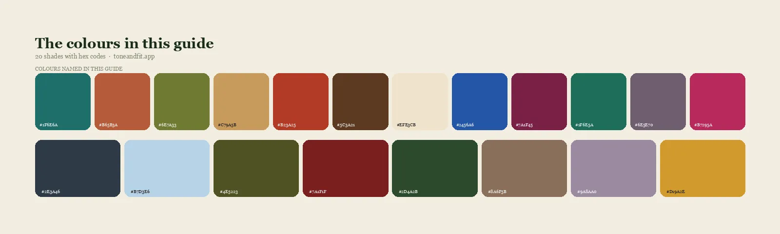
- Teal#1F6E6A
- Terracotta#B65B3A
- Moss Green#6E7A33
- Camel#C79A5B
- Tomato Red#B23A25
- Chocolate#5C3A21
- Warm Ivory#EFE3CB
Cool undertones
Pink, red and blue based skin photographs best in blue based colors, where the sensor can separate skin from fabric cleanly.
- Sapphire#2456A6
- Wine#7A1F45
- Emerald#1F6E5A
- Plum Grey#6E5E70
- Raspberry#B7295A
- Slate Navy#2E3A46
- Ice Blue#B7D3E6
Neutral and olive undertones
Neutral skin has the widest field and should simply avoid the extremes of either temperature. Olive skin is its own case: it carries a faint green cast that flat lighting exaggerates, so it wants colors with some warmth and some depth to push against, and it is the undertone most damaged by pale cool pastels on camera.
- Deep Olive#4E5223
- Brick#7A1F1F
- Forest#2D4A2B
- Taupe#8A6F5B
- Soft Mauve#9A8AA0
- Golden Yellow#D19A2E
Step three: refine it with your color season
Undertone tells you the temperature. Your season tells you the other two things a camera cares about: how deep your coloring is, and how clear or muted it is. Both are decisive for photographs.
Depth matters because contrast in a photograph is the difference between your skin value and your clothing value. Someone with fair skin and light hair can wear a mid blue and get gentle, natural separation. Put the same mid blue on someone with deep skin and dark hair and it may read as barely there, while a bright ice blue or a clear white would give the separation the frame needs. That is a contrast question, not a color question, and it is why finding your contrast level is worth ten minutes of your time before any photo shoot.
Clarity matters because cameras add saturation. If your natural coloring is soft and blended, a highly saturated color will be pushed further by the camera until it dominates the picture and your face becomes the quiet part of the frame. If your coloring is clear and high contrast, a dusty muted shade goes the other way and reads as tired fabric.
| Your season family | Photographs best in | Common photo mistake |
|---|---|---|
| Spring families | Clear warm mid shades: coral, turquoise, warm periwinkle, golden yellow | Heavy black, which drops a shadow across the face |
| Summer families | Soft cool mid shades: dusty blue, soft plum, rose brown, grey blue | Anything neon, which overwhelms soft coloring |
| Autumn families | Deep warm shades: rust, olive, teal, bronze, chocolate | Icy pastels, which drain warm skin on camera |
| Winter families | Saturated cool shades: true red, emerald, sapphire, optic white | Muted beige, which flattens high contrast coloring |
If you do not know which family you sit in, the twelve color seasons explained will place you quickly, and the mechanics behind the whole system are in seasonal color analysis explained. For the deeper background on why depth, temperature and clarity are the three axes that matter, see the personal color analysis guide.
How the light rewrites the answer
The same shirt behaves differently in four common lighting situations, and this is the part most outfit advice leaves out.
- Open shade outdoors, meaning daylight but not direct sun, is the most forgiving light there is and the closest to what your eye sees. Almost any color in your palette works. This is what portrait photographers move you into.
- Direct midday sun is the harshest. It blows out light colors and deepens shadows on your face. Go one step deeper than you normally would and avoid white entirely.
- Golden hour, late afternoon light, warms everything by default. Cool colors look their best here because the light meets them halfway. Warm colors can tip into orange.
- Indoor artificial light is the least predictable, because mixed bulbs and screens each throw their own cast. Mid depth, moderately saturated colors survive best, and pale pastels survive worst.
If your photos will be indoors with mixed light, the safest single move is to raise the contrast between your top and your skin. A color that is clearly darker or clearly lighter than your face gives the camera an anchor that no amount of odd bulb color can destroy. This is the practical opposite of the situation described in colors that wash you out, where the problem is that the color and the skin have too much in common.
Reading the background before you pick
Large colored surfaces do two things at once: they bounce their own color onto your skin, and they compete with your outfit for the eye.
Green grass and dense foliage bounce a slight green cast upward, which is unhelpful for olive skin and generally fine for warm skin. Red brick warms everything. Snow and pale sand act like giant reflectors and lift shadows, which is flattering, but they also raise the overall brightness so light clothing clips faster. Water throws blue.
The practical rule is depth separation. Choose a garment that is clearly lighter or clearly darker than the dominant surface behind you. Matching the hue of a large background is only a good idea when you deliberately want a tonal photograph, and even then you want a different depth so you do not dissolve into it.
Family and group photos
Group photos fail in one of two ways: everyone wears the same thing and the picture goes flat, or everyone wears something different and the picture goes noisy. The fix is to fix the hue family and vary everything else.
- Pick one family. Blues, warm neutrals, or greens all work. Choose based on the location, since it has to sit against that background.
- Vary the depth. One person in the palest version, one in the deepest, the rest in between. This is what creates visual rhythm across a line of people.
- Vary the texture. Knit next to cotton next to denim reads as considered. Five identical cotton shirts read as a uniform.
- Check each person separately. A family will usually contain both warm and cool undertones. Let the warm ones take the warmer end of the family and the cool ones the cooler end, rather than forcing one exact shade on everybody.
- Keep patterns to one or two people, and keep those patterns large scale. Fine stripes and small checks create moire, a shimmering interference pattern, on digital sensors.
For occasion specific versions of this, the same logic drives wedding guest colors by season and what colors to wear to a job interview, both of which are photograph heavy situations in practice.
Colors that consistently photograph badly
| Color | What happens on camera | Wear it instead as |
|---|---|---|
| Pure optic white | Clips to a featureless block in bright light and bounces onto the chin | Ivory, oyster or oatmeal, or white as a small accent only |
| Pure black | Loses all fold and texture, drops a shadow under the jaw | Charcoal, navy, deep forest or the deepest shade in your palette |
| Neon and fluorescent | Reflects colored light onto the neck and jaw, and oversaturates further in editing | The saturated but non fluorescent version of the same hue |
| Skin matched beige or blush | Merges with your face so the eye cannot find an edge | The same shade two or three steps deeper or lighter |
| Very pale pastels | Lose their identity entirely and read as dirty white indoors | The mid depth version of that pastel |
| Fine stripes and small checks | Create moire shimmer on digital sensors | Larger scale pattern, or a solid |
Two of these deserve a caveat, because they are not absolute. White and black both work when they are genuinely your colors and the light is controlled. Whether the white should be optic or soft is covered in white versus cream, and the cases where black genuinely suits someone are in black and your color season. The point is not that these shades are banned. It is that they have the least margin for error, so they are a poor choice when you do not control the light.
Fabric, finish and pattern
Hue is only part of what the camera records. Finish changes how a color behaves at least as much as the color itself does.
Matte fabrics photograph most predictably. Wool, cotton, linen and crepe absorb light and return the color you chose. Shiny fabrics such as satin, sequins and coated synthetics return highlights instead of color, so a satin emerald blouse photographs as a set of white streaks with green in between. That can be beautiful in controlled studio light and messy under a flash.
Texture buys you depth without changing color. A cable knit in your exact shade will photograph richer than a flat jersey in the same shade, because the shadows between the stitches add tonal range that the camera can work with. When you are stuck with a flat color that is slightly too close to your skin, texture is the cheapest way to rescue it.
Layering beats a single block. A jacket over a contrasting top puts a line of separation right where the eye looks, and gives you an adjustment you can make on the spot by opening or closing it. For outerwear specifically, the best coat color for your skin tone is the same calculation, run on the layer that will be in most of your winter photos.
The five minute check before you leave
Do this in front of a window, not a bathroom mirror, with the outfit on.
- Take one photo. Front camera, no filter, no portrait mode, window light on your face. This is the single most useful step and the one people skip.
- Look at your under eye area first. Shadows that look deeper in the photo than in the mirror mean the color is not giving the camera enough contrast to work with.
- Look at your jaw and neck second. A yellow, grey or pink cast appearing along the jawline is a temperature mismatch. Change the shade, not the fit.
- Check the top for detail. Can you see the weave and the folds? If the garment has gone to a flat white or flat black shape, it will only get worse in stronger light.
- Only then decide whether you like the color. Judging the color first is how people talk themselves into an outfit that is not working.
If you would rather not run this check garment by garment, the underlying answer is a fixed set of shades you can shop from once. That is what shopping your color palette is for, and it turns every future photo decision into a two second one.
Know your shades before the camera comes out
Tone & Fit reads your undertone, depth and contrast from one selfie and hands back the full palette behind every recommendation on this page.
Get your color season ↗FAQ
What colors photograph the best?
Mid depth, moderately saturated colors in your own temperature photograph best, because they sit far enough from both white and black that the camera does not have to choose between blowing out the highlights and crushing the shadows. Jewel shades such as teal, sapphire, emerald, burgundy and plum work for most people. The exact version you want depends on your skin undertone rather than on any universal list.
What colors should you avoid wearing in photos?
Avoid pure white and pure black as the only color you wear, avoid neon and fluorescent shades, and avoid anything that matches your own skin depth and temperature so closely that your clothes and your face merge. White tends to blow out in bright light, black tends to lose all its detail, neon casts colored light back onto your jaw and neck, and a skin matched beige makes you look undressed in the frame.
What color should I wear for family photos?
Pick one shared color family and let everyone wear a different depth and a different texture inside it, rather than dressing everyone in identical shirts. A range of blues from pale chambray to deep navy, or a range of warm neutrals from oatmeal to chocolate, keeps the group visually connected without flattening it. Then check each person individually against their own undertone so nobody in the family is the one who looks drained.
Why do I look washed out in photos but fine in the mirror?
A mirror shows you in the light you are standing in, while a camera compresses that light and then applies its own white balance and contrast curve. If your top is close to your skin in temperature, the camera has very little to separate the two, so it pushes both toward the same flat tone. Wearing a color with clear contrast against your skin gives the sensor something to anchor on, which is why the same face can read healthy in one shirt and grey in another.
Does the background color change what I should wear?
Yes, more than most people expect. Large colored surfaces bounce light back onto your face, so green grass, red brick and blue water all tint your skin slightly in the direction of their own color. Choose an outfit color that differs from the background in depth so you do not disappear into it, and be wary of wearing the same hue as a very large backdrop unless you want the photo to read as a single block of color.
Do I need to know my color season to pick colors for photos?
No, but it shortens the process a lot. Undertone alone gets you most of the way: warm skin holds up in golden and earthy shades, cool skin holds up in blue based shades. Knowing your full season adds depth and clarity to the answer, which is what decides whether you want the dusty version of teal or the bright one.
Do these rules change for phone photos versus a real camera?
The colors that flatter you do not change, but a phone exaggerates the mistakes. Phone cameras apply heavier automatic white balance, contrast and skin smoothing than a photographer working with a large sensor, so a slightly wrong color that would pass in a studio portrait can look distinctly off in a phone snapshot. If your photos are mostly phone photos, lean toward clearer contrast and away from very pale, very close to skin shades.