Colors That Wash You Out: Why It Happens and How to Fix It

Short answer: a colour washes you out when its temperature, depth or brightness sits far from your own colouring, so it steals contrast from your face and leaves it looking grey or tired. Optic white and pure black are the two most common culprits, and the fix is usually one or two steps toward cream or a softer dark. The five worst offenders, a 60-second mirror test and a swap for each are below.
You loved the sweater on the hanger. You put it on, look in the mirror, and your face suddenly looks like it needs a nap. That is not bad lighting and it is not your skin. It is a specific, measurable, entirely fixable thing the color is doing to your face.
What's in this guide
What "washed out" actually means
"Washed out" is a vague phrase for a very consistent set of visual symptoms. When a color drains you, four things happen at once, and once you know to look for them you cannot unsee them:
- Your skin loses dimension and reads flat, grey, or oddly yellow
- Shadows under your eyes and along your smile lines get noticeably darker
- Your lips lose color and the edges of your mouth blur into your skin
- Your eyes stop being the first thing someone notices about your face
Here is the part most people get wrong: none of that is happening to your skin. Your skin is exactly the same as it was ten seconds ago. What changed is the reference point your eye is using to judge it.
Human color perception is relative, not absolute. Your visual system measures your face against whatever is next to it, and the largest thing next to your face is almost always the fabric across your shoulders. Put a highly saturated garment under your chin and your skin reads as comparatively dull. Put a cool blue-based garment next to golden skin and the skin reads as comparatively yellow. The fabric is not changing you. It is changing the yardstick.
That is the whole mechanism behind seasonal color analysis, and it is why the system holds up even though it sounds like folklore. Our explainer on how seasonal color analysis works walks through the three dimensions that decide whether a color helps or hurts, and this article is essentially the failure modes of those same three dimensions.
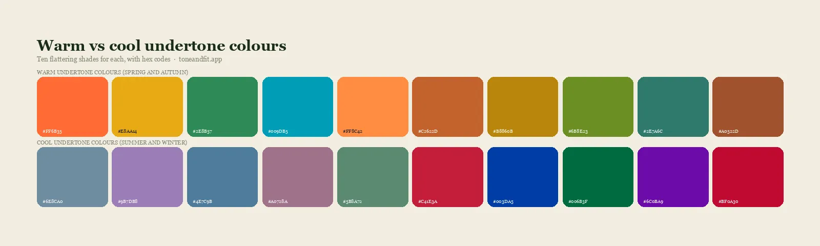
The four ways a color drains your face
There are only four, and identifying which one is happening tells you most of what you need to know about your palette.
1. Undertone clash
The most familiar one. Skin has a warm, cool, or neutral base beneath its surface color, and a garment with the opposite base fights it. A cool, blue-based garment against warm golden skin makes the skin look sallow and slightly green. A warm, orange-based garment against cool pink skin makes it look ruddy and blotchy.
Undertone is independent of how light or dark your skin is, which is why two people with visibly identical complexions can have opposite palettes. If you have never pinned yours down, run the wrist-vein, jewelry, and white-versus-cream checks in our guide to finding your skin undertone at home, and if the answer keeps flipping, the deeper breakdown of warm vs cool undertones settles most edge cases. Some people genuinely land in the middle, and our guide to neutral undertone skin covers what that means in practice.
2. Value clash
Value is simply how light or dark a color is. Every person has a natural overall value created by their hair, skin, and eyes together, and garments that sit far outside that range compete with the face rather than supporting it.
A very light person in charcoal or black often looks like the garment is wearing them: the eye lands on the fabric first and the face becomes a pale afterthought. A deep person in a chalky pastel gets the reverse problem, where the pastel has no weight and the face floats disconnected above it. This is why depth matters as much as undertone, and why the Deep Autumn palette is built from espresso, rust, and forest rather than from the softer versions of the same hues, a pattern Am I a Deep Autumn? covers in full. Very fair complexions run into this problem from the opposite direction, and our breakdown of which colors actually work on pale skin separates the temperature error from the value one.
3. Chroma clash
Chroma is saturation, or how pure and intense a color is. Some people have naturally clear, high-contrast coloring, and some have softly blended, low-saturation coloring where hair, skin, and eyes sit close together in intensity.
Put a muted person in fluorescent lime and the color shouts so loudly the face becomes wallpaper. Put a clear, bright person in dusty sage and they look faintly unwell, as though someone laid a grey film over them. Neither color is wrong. It is wrong for that face. The 12 color seasons exist largely to sort people along this axis, splitting each of the four classic seasons into brighter and softer versions.
4. Contrast clash
The one almost nobody accounts for. Contrast is the gap between your lightest and darkest features. Someone with near-black hair and fair skin has very high contrast. Someone with light blonde hair and light skin has very low contrast.
High-contrast people put into a soft tonal outfit, all beige and oatmeal and cream, lose their definition entirely. Low-contrast people put into a hard black-and-white outfit get overwhelmed, because the outfit has more contrast than their face does and wins the comparison. Matching the contrast level of your outfit to the contrast level of your face is one of the fastest upgrades available, and our complete personal color analysis guide covers how to measure yours.
The five colors that wash out the most people
Optic white
Left to right: optic white, ivory, cream, ecru, oatmeal. Most people who feel drained by the first look great in one of the other four.
Pure optic white is cool, maximally bright, and contains zero warmth. Against golden or olive skin it creates a hard edge that makes the face read yellow by comparison. It is the single most common complaint we hear, and it has the single easiest fix: move one or two steps along the strip above. Cream and ecru do the same crisp, clean, put-together job without the drain. Only the cool, bright seasons genuinely need true white, which is why it sits in the Cool Winter palette and almost nowhere else.
Pure black
Black is the default in most wardrobes and it flatters far fewer people than its popularity suggests. It works beautifully on deep, cool, high-contrast coloring, where it matches the natural depth of the hair and eyes and lets the face carry the contrast. On light, warm, or low-contrast people it does the opposite: it deepens every shadow on the face, drains the lips, and adds ten years around the eyes.
The fix is never to give up dark clothing. It is to find your version of dark. Navy for cool-neutral people, espresso and deep olive for warm people, charcoal for those in between. If black has always felt slightly severe on you, the Warm Spring palette shows what the light, warm end of the spectrum uses instead.
Beige and camel
The sneakiest one, because beige never looks like it is doing anything. That is precisely the problem. When a neutral sits very close to your own skin in both value and hue, the boundary between your face and the fabric stops registering as an edge. You do not look tired. You look faintly invisible, which is harder to diagnose because nothing about the mirror seems wrong.
Beige is worth keeping if you have enough natural contrast in your hair or eyes to carry it, or if you break it with a scarf or necklace at the neckline. Otherwise it belongs below the waist.
Dusty and greyed pastels
Dusty mauve, sage, slate blue, mushroom, greyed lilac. Gorgeous on soft seasons, quietly draining on clear ones.
Muted, greyed-off colors are the signature of the soft seasons and they are genuinely beautiful on the right person. On someone with clear, bright coloring they act like a filter set to fifteen percent grey, and the effect reads as tired rather than as soft. If dusty colors have never worked on you but their saturated cousins do, that is a strong signal you belong in one of the bright seasons.
Neon and fluorescent brights
The opposite failure. Fluorescent colors are more saturated than any human skin, so they always win the comparison. On clear, bright coloring the effect is energizing. On soft or muted coloring the face simply loses, and the outfit walks into the room a half-second before the person does.
Stop guessing which colors drain you.
Tone & Fit's AI measures your undertone, depth, and chroma from one selfie and hands you your exact palette, plus the specific shades to avoid, in 60 seconds.
Try the App ↗The 60-second wash-out test
You can run this at home right now and it is more reliable than most people expect.
- Find north-facing daylight. Stand at a window with indirect natural light. Warm indoor bulbs add yellow to everything and will make warm colors look better than they are. Overhead office fluorescents do the reverse.
- Remove makeup and pull your hair back. Foundation and blush are doing exactly the job you are trying to measure, so they will hide the effect. Hair frames the face and biases the result.
- Hold two garments under your chin, one at a time. Compare in pairs rather than judging a single item alone. Absolute judgments are unreliable, relative ones are not.
- Look at your face, not the fabric. This is the step everyone skips. Watch three specific places: your jawline, the area under your eyes, and your smile lines.
The draining color deepens the shadows and flattens the skin. The flattering color makes your skin look smoother and more even, brings blood back to your lips, and very often makes your eye color look brighter without anything else changing. If you cannot tell the difference, the two colors are probably both fine, and you can move on. Once you know which shades drain you, the useful next step is writing down the ones that do the opposite, which is exactly what a structured personal palette is for, starting from our guide to finding your color season if you have not pinned yours down yet.
The three most common mistakes
Judging by whether you like the color. Your taste and your palette are separate questions. Plenty of people look best in a color they have avoided for years.
Testing in warm indoor light. A 2700K bulb adds enough yellow to shift the result by a full undertone.
Testing with makeup on. Foundation matched to your undertone will mask the exact effect you are trying to see.
What your wash-out pattern says about your season
The colors that fail you are more diagnostic than the colors that work, because failures are unambiguous while "fine" is a wide category. Find the row that matches your experience:
| Colors that drain you | What it points to |
|---|---|
| Camel, mustard, rust, olive, orange-reds, cream | A cool undertone. Start with the Cool Winter and Summer palettes. |
| Black, silver, icy pastels, optic white, cool pinks | A warm undertone. Start with the Warm Spring and Deep Autumn palettes. |
| Neon brights, pure black, optic white, hard contrast | A soft or muted season. Your palette is blended and low in saturation. |
| Dusty mauve, sage, greyed blues, anything hazy | A clear or bright season. You need saturation to hold your own. |
| Nearly every pale or pastel color | A deep season. Your natural depth needs weight to sit against. |
| Almost nothing, but nothing looks amazing either | Likely a neutral or true season, where the range is wide and the wins are subtle. |
Two quick cross-checks sharpen this considerably. The metal test is the fastest: if gold consistently looks more natural on you than silver, you are warm-leaning, and our guide to the gold or silver jewelry test explains how to run it properly. And if you have olive skin, note that olive complexions frequently test as neutral or cool despite looking warm at first glance, which our guide to color analysis for olive skin covers in detail, alongside the wearable shade list in best colors for olive skin tone.
If two adjacent seasons both seem plausible, that is normal and it is where most people get stuck. Side-by-side comparisons resolve it faster than more self-testing does, and Cool Winter vs Cool Summer is a good example of how narrow the deciding factors can be.
The swap list
You do not need to replace a wardrobe. You need to replace the five or six colors that sit closest to your face. Shirts, knitwear, scarves, and collars matter enormously. Trousers, shoes, and bags matter almost not at all, because they are too far from your face to affect it. That is also why shirts and ties carry most of a menswear palette while the trousers can stay whatever you already own.
| If this drains you | Wear this instead |
|---|---|
| Optic white | Cream, ivory, ecru, oatmeal, or soft white with warmth |
| Black | Navy, espresso, deep olive, charcoal, or aubergine |
| Beige and camel | Taupe with more depth, warm grey, or camel worn below the waist |
| Dusty pastels | The same hue at higher saturation: clear rose rather than dusty mauve |
| Neon brights | The same hue softened by a step: coral rather than fluorescent orange |
| Mustard and rust | Raspberry, true red, or emerald if you are cool-toned |
| Icy pastels | Peach, warm apricot, or buttercream if you are warm-toned |
Once you know your season, building forward gets much cheaper than buying by trial and error. Our guide to a capsule wardrobe built around your color season shows how to get to a full rotation from about a dozen pieces.
When it isn't the color at all
Sometimes the sweater is innocent. Before you retire a color, rule out these four:
- Light temperature. Warm 2700K bulbs, cool 5000K bulbs, and daylight give genuinely different results. A color that fails in your bathroom may be fine outdoors.
- Foundation undertone mismatch. A foundation one step too pink or too yellow for your skin creates exactly the flat, masky effect people blame on clothing. Worth checking in daylight.
- Hair color. Changing your hair changes your value and contrast, which can move your whole palette. If colors that used to work stopped working after a salon visit, that is why, and our guide to the best hair color for your skin tone covers how to keep the two in sync.
- Sleep, hydration, and iron. Genuine pallor from any of these will make every color look bad, and no palette fixes it.
If you have ruled all four out and the color still drains you in daylight, believe the mirror. It is the color.
Curious how a phone camera can judge something this subtle? Our breakdown of how AI color analysis works explains what the model actually measures, and why it is more consistent than eyeballing swatches in your bathroom mirror.
Ready to find your season?
One selfie, your 12-season result, and the palette that goes with it. Free, no sign-up.
Find your season free ↗FAQ
What does it mean when a color washes you out?
A color washes you out when it pulls contrast, warmth, or saturation away from your face. Your skin looks flatter and greyer, undereye shadows and smile lines get darker, and your eyes and lips lose definition. Nothing about your skin changed. The color next to it changed what your eye uses as a reference point.
Why does white wash me out?
Optic white is a cool, extremely bright, zero-warmth color. On warm or golden skin it creates a hard edge that makes the face read sallow and yellow by comparison. Most people who feel drained by white are warm or soft seasons, and cream, ivory, ecru, or oatmeal solve it instantly while keeping the same crisp effect.
Does black wash everyone out?
No. Black flatters deep, cool, high-contrast coloring such as Cool Winter and Deep Winter, where it matches the natural depth of the hair and eyes. On light, warm, or low-contrast people it overpowers the face, deepens shadows under the eyes and jaw, and drains color from the lips. Navy, espresso, deep olive, or charcoal do the same wardrobe job without the drain, and the Winter palette shows who black genuinely belongs to.
Can beige wash you out?
Beige is the sneakiest offender of all. When a neutral sits very close to your own skin value and hue, the boundary between your face and the fabric blurs and your features stop reading as distinct. This is why beige is often described as making people look invisible rather than tired. Beige works best on those with enough natural contrast in hair or eyes to carry it.
How do I know which colors wash me out?
Stand at a north-facing window in daylight with no makeup and your hair pulled back, then hold two garments under your chin one at a time. Watch your jawline, undereye area, and smile lines rather than the fabric. The draining color deepens shadows and flattens skin. The flattering color makes your face look smoother and more even, and often makes your eyes appear brighter.
Does washing out mean I have a cool or warm undertone?
It is a strong clue but not proof on its own. If warm colors like camel, mustard, rust, and olive drain you while icy pinks and blues lift you, you likely have a cool undertone. If black, silver, and icy pastels drain you while cream and warm earth tones lift you, you likely have a warm undertone. Value and saturation also cause washing out independently of undertone, which is why the full 12-season system is more reliable than an undertone test alone.