How to Do a Color Analysis at Home: A Step-by-Step Guide
A professional color analysis takes four measurements and confirms each one against fabric. Every part of that is repeatable at your own window with a mirror and a pile of scarves. Here is the method, in the order that keeps it honest.
What's in this guide
- The short answer
- What you need before you start
- Step 1: Set up neutral light
- Step 2: Strip the variables
- Step 3: Find your undertone
- Step 4: Find your depth
- Step 5: Find your chroma
- Step 6: Find your contrast
- Step 7: Drape yourself
- Step 8: Read your result on the season map
- Step 9: Test against the sister season
- The mistakes that produce a false result
- FAQ
The short answer
To do a color analysis at home, work in indirect daylight with no makeup and your hair covered, then measure four things in order: undertone (warm, cool, or neutral), depth (light to deep), chroma (muted to vivid), and contrast (the gap between your hair, skin, and eyes). Drape warm and cool fabrics under your chin to confirm each reading, then match the four results to one of the 12 color seasons. Budget forty minutes and do it in one sitting, because lighting drifts.
That sequence is the whole method. Every step below explains how to run one measurement, what a clean result looks like, and how to tell when you have got a bad reading. If you would rather see the season map first, our guide to finding your color season is the parent reference for everything on this page.
What you need before you start
Almost nothing, and none of it needs buying.
- A window with indirect daylight. North-facing if you have one. Mid-morning or mid-afternoon, never direct sun.
- A mirror you can sit in front of, or a phone on a stand if you prefer to work from photos.
- Two sheets of paper, one pure white and one warm cream or ivory.
- Fabric for draping: at minimum one warm and one cool piece in each of light and dark. Scarves, T-shirts, towels, and pillowcases all work. Eight to twelve pieces is ideal, four is workable.
- One gold item and one silver item. Jewelry, foil, or even a gold and a silver-toned kitchen implement.
- A hair covering: a white or grey towel, or a neutral headband.
What you do not need is a professional drape kit. The paid kits are more precise, but the four measurements below are readable with household fabric as long as your lighting is honest.
Step 1: Set up neutral light
This step decides whether the other eight are worth doing. Every artificial light source has a color temperature, and that temperature lands on your face and changes what you see. Warm bulbs at around 2700K make everyone look warm. Cool LEDs at 5000K and above make everyone look cool. Analyze under either and you will confirm whatever the bulb decided.
What to do:
- Sit facing a window, side-on to the light source, not with the window behind you.
- Turn every artificial light in the room off, including the one you forgot about behind you.
- Avoid direct sunlight falling on your face. It blows out detail and hides the subtle casts you are trying to read.
- Check the wall behind you. A strongly colored wall bounces its color onto your skin. Neutral white, grey, or beige is fine, and a saturated blue or red room is not.
- Work between roughly 10am and 3pm. Early morning and late afternoon light is noticeably warm.
Overcast days are the best analysis conditions there are, because cloud cover diffuses daylight into an even, neutral source. If it is grey outside, that is your cue to do this today. Readers in the UK and Australia have a separate write-up on getting a clean reading in British and Australian light, since the failure modes in each are opposite.
Step 2: Strip the variables
You are trying to read your natural coloring, so anything added has to come off.
- Remove all makeup, including tinted moisturizer, brow product, and lip balm with a tint. Foundation in particular will overwrite your undertone entirely.
- Cover your hair. Dyed hair is the biggest single distortion in home analysis, and even natural hair color competes with the fabric you are about to hold up. Wrap a white or light grey towel around your hairline.
- Wear a neutral top, white or grey, or drape a white towel over your shoulders.
- Take off jewelry until the metal test in step 3.
- Do not analyze on a fresh tan or a sunburn. Wait until your skin returns to baseline. A tan can move you a full season and it will move back.
Step 3: Find your undertone
Undertone is the fixed color bias underneath your surface tone. Surface tone changes with sun, sleep, and season. Undertone does not. Run three tests and take the majority verdict rather than trusting any single one.
Test A: the metal test
Hold gold against one side of your jaw and silver against the other, then swap sides so you are not fooled by lighting. You are not judging which metal you like. You are watching your skin. The flattering metal makes your complexion look even and clear. The wrong one makes your skin look either yellowish or greyish, and often makes shadows under the eyes more obvious.
Gold wins means warm. Silver wins means cool. Genuine ambivalence means neutral. This is the most reliable of the three, and the full version is in our gold versus silver test.
Test B: the white paper test
Hold the pure white sheet up beside your bare face and look at the contrast between paper and skin. Against true white, warm skin reads yellow or golden, cool skin reads pink or slightly blue, and neutral skin reads beige without a clear direction. Then swap in the cream sheet. Whichever paper makes your skin look better tells you the same thing the fabric drapes will tell you later.
Test C: the vein test, with a warning
Look at the veins on your inner wrist in daylight. Green suggests warm, blue or purple suggests cool, a mix suggests neutral. This test is popular because it is easy, and it is the least dependable of the three. It fails for people with deeper skin, where veins are simply hard to see, and it fails for olive skin, where veins often read green regardless of undertone. Treat it as one vote, never as the verdict. Our page on color analysis for olive skin covers that failure mode in detail.
If your three tests split two to one, go with the majority. If they split evenly or all three come back unclear, you are probably neutral, which is a real category and not a failure of the test. Read neutral undertone skin next. The full four-test version of this step lives in how to find your skin undertone at home, and the standalone tool version is our skin undertone test.
Skip the guesswork on step 3
Undertone is where home analysis goes wrong most often. Tone & Fit reads it from one selfie in about sixty seconds. Free, no sign-up.
Test my undertone free ↗Step 4: Find your depth
Depth, sometimes called value, is how light or dark your overall coloring is when you combine skin, hair, and eyes. It is not skin color alone. Someone with fair skin and near-black hair is not light overall.
The fastest method: take a straight-on selfie in your neutral light, then convert it to black and white in your phone's photo editor. Color disappears and only lightness remains, which is exactly what you want to judge.
- Light: everything sits in the upper half of the greyscale. Fair skin, blonde or light brown hair, light eyes.
- Medium: mid-greys dominate. The most common result.
- Deep: dark tones dominate. Deep brown or black hair, dark eyes, or richly pigmented skin.
Depth is what separates Light Spring from Warm Spring, and Deep Autumn from Warm Autumn. Getting it right removes half the map.
Step 5: Find your chroma
Chroma is saturation: how pure and vivid your coloring is versus how soft and greyed. It is the measurement most home analyses skip, and it is the reason people who correctly identify their undertone still end up in the wrong season.
Test it with fabric. Hold up a saturated, clear color, a true emerald or a clear cobalt. Then hold up the muted version of the same hue, a sage green or a slate blue.
- If the clear version makes your features look defined and the muted one makes you look flat or dusty, you are high chroma. That points to True Winter, True Spring, or Warm Spring.
- If the muted version looks harmonious and the clear one looks like it is wearing you, you are low chroma. That points to Soft Summer, Soft Autumn, or Cool Summer.
Most people are somewhere in the middle and lean one way. The lean is enough.
Step 6: Find your contrast
Contrast is the size of the gap between your hair, your skin, and your eyes. Use the same greyscale selfie from step 4.
- High contrast: hair reads near-black, skin reads light, and the two are obviously far apart. Winter territory.
- Medium contrast: a visible gap without drama.
- Low contrast: hair, skin, and eyes blend into a similar grey band. Summer and Soft Autumn territory.
Contrast is what tells you how to combine your colors once you know them, not just which colors to own. High-contrast people can wear a light top with a dark bottom and look sharp. Low-contrast people usually look better in tonal outfits. Full method in how to find your contrast level.
Step 7: Drape yourself
Now you confirm all four measurements against real fabric, which is what a professional analyst spends most of the appointment doing. If you want the draping part on its own, with the fabric pairs to use and the six signals to watch for, our step-by-step guide to draping yourself at home goes deeper than this section.
Sit in your neutral light, facing the mirror, hair still covered. Bring each fabric up under your chin so it fills the area just below your face. Then look at your face, not at the fabric. People instinctively judge whether they like the color, which is the wrong question.
What to watch for:
| Signal | Good drape | Bad drape |
|---|---|---|
| Skin surface | Looks even and smooth | Blotches and redness get louder |
| Under-eye area | Shadows soften | Shadows deepen and go grey |
| Nasolabial lines | Recede | Look etched |
| Eyes | Iris color looks brighter | Eyes look flat |
| Overall | You notice your face | You notice the fabric |
Work in pairs, always. Compare warm cream against cool white. Compare orange-red against blue-red. Compare mustard against lemon. A single drape tells you almost nothing because you have nothing to measure it against. A pair tells you which of two directions is better, and ten pairs give you a season.
Photograph each drape if you can. Reviewing the photos side by side afterward is far more honest than your in-the-moment judgment, because you stop looking at yourself and start comparing images.
Step 8: Read your result on the season map
You now have four readings. Combine them.
| Undertone | Depth | Chroma | Likely season |
|---|---|---|---|
| Warm | Light | Clear | Light Spring |
| Warm | Medium | Clear | Warm Spring |
| Warm | Medium | Muted | Soft Autumn |
| Warm | Medium to deep | Rich | Warm Autumn |
| Warm | Deep | Rich | Deep Autumn |
| Cool | Light | Muted | Light Summer |
| Cool | Medium | Muted | Soft Summer |
| Cool | Medium | Clear | Cool Summer |
| Cool | Deep | Clear | Cool Winter |
| Cool | Deep | Vivid | True Winter |
| Neutral-cool | Deep | Rich | Deep Winter |
| Neutral-warm | Light to medium | Vivid | True Spring |
If two rows look equally plausible, you have found your sister seasons rather than made a mistake. That is normal and step 9 resolves it. The long-form version of this map, with the reasoning behind each split, is in the 12 color seasons and the underlying theory is in seasonal color analysis explained.
Step 9: Test against the sister season
Nearly every result has a neighbor that shares two of its three qualities. Soft Autumn and Soft Summer share muted and medium and differ on temperature. Deep Autumn and Deep Winter share deep and rich and differ on temperature. Warm Spring and Warm Autumn share warm and differ on chroma.
To separate them, drape only the two colors where the seasons actually diverge, not their whole palettes. For Soft Autumn versus Soft Summer, that is warm sage against cool eucalyptus. For Deep Autumn versus Deep Winter, that is oxblood against true burgundy. Two drapes, one clear winner. We have written the head-to-head versions for the pairs people ask about most, including Deep Autumn versus Deep Winter, Warm Spring versus Warm Autumn, and Cool Winter versus Cool Summer.
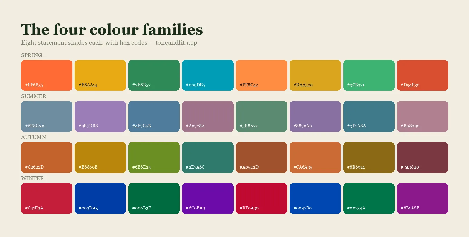
When you have your answer, the matching palette hub gives you the hex swatches to shop against, and what colors look good on me turns the palette into outfit decisions.
The mistakes that produce a false result
- Analyzing under artificial light. The single most common cause of a wrong result. Bulb temperature overwrites skin temperature.
- Leaving your hair visible. Especially dyed hair. You end up analyzing your colorist's decision rather than your coloring.
- Judging the fabric instead of your face. Your favorite color and your best color are unrelated.
- Using one drape at a time. Without a comparison you have no baseline, and every color looks acceptable in isolation.
- Analyzing on a tan. A tan shifts depth and often temperature. Wait for baseline skin.
- Trusting the vein test alone. It is the weakest of the undertone tests and fails outright on olive and deeper skin.
- Stopping at warm or cool. Temperature is one measurement of four. Skipping chroma is why so many people end up in a season that is right on temperature and wrong on everything else.
The shortcut, and when it is worth taking
Home analysis is free and it teaches you the reasoning, which has lasting value. Its weakness is that you are judging your own face, in light you cannot fully control, against a memory of what the previous drape looked like. Those three limitations compound.
A photo-based analysis removes all three. The image freezes the comparison, the model reads pixel values rather than impressions, and every drape is judged against the same reference instead of against your recall. What it cannot do is replace your eye entirely, which is why the best result usually comes from doing both: run the home method to understand your coloring, then check it against an app-based analysis and see whether the two agree. If you want the comparison against a human analyst first, we have written it up in color analysis app versus consultant, and if you would rather know exactly what an AI scan measures before you trust it as a second opinion, that guide explains the whole pipeline.
Check your home result in sixty seconds
Run the nine steps, then see whether Tone & Fit lands on the same season. One selfie, your 12-season result, and the full palette. Free.
Verify my season free ↗FAQ
Can you really do a color analysis at home?
Yes. The four measurements a professional takes, undertone, depth, chroma, and contrast, are all readable at home with daylight, a mirror, and household fabric. What you lose compared with a paid session is a calibrated drape kit and a second pair of eyes. What you gain is the ability to repeat the test whenever you want and an understanding of why your palette is what it is.
What lighting do I need for a home color analysis?
Indirect natural daylight, ideally from a north-facing window, between roughly 10am and 3pm, with every artificial light in the room switched off. Overcast days are ideal because cloud cover diffuses the light evenly. Avoid direct sun, avoid warm bulbs, and avoid rooms with strongly colored walls that bounce their color onto your face.
How long does a home color analysis take?
Around forty minutes if you have your fabrics gathered first. Roughly ten minutes for setup and undertone, ten for depth, chroma, and contrast, fifteen for draping, and five to place yourself on the season map. Do it in one sitting rather than across a week, because the light will not be the same twice.
What can I use instead of professional drapes?
Scarves, T-shirts, towels, pillowcases, and bed sheets all work. What matters is getting pairs that differ on one variable at a time: a warm cream against a cool white, an orange-red against a blue-red, a mustard against a lemon. Four pieces is enough to get a direction, and eight to twelve gives you a confident result.
Should I do a color analysis with or without makeup?
Without. Foundation in particular has its own undertone and will overwrite yours completely, so you end up analyzing the makeup. Remove everything including tinted moisturizer, brow product, and tinted lip balm, and cover your hair with a white or light grey towel so hair color does not compete with the drapes.
Why do I get a different season every time I try?
Almost always the lighting changed between attempts, or you skipped chroma. Temperature alone cannot separate Soft Autumn from Warm Autumn, or Cool Summer from Soft Summer, so an analysis that stops at warm versus cool will land somewhere different each time. Fix the light, measure all four qualities, and the result stabilizes.
Is a home color analysis as accurate as a professional one?
A careful home analysis in good light gets most people to the right season family, and the sister-season split is where it most often slips. A professional session adds calibrated drapes and an experienced second opinion. A photo-based analysis sits between the two: it removes the lighting and memory problems, and it does not replace an analyst's judgment on borderline cases.