Color Analysis for Deep and Dark Skin: Why Most Guides Get It Wrong
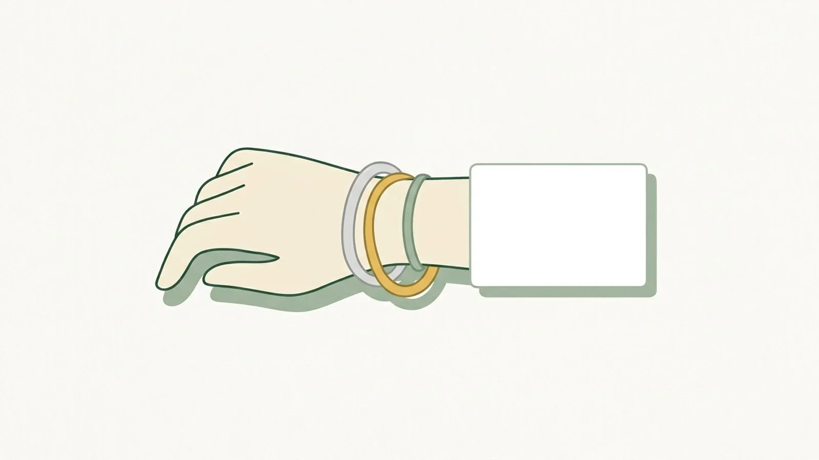
Most color analysis content assumes a fairly narrow range of coloring, and if your skin sits outside it the standard advice starts producing nonsense. You are told to check whether your veins look blue, and they are not clearly visible. You are told a Winter has "porcelain skin", which tells you nothing. You are told deep skin is automatically warm, which is simply false.
This is a real limitation of the framework, not a failing on your part. Here is where it comes from, what still applies, and how to work around the parts that do not.
Where the framework came from, and why that matters
Seasonal color analysis as it is popularly practiced traces back to mid-twentieth-century color theory, and it was formalized and popularized through books and training aimed at a largely European-descended audience. The descriptive language grew up around that population: "golden blonde", "ash brown", "porcelain", "peaches and cream".
That history is baked into the vocabulary, and the vocabulary is most of what you find online.
The underlying measurements are not the problem. Undertone, depth and contrast are properties of any human coloring. The problem is that the descriptions, the reference photos and several of the shortcut tests were calibrated on a narrow slice, and they degrade badly outside it.
So the useful move is not to abandon the system. It is to go back to what it actually measures and ignore the descriptions.
The two myths worth killing first
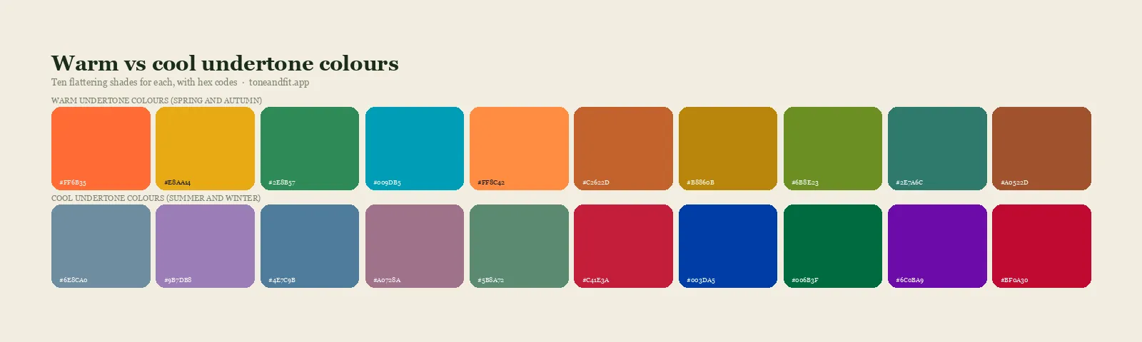
Myth one: deep skin is warm. Depth and undertone are independent. How much melanin your skin has and whether it leans golden or pink or neutral are two separate axes. There are deeply pigmented cool complexions and there are fair warm ones. Any guide that treats "deep" and "warm" as the same word is not measuring, it is assuming.
Myth two: deep skin means high contrast. Contrast is the gap between your features, not the depth of any one of them. Deep skin with black hair is often lower contrast than medium skin with black hair, because the skin and hair sit closer together in value. Squint at a photo of yourself, or convert it to black and white, and you will often find the gap is smaller than you expected. Low-contrast deep coloring is common and almost never discussed.
Those two errors compound. Assume warm, assume high contrast, and you land on Deep Autumn for nearly everyone, which is why so much of the advice online tells deep-skinned readers they are Deep Autumn.
Skip the guesswork. Measure it in 60 seconds.
Tone & Fit reads your undertone, depth, and contrast from one photo and names your season out of all twelve.
Try the App ↗Which standard tests fail, and what to use instead
The vein test: unreliable, skip it. It depends on being able to see vessel color through the skin, and it was never reliable to begin with. Vein appearance is affected by how deep the vessels sit and how much melanin is above them, not only by undertone. On deeper skin it often gives you nothing at all. This test is over-quoted generally, and on deep skin it is close to useless.
The "do you burn or tan" test: not applicable. This one is about melanin quantity, which is depth, not undertone. It was always a bad proxy.
The white paper test: works, and works well. Hold a sheet of pure white paper next to your face in indirect daylight. You are not looking at whether your skin is light or dark. You are looking at the direction it shifts against a true neutral: golden and yellow-leaning, or pink, red and blue-leaning, or neither. This works at any depth because the reference is absolute.
Gold versus silver: works, with a caveat. Hold each against your skin in the same light. The caveat is that both metals often look good on deep skin, which people read as a failed test. It is not a failed test, it is a result, and the result is neutral undertone. Neutral is a legitimate and common answer.
Undertone versus surface tone: the distinction that unlocks it. Two people can have near-identical depth and read completely differently because of what sits at the surface: redness, olive cast, ashiness, hyperpigmentation. Surface tone changes with sun, season and skin health. Undertone does not. When you are judging, look at the most even area of your face, usually the jaw or the side of the neck, and ignore areas of active redness or recent sun.
What the seasons actually mean at depth
Strip out the vocabulary and the twelve seasons are three dials: warm to cool, light to deep, muted to bright. At the deeper end of the depth dial, four sub-seasons come up most:
- Deep Winter. Cool or cool-neutral undertone, deep, with clear rather than muted coloring. Wears true black, pure white, jewel tones, cool reds, emerald, sapphire.
- Deep Autumn. Warm or warm-neutral undertone, deep, richer and more muted. Wears rust, bronze, deep olive, terracotta, warm browns, deep teal.
- True Winter. Distinctly cool, high contrast, high clarity. Icy brights and stark neutrals.
- Soft Autumn. Warm-neutral, medium to deep, low contrast, muted. Wears colors that look slightly dusty rather than saturated.
If your skin is deep and your hair and eyes are also deep, you may be low contrast even at high depth, which pushes you toward the soft and deep families rather than the bright ones. That is the finding most guides never mention and it changes the answer.
The thing that goes wrong most often
Lighting. Every photo-based method depends on the camera getting a usable exposure of your skin, and camera metering and automatic white balance have a long and documented history of performing worse on deeper skin, because the algorithms were tuned on datasets that under-represented it.
Practically this means:
- Expose for your face, not the scene. Tap your cheek in the camera app to set the exposure there. Auto-exposure will often underexpose deep skin against a bright background, and an underexposed photo loses exactly the color information an analysis needs.
- Avoid strong backlighting even more strictly than usual.
- Indirect daylight, one source, no lamps. Same rule as everyone, applied more carefully.
- Do not brighten the photo afterwards. Editing changes the measurement.
Get a properly exposed photo in even daylight and most of this difficulty disappears.
Try it with something that measures rather than describes
Our free color analysis tool works from the pixels rather than from a description. It corrects for the light source, then measures your undertone from the actual balance of color in your skin, your depth on a continuous scale, and your contrast as the real gap between your hair and your face. No assumption that deep means warm, and no vein test.
It runs the same AI engine as the app: your photo is resized in your browser and sent over an encrypted connection to Google's Gemini API for the analysis. Neither we nor our Worker write it to storage. If the service is unreachable, the analysis runs entirely in your browser instead. If the exposure or lighting was not good enough for a clean read, it tells you and asks for another photo instead of guessing.
It is not a replacement for an in-person analysis with a colorist experienced across a wide range of skin tones, and if you can find one, that is still the best result available. But it will not tell you that you are warm just because you are deep.
Skip the quiz. Get your color season in 60 seconds.
Free · No account · Photo never stored
Download Tone & Fit ↗Undertone is the axis people get wrong most often: find your undertone at home in daylight.
Once you know which way you lean, the shade by shade version of this is in our complete list of the best colors for dark skin tones, split by warm, cool and neutral.
Common questions
Is deep skin always warm?
No. Depth and undertone are independent properties. Deep skin can be cool, warm or neutral, and assuming warm is one of the most common errors in color analysis content.
Why does the vein test not work for me?
It relies on seeing vessel color through the skin, which is affected by how deep the vessels sit and how much melanin is above them. It was never a reliable test and it is particularly unreliable on deeper skin. Use the white paper test instead.
Can I be low contrast with deep skin?
Yes, and it is more common than most guides suggest. Contrast is the gap between your hair and your skin, not the depth of either. Deep skin with deep hair often sits closer together in value than medium skin with black hair.
What is the difference between undertone and surface tone?
Surface tone is what sits at the top: redness, olive cast, ashiness, hyperpigmentation. It changes with sun, season and skin health. Undertone is the underlying warm or cool lean and stays constant. Judge from the most even area of your face.
Why do photos of me come out too dark?
Camera auto-exposure meters the whole scene and frequently underexposes deeper skin against a bright background. Tap directly on your cheek to set exposure there, and never brighten the photo afterwards, because editing changes what an analysis measures.