Best Colors for Dark Skin Tones: The Complete Shade List

Deep skin can carry colors that would flatten almost anyone else. That is the useful fact, and it is also why most advice on the subject is so unhelpful: it stops at "you can wear anything" and leaves you standing in a shop with a mid brown sweater that is doing nothing for you.
In this guide
- Best colors for dark skin: the short answer
- Depth is not the same thing as undertone
- How to find your undertone on deep skin
- The colors that work on almost all deep skin
- Best colors by undertone
- Best colors by color season
- What actually goes wrong, and it is not what you think
- Neutrals, denim, and the everyday wardrobe
- Metals, makeup, and hair
- FAQ
Best colors for dark skin: the short answer
The best colors for dark skin tones are saturated colors worn at full strength: emerald, sapphire, cobalt, fuchsia, true red, marigold, amethyst, and clean white. Deep skin has enough visual weight to hold a color that would overwhelm a lighter face, so the shades that fail are usually the weak ones rather than the loud ones.
That is the general rule, and it will get you most of the way. The rest of the way is undertone. Warm deep skin looks best in marigold, rust, bronze, olive, and warm ivory. Cool deep skin looks best in fuchsia, cobalt, emerald, icy pink, and optic white. Neutral deep skin sits between the two and can borrow from both, which is a wider palette but a harder one to shop for, because the middle of the range is where most disappointing purchases happen.
If you want the version tailored to you rather than to a category, the full breakdown of how skin depth, undertone, and contrast combine is in our guide to what colors look good on me, which is the parent guide for everything below.
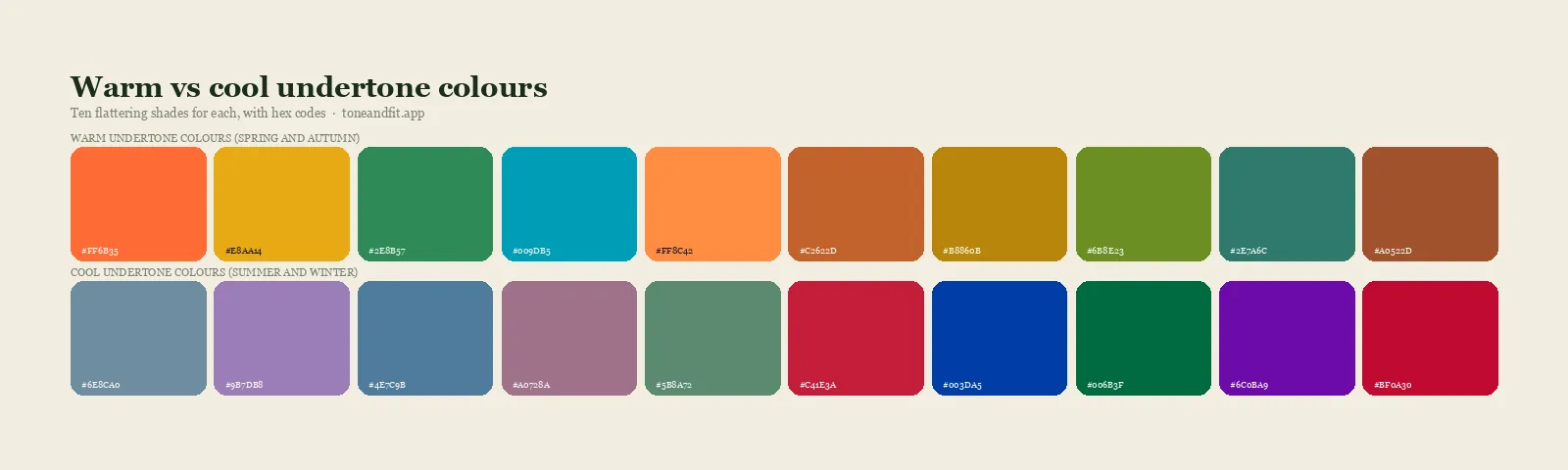

Depth is not the same thing as undertone
This is the single most useful distinction in the whole subject, and almost every article that groups people by "dark skin" gets it wrong.
Depth is how much light your skin, hair, and eyes reflect. It is a vertical measurement, from very light to very deep, and it is the one you can see across a room.
Undertone is the color sitting underneath the surface: golden and peachy on one side, blue and rosy on the other, balanced in the middle. It is a horizontal measurement and it is independent of depth. Two people with identical skin depth can have opposite undertones and therefore opposite palettes.
The persistent myth is that deep skin is automatically warm. It is not. Cool deep skin is extremely common, and so is neutral. When someone with cool deep skin follows advice built for warm deep skin, they end up in a wardrobe of rust and mustard that looks perfectly nice on the hanger and slightly muddy in the mirror. The full explanation of the two camps is in warm versus cool undertones, and the deeper argument about why the standard 12-season material was not built with deep skin in mind is in color analysis for deep and dark skin.
The one sentence version
Depth tells you how strong a color can be. Undertone tells you which direction it should lean. You need both, and most advice only gives you one.
How to find your undertone on deep skin
Two of the classic home tests are close to useless on deep skin, and it is worth saying why so you stop blaming yourself for inconclusive results.
The vein test asks you to look at the veins on your inner wrist and decide whether they read blue or green. On deep skin, melanin in the upper layers absorbs enough light that the veins usually read as a fairly neutral dark line. The test is not giving you a wrong answer, it is giving you no answer.
The sun reaction test asks whether you burn or tan. On deep skin the answer is nearly always tan, which is a fact about melanin rather than about undertone, so it fails to separate anyone.
Three checks do work:
- The metal test. Hold a gold piece and a silver piece against your jaw in daylight, one at a time. One will look like it belongs to your face and the other will look like it is resting on top of it. Gold suggests warm, silver suggests cool, and if both genuinely look fine you are probably neutral. The reasoning behind this is in gold or silver jewelry by undertone.
- The white test. Put optic white next to your jaw, then warm ivory. Optic white has a blue base and ivory has a yellow one. One will make your skin look clearer and more even, the other will pull a slightly grey or slightly sallow cast in. That difference is your undertone talking.
- The lip and palm check. The natural color of your lips and the inner palm is less obscured by surface melanin than the rest of the skin. Cool undertones tend to show a berry or plum cast there, warm undertones a brick or coral one.
The full sequence, including how to control the lighting so the results mean anything, is in how to find your skin undertone at home. If all three checks land ambiguously, that is a real result rather than a failure, and neutral undertone skin covers what to do with it.
Skip the guesswork
Tone & Fit measures undertone, depth, and chroma from one selfie and hands back your season with the exact shades that go with it.
Analyze my photo free ↗The colors that work on almost all deep skin
Before undertone splits the list, there is a group of colors that behave well across nearly the whole range. They share one property: high saturation. A color at full strength holds its own against deep skin because both have visual weight, and neither is asking the other to carry it.
- Emerald green. The most consistently flattering color in the group. It is saturated enough to register, sits close enough to the middle of the temperature scale to suit warm and cool, and reads as rich rather than loud.
- Cobalt and sapphire blue. Clear, strong blues that give a clean edge at the neckline without the flatness of navy.
- Fuchsia and magenta. These are the colors that surprise people. They look aggressive on a hanger and become almost luminous next to deep skin.
- True red. Not brick, not burgundy, the primary one. It is the highest impact color most wardrobes contain.
- Bright white. The contrast between deep skin and clean white is one of the strongest visual effects available in clothing, and it costs nothing to use.
- Gold and bronze. Both as fabric and as metal, these have a lit quality against deep skin that silver only matches on cool undertones.
Two caveats keep this list honest. First, "works on almost everyone" still bends to undertone: the emerald a warm person wants leans slightly toward moss, and the one a cool person wants leans slightly toward jade. Second, saturation is not the only factor. If your overall coloring is deep but soft, which happens with brown eyes, warm brown hair, and low contrast between them, full strength fuchsia can look like it is wearing you. Your contrast level is what settles that question.
Best colors by undertone
Here is the practical split. Use the general list above as your safe zone and this table as the refinement.
| Undertone | Best colors | Approach with care |
|---|---|---|
| Warm deep | Marigold, rust, terracotta, bronze, olive, moss, warm ivory, tomato red, teal, chocolate, camel | Icy pastels, blue based greys, stark optic white, cool lilac |
| Cool deep | Fuchsia, magenta, cobalt, sapphire, emerald, amethyst, ruby, icy pink, optic white, charcoal | Mustard, khaki, orange based rust, warm beige, golden brown |
| Neutral deep | Emerald, teal, true red, denim blue, soft white, aubergine, espresso, dusty coral, pine | Extremes at either end: pure orange, pure icy blue, anything at your exact skin value |
Warm deep skin
Your palette is built from colors with a gold base. Marigold and mustard both work, though marigold is the safer of the two because it is more saturated. Rust, terracotta, and bronze are strong. Olive and moss look intentional rather than dull. For a neutral, warm ivory and espresso beat optic white and black respectively, and camel behaves far better here than it does on cool skin. Teal is the one blue that consistently belongs on this list, because it has enough yellow in it to stay in the family.
Cool deep skin
Your palette is built from colors with a blue base, and it is the more dramatic of the two. Fuchsia, magenta, and ruby red are exceptional. Cobalt, sapphire, and true emerald give you the clean, jewel like effect that warm undertones get from bronze. Amethyst and deep plum sit beautifully. Optic white is your white, charcoal is often better than pure black, and icy pastels are one of the few places where a light color holds up next to deep skin, because the blue base keeps them from turning chalky.
Neutral deep skin
You get the widest range and the least clear guidance, which is a mixed blessing. The colors that suit you best are the ones sitting near the middle of the temperature scale rather than at either edge: emerald, teal, true red, aubergine, pine, denim blue, and a soft white that is neither blue nor yellow. The trap for neutral undertones is not the wrong temperature, it is the wrong value. A garment that lands at almost exactly your own skin depth will look flat no matter how well the temperature is judged, which is the mechanism explained in colors that wash you out.
Best colors by color season
Undertone gets you a shortlist. A full season gets you a palette, because it adds value and chroma to the temperature reading. Deep skin appears across many of the twelve seasons, and these are the ones it lands in most often.
| Season | Signature colors | Best neutrals |
|---|---|---|
| Deep Autumn | Oxblood, forest, deep teal, rust, aubergine, marigold | Espresso, dark olive, warm charcoal |
| Deep Winter | Ruby, emerald, sapphire, magenta, pine, ice blue | Black, charcoal, optic white |
| True Winter | True red, cobalt, fuchsia, emerald, amethyst | Black, pure white, navy |
| Warm Autumn | Terracotta, moss, bronze, mustard, pumpkin | Chocolate, camel, warm ivory |
| Soft Autumn | Sage, dusty coral, muted teal, cocoa rose | Taupe, soft espresso, oatmeal |
| Bright Spring | Coral, turquoise, warm pink, clear yellow green | Warm navy, bronze, cream |
The two most common results on deep skin are Deep Autumn and Deep Winter, and telling them apart is genuinely difficult because both are dark and both are rich. The dividing line is temperature: Deep Autumn's darkness has a warm, earthy base, and Deep Winter's has a cool, inky one. Side by side comparisons live in Deep Autumn vs Deep Winter, and the full swatch sets are in the Deep Autumn palette and on the palettes pages. If you have not been sorted into a season yet, the 12 color seasons walkthrough is the place to start.
What actually goes wrong, and it is not what you think
The advice that deep skin "can wear anything" is close enough to true that it stops people from investigating the cases where it is not. There are three specific failure modes, and none of them is about a color being too bright.
1. Value collision
The most common problem by a distance. A garment that sits at almost exactly your skin's lightness gives the eye nothing to separate you from the fabric, so both the outfit and your features lose definition. Mid brown is the usual offender, followed by warm taupe, khaki, and camel at the wrong depth. The fix is not avoidance, it is distance: go clearly darker or clearly lighter than your own value.
2. Chalky rather than clear
Most inexpensive pastels are made by adding white and grey to a base color, which produces a milky, dusty quality. That dustiness is what flattens against deep skin, not the lightness. A clear mint, a true periwinkle, or a clean buttercup behaves completely differently from a dusty sage or a greyed baby blue. When someone says pastels do not work on dark skin, they have almost always been sold the chalky version.
3. Temperature drift in neutrals
People check the temperature of a bright color and then buy neutrals on autopilot. But beige, grey, brown, and white all come in warm and cool versions, and since neutrals are what you wear closest to your face most days, a mismatch there costs you more than one wrong sweater. If you own a black shirt that always feels slightly severe, try charcoal or espresso instead and watch the difference.
Find your season, then shop from it
One selfie in daylight. Sixty seconds later you have your undertone, your season, and a palette you can hold up in a shop.
Analyze my photo free ↗Neutrals, denim, and the everyday wardrobe
Statement colors are the fun part and about fifteen percent of what you actually wear. Neutrals are the rest, so getting them right matters more.
Black works on most deep skin, and it works best where contrast is high. It is not, however, the automatic default it is treated as. On warm deep skin, espresso or dark chocolate frequently does the same job with more warmth in the face. On soft, low contrast deep coloring, charcoal is gentler than black without losing the anchoring effect.
White is one of the strongest tools you have. The only decision is optic white versus ivory, and that follows your undertone directly.
Brown is excellent when it is far enough from your own value. Espresso and bitter chocolate on one side, caramel and toffee on the other. The mid range is where it goes flat.
Grey needs a temperature check that people rarely give it. Cool greys read clean on cool undertones and slightly lifeless on warm ones, where a greige or a warm charcoal serves better.
Denim follows the same logic as everything else. A clear mid blue or a deep indigo reads well across the range. Faded, greyed, stonewashed denim is the value collision problem in trouser form.
For turning this into an actual wardrobe rather than a list, building a capsule around your color season covers the structure, and how to shop your color palette covers the in store discipline that keeps you from buying the wrong shade of the right color. Outerwear gets its own treatment in best coat colors for your skin tone, since a coat spends more time next to your face than anything else you own.
Metals, makeup, and hair
Metal is the quickest read in the whole system. Gold and bronze look lit against warm deep skin, silver and white gold look clean against cool deep skin, and rose gold sits comfortably on neutral. If you have been wearing one metal out of habit for years, trying the other in daylight is a five second experiment with a surprisingly clear answer.
For makeup, the same temperature rule applies but the stakes are higher because it sits directly on the skin. Foundation undertone is the piece most often mismatched, and a base that is one step too yellow or too pink for you undoes everything else on the face. Finding your foundation undertone walks through it. On the lip, warm deep skin takes brick, terracotta, copper, and warm brown reds, while cool deep skin takes berry, plum, blue based red, and true fuchsia. There is a fuller shade list in best lipstick colors for your undertone, and the same logic transfers to nail colors.
Hair color follows depth first and temperature second. Deep skin usually supports rich, saturated hair color that would be too heavy elsewhere, and the common mistake is lightening several levels in a cool direction on warm skin, or the reverse. Best hair color for your skin tone covers the mapping.
FAQ
What colors look best on dark skin?
Saturated colors at full strength are the reliable answer: emerald, sapphire, cobalt, fuchsia, true red, marigold, and clean white. Deep skin has enough visual weight to hold a color that would swamp a lighter face, so the shades that go wrong are usually the weak ones rather than the loud ones. Beyond that, undertone decides the direction. Warm deep skin leans toward marigold, rust, olive, and warm ivory. Cool deep skin leans toward fuchsia, cobalt, emerald, and optic white.
How do I find my undertone if I have dark skin?
The vein test and the sun reaction test both work poorly on deep skin, because melanin obscures the vein color and almost everyone tans rather than burns. Two checks work better. First, the metal test: hold gold and silver against your jaw in daylight and see which one looks like it belongs and which one looks like it is sitting on top of your skin. Second, the white test: compare optic white against warm ivory at your jawline and notice which one makes your skin look clearer. Photo based analysis is more reliable still, because it measures the pixels rather than asking you to judge.
Can dark skin wear pastels?
Yes, with one adjustment. The problem is never the hue, it is the chalkiness. Most commercial pastels are made by adding white and grey to a color, and that milky quality is what reads as flat against deep skin. Look for pastels that stay clear rather than dusty: mint rather than sage, periwinkle rather than dusty blue, buttercup rather than beige yellow. Wearing a pastel away from the face while a saturated color sits near it also solves the issue instantly.
What is the best white for dark skin?
White is one of the strongest colors available on deep skin because the contrast is dramatic and flattering. The choice is between optic white, which has a cool blue base, and ivory or cream, which has a warm yellow base. Cool undertones look crisper in optic white, and warm undertones look richer in ivory. If you are unsure, hold a piece of printer paper and a cream fabric next to your jaw one after the other and pick the one that makes your skin look more even rather than more grey.
Is brown a bad color for dark skin?
No, but it is the color most often worn at the wrong depth. Brown goes wrong when it sits at almost exactly your own skin value, because the eye then has nothing separating the garment from the face and both lose definition. The fix is distance rather than avoidance. Go darker, into espresso and bitter chocolate, or lighter and warmer, into caramel and toffee, and skip the mid brown that matches you. Texture also helps, since a suede or knit brown reads differently from flat cotton.
Which color season is most common for dark skin?
Deep Autumn and Deep Winter are the most frequent results, since both are defined by depth of coloring rather than by any particular skin color. True Winter, Warm Autumn, and Bright Spring also occur often. There is no season that deep skin cannot be, and the assumption that dark skin is automatically warm is a common error: cool and neutral deep skin are both very common, and getting the temperature wrong is what produces a palette that never quite works.