Best Nail Colors for Your Skin Undertone and Color Season
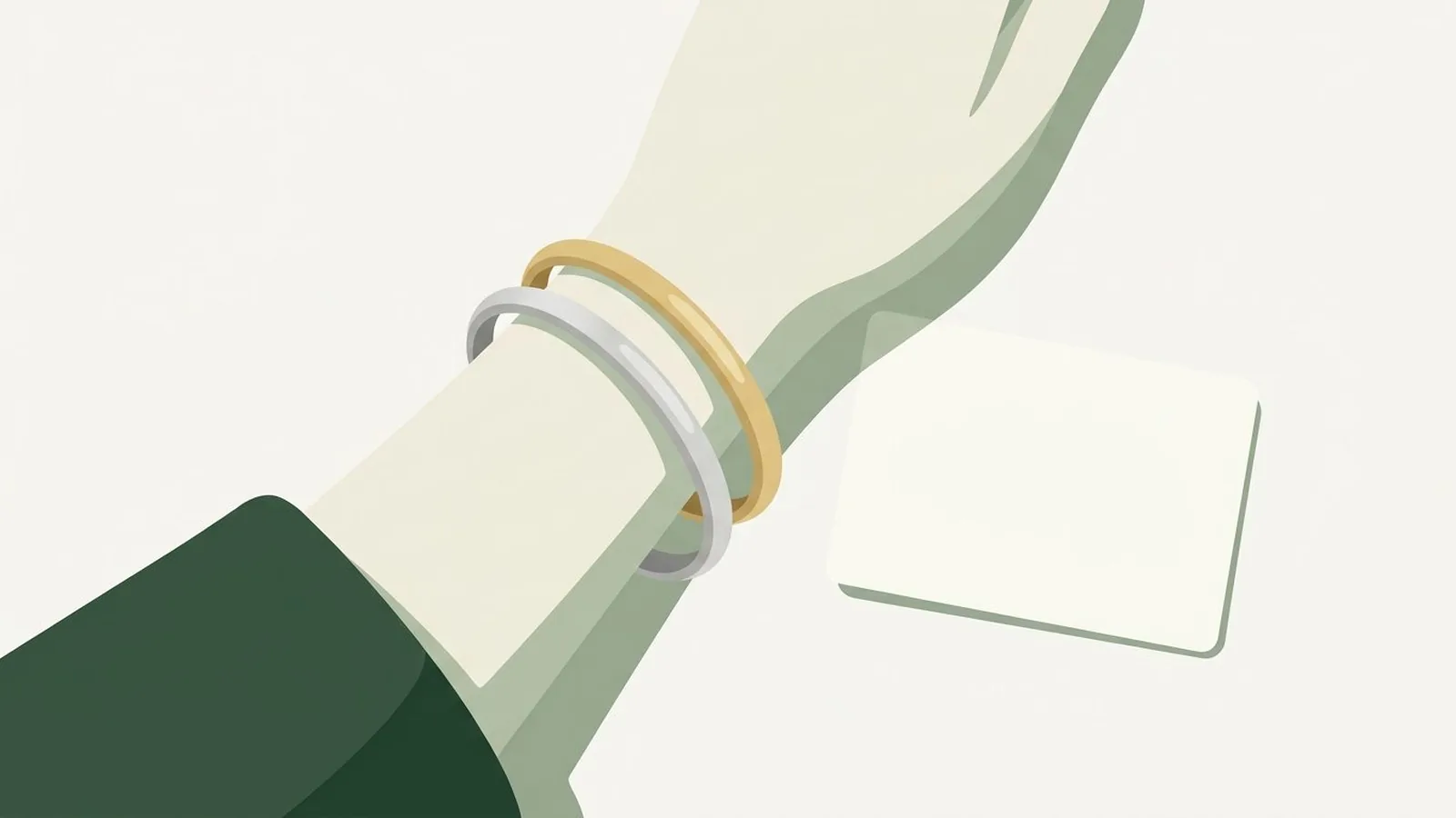
Short answer: nail colour is an undertone decision. Cool undertones look best in blue-based reds, berry, mauve and cool nudes; warm undertones in orange-based reds, coral, terracotta and warm nudes; neutral and olive undertones can borrow from both but should avoid the extremes. The season-by-season lists below name the exact shades.
You see your own hands more than you see your own face. They are in front of you while you type, drive, eat, and scroll, which makes nail color the one shade you get to evaluate honestly, all day, without a mirror. It is also the shade most people pick by shelf appeal and then quietly regret by day three.
The short answer: cool undertones look best in blue-based shades, meaning cherry red, raspberry, plum, cool taupe, and icy pastels. Warm undertones look best in yellow-based shades, meaning brick red, coral, terracotta, warm caramel, and pumpkin. Olive skin takes the muted middle, meaning brick, mauve, sage, and dusty rose. Neutral undertones can wear both sides as long as the shade is not extreme in either direction. The rest of this guide narrows those bands to your specific color season, explains why the same bottle looks different on two people, and gives you a way to test a polish before you buy it.
What's in this guide
- Why nail color is an undertone decision
- Your hands are not your face
- The two-minute test before you buy
- Best nail colors by undertone, at a glance
- Winter seasons: clear, cold, and high contrast
- Autumn seasons: warm, deep, and earthy
- Spring seasons: warm, bright, and light
- Summer seasons: cool, soft, and muted
- Finding your one perfect red
- The nude problem, solved
- Six nail color mistakes worth fixing
- FAQ
Why nail color is an undertone decision
A polish never appears alone. It always appears surrounded by roughly a centimeter of your skin on every side, which means your eye is forced into a direct comparison every time you look at your hands. That comparison is the whole game. When the polish and the skin share an undertone, the eye reads them as a set, and the hand looks longer, cleaner, and more even. When they disagree, the eye reads the difference first, and the skin around the nail suddenly looks yellow, or grey, or red in places you never noticed before.
This is exactly the mechanism behind everything else in color analysis. It is the same reason a scarf can make you look rested or exhausted, and the same reason a foundation can be the right depth and still look like a mask. If the idea is new to you, the foundation piece is warm versus cool skin undertone, which explains temperature as a measurable property of skin rather than a vibe. Nail color simply applies that property to a very small surface held very close to a lot of skin.
There is one useful difference. Because the swatch is small, the effect is gentler than it is with clothing near your face. Nobody has ever looked drained because of a manicure. But the effect on the hand itself is strong, and hands photograph constantly now: holding a coffee, on a steering wheel, on a keyboard, at the edge of every selfie. A shade that fights your skin will show up in every one of those frames.
Your hands are not your face
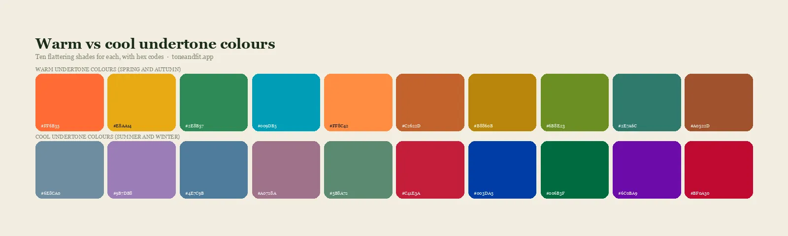
Here is the adjustment most guides skip. Your hands and your face are usually not the same color. Hands get more cumulative sun exposure than almost any other part of the body, they have thinner skin over more visible tendons and veins, and they tend to run a little more sallow and a little more tanned than the face they belong to. Two people with identical facial coloring can have noticeably different hands.
Your undertone does not change between your face and your hands. Temperature is set by the balance of melanin, carotene, and blood visible through skin, and that balance holds across your body. What does change is depth and clarity. Hands often read one step deeper and one step more muted than the face, which means a polish can be technically correct for your season and still look slightly heavy or slightly washed out on your particular hands.
The practical rule: start from your season, then adjust depth by half a step based on what your hands actually look like, and never adjust temperature. Depth is a fit issue. Temperature is a right-or-wrong issue.
A quick check
Hold your bare hand next to your bare forearm in daylight. If the hand is clearly darker or more yellow than the arm, treat it as one step deeper and one step warmer when choosing depth, but keep your season's temperature exactly as it is.
The two-minute test before you buy
Store lighting is designed to make everything look good, and polish bottles lie. The lacquer inside a glass bottle looks more saturated and often warmer than the same lacquer in two thin coats on a nail. Here is a faster test than painting a full hand.
- Bottle to knuckle, not to nail. Rest the bottle against the back of your middle finger, near the knuckle. That skin is a closer match to nail-adjacent skin than your palm or wrist.
- Compare two, never one. A single shade always looks fine in isolation. Hold two candidates side by side and the wrong one becomes obvious in about four seconds.
- Walk to a window. Daylight is the only lighting that tells the truth. This matters more than people expect, and the same trap applies to clothes and makeup, which is why we wrote a whole piece on how lighting changes your color read.
- Ask what happens to your knuckles. Not to the polish. If the skin over your knuckles suddenly looks pinker, redder, or greyer, the shade is fighting you. If your hand simply looks like your hand, you have a match.
Best nail colors by undertone, at a glance
| Undertone | Reds | Nudes | Statement shades | Skip |
|---|---|---|---|---|
| Cool | Cherry, raspberry, true blue-red | Rosy beige, cool taupe, soft mauve | Plum, berry, navy, icy lilac | Orange, rust, mustard, warm camel |
| Warm | Brick, tomato, warm crimson | Caramel, warm beige, honey | Terracotta, olive, bronze, pumpkin | Blue-red, fuchsia, icy pastel, grey-lilac |
| Olive | Brick, deep wine, muted red | Warm mauve, greige, soft clay | Sage, dusty rose, moss, oxblood | Neon, bright yellow-orange, chalky pastel |
| Neutral | True red, soft berry | Balanced beige, soft rose-beige | Dusty pink, muted teal, soft burgundy | Extremes at either end of temperature |
If you cannot place yourself on this chart yet, that is the thing to solve first. Everything downstream of undertone is guesswork until undertone is settled, and the fastest reliable route is the wrist-and-metal method in how to find your skin undertone at home. If your reading keeps coming back ambiguous, you may sit in the genuinely mixed category described in neutral undertone skin, which is more common than the internet suggests.
Winter seasons: clear, cold, and high contrast
Winter coloring can carry the most saturated polish shades on the shelf without being overwhelmed by them, because the contrast between hair, skin, and eyes is already high. Softening a Winter is usually what goes wrong, not overpowering one.
Cool Winter is the most straightforwardly blue-based of the three. Cherry red, raspberry, true plum, deep berry, cold navy, and a stark icy white all sit cleanly on cool skin. Avoid anything with a visible orange base, and be careful with brown-based nudes, which turn muddy against Cool Winter hands. The full shade family, including the specific reds and neutrals that belong to this season, is laid out in the Cool Winter color palette. If you are choosing between two similar cold seasons, Cool Winter versus Cool Summer is the comparison that usually settles it, because the two share temperature but split hard on clarity.
Deep Winter takes the darkest end of the cool range: oxblood that leans blue rather than brown, near-black plum, deep pine, and espresso with a cool cast. Pale nudes tend to look disconnected on Deep Winter hands, so a nude here should be a deep rosy taupe rather than a beige.
True Winter wants pure, unmixed color. True red, pure fuchsia, sapphire, and a clean stark white. Anything dusty or greyed reads as a mistake on True Winter, which is the one season where a muted polish looks worse than a loud one.
Autumn seasons: warm, deep, and earthy
Autumn nails are where the earth shades finally make sense. Terracotta, brick, moss, bronze, and warm chocolate are not compromises for Autumn coloring, they are the point.
Deep Autumn holds the richest versions: oxblood with a brown base, dark chocolate, deep rust, and forest green. The nudes that work are warm and substantial, closer to a caramel than a beige. Deep Autumn is often mistaken for Deep Winter, and the two want genuinely different reds, so if you are unsure it is worth reading Deep Autumn versus Deep Winter before you buy another bottle. The complete shade set lives in the Deep Autumn color palette.
True Autumn takes the classic mid-depth earth range: pumpkin, warm brick, mustard, olive, and copper. This is the season that can actually wear the orange shades most people are told to avoid.
Soft Autumn needs everything dialed down. The right shades are muted and slightly dusty: clay, soft terracotta, warm mauve, sage. A fully saturated polish on Soft Autumn hands looks like it belongs to someone else.
Spring seasons: warm, bright, and light
Spring polish is warm like Autumn but lighter and clearer, which rules out the heavy earth tones and opens up a range of corals and warm pastels that no other group can wear as well.
Warm Spring lives in coral, peach, warm poppy, apricot, and golden nude. These are shades that look almost too cheerful on the shelf and then look correct on the hand. Skip anything blue-based, and skip deep browns, which weigh Warm Spring hands down. The full range is in the Warm Spring color palette. If you have been landing somewhere between Spring and Autumn in every quiz you take, Warm Spring versus Warm Autumn is the direct comparison, since both are warm and the split is really about clarity and depth.
Light Spring wants the palest warm shades: soft peach, buttercream, light coral, and a warm sheer pink. Depth is the failure mode here. A very dark polish on Light Spring hands reads as a costume rather than a choice.
True Spring takes the brightest warm shades available: clear coral, warm turquoise, poppy red, and true golden yellow. Muted shades flatten True Spring the same way bright shades overwhelm Soft Autumn.
Summer seasons: cool, soft, and muted
Summer is cool like Winter but softer, which means the icy brights that suit Cool Winter tend to look slightly harsh on Summer hands.
Soft Summer takes dusty rose, mauve, soft plum, and greyed lilac. This is the season that benefits most from a muted taupe as an everyday shade.
Light Summer wants pale cool shades: soft pink, powder blue, pale lavender, and a cool sheer nude one step deeper than the nail bed.
Cool Summer sits between the two: raspberry, cool rose, soft berry, and periwinkle. The reds should stay on the pink side of red rather than approaching true crimson.
Across all three Summers, the mistake to watch for is depth rather than temperature. A polish that is correct in temperature but too dark will make Summer hands look bruised rather than polished.
Finding your one perfect red
If you only solve one shade, solve red. It is the shade people reach for when it matters, and it is the shade where the temperature error is most visible, because red sits at the point on the color wheel where warm and cool split most dramatically.
Red runs on a continuum from orange-red at the warm end through true red in the middle to blue-red at the cool end. Your position on that line is set by your undertone and nothing else. Cool skin wants blue-red: cherry, raspberry, crimson with a violet edge. Warm skin wants orange-red: brick, tomato, warm scarlet. Neutral and olive skin want something close to the middle, and olive in particular tends to look best with a red that has been slightly greyed rather than one at full saturation.
The test that works: put two reds next to each other, one obviously warmer and one obviously cooler, and look at your knuckles rather than the polish. One of them will make the skin over your knuckles look calmer and more even. The other will pull out redness you did not know was there. That is the entire decision, and once you have made it, you can buy reds confidently for years.
Stop testing bottles against your knuckles
Tone & Fit reads your undertone, depth, and contrast from one selfie and hands you the palette your reds and nudes should come from. Free on iPhone.
Find your season free ↗The nude problem, solved
Nude is the most requested and most misunderstood category in nail color. The reason is that nude is not a shade, it is a relationship: it only works when it is defined relative to your specific hand.
Three rules cover most of it.
- Go deeper than your nail bed, not lighter. A nude lighter than your skin acts as a highlighter and visually shortens the finger. One to two steps deeper elongates it.
- Match temperature, not depth, to your season. Cool skin needs a rosy or taupe nude. Warm skin needs a caramel or honey nude. A beige nude on cool skin reads muddy, and a pink nude on warm skin reads grey.
- Watch the opacity. Deeper skin tones are badly served by the chalky opaque nudes that dominate most shelves. A sheer or jelly formula in a deeper tone lets your natural nail read through and looks far more expensive. This is one of several places where mainstream color advice quietly assumes lighter skin, which is why we addressed it directly in color analysis for deep skin tones.
Olive skin deserves its own note, because it sits outside the simple warm-cool split. Olive has a green cast layered over a warm or neutral base, and it is the reason so many people test as warm on the vein check and then look terrible in gold. Muted, slightly grey-touched nudes and brick reds tend to suit olive hands better than either a clean warm or a clean cool shade. The mechanics are covered in best colors for olive skin tone.
Six nail color mistakes worth fixing
- Buying from the bottle. Glass and lacquer together read more saturated and often warmer than two thin coats on a nail. Judge the shade on skin or on a swatch stick, never through glass.
- Matching the polish to the outfit. The outfit changes daily, the hand does not. Match the polish to your hand, and let it coordinate with the outfit by sharing a palette rather than a shade.
- Fighting your temperature for a trend. Most trend shades exist in both a warm and a cool version. There is almost always a version of the shade you want that belongs to your palette, and finding it is faster than talking yourself into the wrong one.
- Ignoring the polish-to-lipstick clash. These two shades get compared constantly, whenever a hand comes near a face. They do not have to match, but they do have to agree on temperature. Your lipstick should be coming from the same place, which is covered in best lipstick color for your undertone.
- Treating jewelry as separate. Your rings sit within a few millimeters of your polish and either reinforce or undercut it. Silver next to a warm terracotta creates a small visual argument on every finger. The silver-versus-gold question is settled the same way as the polish question, in gold or silver jewelry by undertone.
- Assuming a shade that suits your friend suits you. This is the one that costs the most money over time. The same bottle on two different undertones is functionally two different products.
None of this requires memorizing a palette. It requires knowing one thing about yourself and then applying it consistently, which is what the seasonal color analysis system is actually for. If you want the whole framework in one place, including the three measurements that determine your season and the four ways to find yours, start with the complete personal color analysis guide. If you already know your undertone and just want to place yourself among the twelve, go straight to the 12 color seasons: which am I.
Prefer to have it measured? Try the free photo color analysis and get your season with a confidence score.
FAQ
What nail color suits every skin tone?
A true red, meaning a red that sits almost exactly between orange and blue, comes closest. It is the shade most people can wear because it does not commit hard to either temperature. Beyond that, the honest answer is that no single bottle flatters everyone. A cherry red and a brick red look like the same color on a shelf and completely different on hands, and which one lifts your skin depends on your undertone rather than on the polish being popular.
How do I know if my hands are warm or cool toned?
Look at the inside of your wrist in daylight. Veins that read blue or purple point cool, veins that read green point warm, and a mix points neutral or olive. Then confirm with metal: rest a silver ring and a gold ring side by side on the back of your hand and see which one disappears into your skin and which one sits on top of it. Our guide on how to find your skin undertone at home walks through both tests properly, including the lighting conditions that ruin them.
Can cool undertones wear orange or coral nail polish?
Yes, but the version matters more than the color family. A pure sunset orange will usually make cool hands look ruddy and pink around the knuckles. A coral that has been pulled toward pink, sometimes sold as watermelon or guava, keeps the brightness while losing the yellow base, and that version sits comfortably on cool skin. The test is whether the polish looks like it belongs to the same family as your blush.
Why does nude nail polish look bad on me?
Nude is not one color, it is a whole family, and most people buy the wrong end of it. A nude that is lighter than your hand acts like a highlighter and makes fingers look stubby. A nude that leans pink on warm skin looks grey and lifeless, and a nude that leans beige on cool skin looks muddy. The nude that works is usually one or two steps deeper than your natural nail bed and matched to your temperature.
Should my nail color match my lipstick?
They do not need to match, but they should agree on temperature. A blue-red lipstick with an orange-red manicure is the combination that reads as a mistake in photographs, because the eye compares them directly whenever you touch your face or hold a glass. Matching the temperature and letting the depth differ is a more flexible rule than matching the shade exactly.
Do nail colors follow the same seasonal rules as clothes?
Mostly, with one adjustment. Your hands are usually a shade or two different from your face, often warmer and often more tanned, so a polish can be correct for your season and still look slightly off on your particular hands. Start from your season's palette, then shift half a step warmer or cooler based on what your hands actually look like.
Does nail polish need to change with the seasons of the year?
Not for color analysis reasons. Your undertone does not change in October. What changes is your skin depth if you tan, which can make a very light nude look chalkier in summer and a very deep shade look heavier in winter. Adjusting depth by a step through the year is reasonable. Switching temperature is not.