Am I an Autumn or a Winter? How to Tell the Two Apart

Almost nobody confuses autumn with summer. The pair that traps people is autumn and winter, because both families suit depth, both look strong in saturated color, and both tend to belong to people with dark hair. Depth is the thing they share. It is not the thing that decides it.
In this guide
Why these two get confused
Seasonal analysis sorts you on three readings: temperature, value, and chroma. Temperature is warm or cool, value is light or deep, and chroma is clear or muted. The full mechanics are in seasonal color analysis explained, and the twelve results those three readings produce are laid out in the 12 color seasons.
Autumn and winter sit on the same side of one of those three readings. Both families are anchored at the deep end of value. Both carry weight. Put an autumn and a winter side by side in a photograph and you will see two people who can wear a color that would swallow anyone else.
So the confusion is structural, not a mistake anyone is making. The two families genuinely resemble each other on the one axis people notice first. They differ completely on the axis people notice last, which is temperature. Autumn is the warm half of the deep end. Winter is the cool half.
Add to that the hair problem. Deep autumn hair is often near black. So is deep winter hair. Under a kitchen bulb they are indistinguishable, and most people form their idea of their own coloring under a kitchen bulb. That single fact accounts for a very large share of the people walking around wearing the wrong half of this pair.
The one question that decides it
Does your skin look better next to colors that have yellow in them, or next to colors that have blue in them?
That is the whole question. Everything below is a way of answering it without guessing.
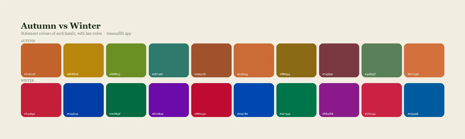
Autumn colors are built on a warm base. Rust, camel, olive, mustard, terracotta, bronze, moss, coffee, and cream. Even the greens and blues in an autumn palette have been warmed: teal rather than sapphire, moss rather than emerald. You can see the whole family laid out on the autumn palette page.
Winter colors are built on a cool base. True red, emerald, sapphire, fuchsia, pure white, and real black. Winter is the only family that wears optic white and true black well, and it is the only family that can take a color at full saturation without being overwhelmed by it. The winter palette page shows the range.
If you have never settled your temperature, do that first and this question answers itself. Warm versus cool skin undertone explains what the two camps actually mean, and how to find your undertone at home gives you the tests in order of reliability.
Four tests you can run today
Do all four next to a window on an overcast day, or in the shade on a bright one. Direct sun is too yellow and indoor bulbs are worse. Take your makeup off, push your hair back off your face, and make sure nothing strongly colored is in view, including the shirt you are wearing and the wall behind you. Watch your jawline and the skin under your eyes, not the fabric.
1. The white test
Hold a piece of pure optic white paper or fabric under your chin, then swap it for cream or ivory. On a winter, the optic white looks clean and the cream looks slightly dingy against the skin, like a shirt that has been washed too many times. On an autumn, the cream looks warm and settled and the optic white makes the face look grey and slightly harsh.
2. The metal test
Silver and gold, one wrist at a time, in the same light. Autumn skin takes gold and yellow gold looks like it belongs there. Winter skin takes silver, white gold, and platinum, and yellow gold can look faintly orange against it. This is the fastest of the four tests and the one with the least room for interpretation, which is why the gold or silver question is worth its own read.
3. The black test
Real black, held right under the jaw. On a winter it is clean and the eyes come forward. On an autumn it is a wall: the face reads tired, the shadows around the nose and mouth deepen, and the black itself looks flat rather than rich. Autumns get the same effect from espresso brown or dark olive without the drain, which is a useful thing to know before you buy another black coat.
4. The camel and charcoal test
This one separates the two families more reliably than any single bright color, because both neutrals are common and easy to find. Hold camel or tan under your chin, then charcoal grey. Autumns look warmed and healthy in camel and slightly flattened in charcoal. Winters look crisp in charcoal and slightly sallow in camel, as if the yellow in the fabric has migrated into the skin.
If three of the four point the same way, that is your answer. If they split evenly, read the neutral section below rather than picking whichever result you liked better.
The three autumns and the three winters
Neither family is one thing. Each splits into three, and knowing which variant you are matters more than the family name once you start shopping.
| Season | Temperature | Value | Chroma | Signature colors |
|---|---|---|---|---|
| Warm Autumn | Fully warm | Medium | Medium | Rust, mustard, moss, terracotta |
| Soft Autumn | Warm neutral | Medium | Muted | Sage, dusty rose, oatmeal, soft teal |
| Deep Autumn | Warm neutral | Deep | Rich | Espresso, forest, burnt orange, aubergine |
| Deep Winter | Cool neutral | Deep | Rich | Black, pine, deep plum, true navy |
| True Winter | Fully cool | Deep | Clear | True red, emerald, optic white, royal blue |
| Cool Winter | Fully cool | Medium to deep | Clear | Icy blue, raspberry, cool grey, sapphire |
Read down the temperature column and the pattern is obvious. The two seasons that sit closest to each other across the family line are deep autumn and deep winter, which is why almost every real case of this confusion is one of those two. The full profiles are in am I a deep autumn and am I a cool winter, and the swatches are in the deep autumn palette and cool winter palette.
The exact pairs people get stuck between
Deep autumn and deep winter
This is the real one, and it accounts for most of the traffic to this question. The two share a value and overlap on a handful of colors: espresso, deep teal, aubergine, forest green, and burgundy all appear in both palettes. Where they part company is at the extremes. Deep winter takes black and icy accents. Deep autumn takes chocolate and cream instead, and looks harsh in both black and optic white.
The tie breaker is usually the hair, checked outdoors. Warm dark hair throws red, coffee, or bronze in daylight. Cool dark hair throws blue, ash, or plum. If you want the pair broken down color by color, deep autumn versus deep winter does exactly that.
Warm autumn and true winter
These two are at opposite corners, so if a tool has offered you both, one of the two readings was taken from a bad photo. Warm indoor light pushes skin toward autumn and blue screen light or a beauty filter pushes it toward winter. Retake the analysis in daylight before treating this as a genuine ambiguity.
Soft autumn and cool winter
Rarer, and it is a chroma problem rather than a temperature one. Soft autumn is muted and cool winter is clear, so the test is not which colors suit you but how much saturation you can carry. Put a dusty sage and a clean raspberry side by side. If the sage looks like nothing and the raspberry looks alive, you are on the clear side. Finding your contrast level is the companion read.
Autumn and spring, for completeness
Some people arriving at this question are actually warm and light rather than warm and deep, which puts them in spring rather than autumn. If camel and cream flatter you but rust and olive feel heavy, look at am I a warm spring before you settle on autumn. The temperature reading was right and the value reading was not.
What goes wrong on the wrong side
Picking the wrong family is not a neutral mistake. It produces a specific and recognizable set of effects, which is useful, because you may already be seeing them.
- An autumn dressed as a winter looks severe. Black near the face hardens the jaw, optic white greys the skin, and fuchsia and icy pastels make the face look slightly unwell. The usual complaint is that photographs of yourself look drained even when you felt fine.
- A winter dressed as an autumn looks sallow. Camel, mustard, and olive push yellow into the skin, and the muted end of the autumn palette makes a winter look faded rather than softened. The usual complaint is that you own beautiful clothes that somehow always feel dull on.
- Both end up buying the same neutral over and over because nothing feels right, and then blaming the fit.
If any of that is familiar, the list in colors that wash you out is a fast way to check which pattern you are in. And once you know your family, the hair color question follows immediately, which is covered for each side in deep autumn hair color and cool winter hair color.
Settle it in 60 seconds
Tone & Fit reads undertone, value, and chroma from one selfie and gives you the season plus the palette, without the guesswork of holding fabric up to your own face.
Get your color season freeIf you are neutral
A meaningful share of people run the four tests and get a split. That is not a failure of the tests. Neutral undertone means the warm and cool pigments in your skin are close to balanced, and it is common enough that two of the twelve seasons exist mainly to describe it.
If your tests split and you are clearly deep, you are at the boundary, which means deep autumn on the warm side or deep winter on the cool side. Your safest ground is the overlap the two palettes share:
- Espresso and dark chocolate rather than black or camel
- Deep teal, which is warm enough for autumn and blue enough for winter
- Aubergine and deep plum
- Forest green
- Off white rather than optic white or cream
- Burgundy, kept away from both the orange and the pink extremes
Build the near face layer of your wardrobe from that list and you cannot go badly wrong in either direction. Then lean one way with a scarf, a jacket, or your metals, which are cheap to change if you decide you leaned wrong. The wider logic of building outward from a core is in the personal color analysis guide.
How to settle it
Three routes, in increasing order of effort.
- The wardrobe audit. Free, and it uses evidence you already have. Pull the three tops you get complimented in most and the three you never reach for. Sort both piles by temperature. If the compliment pile is warm and the dead pile is cool, you are an autumn. If it runs the other way, you are a winter. This is more reliable than a single fabric test because it is six data points collected over years.
- A photo analysis. Sixty seconds, and it reports the three underlying readings rather than only a season name, which is what you want here, since your uncertainty is specifically about temperature. Our free AI color analysis does this from a single selfie, and the routes compared against each other are in find my color season.
- A draping session with a consultant. The most thorough and by some distance the most expensive. Worth it if you have run everything above and still cannot separate the two, which does happen to genuinely neutral people.
Whichever route you take, check the input before you doubt the output. Lighting flips this particular question more often than any other in color analysis, because the whole thing rests on a temperature judgment and temperature is exactly what a warm bulb distorts.
FAQ
What is the main difference between an autumn and a winter?
Temperature. Autumn is the warm half of the deep, rich end of the color wheel and winter is the cool half. Both families suit depth and both look strong in saturated color, so depth alone will never separate them. An autumn is flattered by colors with yellow, gold, and earth in them, such as rust, olive, camel, and bronze. A winter is flattered by colors with blue in them, such as true red, emerald, pure white, and cool navy. If you can decide whether gold or silver looks more natural against your skin in daylight, you have most of the answer already.
Can I be a deep autumn and a deep winter at the same time?
No, but you can sit close enough to the boundary that both palettes contain colors that work on you. Deep autumn and deep winter share the same value, meaning they are both dark overall, and they overlap on colors that are deep and reasonably neutral in temperature, such as espresso brown, deep teal, and aubergine. What they never share is the extremes. If icy white and true black both look clean on you, you are on the winter side. If they look severe next to cream and dark chocolate, you are on the autumn side.
Does dark hair automatically make me a winter?
No, and this is the single most common reason people mislabel themselves. Dark hair sets your value, meaning how deep your overall coloring is, and it does not set your temperature. Deep autumn hair is frequently near black. The question is what the hair does under daylight: warm dark hair throws red, coffee, or bronze in the light, and cool dark hair throws blue, ash, or plum. Both look black indoors, so indoors is the wrong place to check.
Which colors look bad on an autumn but good on a winter?
Pure optic white, icy pastels, fuchsia, and true black next to the face are the clearest examples. On a winter these look crisp and make the eyes read brighter. On an autumn the same colors drain the warmth out of the skin and make shadows under the eyes and around the mouth more visible. Running it in reverse, camel, rust, olive, and mustard flatter an autumn and tend to make a winter look sallow or slightly unwell.
What if I am neutral and neither family fully fits?
Neutral coloring is common and it means your undertone is close to balanced rather than absent. In practice you sit at one of the two boundary seasons, which are deep autumn on the warm side and deep winter on the cool side, and your safest ground is the colors both palettes contain. Deep teal, espresso, aubergine, forest green, and off white are the usual candidates. From there you can lean one way with accessories rather than committing your whole wardrobe to a single palette.
How do I check this properly without a consultant?
Use indirect daylight next to a window, no makeup, hair pushed back off the face, and nothing strongly colored in view including your shirt and the wall behind you. Hold a warm fabric and a cool fabric under your chin in turn and watch your jawline and the skin under your eyes rather than the fabric. Warm indoor bulbs and beauty filters shift apparent skin temperature enough to flip the result, so the lighting matters more than the fabrics do.