How to Read Your Color Analysis Results

Getting a result is the easy part. A screen says Soft Autumn, or Cool Winter, and hands you thirty swatches. Then you stand in front of your wardrobe and realize nobody explained what any of it actually means or what you are supposed to do on Monday morning.
In this guide
What a result is actually telling you
A color analysis result is a summary of three measurements about your coloring, expressed as a name. The name is a convenience. The measurements are the substance.
This matters because of how people use the result. Told they are a Deep Winter, most people go looking for a list of Deep Winter colors and memorize it. That is the slow way round. If you understand the three measurements instead, you can walk into any shop, look at a garment nobody has labelled for you, and know within a second or two whether it belongs to you. The label is a shortcut for the first month. The measurements are what you keep.
If you have not been sorted yet, or you want to redo it, our find my color season guide is the parent for everything on this page and covers the routes available. What follows assumes you already have a result in hand and want to know what to do with it.
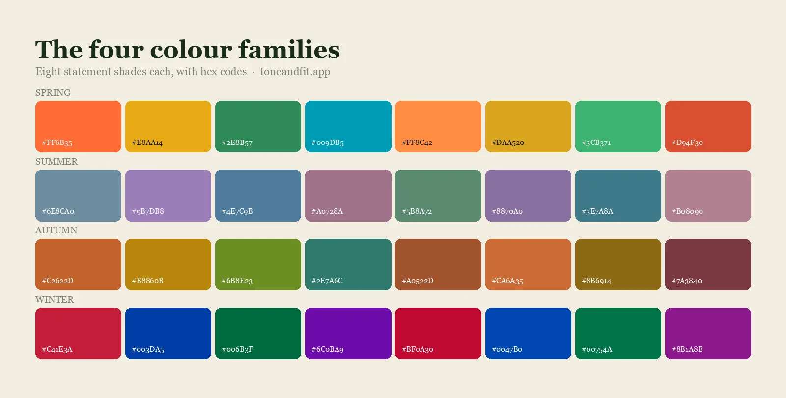
The four readings behind your season
Every serious color analysis, whether done by a consultant with drapes or by an app reading a photo, is trying to answer the same questions. Three of them produce your season. The fourth is not always reported but changes how you use the result.
1. Undertone: the temperature
Whether the color beneath your skin's surface leans golden, peachy, and yellow, or blue, rosy, and pink. Neutral means the two are close to balanced rather than that you have no undertone.
This is the most consequential of the readings and the one people most often carry a wrong belief about, usually from a magazine quiz taken years ago. It is also fixed: it does not change with tanning, age, or hair color. The background on what the two camps mean in practice is in warm versus cool skin undertone, and the home tests are in how to find your undertone at home.
2. Value: how light or deep you are overall
Value takes your hair, skin, and eyes together, not your skin alone. This surprises people. Someone with fair skin, near black hair, and dark brown eyes has a deep overall value despite the skin, and their palette reflects that.
Value is why season results shift when someone dyes their hair three shades lighter. The undertone did not move. The value did.
3. Chroma: clear or muted
Chroma asks whether your face looks better beside a clean, bright color or beside a softened, dusty one. It is the reading most people have never heard of and the one that explains the most otherwise puzzling wardrobe failures. Someone with muted coloring in a saturated cobalt does not look bad, exactly, but the shirt arrives in the room first. Someone with clear coloring in a dusty sage looks slightly tired for reasons they cannot name.
The mechanics of all three, and how they combine into the twelve categories, are laid out in seasonal color analysis explained.
4. Contrast: the gap between your own features
Contrast is the distance between your lightest feature and your darkest. Dark hair against light skin is high contrast. Light hair against light skin is low. It is independent of the other three, and it decides how far apart the colors in a single outfit should sit, which is a completely different question from which colors they are.
High contrast people look right in a black and white outfit and washed out in a tonal beige one. Low contrast people look right in the tonal outfit and slightly overwhelmed by the black and white. If your result did not report contrast, how to find your contrast level takes about five minutes with a phone camera.
How the four fit together
Undertone picks the family. Value sets how dark. Chroma sets how bright. Contrast sets how far apart the pieces of one outfit should be. Your season is the first three combined into a name; contrast is how you wear it.
Want all four measurements, not just a label?
Tone & Fit reads undertone, value, and chroma from one selfie in daylight and gives you the season plus the palette behind it.
Analyze my photo free ↗Reading your palette: the four jobs colors do
A palette usually arrives as a grid of swatches, which is a poor format for deciding what to buy. The swatches are not interchangeable. They do four different jobs, and knowing which is which turns a decorative grid into a shopping list.
| Job | What it is | How much of your wardrobe |
|---|---|---|
| Core neutrals | Your version of black, white, navy, grey, brown, beige | Roughly half |
| Near face colors | The shades that look best directly under your chin | Tops, knitwear, scarves, coat collars |
| Statement colors | The strongest shades in your palette | A few pieces, high impact |
| Accents | Small doses: bags, shoes, lipstick, nails | Anywhere, including outside the palette |
The core neutrals are the highest value part of the result and the part people skim past on the way to the pretty colors. Your palette does not just say "navy", it says which navy, and since neutrals are most of what you wear next to your face, a mismatch there costs you more over a year than any single bright shirt.
Near face colors are the second priority. The rule of thumb worth internalizing is that the palette matters most within about a hand's width of your jaw and matters progressively less the further down your body you go. That is why trousers, skirts, and shoes are largely exempt, and why a scarf can rescue a top in a color that is not yours.
The season by season swatch sets live on the palettes pages, and if you want to see what a fully built out example looks like, the Deep Autumn palette and the Cool Winter palette are laid out this way.
Five things your result does not mean
Most of the disappointment people feel a week after an analysis comes from one of these five misreadings.
- It is not a ban list. Colors outside your palette are not forbidden, they are just doing less for you at face level. Wear them below the waist, or put something from your palette between them and your chin.
- It is not about your skin color alone. Value and contrast are calculated from hair and eyes as well. This is why two people with the same skin can get different seasons and both results be correct.
- It is not a personality result. Being a Soft Summer does not mean you have to dress softly. It means certain shades sit well near your face. Style, formality, and taste are separate variables you still control entirely.
- It is not permanent in every dimension. Undertone is fixed. Value and contrast move with hair color and, temporarily, with a tan.
- It is not a mandate to replace your wardrobe. The efficient version is to use it at the point of purchase, replacing things as they wear out. Buying thirty new items in week one is how people end up resenting the whole exercise.
When the result feels wrong
This happens often enough to deserve a proper procedure rather than a shrug. Work through it in this order, because the cheap explanations are also the most likely.
Step 1: Check the input before doubting the output
Photo based analysis is only as good as the photograph. Retake it with indirect daylight from a window, no makeup, hair pulled back off your face, no filter, and nothing strongly colored in the frame, including the shirt you are wearing and the wall behind you. Warm indoor bulbs push skin toward apparent warmth. Ring lights flatten everything. Beauty filters actively smooth out the exact information the analysis needs. More on why the same face reads differently under different bulbs is in how your color season changes in different lighting, and the practical photo setup is in color analysis at home with a phone camera.
Step 2: Test it against evidence you already have
This is the most useful ten minutes in the whole process, and almost nobody does it. Go to your wardrobe and pull two piles: the three pieces you get complimented in most, and the three you own but never reach for. Now check both piles against your palette.
If the compliment pile sits inside the palette and the dead pile sits outside it, the result is confirming something you already knew but had never articulated. That is much stronger evidence than your gut reaction to a season name.
Step 3: Consider whether you are between two seasons
Plenty of people sit on a boundary. If you do, two neighbouring seasons will both be partly right, and the colors they share are your safest ground. Boundary cases are the reason comparison articles exist: Deep Autumn vs Deep Winter, Cool Winter vs Cool Summer, and Warm Spring vs Warm Autumn each work through a specific pair.
Step 4: Separate dislike from mismatch
Sometimes the analysis is right and you simply do not like the colors. That is a legitimate and different problem. The answer is usually to work within your palette's range rather than to abandon it: most seasons contain both a quiet and a bold end, and if the swatches you were shown skew one way, the other end exists.
Step 5: Test in daylight with actual fabric
Hold two candidate colors under your chin in daylight, one at a time, and watch your face rather than the fabric. The right color makes your skin look more even and your eyes clearer before you have changed anything else. The wrong one adds grey or yellow under the eyes and pulls color out of your lips. The full draping method is in how to do a color analysis at home.
Re-run it properly in sixty seconds
Daylight, no filter, no makeup. Tone & Fit gives you the reading again so you can compare against what you got the first time.
Analyze my photo free ↗When two tools disagree
You run a quiz, you run an app, a friend has an opinion, and you get three answers. This is less confusing than it looks if you compare the underlying readings rather than the season names.
Ask what the two results agree on. If one says Soft Autumn and the other says Soft Summer, they agree that you are muted rather than clear, and they agree you are medium in value. The only live disagreement is temperature, so that is the one thing to settle, and the metal test plus the white test will usually settle it in a minute.
If the two results have nothing in common, for example True Winter against Warm Autumn, something in one of the inputs was wrong. That is nearly always lighting, and it is nearly always the warm indoor bulb. Redo the one taken in worse conditions.
It is also worth knowing which kind of tool gave you which answer. A quiz is asking you to self report the judgments you wanted help making in the first place, so it inherits your existing assumptions. A photo based tool measures pixels instead. Neither is infallible, and the honest comparison of the categories is in our color analysis app buying guide, with the app against consultant question covered in app vs consultant. If you have been running social filters, how accurate TikTok color analysis filters are is worth reading before you weigh their answer equally.
Your first week and first month
Concrete, in order, with no shopping in the first week.
Week one: audit, do not buy
- Do the compliment pile and dead pile exercise from step two above.
- Identify your core neutral. One color, the one you will build everything on. For most people it is a version of navy, charcoal, espresso, or grey.
- Find the three items you already own that are closest to your near face colors and wear them this week. Notice the difference in how often people comment.
- Screenshot your palette to your phone's home screen or save it offline so it is available in a shop without hunting.
Weeks two to four: buy narrowly and well
- One near face top in your best color, in a fabric you will actually wear.
- One scarf or collar piece in a strong palette color, which is the cheapest way to rescue every off palette top you already own.
- Replace one core neutral that is in the wrong temperature, if you found one in the audit. The black shirt that always felt severe is the usual candidate.
- Check your metals and, if you wear it, your foundation. A base in the wrong undertone undoes the clothing work, and finding your foundation undertone covers it.
After that, the palette stops being a project and becomes a filter you apply at the point of purchase. The in store discipline is in how to shop your color palette, and if you want to build deliberately rather than replace piecemeal, the capsule wardrobe approach gives you a structure. For the wider question of what all of this is for, what colors look good on me is the long form version.
FAQ
What do undertone, value, and chroma mean on my result?
Undertone is the temperature of your coloring, meaning whether it leans golden and peachy or blue and rosy. Value is how light or deep your overall coloring is, taking hair, skin, and eyes together rather than skin alone. Chroma is whether your face looks better next to clear, bright color or next to muted, softened color. Those three readings combine to produce your season, and the season is a summary of them rather than a separate fact. If you disagree with your season, one of the three underlying readings is where the disagreement actually lives.
What should I do first after getting my color analysis result?
Do not shop yet. Go to your own wardrobe and pull out the three pieces you get the most compliments in and the three you never reach for, then check them against the palette. If the compliment pile lands inside your palette and the dead pile lands outside it, the result is consistent with evidence you already had, and you can trust it. This takes ten minutes and is far more informative than buying something new to test the theory.
My color analysis result feels wrong. What now?
Check the input before you doubt the output. Retake the analysis in indirect daylight near a window, with no makeup, hair pulled back off the face, no filter, and nothing strongly colored in the frame including your shirt and the wall behind you. Warm indoor bulbs, ring lights, and beauty filters all shift skin toward a different apparent temperature. If a clean retake gives the same result, the next likely explanation is that you are between two neighbouring seasons, which is common and means the shared colors of both are your safest ground.
Can my color season change over time?
Your undertone does not change, since it comes from the fixed structure of your skin. What can change is your value and contrast, which depend on hair color and on how tanned you are. Going significantly lighter or darker with hair color is the most common reason a result shifts, because hair is a large part of the value reading. A tan can move you temporarily. Neither of these changes your temperature, so a warm person stays warm even when their season label moves from one variant to a neighbouring one.
Two color analysis tools gave me different seasons. Which is right?
Look at whether the two answers share a trait. If one says Soft Autumn and the other says Soft Summer, both agree you are muted rather than bright, and the disagreement is only about temperature, so that is the one thing left to settle. If one says True Winter and the other says Warm Autumn, something in the input was off, most likely the lighting in one of the photos. Compare the underlying undertone, value, and chroma readings rather than the season names, because the names hide where the tools actually disagreed.
Do I have to throw out clothes that are not in my palette?
No. A palette is a guide to what sits near your face, not a rule for your whole body. Colors outside your palette are fine as trousers, skirts, shoes, and bags, where they are nowhere near your skin. For a top or a coat in a color you love that is outside the palette, a scarf or a collar in your own colors between the fabric and your jaw does most of the work. Replace things as they wear out rather than all at once.