How to Tell If a Color Is Warm or Cool: 5 Quick Checks
What's in this guide
- What warm and cool actually mean
- Five quick checks to tell if a color is warm or cool
- Warm versus cool chart for every color family
- The tricky colors, and which side they fall on
- Three things that look like temperature and are not
- Why the same color looks different in the shop, at home and on a screen
- How to match a color's temperature to your own
- A ten minute practice drill with your own closet
- Common mistakes when judging color temperature
- When to stop sorting and get your palette
- Quick recap
- FAQ
To tell if a color is warm or cool, look at which way it leans. A color is warm when it leans toward yellow or orange, and cool when it leans toward blue. Every color family has both versions: tomato red is warm and cherry red is cool, olive green is warm and emerald is cool. The quickest check is to hold the color next to another shade of the same family and see which one looks yellower.
That one comparison solves most cases, and this guide gives you four more checks for the stubborn ones, a warm versus cool chart for every color family, and a way to practise on your own closet. One note before you start: a color's temperature only helps you once you know your own. If you have not confirmed whether your skin is warm, cool or neutral, the skin tone analyzer guide is the place to do that, and then everything below becomes a shopping tool.
What warm and cool actually mean
The words get used in two different ways, and mixing them up is the source of most confusion.
The first meaning is about color families. On a basic color wheel, red, orange and yellow are called the warm half, and green, blue and purple are called the cool half. This is the version taught in art class. It is true as far as it goes, and it is close to useless for choosing clothes, because it would mean nobody with cool skin could wear red and nobody with warm skin could wear blue.
The second meaning is about the lean inside a family. Within every color family, some shades have a little yellow mixed in and some have a little blue mixed in. A red with yellow in it becomes tomato or brick. A red with blue in it becomes cherry or raspberry. Both are red, and they behave completely differently next to a face. This lean, sometimes called the color's undertone or bias, is the meaning that personal color analysis uses.
So the useful question is never "is red warm?" It is "is this red warm for a red?" Temperature is relative, and you judge it by comparing a shade with its own relatives. That is why the first check below is a comparison and not a rule.
Skin works the same way, which is why this skill transfers so well. Your surface skin color and the lean underneath it are two separate things, and how to determine your skin undertone shows how to read that lean on yourself.
Five quick checks to tell if a color is warm or cool
1. Compare it with a sibling shade
Put the color next to another shade from the same family. Two reds, two greens, two pinks. Side by side, one will look yellower, more golden or more orange, and the other will look bluer, pinker or more purple. The yellower one is the warmer of the pair.
This works because your eye is poor at judging a single color alone and very good at judging differences. A coral lipstick looks simply "pink" on its own. Next to a fuchsia one, it is obviously orange. In a shop, grab a second item in the same color family and hold the two together.
2. Ask which neighbor it leans toward
Every color sits between two neighbors on the wheel, and it leans toward one of them. Red sits between orange and purple. Green sits between yellow and blue. Purple sits between red and blue. Ask which neighbor your shade is drifting toward:
- If it drifts toward yellow or orange, it is warm.
- If it drifts toward blue, it is cool.
A green that looks like it is heading toward yellow, such as lime, moss or olive, is warm. A green heading toward blue, such as emerald, pine or spruce, is cool. A helpful mental trick is to imagine adding a drop of yellow paint and then a drop of blue. Whichever drop would make the color look more like itself tells you its lean.
3. Hold it against pure white
Place the color on a sheet of plain white printer paper in daylight. White gives your eye a clean reference point, and the hidden lean of a color shows up against it. Warm colors look slightly golden, creamy or earthy against the paper. Cool colors look crisp, icy or slightly blue.
This check is especially good for pale colors and neutrals, where the lean is subtle. A cream sweater looks white until you put it next to real white, and then it is clearly yellow. The same test separates warm white from cool white, which matters more than it sounds, because white sits right under the face in shirts and collars.
4. Put it next to gold and silver
Lay a piece of gold jewelry and a piece of silver jewelry on the fabric. Warm colors look richer and more harmonious with gold, and silver looks a little cold and separate on them. Cool colors do the opposite: silver looks clean and at home, and gold can look brassy.
It is the same logic as the jewelry test for skin, turned around and applied to the garment. If you want to see how that test works on you, see gold or silver for your skin undertone.
5. Read the name and the numbers
When you are shopping online and cannot hold anything, use the clues on the page. Color names are not reliable on their own, but they are a strong hint. Words such as golden, honey, amber, rust, coral, peach, olive, mustard, camel and brick nearly always describe warm shades. Words such as icy, berry, rose, fuchsia, plum, emerald, cobalt, slate and charcoal nearly always describe cool ones.
If you can see a hex code or RGB values, compare two shades of the same family and look at the blue value. The shade with relatively more blue in the mix is the cooler one, and the shade with less blue and more red and green, which together make yellow on a screen, is the warmer one. Treat this as a rough clue for comparing siblings and not as a formula, and remember that screens vary. Our guide on how to shop your color palette has more on buying color with confidence.
Warm versus cool chart for every color family
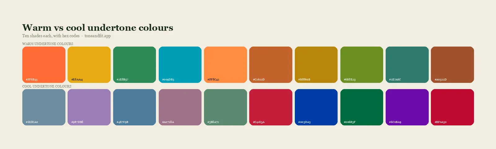
Use this as a reference when you are sorting clothes or reading product names. The last column gives the tell: the thing to look for when you are not sure.
| Color family | Warm versions | Cool versions | The tell |
|---|---|---|---|
| Red | Tomato, brick, rust, poppy | Cherry, raspberry, cranberry, crimson | Does it lean orange or lean pink? |
| Pink | Coral, salmon, peach, warm blush | Fuchsia, rose, bubblegum, magenta | Is there any orange in it? |
| Orange | Almost all: pumpkin, apricot, terracotta | Very few. Orange is the warmest family | Redder oranges are slightly less warm than yellow ones |
| Yellow | Golden yellow, mustard, marigold, butter | Lemon, primrose, icy yellow | Does it lean orange or lean green? |
| Green | Olive, moss, lime, khaki, avocado | Emerald, pine, spruce, mint | Does it lean yellow or lean blue? |
| Blue | Teal, turquoise, aqua, peacock | Cobalt, royal, navy, icy blue, periwinkle | Is there green in it, or violet? |
| Purple | Aubergine, warm plum, orchid, red-violet | Violet, indigo, lavender, blue-purple | Does it lean red or lean blue? |
| Brown | Camel, caramel, chestnut, cinnamon, chocolate | Taupe, cocoa, ash brown, rose brown | Golden or reddish, versus greyish or pinkish |
| Grey | Greige, stone, mushroom, warm pewter | Slate, dove, blue-grey, charcoal | Does it look beige next to white, or blue? |
| White | Cream, ivory, ecru, oyster | Optic white, snow, soft blue-white | Hold it against printer paper |
Two families behave unusually. Orange is warm almost by definition, because it is made of red and yellow with no blue in it at all. Blue is the mirror image: it is the coolest family, so even its "warm" versions, such as teal and turquoise, are only warm for a blue. That is the relative idea again. A teal scarf is a warm choice within blue, and it will still look cooler than a rust one.
For reds in particular, the difference shows most in lipstick. Our guide to the best lipstick color for your undertone sorts every lip shade family into its warm and cool halves.
The tricky colors, and which side they fall on
Some colors confuse nearly everyone. Here is how they sort out.
- Teal. A blue with green and a little yellow in it, so it is on the warm side of blue. It is also one of the most widely flattering colors, because it sits near the middle of the temperature scale.
- Burgundy. It depends on the version. Burgundy that leans brown, such as oxblood and maroon, is warm. Burgundy that leans purple, such as wine and bordeaux, is cool.
- Navy. Usually cool. A navy with a hint of green or teal in it, sometimes sold as marine or petrol navy, is the warmer version.
- Olive and khaki. Warm, because they are greens with a lot of yellow. Do not let the fact that green is a "cool family" mislead you.
- Mint. Cool. It is a pale green with blue in it. The warm pale green is pistachio or light lime.
- Mustard and lemon. Both yellow, opposite temperatures. Mustard leans orange and is warm. Lemon leans green and is cool.
- Taupe and greige. These sit almost exactly between warm and cool, which is why they are so easy to wear. Taupe usually has a slight pink or grey cast and edges cool. Greige usually edges warm.
- Dusty rose and mauve. Cool, softened with grey. Their warm cousins are muted salmon and terracotta pink.
- Black. Treated as cool, because it is stark and has no warmth in it. Soft black, off black and brown-black are the gentler, warmer alternatives. It suits cool, deep and high contrast coloring best.
- Denim. Classic mid blue denim is close to neutral, which is part of why it works on everyone. Washes with a green or yellow cast are warmer, and inky or grey washes are cooler.
Three things that look like temperature and are not
A color has three separate qualities: temperature, depth and brightness. People often read one of the other two as warm or cool by mistake. Our guide to seasonal color analysis explains all three, and here is the short version.
Dark does not mean cool. Chocolate brown is dark and warm. Charcoal is dark and cool. Depth is a separate scale from temperature, and every level of depth has both warm and cool colors in it.
Light does not mean warm, and pastel does not mean cool. Peach is a warm pastel. Lavender is a cool one. Icy pastels look cool because they have a lot of white and a blue lean, and not because they are pale.
Muted does not mean warm. This is the most common mistake. A soft, greyed color such as dusty rose or sage can look "earthy" and get filed as warm. Softness is brightness, not temperature. Dusty rose is a muted cool pink, and sage can lean either way depending on how much yellow is in it. In the same way, bright does not mean cool: hot coral is very bright and very warm.
When a color confuses you, name all three qualities one at a time. "This is a dark, muted, cool green" is a far more useful description than "this is kind of a wintery color," and it is exactly how the 12 color seasons are defined.
Not sure which side you are on?
The free web tool names your season from one selfie, with no sign-up. The app's scan is free too and shows your undertone, best metals and starter colors; your season and full palette in the app are an optional upgrade.
Find my season free → Get the app ↗Why the same color looks different in the shop, at home and on a screen
Light has a temperature of its own, and it changes how every color looks.
- Warm indoor bulbs add yellow to everything. Cool colors look duller and warmer than they are, and warm colors look richer. Many fitting rooms use this kind of light.
- Cool white lighting does the reverse, pushing colors toward blue and making warm shades look flat.
- Daylight near a window is the most balanced light you have easy access to. Judge temperature there whenever you can.
- Phone and laptop screens each show color a little differently, and night mode or a warm display setting shifts everything toward yellow. Turn those settings off before you judge a color online.
Cameras add another layer, because a phone adjusts white balance automatically and can warm up or cool down a whole photo. If you have ever wondered why a top looks different in every picture, why your colors look different in every light explains what is happening. The practical rule is simple: compare two colors in the same light at the same time. Even bad light is fair if both colors are sitting in it together.
How to match a color's temperature to your own
Once you can sort colors into warm and cool, the last step is knowing which pile is yours.
If your undertone is warm, the warm version of each family will usually look best next to your face: tomato red over cherry, olive over emerald, cream over optic white, camel over grey. Our list of the best colors for warm undertones goes through every family.
If your undertone is cool, choose the cool version: raspberry over coral, emerald over olive, soft white over cream, charcoal over camel. The best colors for cool undertones has the full list.
If your undertone is neutral, you have room on both sides, and the colors nearest the middle, such as teal, soft burgundy, jade and taupe, will be the easiest. Most neutral skin still leans slightly one way.
If you are not sure which you are, run the tests in how to find your skin undertone at home. If you have done them and the results disagree, warm versus cool undertone explains which signals to trust.
The 12 seasons then refine this by depth and brightness. As a rough map:
| Season group | Temperature | What to reach for |
|---|---|---|
| Warm Spring, Warm Autumn | Fully warm | The warm version of every color, always |
| Cool Summer, Cool Winter | Fully cool | The cool version of every color, always |
| Light Spring, Bright Spring, Soft Autumn, Deep Autumn | Warm leaning | Warm versions first, with some near-neutral shades such as teal |
| Light Summer, Soft Summer, Deep Winter, Bright Winter | Cool leaning | Cool versions first, with some near-neutral shades |
You can see the exact shades for each one on the season palettes hub, and the guide to finding your color season walks through working out which group you belong to.
A ten minute practice drill with your own closet
Reading about temperature only gets you so far. Sorting real clothes trains your eye quickly, and it usually explains a few things about your wardrobe along the way.
- Pull out everything in one color family. Start with whichever family you own most of. Blue or pink are good first choices.
- Lay the pieces side by side in daylight, on a white sheet or a white duvet cover if you have one.
- Line them up from warmest to coolest. Do not think in categories yet. Just keep asking of any two pieces, "which one is yellower?" and swap them until the row runs smoothly from one end to the other.
- Find the dividing point. Somewhere in the row the colors stop leaning yellow and start leaning blue. Pieces near that point are your near-neutral shades.
- Notice which end you actually wear. Most people find that their favorite, most complimented pieces cluster at one end. That is a strong hint about your own temperature.
- Repeat with a second family. By the third family you will be sorting on sight.
The pieces at the wrong end are often the ones that sit unworn. If you want to turn the drill into a full edit, how to clean out your closet by color season gives you a method for deciding what stays.
Common mistakes when judging color temperature
- Judging a color by itself. Without a comparison, almost any color can be argued either way. Always find a sibling shade.
- Sorting by family. "Blue is cool, so I cannot wear it" throws away half your options. Every undertone has a version of nearly every family.
- Trusting the product name alone. One brand's "berry" is another brand's "brick." Use names as a hint and your eyes as the judge.
- Confusing muted with warm. Soft and dusty describes brightness. Check the lean separately.
- Judging under shop lighting. Warm bulbs make cool colors look warm. Walk the item to a window or the door.
- Expecting every color to be clearly one or the other. Temperature is a scale. Plenty of shades sit near the middle, and those are useful colors that most people can wear.
When to stop sorting and get your palette
Being able to read a color's temperature is a real skill, and it makes shopping faster for life. It still leaves two things to work out: your own undertone, and how light, deep, soft or bright your colors should be. You can find those by draping, which our personal color analysis guide covers from start to finish, or by trying a color analysis at home with clothes you already own.
The faster route is to let a tool measure it. A finished palette is, in effect, a list of colors that have already been sorted for temperature, depth and brightness, so you can compare any item against it instead of judging each one from scratch.
Quick recap
- Warm colors lean toward yellow or orange. Cool colors lean toward blue. Every family has both.
- Temperature is relative, so compare a shade with another shade from the same family.
- Use white paper for pale colors and neutrals, and gold versus silver jewelry as a second opinion.
- Do not confuse dark, light or muted with warm or cool. Those are separate qualities.
- Judge in daylight, and match the color's temperature to your own undertone.
Get your colors sorted for you
The free web tool names your season from one selfie, with no sign-up. The app's scan is free too and shows your undertone, best metals and starter colors; your season and full palette in the app are an optional upgrade.
Find my season free → Get the app ↗FAQ
How can you tell if a color is warm or cool?
Compare it with another shade from the same color family. The one that looks yellower, more golden or more orange is warm, and the one that looks bluer, pinker or more purple is cool. Checking the color against plain white paper in daylight makes the lean easier to see.
Is red a warm or cool color?
Red can be either. Reds that lean orange, such as tomato, brick and rust, are warm. Reds that lean blue or pink, such as cherry, raspberry and cranberry, are cool. On a basic color wheel red sits in the warm half, but for clothes and makeup the lean of the specific red is what matters.
Is green warm or cool?
Green has warm and cool versions. Olive, moss, lime and khaki lean yellow and are warm. Emerald, pine, spruce and mint lean blue and are cool.
Is purple a warm or cool color?
Purple depends on its lean. Purples that lean red, such as aubergine, orchid and warm plum, are warm. Purples that lean blue, such as violet, indigo and lavender, are cool.
Is teal warm or cool?
Teal is on the warm side of blue, because it contains green and a little yellow. It sits close to the middle of the temperature scale overall, which is why it tends to flatter warm, cool and neutral undertones.
Are black, white and grey warm or cool?
Black and optic white are treated as cool. Cream and ivory are warm whites. Grey can go either way: slate, dove and blue-grey are cool, while greige, stone and mushroom are warm.
Is navy blue warm or cool?
Navy is usually cool. A navy with a hint of green or teal in it is the warmer version, and it is the easier navy for warm undertones to wear near the face.
How do I know if warm or cool colors suit me?
It depends on your skin's undertone. Warm undertones are usually flattered by warm versions of each color and cool undertones by cool versions. You can check yours with at-home tests such as comparing gold and silver jewelry, or by holding a warm and a cool shade of the same color under your chin in daylight.
Can I check my color season from a photo?
Yes. The free Tone & Fit web tool reads your color season from one selfie in about 30 seconds, with no sign-up and no photo stored by us. The Tone & Fit app for iPhone and Android then builds your full palette of 38 named shades.