How to Do Color Draping at Home: Step by Step
Color draping means holding solid-colored fabrics under your chin, in pairs, in neutral daylight, and watching what each one does to your face. Three rounds decide it: warm against cool, light against dark, bright against muted. The fabric that makes your skin look even and your eyes look clear is the winner.
The short version: you do not need a consultant's kit. You need a window, a white cloth, and a handful of solid-colored fabrics arranged in opposing pairs. Run temperature first, then depth, then chroma, and read your face rather than the fabric. Done in that order, home draping places most people in the right color family within an hour, and the section on reading your result shows how to turn those three answers into one of the twelve seasons. This is the practical companion to our guide on how to find your color season, which covers every method side by side.
What's in this guide
- What color draping actually is (and is not)
- What you need, and what to use instead
- Step 1: Get the light right
- Step 2: Neutralize yourself
- Step 3: The temperature round
- Step 4: The depth round
- Step 5: The chroma round
- Step 6: Drape your candidate seasons
- How to read your face: the six signals
- Turning three answers into a season
- Mistakes that produce a false result
- Draping vs photo analysis vs a consultant
- FAQ
What color draping actually is (and is not)
Draping is the original method behind seasonal color analysis. Before quizzes, apps and filters, a consultant sat you in front of a mirror, covered your clothes with a neutral cape, and worked through a stack of fabric squares one at a time. The point was never to find a color you liked. The point was to find the colors under which your face changed for the better, and to notice that they all shared the same three properties.
Those three properties are the whole system. Temperature is whether a color leans yellow (warm) or blue (cool). Value is how light or dark it is. Chroma is how saturated or muted it is. Every one of the twelve seasons is just a particular combination of those three, which is why draping works: each round isolates one property and lets you see the answer directly on your skin.
Draping is not a quiz about your vein color or your jewelry preference. Those are shortcuts that try to predict the same answer without looking. It is also not "which color do I look good in", because a good drape is not a color you would necessarily wear. It is a test swatch. Its only job is to show you which direction your coloring leans, and the wearable colors follow from that.
What you need, and what to use instead
A professional kit contains dozens of drapes. You need far fewer, because you are only trying to answer three yes-or-no questions.
| Item | What it does | Wardrobe substitute |
|---|---|---|
| Plain white cloth or sheet | Covers your clothing so nothing else competes | A white T-shirt worn over everything, or a white towel |
| Neutral head wrap | Hides dyed or very warm or cool hair | A white or grey scarf, or a plain shower cap |
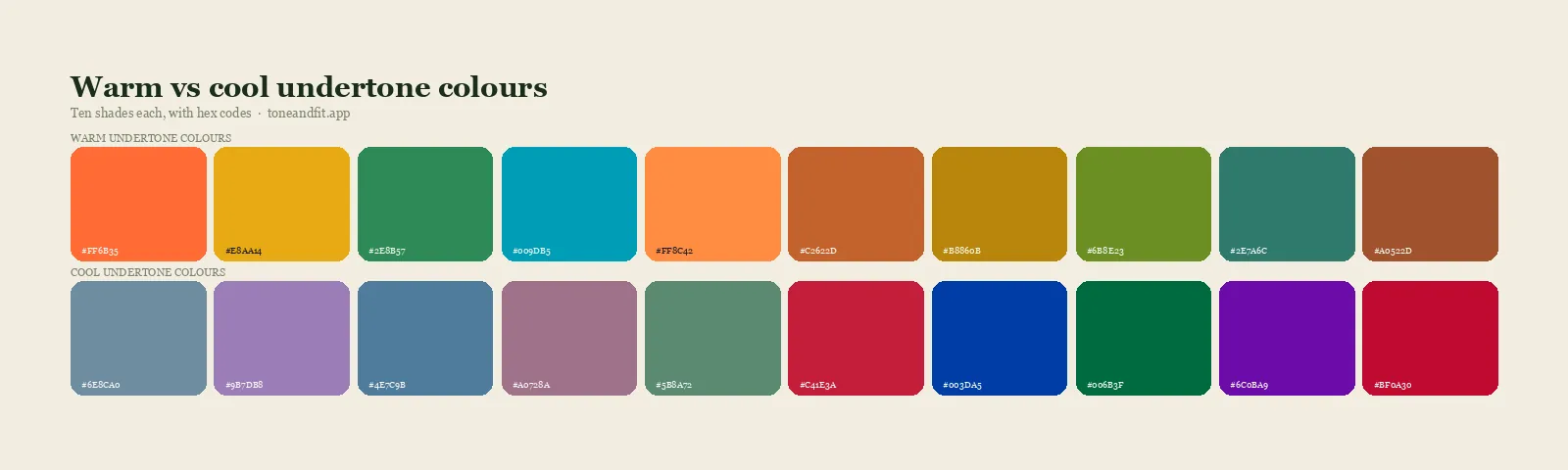
| Temperature pair | One warm and one cool version of a similar color | Tomato red and raspberry red; camel and grey; olive and teal |
| Depth pair | One light and one dark neutral | Ivory and black; light grey and charcoal |
| Chroma pair | One vivid and one dusty version of a hue | Fuchsia and dusty rose; royal blue and denim blue |
| Season drapes | Two or three signature colors from each candidate season | Printed swatches from the season palette pages |
Fabric choice matters a little. Matte cotton, jersey and wool read truest. Satin, sequins and anything with a shine reflect light back into your face and make everything look better than it is. Prints are useless because your eye cannot settle on one color. If you are short on fabric, plain colored paper or card works surprisingly well for the temperature and chroma rounds, and a printed page of swatches is a perfectly good stand-in for a season drape.
You also need a mirror large enough to show your whole face and upper chest at once, and ideally a phone on a stand so you can photograph each drape in the same position. The photos are what you will trust later, when you have looked at your own face for so long that everything starts to look the same.
Step 1: Get the light right
Lighting is the single biggest variable, and it is the one most home sessions get wrong. Warm household bulbs add yellow to everything, which makes cool-toned people look warm and makes warm colors look flattering on everyone. Cool white LEDs do the reverse. Either way, the lamp is doing the draping and you are just watching.
Sit facing a window, out of direct sunlight, somewhere between late morning and mid afternoon. Turn every artificial light in the room off. Overcast days are better than sunny ones because the light is more even. If your only window faces a brick wall or a green garden, be aware that the reflected color will tint your skin, and move if you can.
If daylight is impossible, a bulb rated at 5,000 to 5,500 K, positioned in front of you and slightly above, is the closest substitute. Our post on why your color season seems to change in different lighting goes into the physics if you want to understand why this matters so much.
Step 2: Neutralize yourself
Draping reads the skin, so anything sitting on the skin will skew the reading.
- No makeup. Foundation, bronzer and blush all carry a temperature. Remove everything, including tinted moisturizer and lip balm with color.
- Cover your hair if it is dyed, highlighted or simply very strong in color. Even natural red or platinum hair pulls the eye and biases the result. A white or grey wrap is ideal.
- Cover your clothes with the white cloth so only the drape and your face are in the frame.
- Remove jewelry and glasses. Gold frames warm the face. Silver frames cool it. Take them off for the session and put them back for the confirmation round later.
- Wait ten minutes if you have just come in from the cold, exercised or had a hot shower, because temporary redness reads as cool undertone.
One more thing to neutralize is your expectation. If you already have a season in mind, you will see it. Try to run the whole session without deciding, and let the photos vote at the end.
Step 3: The temperature round
This round answers whether your undertone is warm, cool or somewhere between. It is the same question our four at-home undertone tests try to answer, but draping shows it directly instead of inferring it.
Take your temperature pair. Hold the warm one under your chin, high enough that it touches your jaw, and look at your face for a slow count of five. Swap to the cool one and do the same. Then swap back. Do not look at the fabric. Look at the skin between your cheekbones and your jaw, the area under your eyes and the corners of your mouth.
Under the right temperature, the skin looks like one continuous surface. Under the wrong one, it breaks up: patches of redness show, shadows deepen, and the skin can take on a grey or sallow cast. Repeat with a second pair if you have one, because one pair can mislead if the two fabrics are not equally saturated. Camel versus grey is a good second pair since both are neutrals and only the temperature differs.
If you cannot see a difference after three pairs, that is a real result, not a failure. It usually means a neutral or olive undertone, and neutral undertone skin explains how to work with it. Olive is its own case, because it can look cool in the temperature round and then warm in the season round; telling warm olive from cool olive covers what to do.
Step 4: The depth round
Depth is how much darkness your coloring can carry. Take your depth pair, which should be a light and a dark neutral in the temperature you just found (ivory and chocolate for warm, white and black for cool). Drape each one.
Under the drape that matches your depth, your features stay in proportion: your eyes, brows and lips all remain visible and roughly equal in emphasis. Under the wrong one, either the fabric swallows you (dark drape on light coloring, where the face fades and the fabric becomes the subject) or the fabric looks flimsy and the face looks heavy (light drape on deep coloring). How black behaves on each season is the most common version of this test, since black is the drape most people already own.
If both the light and the dark neutral look reasonable, your depth is medium and the next round will matter more. If the difference is dramatic, you have found the property that defines your season, and the remaining rounds are refinements.
Step 5: The chroma round
Chroma is the least intuitive of the three and the one that separates the seasons people mix up most often. Take a vivid and a dusty version of one color, both in your temperature. Fuchsia and dusty rose for cool; tangerine and terracotta for warm.
Under the vivid drape, bright coloring looks alive and muted coloring looks overpowered, as if the fabric is wearing the person. Under the dusty drape, muted coloring looks harmonious and bright coloring looks tired, as if someone turned the lights down. Photograph both. This is the round where your eyes will lie to you most, because most of us are trained to think brighter is better.
Chroma and depth interact with your contrast level, which is the difference between your hair, skin and eyes. High contrast people can carry more chroma and more depth; low contrast people are overwhelmed by both. If your chroma result is unclear, finding your contrast level often resolves it.
Step 6: Drape your candidate seasons
You now have three answers, and they point to one or two seasons. Warm, deep and muted points to Deep Autumn. Cool, light and soft points to Light Summer. Warm, medium and bright points to Bright Spring, and so on. The full mapping is in the section below, and the 12 color seasons explained has a longer description of each.
Take two or three signature colors from each candidate season and drape them against one another. A Deep Autumn candidate might drape rust, olive and chocolate against a Deep Winter's true red, emerald and black. The season whose drapes consistently even out your skin is yours. If it is genuinely split, you are probably on the border between two sister seasons, which is common and not a problem: it means you can borrow from both palettes.
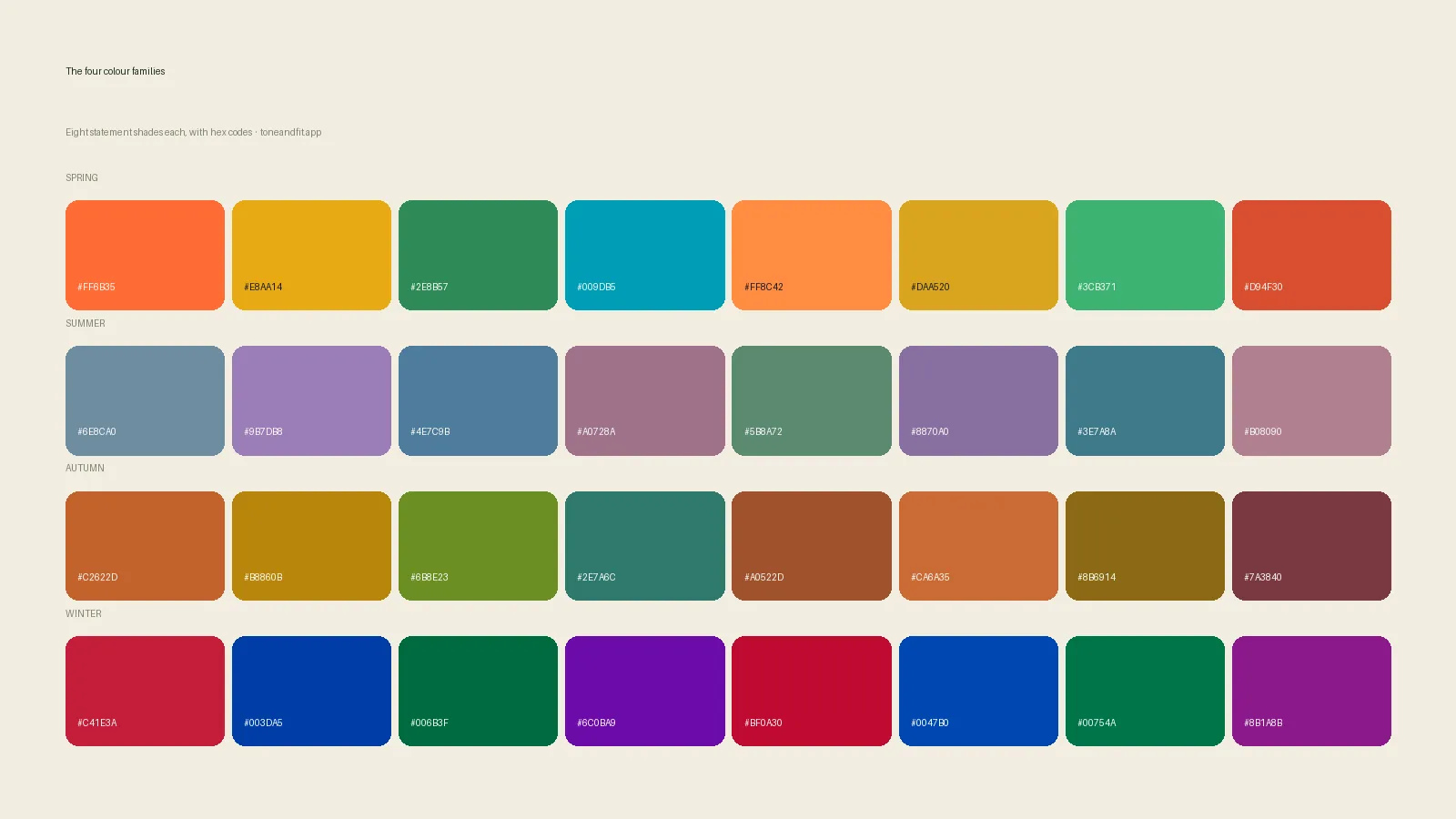
This is the round where printed swatches earn their keep. Each of the twelve season pages lists statement shades with hex codes, so you can print a page and hold it under your chin. Paper is flat and matte, which is exactly what you want.
Want a second opinion before you trust the mirror?
Tone & Fit reads undertone, depth and chroma from one selfie and gives you a 12-season result to check your draping against.
Try Tone & Fit free ↗How to read your face: the six signals
Every step above depends on the same skill: noticing what a color does to the face rather than whether the color is pretty. These are the six things consultants look at, in roughly the order they become visible.
1. Evenness of the skin
The right drape makes the skin look like one tone. The wrong drape reveals patches: redness on the cheeks, sallowness at the temples, a grey cast around the mouth.
2. Shadows under the eyes and beside the nose
Under the wrong temperature or the wrong depth, dark circles deepen and the nasolabial folds look carved in. Under the right one they soften without disappearing.
3. The whites of the eyes
A good drape makes the whites look clearer and the iris look more saturated. A bad drape makes the whites look slightly yellow or slightly pink.
4. Natural lip color
The right drape brings your lips forward; you notice their color. The wrong drape makes them fade into the surrounding skin or turn faintly blue or brown.
5. Where your eye goes first
Look away, then look back at the mirror. If you see the fabric first, it is winning against you. If you see your face first, the fabric is supporting you.
6. Jawline definition
Under a drape that matches your depth and chroma, the line between jaw and neck stays crisp. Under one that does not, the shadow blurs and the face looks heavier or older.
You will not see all six on every drape. Two or three consistent signals across a pair is enough to call the round. Some of the most common false readings, like mistaking redness for coolness or a shiny fabric for a flattering one, are covered in our roundup of color analysis mistakes.
Turning three answers into a season
Each season is defined by its dominant property first and its secondary property second. The table maps the draping results onto the twelve.
| Dominant result | Secondary result | Season |
|---|---|---|
| Light | Warm | Light Spring |
| Light | Cool | Light Summer |
| Warm | Bright | Warm Spring |
| Warm | Muted | Warm Autumn |
| Bright | Warm | Bright Spring |
| Bright | Cool | Bright Winter |
| Cool | Light or muted | Cool Summer |
| Cool | Deep or bright | Cool Winter |
| Muted | Cool | Soft Summer |
| Muted | Warm | Soft Autumn |
| Deep | Warm | Deep Autumn |
| Deep | Cool | Deep Winter |
The dominant result is the round where the difference between the two drapes was most dramatic. If the depth round was the obvious one and temperature was subtle, you are a Light or Deep season. If temperature was obvious and depth was subtle, you are a Warm or Cool season. If chroma was the round that made you gasp, you are a Bright or Soft season. That ordering is the heart of the twelve-season system, and it is why two people with the same undertone can land in different seasons.
Mistakes that produce a false result
- Judging one drape on its own. Almost any color looks acceptable in isolation. Draping only works as a comparison between a pair, swapped back and forth.
- Warm lighting. The most common error. If the room feels cozy, the light is too warm to drape in.
- Draping over makeup or a tan. A summer tan pushes warm; foundation pushes whatever temperature the brand chose. Drape your resting, bare skin.
- Letting hair vote. Dyed hair is not part of your coloring. If yours is dyed, cover it, then read how to find your season with dyed hair for the second-order effects.
- Using shiny or patterned fabric. Shine flatters everyone; pattern flatters no one. Both hide the answer.
- Draping colors you love. Preference is loud and the signal is quiet. Test the colors you have no feelings about.
- Stopping after the temperature round. Undertone alone gives you a family, not a season. Depth and chroma are where most people's real answer lives.
- Trusting your eyes over the photos. After twenty drapes your eyes adapt and everything looks fine. Compare the photos side by side at the end and let them overrule you.
Draping vs photo analysis vs a consultant
Home draping has an honest limitation: you are both the subject and the judge, and you cannot see your face without also seeing your opinion of it. Professional draping fixes that by adding a trained second pair of eyes and a controlled room, at the cost of a session fee and a trip. Photo-based analysis fixes it a different way, by measuring the skin numerically under a corrected white balance so that nobody's opinion is involved. How AI color analysis works describes what is actually being measured, and quiz vs photo vs draping compares the three methods on what each one can and cannot see.
The practical answer is to use two of the three. Drape at home to understand your coloring, because nothing else teaches you what warm, deep and muted actually look like on your own face. Then confirm with a photo analysis, because it catches the two failure modes that home draping cannot: bad light and wishful thinking. If the two agree, you are done. If they disagree, the disagreement usually points at one specific round to redo, and reading your color analysis results explains how to interpret the gap.
If you want the whole process laid out from tests through to palette, our personal color analysis guide is the long version, and the step-by-step color analysis at home walks through the non-draping tests that go with it.
Check your draping result in 60 seconds
One selfie in daylight, your 12-season result, and the palette to shop from. Free, no sign-up.
Find your season free ↗FAQ
What is color draping in color analysis?
Color draping is the method where pieces of colored fabric are held under your chin, one after another, so you can watch what each color does to your face. Warm versus cool drapes reveal your undertone, light versus dark drapes reveal your depth, and bright versus muted drapes reveal your chroma. Together those three answers place you in one of the twelve color seasons. It is the technique professional consultants use, and it can be reproduced at home with a small set of fabrics and good daylight.
What fabrics do I need for color draping at home?
You need a plain white cloth to cover your top, a neutral head wrap or hair tie, and a set of solid-colored fabrics in pairs: a warm and a cool version of the same color (for example a tomato red and a raspberry red), a light and a dark neutral, and a bright and a muted version of one hue. Cotton, jersey and matte silk work best because they do not add shine. Scarves, T-shirts, pillowcases and even sheets of colored paper can substitute for purpose-made drapes.
Can you do color draping without buying drapes?
Yes. Most wardrobes already contain enough variety to run a rough draping session: a navy and a camel top for temperature, a black and a white piece for depth, and a bright and a dusty version of any color for chroma. Print swatches from a season palette page onto plain paper if you are missing a color. The comparison matters more than the material, so two similar pieces of anything solid will do.
What lighting is best for color draping?
Indirect natural daylight is best: sit facing a window, out of direct sun, in the middle of the day, with every artificial light in the room switched off. Warm bulbs push everyone toward looking warm and cool LEDs do the opposite, and either one will bias the result. If you cannot get daylight, a daylight-balanced bulb rated around 5,000 to 5,500 K is the next best option.
How do I know which drape is winning?
Look at your face, not at the fabric. The winning drape evens out your skin, makes shadows under the eyes and around the mouth softer, makes the whites of your eyes look clearer and brings your natural lip color forward. The losing drape does the opposite: it adds grey or yellow to the skin, deepens dark circles, exaggerates redness and pulls attention away from your face toward the fabric itself.
Is home color draping accurate?
It is accurate enough to place most people in the right family and often the right season, provided the lighting is neutral and you compare drapes in pairs rather than judging one color in isolation. The main sources of error are warm lighting, makeup, colored hair and wishful thinking. Confirming the result with a second method, such as a photo-based analysis, catches the cases where home draping goes wrong.