Best Colors for Pale Skin: What Actually Works

Pale skin is not one thing. Two people can be the exact same lightness and need opposite halves of the color wheel. The lightness tells you how much intensity you can take. The undertone tells you which colors to take it from.
What's inside
- The short answer
- Why "pale" alone is not a color rule
- Step one: settle your undertone
- Best colors for cool pale skin
- Best colors for warm pale skin
- Best colors for neutral pale skin
- The colors that wash pale skin out
- Contrast, the variable most advice skips
- Neutrals, denim, and metals
- How to test a color in 30 seconds
- FAQ
The short answer
The best colors for pale skin are the ones that share your undertone and sit at a light to medium intensity: soft rose, dusty blue, periwinkle, lavender, and cool navy if your skin is cool; peach, coral, warm ivory, camel, and soft aqua if your skin is warm; and cocoa, soft teal, plum, and denim blue if you land in the middle. What flatters pale skin is not paleness in the clothing. It is temperature agreement between the color and your skin, plus enough color saturation to keep your face from becoming the least interesting thing in the outfit.
That is the whole rule, and almost every piece of pale-skin advice that fails does so because it swapped that rule for a simpler one: wear pastels because you are light. Pastels flatter some pale people and drain others into invisibility. The deciding factor is undertone, which is why our guide to which colors look good on you starts there rather than with skin depth.
Why "pale" alone is not a color rule
Skin has two independent properties that matter for color. Depth is how light or dark the skin is: this is the axis a foundation shade number moves along. Undertone is the temperature underneath: golden and peachy on the warm end, pink and blue-based on the cool end, balanced in the middle. The two do not track together. You can be very fair with a distinctly golden cast, and you can be very fair with skin that reads porcelain-pink in every light.
Depth and undertone answer different questions:
- Undertone decides which colors. Warm skin lifts under yellow-based colors and goes sallow under blue-based ones. Cool skin does the reverse.
- Depth decides how much. Very light skin has less pigment to compete with a color, so a heavy, saturated black or a hot fuchsia can take over the frame. Not always badly, but it changes who is looking at whom.
Most bad advice collapses these two into one instruction. If you have ever been told "you're so fair, wear light colors" and then felt washed out in a pale grey sweater, you now know why: grey did nothing wrong except be the wrong temperature and too close to your own value. The skin tone chart plots both axes side by side if you want to see where you land before reading on.
Step one: settle your undertone
You cannot pick colors for pale skin without this. Three checks that take a minute each:
The jewelry check
Hold gold against your bare jaw, then silver. One will look like it belongs and one will look like it is sitting on top of your skin. Gold winning suggests warm, silver winning suggests cool, and both looking fine suggests neutral. The gold or silver test covers the edge cases.
The white check
Hold a sheet of printer white next to your face, then a piece of cream or ivory fabric. Pure white makes warm skin look slightly yellow and cream makes cool skin look slightly grey. Whichever one leaves your skin looking clean is on your side.
The blush check
How does your skin flush? Pale skin that goes pink or red when you are warm, embarrassed, or cold is usually cool-leaning. Pale skin that goes peachy or slightly orange is usually warm-leaning.
None of these is decisive alone. Run all three, take the majority, and read how to find your skin undertone at home if two of them disagree, which happens more often on very fair skin than on any other depth. If you keep landing in the middle, you are probably in the group described in our piece on neutral undertone skin, and the difference between warm and cool is explained in full in warm vs cool undertone.
Best colors for cool pale skin
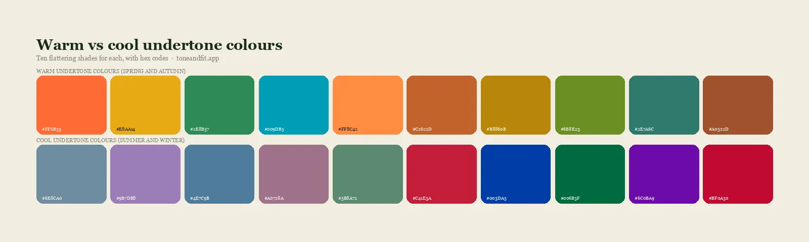
Cool pale skin has a pink, rosy, or blue-based cast. It burns more readily than it tans, and silver jewelry tends to look like part of the outfit rather than an addition to it. In seasonal terms this usually points toward Light Summer, Cool Summer, or on the higher-contrast end Cool Winter.
The colors that work hardest
- Soft rose and dusty pink. These echo your natural flush instead of fighting it. On cool fair skin they read as healthy rather than pink-on-pink.
- Periwinkle and cornflower blue. The single most reliable category. Blue with a violet lean sits directly opposite the yellow that cool pale skin lacks, so it makes the skin look clearer.
- Lavender and soft plum. Purple is under-used on pale skin and it should not be. Anything from lilac up to a muted mulberry works.
- Cool navy. Your black substitute. Navy gives you the anchor of a dark neutral without the harsh edge black creates against very light skin.
- Emerald and cool teal. The green that has blue in it rather than yellow. It gives contrast without heat.
- Raspberry and cool berry reds. If you want a red, take the one that leans blue. Cherry and cranberry, not brick or rust.
- Soft white and cool grey. Optic white works better here than cream does, and a true grey with no beige in it is a genuine neutral for you rather than a compromise.
What to be careful with
Orange, mustard, camel, olive, and warm browns are the usual offenders. They are not banned, but on cool pale skin they add a yellow cast that reads as tiredness. If you love them, keep them away from the face: a mustard bag or a camel shoe costs you nothing.
Best colors for warm pale skin
Warm pale skin has a golden, peach, or honey cast even at very light depths. Gold jewelry melts in. The skin may freckle. Seasonally, this often lands on Light Spring or True Spring, both of which are covered in the 12 color seasons breakdown.
The colors that work hardest
- Peach, apricot, and coral. The signature warm-fair colors. They mirror the skin's own warmth and make the whole face look lit rather than pinkened.
- Warm ivory and buttercream. Your version of white. Optic white will look slightly clinical next to warm fair skin.
- Soft aqua and turquoise. The warm-side blues. They carry a hint of green, which keeps them from going icy on you.
- Golden yellow and honey. Rare that anyone gets to wear yellow this successfully. Use it.
- Salmon, warm rose, and clear watermelon. The pink family, adjusted warm.
- Camel, caramel, and warm taupe. Your dark neutrals. Warm brown does the work navy does for cool skin.
- Light warm greens. Moss, apple, and sage all work if they hold some yellow.
What to be careful with
Icy pastels, pure black, stark white, and cold greys. Black against warm fair skin creates a hard line that pulls attention to shadows under the eyes and around the mouth. Swap to a deep chocolate or a warm charcoal and the same outfit reads softer without losing its authority.
Not sure which side you're on?
One selfie, your 12-season result, and the palette that goes with it. Free, no sign-up.
Find your season free ↗Best colors for neutral pale skin
Neutral pale skin holds warm and cool in near balance. Gold and silver both look fine. The white and cream test comes back inconclusive. This is a real category rather than a failure to determine an answer, and it is more common at very light depths than most guides admit.
Your advantage is range. Your risk is that extreme colors on either end look slightly off without you being able to name why. The safe center of your palette:
- Soft teal, denim blue, and slate. Blues that hold both temperatures.
- Cocoa, mushroom, and greige. Neutrals that are neither yellow-brown nor grey-brown.
- Dusty plum and mauve. Purple sits on the temperature line naturally, which makes it a reliable neutral-skin color.
- Muted rose and soft coral. Pinks with some grey mixed in, so they commit to neither end.
- Soft white rather than optic white or heavy cream.
Muted, slightly greyed versions of colors flatter neutral skin more consistently than clear, saturated versions do. If a color looks like it has a drop of grey in it, it is probably yours.
The colors that wash pale skin out
Washing out has two separate causes, and they need different fixes.
Cause one: wrong temperature. A color from the opposite undertone family pulls the complementary cast into your skin. Warm colors on cool skin bring out yellow; cool colors on warm skin bring out grey. The fix is to switch to the same color in the other temperature, not to abandon the color.
Cause two: not enough separation. This one is specific to pale skin. A color that sits at almost exactly your skin's lightness gives the eye nothing to distinguish. Very pale beige, oatmeal, blush nude, and pale grey are the repeat offenders. Nothing is wrong with the color. There is simply not enough difference between your face and the fabric, so the whole picture flattens.
The fix for cause two is not to go dark. It is to add either depth or saturation. A blush pink at twice the saturation reads as rose and works. An oatmeal knit under a navy coat works because something else in the frame supplies the contrast. Our piece on colors that wash you out works through both causes with more examples.
Contrast, the variable most advice skips
Two people with identical pale skin and identical undertones can still need different color intensity, because contrast is a third variable. Contrast is the gap between your hair, your skin, and your eyes.
| Your look | Contrast level | Color intensity to aim for |
|---|---|---|
| Pale skin, light blonde hair, light eyes | Low | Light to medium colors, tonal outfits, avoid black next to the face |
| Pale skin, medium brown or auburn hair | Medium | Medium saturation, one accent color at a time |
| Pale skin, black or very dark hair, dark eyes | High | Saturated and clear colors, true black and optic white both work |
This is why the "pale skin cannot wear black" advice is only two thirds true. A pale, dark-haired, high-contrast person often looks best in black, because their own coloring already contains that much contrast. A pale, blonde, low-contrast person tends to disappear behind it. Run the mirror check in how to find your contrast level before you write off any color as too strong.
Neutrals, denim, and metals
Most of your wardrobe is neutrals, so getting these right matters more than getting one perfect blouse right.
- Instead of black: navy or charcoal if cool, dark chocolate or espresso if warm.
- Instead of stark white: soft white if cool, ivory or warm cream if warm.
- Denim: cool pale skin takes indigo and rinse-dark washes; warm pale skin looks better in mid-blue and slightly faded washes. Very light stonewash near the face has the same flattening problem as pale beige.
- Metals: silver, white gold, and platinum for cool skin; yellow gold, brass, and rose gold for warm skin. Neutral skin can mix them and should.
- Leather and shoes: the cool set goes black and grey, the warm set goes tan, cognac, and brown.
If you would rather see the whole set at once, the season palettes lay out the full color set for each of the 12 seasons, neutrals included.
How to test a color in 30 seconds
Do this in a fitting room or in front of a window at home, not under a store's overhead lighting, which is where more color decisions go wrong than anywhere else. The effect of light on this is real and is covered in why your season looks different in every light.
- Stand facing indirect daylight with no makeup on the parts of your face you are judging.
- Hold the color up under your chin so it fills the frame below your face.
- Look at the skin around your eyes and mouth, not at the garment. That is where the change shows.
- Swap in a second color and look again. Comparison is far more reliable than judging one color alone.
- Ask one question: did shadows under my eyes get stronger or weaker? Weaker means the color is working.
If you want the same judgment made from a photo without you having to hold up fabric, that is what Tone & Fit does: it reads your undertone and depth from a selfie and returns the season plus its palette. The full method is described in the personal color analysis guide, and if you want the traditional theory behind the 12 seasons first, start with seasonal color analysis explained.
Carrying it into hair and makeup
The same temperature rule governs everything that sits near your face. Hair color is the biggest one, because it is a permanent swatch: a cool ash blonde on warm pale skin, or a golden honey on cool pale skin, undoes the work your wardrobe is doing. The full breakdown is in best hair color for your skin tone.
Lipstick follows the same split. Cool pale skin takes berry, rose, and blue-reds; warm pale skin takes coral, peach, and brick. The lipstick colors by undertone piece has the shade families, and if your foundation has ever looked slightly grey or slightly orange, that is the same temperature mismatch showing up in base makeup rather than clothing.
Get your exact palette in 60 seconds
Tone & Fit reads your undertone and depth from one selfie and gives you the colors that go with them.
Analyze my photo free ↗FAQ
What colors look best on pale skin?
It depends on your undertone rather than on how pale you are. Cool pale skin looks best in soft rose, periwinkle, lavender, emerald, cool navy, and berry reds. Warm pale skin looks best in peach, coral, ivory, camel, aqua, and golden yellow. Neutral pale skin does best in muted middle colors like soft teal, cocoa, dusty plum, and denim blue. In every case, aim for light to medium intensity unless your hair and eyes are dark, in which case you can take stronger colors.
Can pale skin wear black?
Sometimes. It depends on your contrast level rather than your skin depth. If you have pale skin with dark hair and dark eyes, your own coloring already contains high contrast and black next to your face looks intentional. If you have pale skin with light blonde hair and light eyes, black usually overwhelms the frame and pulls attention to shadows. Navy, charcoal, or dark chocolate give you the same anchoring effect without the harsh edge.
Why do pastels make me look washed out if I have pale skin?
Because the pastel is sitting at nearly the same lightness as your skin, so the eye has nothing to separate the two and the whole picture flattens. It is a separation problem, not a color problem. Keep the same hue and increase the saturation, so blush becomes rose and pale blue becomes cornflower, or add a deeper piece elsewhere in the outfit to supply the contrast the pastel cannot.
What is the best white for pale skin?
Cool pale skin looks cleaner in soft white or optic white, and cream tends to leave it looking slightly grey. Warm pale skin looks better in ivory, warm cream, or buttermilk, and stark white can look clinical against it. If you cannot tell which way you lean, hold a piece of printer paper and a piece of cream fabric next to your jaw one after the other and look at which one makes your skin look more even.
Is pale skin always cool-toned?
No. Depth and undertone are independent. Plenty of very fair skin has a golden or peachy cast, which is why some pale people look better in gold jewelry and camel coats than in silver and navy. The assumption that fair means cool is one of the most common reasons people end up with a wardrobe that never quite works on them.
What colors should pale skin avoid?
Two groups. First, anything in the opposite temperature family from your undertone, because it pulls a yellow or grey cast into your skin. Second, and specific to pale skin, anything sitting at almost exactly your own lightness with low saturation: pale beige, oatmeal, nude blush, and light warm grey are the usual culprits. Neither group is truly banned. Move the first to accessories and give the second more saturation or more contrast elsewhere in the outfit.