GTA 6 Vice City Color Palette: Hex Codes and Who Can Wear It
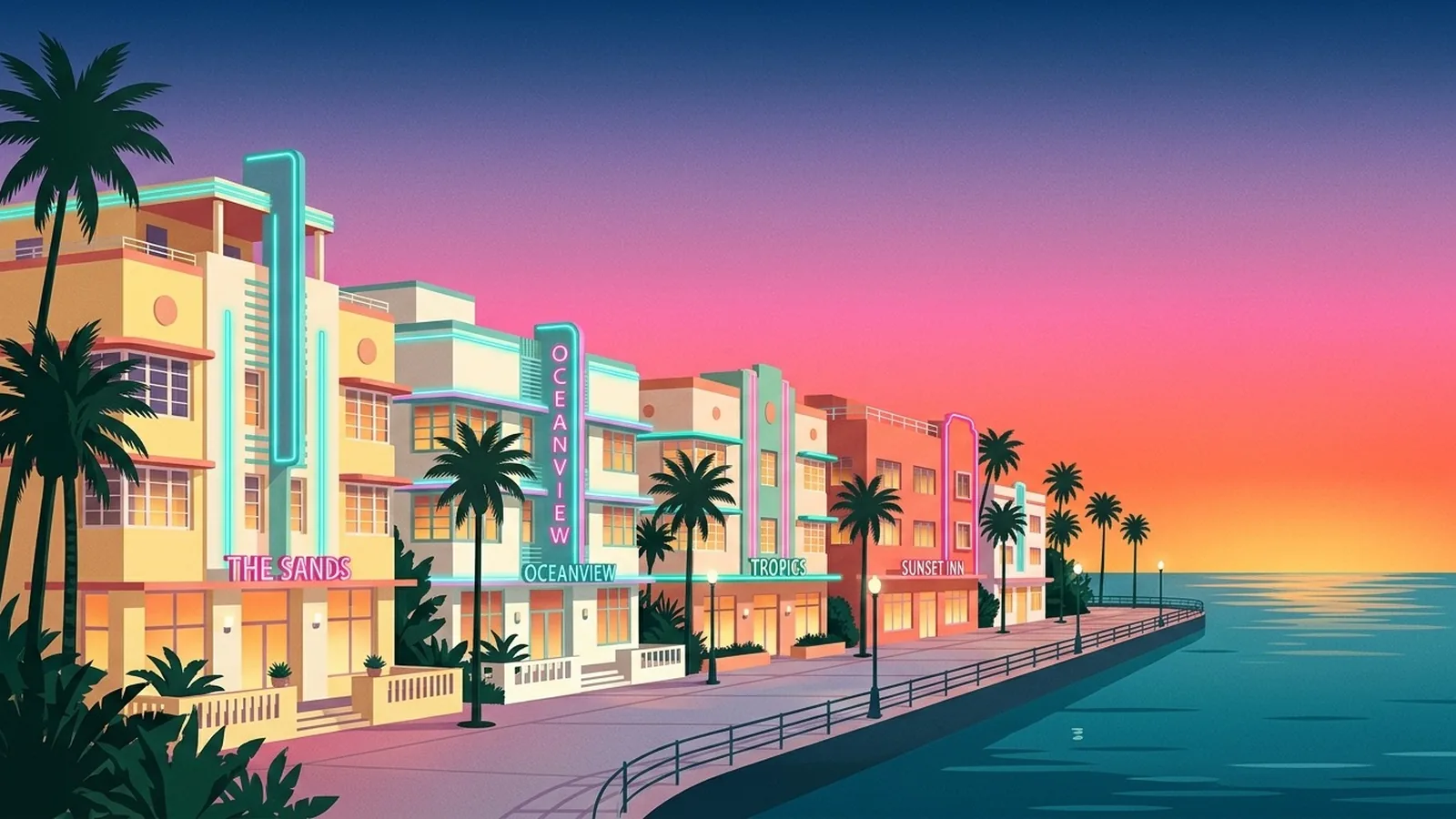
The Vice City color palette, the neon Miami look that GTA 6 has put back on every screen, is hot pink, teal and aqua, sunset orange and coral, lilac and pastel yellow, all set on white, with palm green and night navy to anchor it. Bright Spring and Bright Winter can wear it at full strength. Light Spring and Light Summer should take the pastel end. Every other season has its own pink, teal and coral that give the same mood.
Below are the ten swatches with hex codes, a table with the pink, the teal and the accent for each of the 12 color seasons, and a section on wearing the look without it turning into a costume. Every season shade named here comes from that season's palette in the Tone & Fit app, so you can open the linked palette page and see it in context.
Tone & Fit is not affiliated with or endorsed by Rockstar Games or Take-Two Interactive. Game and place names are used only to describe the game, and the hex codes are our own reading of the look, not official colors.
In this guide
- The Vice City color palette, with hex codes
- Why the GTA 6 palette is everywhere this week
- Which color seasons can wear it
- Quick table: your pink, your teal, your accent
- The palette, season by season
- How to wear it without looking like a costume
- Neon pink and teal: making the pairing work
- How to find which version is yours
- FAQ
The Vice City color palette, with hex codes
These ten colors are the look in one row. Copy the hex codes into any design tool, or use the names as search terms when you shop.

- Neon hot pink#FF2D95
- Ocean teal#00B5AD
- Pool aqua#5CE1E6
- Sunset orange#FF7A2F
- Coral#FF6F61
- Dusk lilac#C3A6FF
- Pastel yellow#FFE98A
- Stucco white#FFFAF2
- Palm green#1F8A5B
- Night navy#141B4D
The palette splits into three groups, and the split matters more than any single color:
- The neons: hot pink, ocean teal and sunset orange. Fully saturated, the colors of a sign at night.
- The pastels: pool aqua, coral, dusk lilac and pastel yellow. The same hues with white mixed in, the colors of painted hotel fronts in daylight.
- The anchors: stucco white for day, night navy for evening, and palm green as the one natural color that stops the rest from looking artificial.
Notice what is missing: brown, olive, mustard, beige and grey. Nothing in the palette is earthy or dusty. That one fact decides who can wear it as it comes and who needs to translate it.
Why the GTA 6 palette is everywhere this week
Grand Theft Auto VI launches on November 19, 2026 on PlayStation 5 and Xbox Series X|S. It is set in the state of Leonida, which includes Vice City, the series' fictional Miami. If your feeds have turned pink and teal this week, that is why.
The look itself is older than any game. It is Miami's own: pastel Art Deco fronts, neon signs after dark, and pink and orange sunsets over the water. That is also why searches for a Vice City palette and a Miami Vice color palette land on nearly the same colors. The useful question for your wardrobe is not what the city looks like. It is which of these colors look good on you.
The GTA 6 look in four moods
You do not need all ten colors at once. The look breaks into four moods, and each one is a small palette you can wear on its own.
- Sunset. Hot pink, sunset orange and lilac, the gradient on the game's own logo. Wear it as one bright piece over white.
- Pool and ocean. Ocean teal and pool aqua with stucco white. The calmest version, and the easiest for cool and light seasons.
- Neon night. Hot pink and teal against night navy. Dark base, one or two bright accents, which is how the deep seasons should take it.
- Daytime pastel. Pastel yellow, coral and palm green on white, like Art Deco fronts at noon. The softest version, made for the light seasons.
Which color seasons can wear the Vice City palette
The Vice City palette is a high-chroma palette, so the seasons that can wear it at full strength are the two bright ones: Bright Spring and Bright Winter. Chroma is how clear or how greyed a color is, and it is one of the three things seasonal color analysis measures, next to undertone and depth. A neon is a color with no grey in it at all.
That gives three ways to wear the look, depending on your season:
- Full strength. Bright Spring and Bright Winter have vivid hot pink and bright teal in their own palettes. Warm Spring joins them for the sunset half: orange, coral and turquoise.
- The pastel end. Light Spring and Light Summer are light seasons, so they take the daytime version: light pink, aqua, lilac and butter yellow.
- Your own translation. The muted seasons (Soft Summer, Soft Autumn, Cool Summer) and the deep ones (Warm Autumn, Deep Autumn, Cool Winter, Deep Winter) keep the idea of pink plus teal plus a sunset accent, and change the volume or the depth.
If you do not know your season yet, the guide to the 12 color seasons explains how they differ, and the season quiz will place you in a few minutes.
Quick table: your pink, your teal, your accent
One row per season. Each shade is from that season's own palette, with its hex code, and each name links to the page for that color.
| Season | Wear this pink | This teal | This accent |
|---|---|---|---|
| Bright Spring | Vivid hot pink #FF3A8C | Vivid cyan-teal #00D4C8 | Vivid orange #FF9500 |
| Bright Winter | Vivid hot pink #FF0080 | Bright teal #00BFA5 | Vivid violet #9900CC |
| Warm Spring | Deep warm coral #D94F30 (coral stands in for pink) | Warm turquoise #009DB5 | Vivid coral-orange #FF6B35 |
| Light Spring | Light warm pink #FFB6C1 | Light warm aqua #7EC8E3 | Butter yellow #FFD166 |
| Light Summer | Pale pink #E8BCD0 | Pale teal #AFCDC5 | Soft lilac #C8B0D4 |
| Cool Summer | Dusty rose-mauve #A0728A | Cool teal #3E7A8A | Soft purple #9B7DB8 |
| Soft Summer | Soft pink #D4B0BD | Deep teal-green #628F77 | Soft lilac #B5A3C1 |
| Soft Autumn | Dusty warm rose #BC8474 | Warm muted teal #5E8C82 | Terracotta #C4714A |
| Warm Autumn | Warm dusty rose #C4907A | Warm muted teal #2E7A6C | Pumpkin orange #CA6A35 |
| Deep Autumn | Warm rust #A86858 (rust stands in for pink) | Deep warm teal #2E5E50 | Deep rust-red #7A3830 |
| Cool Winter | Cool deep rose #CC2244 | Bright teal #00A99D | Magenta-purple #8B1A8B |
| Deep Winter | Deep cerise #9C1458 | Medium deep teal #007B68 | Midnight navy #00205B |
Two rows are honest substitutions. Warm Spring and Deep Autumn have no true pink in their palettes, so their closest relative, a coral and a rust, takes that slot. Forcing a blue-based pink onto either one is the mistake the table is there to prevent.
The Vice City palette, season by season
Full strength: Bright Spring and Bright Winter
Bright Spring is the season this palette could have been drawn for. Its own palette already holds vivid hot pink (#FF3A8C), vivid cyan-teal (#00D4C8), vivid orange (#FF9500), vivid coral-red (#FF6961) and vivid yellow (#FFCC02), with bright violet (#BF5AF2) standing in for lilac. Wear them on bright white or stone. The one part to skip is the black backdrop: black is a near miss for Bright Spring, so take the daytime version of the look even at night.
Bright Winter gets the night version. Its vivid hot pink (#FF0080) is cooler and sharper than Bright Spring's, and it pairs with bright teal (#00BFA5), vivid violet (#9900CC) and vivid orange-red (#FF6600). This is the season that can put neon on optic white or on ink and look right both ways. Keep the pastel yellow and the coral away from the face, since warm, softened shades are the ones this palette avoids. Not sure which of the two you are? Bright Spring vs Bright Winter covers the difference.
The sunset half: Warm Spring
Warm Spring owns the sunset. vivid coral-orange (#FF6B35) is its signature color, and warm turquoise (#009DB5) and vivid golden yellow (#FFD700) complete the picture. What it lacks is the pink and the lilac: cool magenta is on its avoid list and cool lilac is a named near miss, so let deep warm coral (#D94F30) do the job of pink. Use ivory instead of stark white as the base.
The pastel end: Light Spring and Light Summer
Light Spring wears the daytime palette almost unchanged: light warm pink (#FFB6C1), light warm aqua (#7EC8E3), light coral (#FF9A76), butter yellow (#FFD166) and mint green (#A8E6CF). Leave night navy out, because navy is several steps darker than anything in this palette, and use warm ivory or cream as the white.
Light Summer takes the cool pastels: pale pink (#E8BCD0), pale teal (#AFCDC5), soft lilac (#C8B0D4) and pale lavender (#DBCAF0). Coral and orange belong to the warm seasons, so the sunset accent here is lilac, on soft white.
Cool and softened: Cool Summer and Soft Summer
Cool Summer keeps the pink and teal pairing and turns both down a step: dusty rose-mauve (#A0728A) with cool teal (#3E7A8A), and soft purple (#9B7DB8) where the lilac would go. Electric fuchsia is cool but far too saturated for this season, which is why the neon pink stays on the hanger.
Soft Summer wears the palette as if seen through sea mist: soft pink (#D4B0BD), deep teal-green (#628F77) and soft lilac (#B5A3C1) on pearl grey. A clear, true teal is a named near miss for Soft Summer, so pick the greyed one even when the bright one is right beside it on the rail.
Sunset in earth tones: Soft Autumn and Warm Autumn
Soft Autumn has a ready-made version: dusty warm rose (#BC8474) for the pink, warm muted teal (#5E8C82) for the teal and terracotta (#C4714A) for the sunset, on oat cream. It reads as a faded postcard of the same city, which is a look in its own right.
Warm Autumn treats hot pink as an avoid color, so the pink becomes warm dusty rose (#C4907A). Its warm muted teal (#2E7A6C) is deeper and richer than Soft Autumn's, and pumpkin orange (#CA6A35) is the sunset. Cream beige is the white.
After dark: Deep Autumn, Cool Winter and Deep Winter
Deep Autumn takes the last light of the sunset: warm rust (#A86858) and deep rust-red (#7A3830) with deep warm teal (#2E5E50). Fuchsia and pastel lavender are both on its avoid list, so this is the one season where the look works best with no pink at all.
Cool Winter can wear nearly as much color as Bright Winter, a shade deeper: cool deep rose (#CC2244), bright teal (#00A99D) and magenta-purple (#8B1A8B) on pure white or black. Coral is the piece to drop.
Deep Winter is the city at midnight. midnight navy (#00205B) is one of its power colors, so start there and add deep cerise (#9C1458) and medium deep teal (#007B68). Deep Winter pinks are deep and clear, so skip the pastel end completely.
Find out which version is yours
The free web tool names your season from one selfie, with no sign-up. The app's scan is free too and shows your undertone, best metals and starter colors; your season and full palette in the app are an optional upgrade.
Find my season free → Get the app ↗How to wear it without looking like a costume
The Vice City look turns into a costume when every part of it shows up at once. The fix is to borrow the color idea and leave the props behind.
- Pick one neon, not three. One saturated piece reads as a choice. Hot pink, teal and orange together read as a theme party.
- Let white or navy do most of the work. The palette is bright color on a calm base: white by day, navy at night. Use your own season's version of each, from the neutrals guide.
- Put your season's shade nearest your face. A color from the wrong end of the palette can still appear on shoes, a bag or a belt, where it does not light your skin.
- Choose plain fabric over print. A palm print in neon is a souvenir. The same teal in a plain knit or a linen shirt is an outfit.
- Keep the cut ordinary. The color is already doing the talking, so a simple shirt, tee, trouser or slip dress is enough.
Four formulas that work, written as base, main piece, accent:
- Day, bright seasons: white trousers, a teal shirt, a coral or orange bag.
- Night, bright and deep seasons: navy or ink tailoring, a hot pink or cerise top, silver jewelry.
- Pastel tailoring, light seasons: a lilac or pale aqua blazer over a white tee with light trousers. This is the 1980s Miami idea, minus the shoulder pads.
- Muted seasons: oat or pearl grey trousers, a dusty rose knit, a muted teal scarf.
For more pairings built the same way, see color combinations by season. If you are dressing for a themed party on purpose, costume colors by season covers how to stay in your palette when a costume is the point.
Neon pink and teal: making the pairing work
Pink and teal work together because they sit almost opposite each other on the color wheel, so each one makes the other look brighter. That is the reason the pairing feels loud, and the reason it needs a rule.
The rule is proportion. Give one color most of the outfit and the other a small share: a teal dress with pink earrings, or a pink shirt with a teal watch strap. A rough split of three parts base, two parts main color and one part accent keeps it deliberate.
Temperature matters too. A warm pink, one that leans coral, sits best with a warm teal that leans turquoise. A cool pink that leans fuchsia sits best with a cooler, bluer teal. If you are unsure which way a shade leans, how to tell if a color is warm or cool has five quick checks. Swimwear is the easiest place to try the pairing at full volume, and the swimsuit color guide sorts the options by skin tone.
How to find which version is yours
Everything above depends on knowing your season, and guessing from a mood board is how people end up in the wrong pink. Two free ways to check: the free photo tool names your season from one selfie in about 30 seconds, and the season quiz does it from a few questions. Then open your page on the palettes hub and look for your pink, your teal and your coral or orange.
A quick home test works too. Hold a hot pink and a dusty rose under your chin in daylight, one after the other. If the hot pink makes your skin look clear and your eyes brighter, you can go full strength. If it arrives before you do, and the dusty rose looks calmer and more expensive, take the translated version from the table.
Ready to find your season?
The free web tool names your season from one selfie, with no sign-up. The app's scan is free too and shows your undertone, best metals and starter colors; your season and full palette in the app are an optional upgrade.
Find my season free → Get the app ↗Frequently asked questions
What colors are in the Vice City color palette?
The Vice City color palette is neon hot pink (#FF2D95), ocean teal (#00B5AD), pool aqua (#5CE1E6), sunset orange (#FF7A2F), coral (#FF6F61), dusk lilac (#C3A6FF) and pastel yellow (#FFE98A), set on stucco white (#FFFAF2) and anchored by palm green (#1F8A5B) and night navy (#141B4D). These hex codes are our own reading of the Miami look the city is modeled on, not official colors from the game.
Which color season suits the Vice City palette best?
Bright Spring and Bright Winter. They are the two seasons built on fully saturated color, and both have a vivid hot pink and a bright teal in their own palettes. Bright Spring wears the look on bright white with orange and yellow accents. Bright Winter wears it on optic white or ink with violet.
Can you wear neon pink and teal together?
Yes, if one of them leads. Make one color the main piece and keep the other to an accent such as a bag, a shoe or a stripe, then let a white or navy base carry the rest of the outfit. Equal blocks of both, plus a print, is the point where the look turns into a costume.
Is the Vice City palette the same as a Miami Vice color palette?
They overlap. The 1980s Miami television look is the pastel half: flamingo pink, aqua, lilac and pale yellow with a lot of white. The Vice City look keeps those pastels and adds the neon half, hot pink and teal against a dark night sky. Light Spring and Light Summer suit the pastel half, and Bright Spring and Bright Winter suit the neon half.
How do muted or deep seasons wear the Vice City look?
By keeping the color idea and changing the volume. Soft Autumn swaps hot pink for dusty warm rose and neon teal for warm muted teal. Soft Summer uses soft pink and a greyed teal-green. Deep Winter takes the night version, deep cerise and deep teal on midnight navy. The pink plus teal plus sunset pairing still reads as Miami in every one of those versions.
Are these the official colors from GTA 6?
No. Rockstar Games has not published a color palette that we can point to, and the hex codes here are our own. Tone & Fit is not affiliated with or endorsed by Rockstar Games or Take-Two Interactive.
Can I check my color season from a photo?
Yes. The free Tone & Fit web tool reads your color season from one selfie in about 30 seconds, with no sign-up and no photo stored by us. The Tone & Fit app for iPhone and Android then builds your full palette of 38 named shades.