How to Wear a Color That Isn't in Your Palette
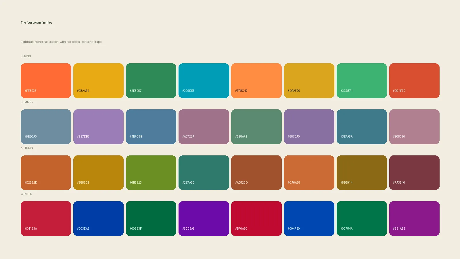
To wear a color that isn't in your palette, keep it away from your face, shrink its area, or buffer it with a color from your palette. Wear it as trousers, a skirt, shoes or a bag instead of near your neckline, add a scarf or necklace in a flattering shade between it and your skin, and let makeup and hair do some of the correcting. Your palette is a guide to your best colors, not a list of prohibitions.
The short version: color analysis tells you which shades flatter your face. It does not tell you what you are allowed to own. Most people have a favorite shirt, a work uniform or a team color that sits outside their palette, and the fix is rarely to throw it out. It is to control where the color sits and what stands between it and your skin. If you are still working out your own palette, start with the what colors look good on me guide, then use the seven techniques below.
What's in this guide
- Why an off-palette color looks wrong near your face
- Step 1: work out how far off the color is
- Step 2: move the color away from your face
- Step 3: add a buffer layer
- Step 4: change the proportion
- Step 5: correct with makeup, hair and glasses
- Step 6: nudge the shade toward your palette
- Step 7: use pattern and mixed colors
- Common cases: black, white, red and uniforms
- When to just let it go
- FAQ
Why an off-palette color looks wrong near your face
A color next to your face reflects light onto your skin and sets the context your eye uses to judge your complexion. If the color agrees with your undertone, depth and clarity, your skin looks even and your features look clear. If it disagrees, it can pull yellow, grey or red out of your skin, deepen shadows under your eyes, or simply swallow you.
That is the same effect described in colors that wash you out, and it explains why the problem is mostly about the area near your face. A wrong color on your feet cannot throw a shadow on your cheek. The whole strategy in this guide follows from that one idea: you can change how bad an off-palette color looks without changing the color.
The framework behind a palette is three properties of your coloring: undertone (warm, cool or neutral), depth (light to deep) and clarity (soft to bright). A color can be off on one, two or all three, and how far off it is determines how much work it needs. The background is in seasonal color analysis explained.
Step 1: work out how far off the color is
Before you reach for a fix, decide how big the problem is. Hold the garment against your bare face in daylight, then ask three questions.
- Is the temperature wrong? A warm orange on a cool complexion, or an icy pink on a warm one, is a temperature clash. It is the hardest kind to fix.
- Is the depth wrong? A pale pastel on very deep coloring, or a heavy charcoal on very light coloring, is a depth mismatch. It is usually easy to improve.
- Is the clarity wrong? A neon on soft coloring, or a dusty muted shade on bright coloring, is a clarity mismatch. It tends to be forgiving.
If only one property is off, you can usually make the color work. If all three are off, it is probably a color to wear low on the body or not at all. To check which of your properties is the dominant one, the contrast level guide and the undertone tests are the quickest tools.
Step 2: move the color away from your face
This is the single most effective trick. The farther a color sits from your face, the less it affects your skin. Here is a rough order from most to least risky:
| Placement | Effect on your face | Good for |
|---|---|---|
| Scarf, collar, top, dress neckline | Strongest. Reflects straight onto your skin | Only palette colors |
| Jacket or cardigan worn open over a palette top | Moderate. The top acts as a frame | Slightly off colors |
| Skirt, trousers, shorts | Weak. Far from the face | Most off-palette colors |
| Shoes, bag, belt | Almost none | Anything you love |
| Socks, nail polish, phone case | None to minimal | Any color at all |
In practice this means a person with a Winter palette can keep an orange bag, a person with an Autumn palette can wear icy grey trousers, and nobody has to give up a color they enjoy. The wardrobe workflow in how to shop your color palette uses the same principle for deciding what to buy. The capsule approach in capsule wardrobe by color season shows how to lay it out across a whole closet.
Step 3: add a buffer layer
If the off-palette color has to sit near your face, put something from your palette between it and your skin. A buffer breaks the line of reflected color and gives your face a flattering frame.
- A scarf or collar in a palette color. Wear it open at the neck of an off-palette coat.
- A neutral under-layer. A camisole, tee or shirt in a palette neutral worn under the problem color. Our guide to neutrals by color season lists the right ones for each palette.
- Jewelry that agrees with your undertone. A necklace in the right metal adds a bright, flattering line. If you are not sure which metal that is, see gold or silver jewelry by skin undertone.
- A layered neckline. A V-neck or open collar shows more skin, which helps the face stay the focus.
A practical example: a cool-toned person given a warm mustard sweater can wear it with a crisp white collar peeking out, plus a silver chain. The collar and chain sit nearest the face and carry the cool message, and the sweater is just the background.
Step 4: change the proportion
The more of your outfit a color fills, the more it shapes the overall impression. A small amount of off-palette color reads as an accent. A whole outfit in it reads as your color.
Use the 80/20 approach
Build most of the look from palette colors, and keep the off-palette color to a smaller share, roughly a fifth of what the eye sees. A striped top in which the off-palette shade is a thin line works better than the same shade as a solid block. A printed scarf with a small off-palette motif works better than a solid scarf in that color.
Use texture to change how a color reads
Matte fabrics absorb light and soften a color, while shiny fabrics reflect it and intensify it. If a color is slightly too bright for your clarity, pick it in a matte knit rather than satin. If it is slightly too dull, a bit of sheen can help. Texture will not rescue a temperature clash, but it can close a small gap on clarity.
Step 5: correct with makeup, hair and glasses
You can also adjust the face rather than the garment. These are small tweaks, not a transformation.
- Lip color. A lipstick from your palette near an off-palette top gives the eye a flattering focal point. For lip shades by undertone, see best lipstick colors for your undertone.
- Blush. A little color on the cheeks counteracts the pallor an off color can create. The guide to blush by undertone shows which shades to reach for.
- Foundation. A well matched base keeps skin looking even under any top. See best foundation undertone match.
- Glasses. Frames sit right next to the eyes and can pull focus from the garment. How to pick glasses for your undertone covers the colors and metals.
- Hair. Hair frames the face. If your color is far from your palette, your hair color matters even more; see hair color by season.
Think of makeup as the second buffer layer. It is not a way to make every color work, but it is a reasonable way to make a slightly off garment look intentional.
Know which colors are really yours
Tone & Fit reads undertone, depth and clarity from one selfie and returns your season with its palette.
Try Tone & Fit free ↗Step 6: nudge the shade toward your palette
Many "wrong" colors are one adjustment away from a right one. When you shop, look for the version of a color that leans toward your palette.
| If you are | And you love | Look for the version that is |
|---|---|---|
| Cool or Summer/Winter | Orange | A cooler coral-red or a deep rust with a berry edge |
| Cool or Summer/Winter | Yellow | A lemon or pale butter rather than mustard |
| Warm or Spring/Autumn | Pink | A salmon, coral or warm rose rather than fuchsia |
| Warm or Spring/Autumn | Navy | A softer teal-navy or a warm dark brown instead |
| Soft or muted coloring | Neon or electric tones | A dusty, greyed version of the same hue |
| Bright or high contrast coloring | Beige and taupe | A cleaner stone, ivory or a deeper chocolate |
The idea is to keep the hue you love and shift the temperature, depth or clarity. This is far easier than changing hues entirely, and it often feels like the same color in a better outfit.
Step 7: use pattern and mixed colors
A pattern blends several colors, and the eye averages them. A floral, plaid or stripe that contains your palette colors alongside an off-palette one often works, because the palette colors dominate near your face. When shopping prints, check the dominant tone and the lightest tone first, since those are what reflect onto your skin.
Color blocking works in the opposite way, so use it carefully. Putting an off-palette color directly beside your face and a palette color lower down is the reverse of what you want. Swap the order: palette colors high, off-palette low.
Common cases: black, white, red and uniforms
Black
Black is the most common off-palette color, and it is a real problem for many Spring, Summer and soft-coloured people. A deep charcoal, navy or dark brown near the face is usually kinder. If you must wear black, use the buffer and distance steps, and see can you wear black by color season for specifics.
White
Pure white is harsh for many warm and soft palettes. Swap it for cream, ivory or oatmeal near the face. Cool and high-contrast palettes can usually keep crisp white.
Red
There is a red for nearly every palette: blue-based for cool, tomato and brick for warm. If you love red, hunt for the version in your temperature. For lipstick in particular, red lipstick for every undertone goes through each match.
Work uniforms and dress codes
If your uniform is a fixed off-palette color, the answer is a buffer: a scarf, tie, collar or jewelry in your palette at the neckline, and makeup that supports your coloring. A lanyard in a flattering color is also an easy and underrated fix. For interview situations specifically, what colors to wear to a job interview covers the choices that matter most.
Team colors, school colors and gifts
Wear them lower on the body, such as a cap in the team color with a palette top, or a scarf worn loose rather than tight to the neck. Gifts from people who love you are the best reason to ignore a rule altogether, and a buffer layer makes them easier to wear.
When to just let it go
There are two situations where a fix is not worth it. The first is when a color is wrong on all three properties and sits right next to your face; in that case the cost to your overall look is real, and the garment is better kept for layers or for someone else. The second is the opposite: a color you love, in an occasion that matters to you, where the feeling it gives you outweighs the small visual cost. Confidence changes how an outfit reads, and a palette is a tool, not a verdict.
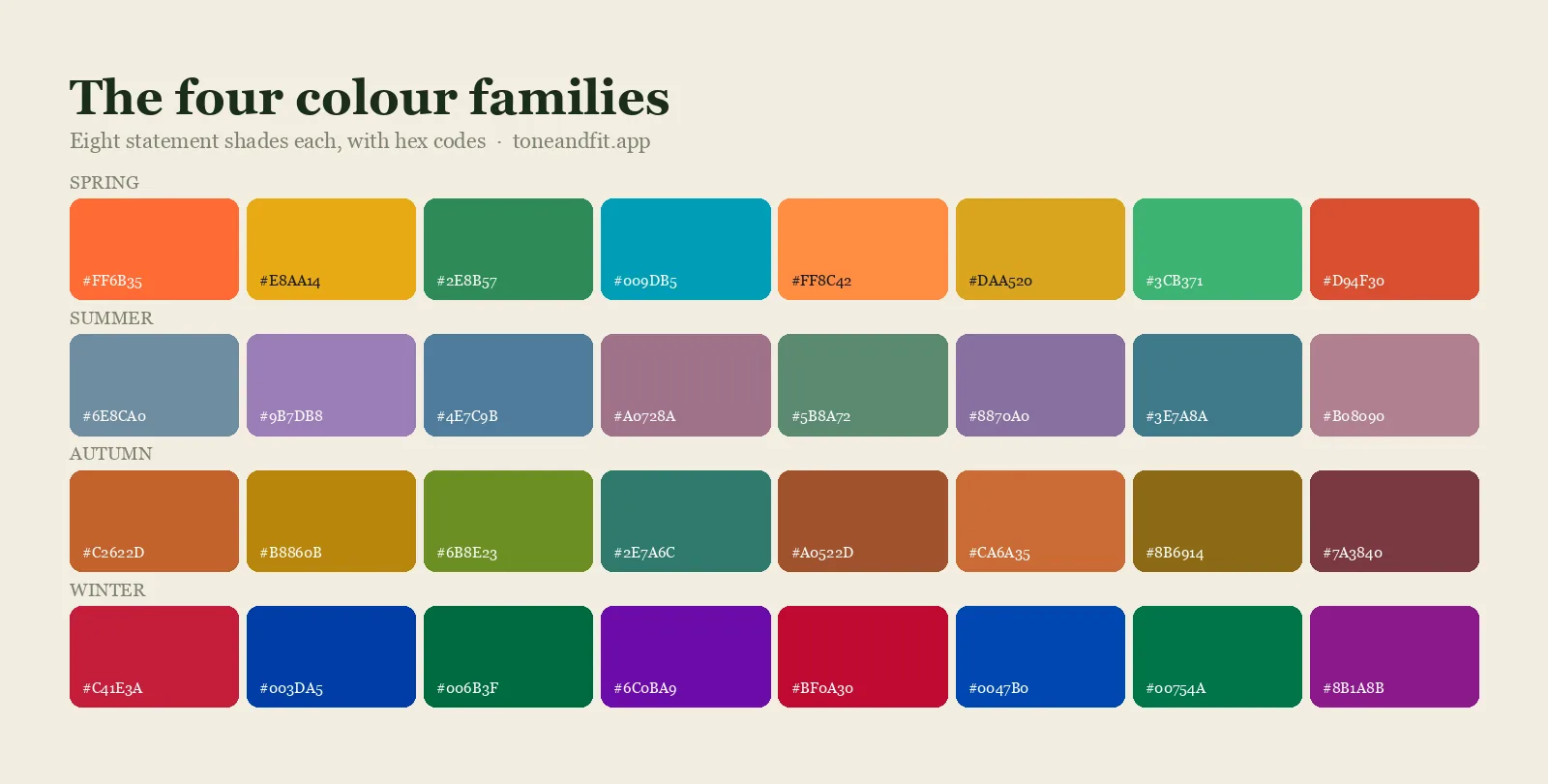
If you are unsure how far your palette really reaches, it is worth reading how to read your color analysis results, because many people treat a palette as narrower than it is. Most palettes include many more usable colors than the swatch strip shows, and your result is a recommendation, not a boundary. The complete order of operations from undertone to season to palette is in the personal color analysis guide, and the 12 color seasons page maps each palette. If your result still feels unclear, the find my color season guide walks through it again.
Find your palette in one selfie
Get your 12-season result and palette from a single photo. Free to try, no sign-up.
Find your season free ↗FAQ
Can I wear colors that aren't in my color palette?
Yes. A palette shows the colors that flatter your face most, not a list of forbidden colors. You can wear off-palette colors by keeping them away from your face, adding a buffer such as a scarf or a necklace in a palette shade, or choosing a version of the color that leans toward your palette.
How do I wear a color that doesn't suit me near my face?
Put something from your palette between the color and your skin, such as a collar, scarf or neutral under-layer, and choose a V-neck or open neckline. Keep the off-palette color to a small share of the outfit and use makeup from your palette, such as lipstick and blush, to support your coloring.
What can I wear if my favorite color isn't in my season?
Look for the version of that hue that moves toward your palette in temperature, depth or clarity, for example a coral instead of orange on a cool complexion, or a dusty shade instead of a neon on soft coloring. Or wear your favorite color lower on the body, as trousers, a skirt, shoes or a bag.
Do I have to throw out clothes that aren't in my palette?
No. Sort them first. Keep what is close to your palette, keep off-palette pieces that you wear below the waist or under a flattering layer, and let go of items that are wrong on every property and sit right at your face. The clothes you never wear are better candidates than clothes you love.
Does makeup fix a color that doesn't suit me?
It helps but does not fully fix it. A lip and blush shade from your palette gives the eye a flattering focus and can make a slightly off garment look intentional. A strong temperature clash near the face is better solved with distance or a buffer layer.
Is it okay to wear black if it isn't in my palette?
Often, yes, with adjustments. Keep black below the waist, or wear it with a palette-colored scarf, collar or jewelry near your face. Deep charcoal, navy and dark brown are usually easier to wear near the face than true black for people whose palettes lean away from it.
How do I wear a work uniform in a color that doesn't suit me?
Use the neckline. A scarf, tie, collar insert or necklace in a palette color gives your face a flattering frame, and a lanyard or badge strap in a good color adds another. Makeup from your palette completes the effect.