How to Choose a Headshot Background Color
The best headshot background color shares your undertone's temperature and sits a shade or two softer than your outfit. Warm undertones read best against warm neutrals like taupe, olive-grey, and soft cream. Cool undertones read best against cool neutrals like dove grey, slate, and charcoal. Get the temperature wrong and even a great outfit and a good photographer can't fully save the shot.
What's in this guide
- Why background color changes how a headshot reads
- Find your undertone before you book the shoot
- Best headshot background colors by undertone
- Best headshot background colors by season
- Matching the background to the context
- Headshot background colors for specific skin tones
- Background color vs outfit color
- What to avoid
- Quick pre-shoot checklist
- FAQ
Why background color changes how a headshot reads
A headshot background does two things most people never think about. Physically, a strongly colored backdrop bounces some of its own light back onto your face, the same way standing near a red wall gives your skin a faint pink cast. Digitally, most cameras use automatic white balance, which reads the dominant colors in the whole frame, background included, to decide how to render skin tones. A heavily warm or heavily cool backdrop can quietly shift the color of your face along with it.
This is the same logic our guide to what colors look good on you applies to clothing, just applied to whatever's behind you instead of what's on you. If you already know your color season, you can jump straight to the chart below.
Find your undertone before you book the shoot
Undertone, not skin depth, is what decides which backdrop works for you. A fair cool undertone and a deep cool undertone want the same backdrop family; a fair warm undertone wants the opposite one.
- Warm undertone: golden, peachy, or yellow cast to your skin. Warm neutrals, taupe, warm grey, soft olive, sit closest to your own coloring.
- Cool undertone: pink, red, or blue cast. Cool neutrals, dove grey, slate, charcoal, complement you best.
- Neutral undertone: a balanced mix. A true mid-grey works for you in either direction.
If you're not sure which you are, our guide to finding your skin undertone at home walks through it in a few minutes, and the deeper explainer on warm vs cool skin undertone covers the edge cases. Undertone plus your overall value and chroma gives you one of the 12 color seasons, which is the fastest way to pick a backdrop with confidence instead of guessing in the studio.
Best headshot background colors by undertone
| Undertone | Best background colors | Use caution |
|---|---|---|
| Warm | Warm grey (greige), taupe, soft olive, warm cream, warm chocolate-brown | Cool blue-grey, icy white, true slate |
| Cool | Dove grey, charcoal, slate blue, cool navy, soft cool white | Warm tan, mustard, warm chocolate-brown |
| Neutral | Soft mid-grey, muted sage, warm-neutral beige | Extremes of either very warm or very icy backdrops |
Best headshot background colors by season
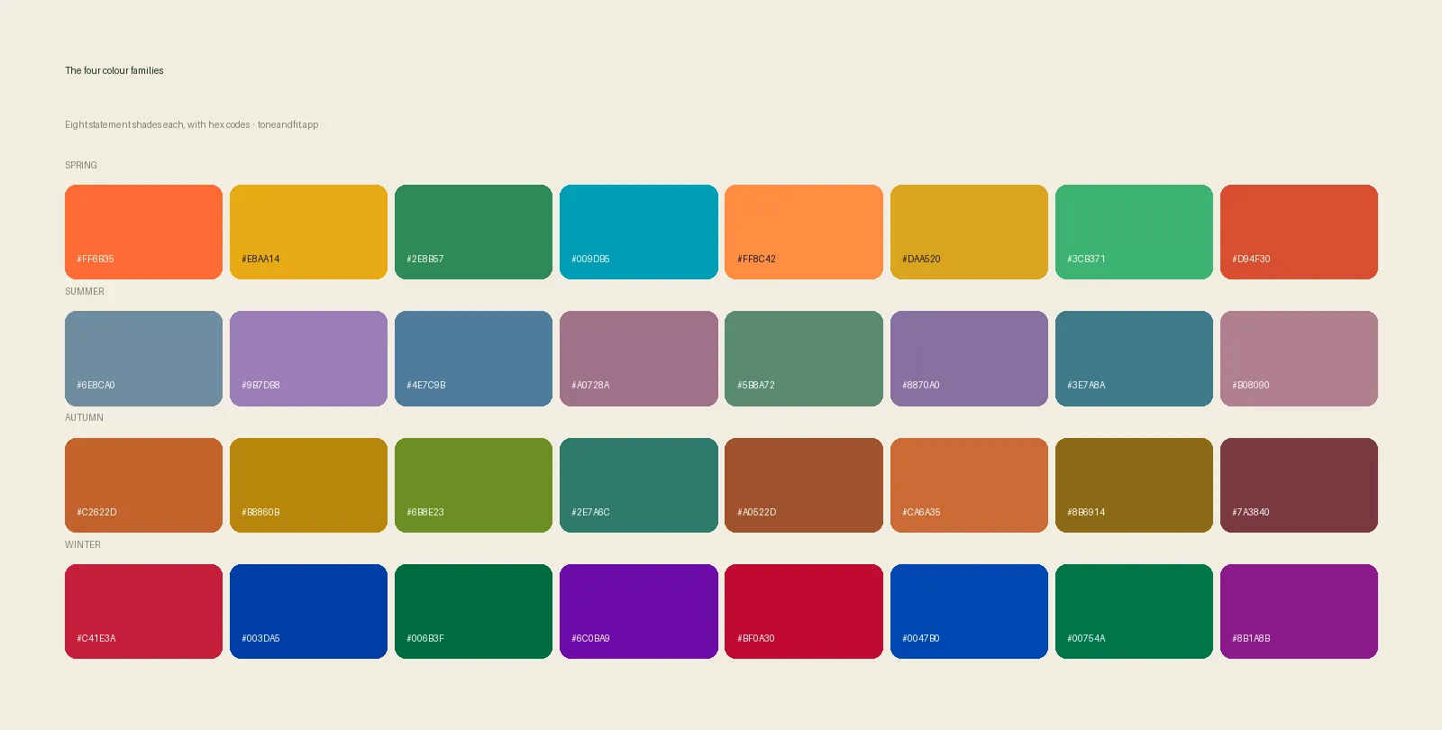
Your undertone narrows the field; your full season fine-tunes it further, since a bold Winter backdrop and a soft Summer backdrop should not look the same even though both are technically cool.
Spring (warm + light/bright)
Soft warm cream, light warm taupe, and a muted warm turquoise-grey all work well. These keep the brightness that Spring coloring needs instead of flattening it. Likely seasons: Warm Spring, Light Spring, Bright Spring.
Summer (cool + light/soft)
Dove grey, soft periwinkle-grey, and cool mushroom tones suit Summer's gentle, muted coloring without adding harshness. Likely seasons: Light Summer, Cool Summer, Soft Summer.
Autumn (warm + deep/rich)
Olive, warm chocolate-brown, and a muted mustard-grey match Autumn's richness and depth, and photograph as warm and grounded rather than washed out. Likely seasons: Warm Autumn, Soft Autumn, Deep Autumn.
Winter (cool + deep/bright)
Charcoal, true navy, and cool black hold up against Winter's natural high contrast; a creative or acting headshot can also use a deep jewel-toned teal where a corporate one would stay neutral. Likely seasons: Cool Winter, True Winter, Deep Winter.
Know your season before your next headshot
One selfie, your undertone and season in 60 seconds, free.
Try Tone & Fit free ↗Matching the background to the context
The right backdrop also depends on where the photo is going, not just your coloring.
Corporate and LinkedIn
Stay muted and neutral: a warm greige or a cool dove grey both read as professional at any size, which matters since LinkedIn photos are usually viewed small and cropped into a circle. This is the same restrained approach we cover in what colors to wear to a job interview, just extended to whatever's behind you. Coordinate with office outfit colors by season if you're shooting outfit and backdrop together.
Creative, acting, and modeling headshots
These allow more saturation. A deep jewel tone in your own temperature, emerald for a cool Winter, warm terracotta for an Autumn, can make a comp card or portfolio shot stand out without looking unprofessional in that context.
Academic and personal websites
A softer, warmer-leaning neutral tends to read as approachable, which is usually the goal for a faculty page or an "about me" photo, even for people with cool undertones. A gentle cool grey still works, it just shouldn't be the starkest, coolest option available.
Headshot background colors for specific skin tones
Season is the fastest shortcut, but it helps to see how the same undertone logic plays out for specific skin tones people actually search for.
Fair skin, warm undertone
A soft warm cream or light taupe backdrop sits close enough to your own coloring that it reads as a gentle frame rather than a competing color. Avoid a cool, icy grey here, it tends to make fair warm skin look slightly grey or tired rather than crisp.
Fair skin, cool undertone
Dove grey and soft cool white keep fair, pink-toned skin looking clear. Warm backdrops like tan or mustard tend to make the pink in fair cool skin look ruddy rather than warm, the same clash that shows up in clothing choices.
Olive skin
Olive undertones are easy to misjudge because the greenish-yellow cast can look warm at a glance while actually testing cool, or the reverse. If you're a warm olive, a warm chocolate-brown or soft olive backdrop is safe. If you're a cool olive, a cool charcoal or slate reads better than anything orange-based. Our full guide to the best colors for olive skin tone covers how to tell which side you're on.
Tan or medium skin
A tan changes how deep your skin reads in a photo, not your undertone. Medium warm skin can lean into richer warm backdrops like terracotta-brown without it looking heavy. Medium cool skin should still avoid warm, orange-based backdrops even at a deeper tan, since the mismatch is about temperature, not depth.
Deep skin
Deep skin, warm or cool, generally has the most backdrop range, since the natural contrast between a rich color and deep skin reads as striking on camera rather than jarring. Deep warm skin looks strong against warm chocolate-brown or olive. Deep cool skin looks strong against charcoal, true navy, or a deep jewel tone. See best colors for dark skin tones and color analysis for deep skin tones for the fuller breakdown.
Very pale skin
If you burn easily and read as very pale, a softer, lower-saturation version of your temperature's backdrop usually photographs better than the boldest option on the wall. Our guide to best colors for pale skin has the full palette, including which neutrals work as a base layer under a jacket for a shoot.
Background color vs outfit color
Background and outfit should share a temperature but not a value. If your shirt and your backdrop are close to the same color and depth, your silhouette blends into the background instead of standing out from it, an effect photographers sometimes call "melting into the wall." Keep them in the same warm or cool family, but pick a background a few shades lighter or darker than your top.
How much room you have to play with that value gap depends on your natural contrast level. If you want to understand why some people can wear a near-black top against a mid-grey background and others need a softer combination, read our guide to finding your contrast level. Pairing your shirt color with the right background is the same exercise either way: same temperature, different depth.
What to avoid
- Pure, stark white. It offers the camera no color cue to balance against, which can push skin tones slightly cool or grey, and it can overexpose around the edges of warm or deep skin.
- Green-screen chroma key backgrounds used for a final photo rather than a composite. Even with good lighting, green spill can tint skin with a faint sickly cast.
- A trendy blurred-bookshelf or plant-wall background chosen for looks alone. If the props mix warm wood and cool metal in equal amounts, the background reads as visually busy rather than color-coordinated with you.
- A background that matches your brand colors but not your undertone. Brand consistency matters, but if the two genuinely conflict, your face should win; see colors that wash you out for what that actually looks like on camera.
Quick pre-shoot checklist
- Know your undertone (a quick photo check takes under a minute).
- Pick two backdrop options in your temperature family, one lighter, one darker.
- Bring an outfit change in the same temperature as your chosen backdrop.
- Shoot near a daylight-balanced window if you have any control over lighting.
- Check a preview photo against your actual skin, not just the studio monitor, before the session ends.
- Avoid a background color that's nearly identical to your top.
FAQ
What's the best headshot background color for LinkedIn?
A muted, mid-value neutral in your own temperature works best: warm greige or soft taupe for warm undertones, dove grey or cool slate for cool undertones. LinkedIn photos are viewed small and often in a circle crop, so a calm neutral reads as professional at any size, while a bright or trendy color can look distracting.
Should my headshot background match my outfit color?
Not exactly. Background and outfit should share the same temperature, warm with warm, cool with cool, but not the same value. If your top and your backdrop are near-identical in color and depth, your silhouette flattens into the background instead of standing out from it.
Is a white background always safe?
No. A stark, cool-toned white can wash out warm or deep skin by overexposing around the edges, and it offers no color cue for the camera's white balance to work with, which can push skin tones slightly cool or grey. A soft warm cream or a gentle cool white, matched to your undertone, is safer than pure white.
What background color works for cool undertones on a budget paper roll?
Dove grey and cool charcoal are the two most widely available seamless paper colors that flatter cool undertones, and both photograph as neutral and professional rather than cold or harsh.
Can I use a blurred bookshelf or office background?
Yes, as long as the dominant color tones in that blur are in your temperature family. A warm wood bookshelf suits a warm undertone; a cool grey office wall suits a cool undertone. If the background mixes both warm wood and cool metal in equal amounts, it reads as visually busy rather than color-coordinated.
Does background color really change skin tone in photos?
Yes, in two ways. Physically, a strongly colored background bounces some of its own light back onto your face and clothing. Digitally, a camera's automatic white balance reads the dominant colors in the frame, including the background, to decide how to render skin tones, so a heavily warm or cool backdrop can shift the whole image's color cast.