Best Colors for Family Photos: Palettes That Flatter Everyone
What's in this guide
- The quick formula for family photo colors
- Why coordinating beats matching
- The best colors for mixed skin tones
- 8 family photo color palettes that work
- Best colors by location and time of year
- Giving each person their best version of the palette
- Skin depth, contrast and who wears the lightest color
- How to build the outfits, step by step
- Kids, babies, men and grandparents
- Pattern, texture and fabric
- Colors to avoid in family photos
- Holiday card photos
- The ten minute test before the shoot
- Quick recap
- FAQ
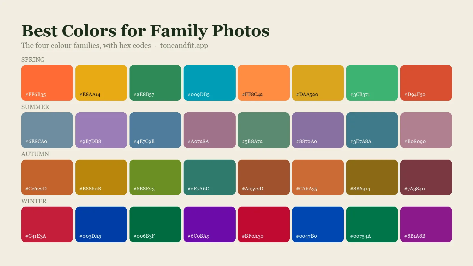
The best colors for family photos are a small palette of two or three coordinating colors plus one or two neutrals, in mid depth, slightly muted shades. Navy, teal, forest green, burgundy, dusty blue, sage, mauve and soft white flatter the widest range of skin tones, so they are the safest starting points when a family has mixed coloring. Then give each person the version of the palette that suits their own undertone.
That last sentence is the part most family photo advice skips. A palette can look lovely laid out on a bed and still make one person look washed out, because the color sitting next to their face fights their skin. This guide covers both halves: how to pick a palette that suits the setting, and how to hand out the colors so that every face looks its best. It is part of our wider guide to finding the colors that look good on you, applied to the trickier problem of several people in one frame.
The quick formula for family photo colors
If you only have five minutes, use this.
- Pick two or three colors that sit well together. For example navy, dusty blue and rust, or forest green, cream and burgundy.
- Add one or two neutrals. Soft white, cream, camel, grey, tan or denim.
- Keep everything in a similar depth and softness. All mid tones, or all soft and light, or all deep and rich. Mixing one neon item into a muted set is what breaks a photo.
- Start with one outfit. Usually the hardest person to dress, or a patterned piece that contains most of the palette. Build everyone else around it.
- Put each person's best color nearest their face. Use the rest of the palette for trousers, skirts, layers and accessories.
Everything below is detail on those five steps.
Why coordinating beats matching
The matching white shirts and jeans look had a long run, and it has two problems. The first is visual. When everyone wears the same thing, the group merges into one block and individual people stop standing out. The second is about skin. One color cannot suit every undertone in a family, and bright white is one of the hardest colors of all to wear near the face. Our guide to white versus cream shows how differently the two behave on warm and cool skin.
Coordinating fixes both. A shared palette makes the family look like it belongs together, and the variation inside the palette lets each person wear a shade that works for them. Think of it as a color story with several characters, instead of a uniform.
It helps to know why color near the face matters so much. Fabric reflects light up onto the jaw, the mouth and the skin under the eyes. A shade that agrees with your undertone evens your skin out. One that disagrees adds a cast, which is the effect described in colors that wash you out. In a family photo this happens to every person at once, so small choices add up.
The best colors for mixed skin tones
Some colors are balanced between warm and cool, or come in an easy version for both. These are the ones to build a family palette around when undertones differ, which they usually do, since undertone does not always run in a straight line through a family.
| Color | Why it works on a group | Warm skin version | Cool skin version |
|---|---|---|---|
| Navy | A dark neutral that is softer than black and kind to nearly every undertone | Navy with a hint of teal | Deep ink navy |
| Teal | Sits between blue and green, so it balances warm and cool | Deeper, greener teal | Bluer teal |
| Forest and sage green | Natural looking outdoors and gentle on most skin | Olive, moss, warm sage | Pine, blue-green, grey sage |
| Burgundy and wine | Rich without being loud, and flattering from fair to deep skin | Brick or brown-based burgundy | Blue-based wine or plum |
| Dusty blue | Soft, calm and easy for the camera to handle | Soft teal blue | Slate or powder blue |
| Mauve and dusty rose | A muted pink that reads as a soft neutral in photos | Dusty peach, terracotta rose | Mauve, rose, soft berry |
| Soft white | Lights up the frame without the glare of bright white | Cream, ivory | Soft white, pale grey |
| Denim | Works as a neutral with every palette here | Mid or dark wash | Mid or dark wash |
Notice how each row splits into two versions. That split is the whole trick: the family shares the color, and each person takes the side that suits them. If telling the two versions apart is new to you, how to tell if a color is warm or cool has quick checks for every color family.
8 family photo color palettes that work
Each of these has two or three colors and a neutral or two, and each can be worn by warm and cool undertones in the same photo.
| Palette | Colors | Best for |
|---|---|---|
| Classic blues | Navy, dusty blue, soft white, tan | Beach, studio, any season |
| Autumn warmth | Rust, mustard, olive, cream, denim | Fall leaves, golden fields |
| Woodland | Forest green, sage, cream, camel | Parks, forests, evergreen backdrops |
| Berry and navy | Burgundy, navy, mauve, grey | Late autumn, winter, city settings |
| Soft neutrals | Cream, oatmeal, camel, soft grey | Newborn sessions, indoor light, minimal looks |
| Coastal | Soft white, sand, pale blue, sage | Beach and lakeside at sunset |
| Spring garden | Dusty rose, sage, soft white, light denim | Blossom, gardens, bright spring light |
| Winter jewel | Emerald, wine, navy, soft white | Snow, holiday cards, evening light |
If you want to check that your chosen colors really do sit well together, color combinations by season explains which pairings work and why, and neutrals by color season covers which neutral suits which kind of coloring.
Best colors by location and time of year
The background is the biggest color in your photo, so choose the palette against it. The aim is for the family to stand out from the setting without clashing with it.
| Setting | Colors that work | Colors that struggle |
|---|---|---|
| Autumn trees and fields | Navy, cream, burgundy, denim, deep teal | Head to toe orange and yellow, which blend into the leaves |
| Green parks and forests | Cream, rust, navy, dusty rose, mustard | Mid green, which disappears, and bright white in strong sun |
| Beach and water | Soft white, sand, pale blue, sage, coral accents | Black and very dark, heavy colors |
| Snow | Burgundy, emerald, navy, camel, mustard | All white outfits, which merge with the ground |
| City and brick | Navy, grey, black accents, mustard, wine | Brick red against a red brick wall |
| Studio or at home | Soft neutrals, dusty blue, sage, mauve | Anything that matches the backdrop or the sofa exactly |
Time of day matters as well. Late afternoon light is warm and makes rust, cream and camel glow. Overcast light is cool and even, and it is kind to blues, greys and berry shades. How lighting changes the way colors look on you explains what to expect. For shade ideas tied to the time of year, see the fall color palette and winter color palette guides.
Giving each person their best version of the palette
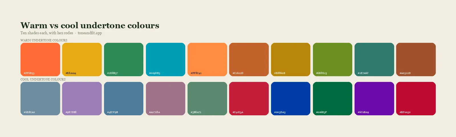
Now the part that makes faces look good. Work out each person's undertone, then give them the matching version of the family colors. You do not need a full analysis for everyone. The at-home undertone tests take a few minutes per person, and the jewelry test alone is often enough: if gold flatters, lean warm, and if silver flatters, lean cool.
| Undertone | Give them | Their neutral near the face | Keep away from the face |
|---|---|---|---|
| Warm | Rust, olive, mustard, teal, brick burgundy, warm sage | Cream, camel, warm tan | Icy pastels, cool grey, bright white |
| Cool | Navy, dusty blue, wine, emerald, mauve, slate | Soft white, grey, charcoal | Mustard, orange, yellow-based beige |
| Neutral | Teal, dusty rose, sage, soft navy, muted burgundy | Soft white, taupe, oatmeal | The most extreme warm or cool shade in the set |
| Olive | Deep teal, forest green, burgundy, aubergine, navy | Camel, taupe, warm cream | Powdery pastels, flat mid grey |
Here is how that plays out with the "Autumn warmth" palette. A warm toned parent wears rust. A cool toned parent wears denim and navy with a cream scarf kept low. A child with neutral coloring wears olive and cream. Everyone is plainly in the same palette, and nobody is wearing mustard against skin that it turns sallow.
If someone's signals keep contradicting each other, they may be neutral or olive. Warm versus cool undertones explains which clues to trust, and olive undertone explained covers the group that standard tests misread most often. For family members who already know their season, the 12 color seasons lists the best shades for each.
Find each person's best colors before the shoot
The free web tool names your season from one selfie, with no sign-up. The app's scan is free too and shows your undertone, best metals and starter colors; your season and full palette in the app are an optional upgrade.
Find my season free → Get the app ↗Skin depth, contrast and who wears the lightest color
Undertone decides the temperature each person wears. Depth and contrast decide how light, dark or strong their color should be. This matters most in families where skin depth varies a lot, because a camera sets one exposure for the whole frame.
- Fair skin can be overpowered by very dark, heavy colors and can blend into pale beige. Mid tones and soft colors are the easy choice. See the best colors for pale skin.
- Medium and tan skin has the widest range. Avoid shades close to the skin's own color, which blur the line between face and clothing.
- Deep skin looks rich in saturated and bright shades and in clean light neutrals. Dusty, greyed mid tones can look flat. See the best colors for dark skin tones.
When depth varies across the family, mid tone clothing is the most reliable choice for everyone. Large areas of bright white or solid black push the camera toward extremes, and somebody's face ends up too dark or too bright. Mid tones keep every face in a range the camera can hold. This is covered in more detail in our guide to choosing colors that photograph well.
Contrast is personal too. Someone with dark hair and light skin can carry a stronger color or a bolder pattern than someone whose hair, skin and eyes are close together in depth. How to find your contrast level shows how to check from a single photo.
How to build the outfits, step by step
- Choose the location first, then pick a palette from the tables above that stands out against it.
- Find an anchor piece. A patterned dress, a plaid shirt or a floral skirt that contains two or three of your palette colors. Pull the other outfits from the colors in that one item.
- Dress the hardest person next. That is usually whoever has the fewest options, such as a toddler, a teenager with firm opinions or a parent who dislikes shopping.
- Assign colors by undertone. Use the table in the previous section so each person gets their version near the face.
- Spread the colors around. Avoid putting all the dark outfits on one side of the group. If one person wears burgundy on top, let someone else carry it in a skirt, a hair bow or a scarf.
- Limit the bright accent. One stronger color, used on one or two people, gives the photo life. The same color on everyone turns into a uniform.
- Add texture in place of extra colors. Knits, corduroy, linen, denim and lace add interest without adding noise.
- Check shoes and socks. Neutral shoes in brown, tan, white or grey. Bright trainers draw the eye to the bottom of the frame.
You do not need to buy everything new. Start with what the family already owns and fill the gaps. If you keep each person's palette on your phone, shopping for the gaps is much faster, which is the idea behind how to shop your color palette.
Kids, babies, men and grandparents
Babies and young children. Their clothes sit right under their faces and often get held against a parent's chest, so a baby's outfit becomes part of the parent's color too. Soft neutrals and gentle versions of the palette work best. Skip large logos, slogans and cartoon characters, which pull attention away from faces.
Children with different coloring from their parents. This is common, and it is the main reason matching outfits disappoint. Check each child separately. A fair, cool toned child in a warm toned family may need the dusty blue while everyone else wears rust.
Men. Shirts, knitwear and jackets do the same job on men as dresses and tops do on women: the color at the collar is the one that counts. Navy, olive, burgundy, grey and denim cover most palettes. The best shirt colors for men has the breakdown by undertone, and color analysis for men covers the basics.
Grandparents. Grey and white hair lowers contrast and often softens a person's overall coloring, so clear mid tones and soft colors near the face tend to work better than black or harsh brights. Going grey by color season covers how a palette shifts over time.
Pattern, texture and fabric
- Use one or two patterns in a group, not five. A good rule is one pattern for every two or three people, with solids in between.
- Vary the scale. If two people wear patterns, make one large and one small, such as a wide plaid and a fine stripe.
- Avoid very fine, tight stripes and checks. They can shimmer or look distorted on camera and on screens.
- Choose matte fabrics. Shiny satin and sequins create bright hot spots. Cotton, linen, wool and knits photograph evenly.
- Judge a pattern by its overall color. A floral that is mostly navy with small cream flowers reads as navy from a few steps back.
Colors to avoid in family photos
- Neon and fluorescent colors. They reflect colored light onto nearby skin and dominate the frame.
- Head to toe bright white. It is hard to expose for, shows every mark on a child's clothes, and suits fewer skin tones than soft white or cream.
- Solid black on everyone. It loses detail in shadow and can look heavy, especially outdoors. One black item in a city palette is fine.
- Bright red in large amounts. It pulls the eye away from faces. Burgundy and wine give the same warmth more quietly.
- The exact color of your background. Green in a forest, sand on a beach, white in snow.
- A color that is wrong for one person, worn near their face. Move it lower, or swap them into the neutral. How to wear colors outside your palette has the workarounds.
Holiday card photos
Holiday cards bring their own temptation: red and green on everybody. You can keep the festive feeling and still flatter every face by softening the idea.
- Swap bright red for burgundy, wine or cranberry, and bright green for forest, emerald or sage.
- Use cream and soft white as the main neutral, with camel or grey for anyone who finds cream too warm.
- Add navy. It calms a red and green palette and suits almost everyone.
- Choose metallic accents by undertone: gold for warm skin and silver for cool. Here is how to tell whether gold or silver suits your undertone.
- Keep matching pajamas for the fun shot. Take one coordinated set for the card and one silly set for the fridge.
For individual outfit ideas, holiday party colors by season lists festive shades for all 12 seasons, and seasonal color analysis explained covers how those seasons are worked out.
The ten minute test before the shoot
- Lay every outfit out together on a bed or the floor, shoes included, in the order people are likely to stand.
- Take a phone photo of the layout and look at it small. Anything that jumps out at thumbnail size will jump out in the final photo.
- Hold each top under its owner's chin near a window. If a color deepens the shadows under their eyes or adds a yellow or grey cast, swap it within the palette.
- Take one quick group photo in similar light to the shoot, with no filter. Check faces first and clothes second.
- Pack a spare neutral layer for each child. Cardigans and plain tops solve most last minute problems.
The under the chin check is a simple form of draping, and how to do color draping at home shows how to do it properly. If you want to go further than undertone and give every adult a full palette, the personal color analysis guide walks through the whole process.
Quick recap
- Choose two or three coordinating colors and one or two neutrals, all at a similar depth and softness.
- Build around colors that flatter mixed skin tones: navy, teal, forest green, sage, burgundy, dusty blue, mauve and soft white.
- Pick the palette against the location so the family stands out from the background.
- Give each person the warm or cool version of the palette that suits their undertone, and put it nearest their face.
- Favor mid tones, matte fabrics and a small number of patterns.
- Lay everything out, photograph it and check each color under its owner's chin before the day.
Find your family's best colors in 30 seconds each
The free web tool names your season from one selfie, with no sign-up. The app's scan is free too and shows your undertone, best metals and starter colors; your season and full palette in the app are an optional upgrade.
Find my season free → Get the app ↗FAQ
What is the best color to wear for family photos?
There is no single best color, but navy is the closest thing to one. It is a soft dark neutral that suits nearly every undertone and works in almost any setting. Build a palette around it with one or two other colors, such as dusty blue and rust or burgundy and cream, and add a light neutral.
How many colors should a family wear in photos?
Two or three coordinating colors plus one or two neutrals is the range that works for most families. Fewer than that starts to look like a uniform, and more than that looks busy. Larger groups can add a fourth color if it sits at the same depth and softness as the rest.
Should everyone match in family photos?
No. Coordinate instead of matching. Identical outfits merge the group into one block, and one color cannot suit every skin tone in a family. A shared palette with a different shade or piece on each person looks connected and lets everyone wear something that flatters them.
What colors should you not wear for family photos?
Avoid neon and fluorescent colors, head to toe bright white, solid black on everyone, large areas of bright red, and any color that matches your background. Also avoid large logos and very fine stripes, which distract from faces or distort on camera.
What colors look best for fall family photos?
For fall family photos, navy, cream, burgundy, denim and deep teal stand out well against orange and yellow leaves. Rust, mustard and olive are lovely as accents on people with warm undertones, but a whole family dressed in orange tends to blend into the foliage.
What colors are best for family photos on the beach?
Soft white, sand, pale blue and sage work best on the beach, with a coral or dusty rose accent if you want more color. Light, soft shades suit the open light and pale background. Black and very dark, heavy colors tend to look out of place against sand and water.
What should we wear for Christmas card photos?
Use softened versions of the festive colors. Burgundy, wine or cranberry in place of bright red, forest green or sage in place of bright green, with cream, navy and camel as neutrals. Give warm undertones gold accents and cool undertones silver.
How do I choose family photo colors when we all have different skin tones?
Pick colors that come in both a warm and a cool version, such as navy, teal, green, burgundy and soft white. Then give each person the version that matches their undertone and place it nearest their face. Mid tone clothing also helps the camera expose every face well when skin depth varies.
Can I check my color season from a photo?
Yes. The free Tone & Fit web tool reads your color season from one selfie in about 30 seconds, with no sign-up and no photo stored by us. The Tone & Fit app for iPhone and Android then builds your full palette of 38 named shades.