How to Find Your Color Season When You're Between Two Seasons
What's in this guide
- Why you land between two seasons
- Step 1: Lock your undertone
- Step 2: Name the hinge
- Step 3: Run a six swatch drape test
- Step 4: Pick a primary and secondary season
- Step 5: Shop the overlap colors
- Special cases that cause false results
- Using a photo tool as a tie breaker
- What to do if you are still unsure
- FAQ
If you are between two seasons, you are not broken, and you do not need a thirteenth season. Lock your undertone first, find the one dimension (temperature, depth or softness) that is actually in doubt, settle it with a short side by side drape test, and wear the colors your two candidate seasons share while you decide.
Almost everyone who takes a color analysis quiz or runs a selfie through an app hits this wall at some point. The result says Soft Summer, but the Soft Autumn palette looked good too. Or you are sure you are a Winter, but you cannot tell whether you are a Cool Winter or a Deep Winter. This guide is the step by step way out. It sits under our main walkthrough, how to find your color season, and goes deeper on the single most common sticking point.
Why you land between two seasons
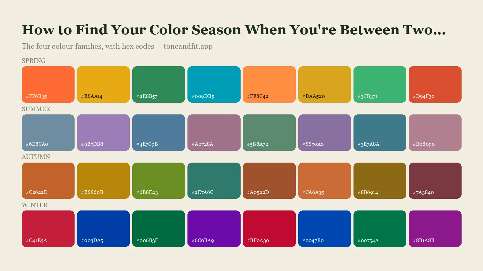
The 12 color seasons are not 12 separate boxes. They are a grid built on three dimensions, which we explain in full in seasonal color analysis explained. Every season sits somewhere on each of these:
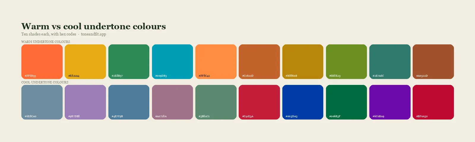
- Temperature: whether your coloring leans warm (golden, peachy, yellow based) or cool (pink, rosy, blue based).
- Depth (value): how light or dark your skin, hair and eyes look together.
- Softness (chroma): whether your coloring looks muted and blended or clear and vivid.
Neighboring seasons share two of these dimensions and differ on one. That is why they feel so similar when you try them on. Light Spring and Light Summer are both light and both fairly delicate, and they differ mostly on temperature. Deep Autumn and Deep Winter are both deep and rich, and they differ mostly on temperature too. Soft Summer and Soft Autumn are both muted, and again the hinge is warm versus cool. So when two results keep competing, you are almost always looking at a one dimension difference, not a total mismatch.
Real people also do not sit neatly in the middle of a season. Your skin may be neutral, your hair may be a mid tone, and your eyes may carry both gold and gray. Being a blend is normal. The goal is not to find a perfect label, it is to find the palette that makes your face look clear and rested, which is a more forgiving target than it sounds.
Step 1: Lock your undertone before anything else
Temperature is the most common hinge between neighboring seasons, so settle it first. If you have not run the tests yet, work through how to find your skin undertone at home and come back. The short version is to use at least three independent checks, in daylight, with no makeup and no tan:
- Hold gold and silver jewelry (or pieces of gold and silver foil) against your bare jaw and see which one makes your skin look cleaner.
- Compare a pure white and a cream or ivory fabric under your chin, as in our white versus cream test.
- Look at the inside of your wrist in natural light, then compare it with the color of your neck, which is usually less sun affected than your face.
If three tests agree, you have your temperature and you can cut your candidate list in half. Warm results point to Spring or Autumn, cool results point to Summer or Winter. If the tests split evenly, you may have a neutral undertone, which is a real category and a very common reason for between season results. Neutral people usually sit in a Soft season (Soft Summer or Soft Autumn) or a Light season, so note that and keep going.
Be careful about lighting here. A warm lamp, a blue tinted bathroom mirror or a window with a colored curtain can flip a test result, and so can the filter on a phone camera. Our post on how color seasons change in different lighting shows exactly how much this can swing, so repeat any test that surprised you in a second, neutral light before you trust it.
Step 2: Name the hinge, the one dimension you cannot settle
Now look at the two seasons you keep getting and ask which dimension separates them. Use this table as a map. Each row is a pair people commonly confuse, with the dimension that decides it and the question to ask yourself.
| Seasons you are torn between | The hinge | Ask yourself |
|---|---|---|
| Light Spring vs Light Summer | Temperature | Does gold or silver look cleaner on my bare skin? |
| Soft Autumn vs Soft Summer | Temperature | Do dusty rose and sage look better, or dusty peach and olive? |
| Deep Autumn vs Deep Winter | Temperature | Does a warm chocolate brown or a cool charcoal flatter me more? |
| Cool Winter vs Cool Summer | Softness | Do I look better in crisp, high contrast colors or in soft, blended ones? |
| Warm Spring vs Bright Spring | Softness and temperature | Do I suit warm and golden, or clear and vivid? |
| Warm Autumn vs Deep Autumn | Depth | Do medium rich colors work, or do I need very deep ones? |
| Bright Winter vs Deep Winter | Depth | Do pure bright colors beat deep, dark ones on me? |
| Light Summer vs Soft Summer | Depth and softness | Do I look better in light clear pastels or in muted mid tones? |
If your pair is not listed, the rule still works. Compare the two palettes and ask which of the three dimensions differs most. That one question turns a vague feeling of being unsure into a single, testable decision.
If the hinge is temperature
This is the easiest hinge to test because warm and cool colors fight your skin in obvious ways when you are on the wrong side. Wrong temperature tends to make skin look sallow, gray or oddly flushed, even when the color itself is pretty. Compare a warm and a cool version of the same color, such as a coral against a raspberry pink, or a tomato red against a blue red, and watch your skin rather than the fabric.
If the hinge is depth
Depth is about how much the color weighs on your face. Too light a color on a deep complexion looks chalky and floaty, while too dark a color on a light complexion swallows you. Hold a medium tone and a very deep tone of the same hue under your face. The right one makes your eyes and skin look like they belong to the same picture. You can also read our guide to finding your contrast level, because contrast is the simplest proxy for depth.
If the hinge is softness
Softness decides whether you wear clear, saturated colors or dusty, blended ones. Hold a vivid royal blue against a muted dusty blue. If the vivid one makes your face look sharper and more awake, you lean clear. If it makes you look like you are being overpowered by the color and the dusty one lets your face lead, you lean soft. Many between season results come from people with medium contrast and a muted look who get pulled toward brighter seasons by a flattering photo.
Step 3: Run a six swatch drape test
A drape test beats any quiz for tie breaks because you are comparing directly, with your own face, rather than answering questions about how you think you look. The full method is in our guides to color draping at home and doing a color analysis at home. Here is the fast version built for a tie break:
- Sit by a window in indirect daylight, hair pulled back, no makeup, and cover your clothes with a white or neutral towel.
- Pick six pieces of fabric or clothing: three from the palette of your first candidate season, three from the second, in matching hues where you can (one red, one blue, one green is ideal).
- Take a photo of each drape with the same camera settings and no filter, or have a friend watch your face live.
- For each pair, write down which one makes your skin look smoother, your eyes brighter and your face less tired. Ignore which color you like more on the hanger.
- Count the wins. A 5 to 1 or 4 to 2 result is a clear answer. A 3 to 3 result tells you something too, which we cover below.
Keep your expectations honest. The test is only as good as your lighting and your swatches, and a wrong color does not look terrible, it just looks slightly worse. That is why side by side comparison and a third person's opinion help so much. If you are doing this alone, review the photos a day later with fresh eyes.
Skip the guesswork
The free web tool names your season from one selfie, with no sign-up. The app's scan is free too and shows your undertone, best metals and starter colors; your season and full palette in the app are an optional upgrade.
Find my season free → Get the app ↗Step 4: Pick a primary season and a secondary season
Once you have your results, stop trying to force a single answer. Treat your result as a primary season with a secondary season on one side of it. This matches how many color analysts actually describe clients, and it fits how people really look.
- Clear winner (4 to 2 or better): your primary season is the winner. Use its palette as your default and treat the other season as a source of occasional extras.
- Narrow win (3 to 2 with one tie): name a primary and secondary season. Build your wardrobe from the primary palette and borrow shades from the secondary only in the colors you already tested well.
- True tie (3 to 3): you likely sit on the border, or your undertone is neutral. Use the overlap colors described in the next section and let a second method, such as a photo based tool, break the tie.
Write your primary and secondary seasons down, along with the hinge dimension. It sounds like homework, but it makes shopping decisions far easier. If your hinge is softness, for example, you know to ask of every purchase whether it is a little too bright or a little too dusty, rather than reopening the whole question each time.
Step 5: Shop the overlap colors while you decide
Neighboring seasons share colors. A dusty teal, a soft navy, a warm taupe or a muted berry can sit in two palettes at once, and those shared shades are the safest purchases while you are still deciding. Our color combinations by season and neutrals by color season pages show how neutrals carry across seasons, and neutrals are where the overlap is largest.
A practical way to find overlap is to open the two season palettes side by side and look for colors that appear in both or nearly match. Start there. Colors from the far ends of either palette, the ones that only appear in one, are the risky ones, so save them until the tie is settled.
Before you spend money, it also helps to know which colors are firmly off the table. Each season has a list of shades to skip, and when you are between two seasons, the shades that appear on both avoid lists are your clearest no. See our guide to colors that wash you out for a general version of that list.
Special cases that cause false between season results
You have a tan, or you are tanning season by season
A tan can make a cool person look golden and a warm person look orange. Judge your undertone on the neck, inner arm and the skin along your hairline rather than on a tanned face, or test in winter. Our guide to finding your undertone with a tan walks through it.
Your hair is dyed or going gray
Dyed hair changes the frame around your face and can skew both your own eye and any photo analysis. Use your natural hair color where you can, or hold a neutral cloth over your hair during the test. See how to find your color season with dyed hair for the full method.
Your skin is red, uneven or has makeup on
Redness, acne and foundation can all pull your test toward cool or warm for reasons that have nothing to do with your true undertone. Test bare skin on a calm area such as the inner wrist or collarbone, and see undertone testing with redness if that is a concern.
Your results change between quizzes
If a quiz gives you a different answer each time, the issue is often the inputs, not you. A colorful room, a warm lamp or a different time of day moves the answer. Read color analysis quiz versus photo to see why a quiz answered from memory tends to be the least stable method, and common color analysis mistakes for the other traps.
Using a photo tool as a tie breaker
When your own drape test ends in a tie, a photo based tool is a useful third opinion because it looks at skin, hair and eyes together and is not swayed by how much you like a color. The free Tone & Fit web tool reads your season from one selfie in about 30 seconds. If you want to understand how this kind of analysis works and where it can go wrong, read how accurate AI color analysis is.
Treat any tool result as one more vote rather than a verdict. If it agrees with your drape test, you are done. If it names a third season that neither of your candidates expected, go back and check your lighting, because the photo may have been taken in a color cast. Our color analysis app guide explains what to look for in a tool and how to take a selfie that gives it the cleanest input.
What to do if you are still unsure
Some people stay on a border permanently, and that is fine. Here is how to live well with a blended season:
- Wear the overlap first. Build your core wardrobe from colors shared by both palettes, so that nothing in your closet is a gamble.
- Test new colors one at a time. Buy one new piece in a questionable color, wear it near your face in daylight, and keep it only if people comment on you rather than the garment.
- Let your features lead. If your hair and eyes are warm but your skin is neutral, lean on warm colors near the hair and eyes and keep neutral colors near the face.
- Revisit after a change. Hair color, weight, age and tanning all shift your coloring. Retest when your look changes meaningfully, and read about finding your season after 50 if your hair has turned gray.
A useful reminder: a color season is a tool for narrowing choices, not a rule you can break. Even an analyst who is certain of your season would tell you to wear a color you love if it makes you feel good. The point of finding your season is a better hit rate and less wasted money, which a close enough answer already delivers. For the wider picture, our personal color analysis guide covers the whole process from first test to finished wardrobe, and the what colors look good on me guide helps you turn a season into outfit decisions.
Quick recap
- Between seasons is normal, because neighboring seasons differ on only one of three dimensions.
- Lock your undertone with at least three tests in daylight.
- Name the hinge dimension: temperature, depth or softness.
- Run a six swatch side by side drape test and count the wins.
- Pick a primary and secondary season, and shop the overlap colors until you are sure.
Skip the guesswork
The free web tool names your season from one selfie, with no sign-up. The app's scan is free too and shows your undertone, best metals and starter colors; your season and full palette in the app are an optional upgrade.
Find my season free → Get the app ↗FAQ
What does it mean if I am between two color seasons?
It usually means your coloring differs from one neighboring season on a single dimension, such as temperature, depth or softness. Neighboring seasons share the other dimensions, so both palettes can look good on you. Name the one dimension in doubt and test it directly.
How do I choose between two color seasons?
Lock your undertone first with at least three daylight tests, then identify which dimension separates your two candidate seasons. Run a side by side drape test with three swatches from each palette and count which wins on your face. Pick the winner as your primary season and keep the other as a secondary.
Can I be two color seasons at once?
Many people sit on the border between two seasons, especially with a neutral undertone or medium contrast. It is practical to name a primary season and a secondary season and wear the colors that appear in both palettes. A color season is a guide to narrowing choices, not a strict category.
Why do I get a different color season every time I take a quiz?
Quiz answers depend on lighting, mirrors, makeup, tan and how you remember your own coloring, so small differences move the result. Neighboring seasons are also close to each other, so a small change can flip the answer. Test in neutral daylight with no makeup and compare more than one method.
Which seasons are most commonly confused?
Pairs that share two dimensions are the usual suspects, such as Light Spring and Light Summer, Soft Summer and Soft Autumn, and Deep Autumn and Deep Winter. Cool Winter and Cool Summer, and Bright Winter and Deep Winter, are also common pairs. Each pair has one deciding dimension to test.
What are overlap colors?
Overlap colors are shades that appear in, or closely match, the palettes of two neighboring seasons. Neutrals such as taupe, soft navy and muted teal often overlap. They are the safest purchases while you are still deciding between seasons.
Should I get a professional analysis if I cannot decide?
It can help, because a trained analyst compares drapes on your face in controlled light. A free photo tool, a careful drape test at home and a trusted friend's opinion can also settle most ties. Whatever you choose, judge the result by how your face looks, not by how much you like the color.
Can I check my color season from a photo?
Yes. The free Tone & Fit web tool reads your color season from one selfie in about 30 seconds, with no sign-up and no photo stored by us. The Tone & Fit app for iPhone and Android then builds your full palette of 38 named shades.